
Selecting the right typography can make or break a design. Fonts shape tone, guide readability, and establish visual hierarchy. With over 1,000 typefaces in Google Fonts, the options are vast—but not all pairings work well together. The key to effective typography lies in contrast, compatibility, and context.
A successful font combination balances personality with practicality. One font might bring elegance; the other ensures legibility. Together, they create rhythm across headlines, subheadings, and body text. Below are 10 expert-curated Google Font pairings proven to deliver both aesthetic appeal and functional clarity—ideal for blogs, portfolios, landing pages, and branding projects.
Why Font Pairing Matters in Web Design
Typography isn’t just about choosing “nice-looking” fonts. It’s about creating a seamless reading experience while reinforcing brand identity. Poorly matched fonts compete for attention, confuse hierarchy, or feel disjointed. Strong pairings, on the other hand, enhance scannability and emotional resonance.
Effective combinations typically follow one of these principles:
- Contrast in weight or style – pairing a bold display font with a light sans-serif.
- Complementary moods – using two fonts that share a similar era or cultural reference.
- Different classifications – combining serif with sans-serif for structure and modernity.
“Typography is the voice of the page. When two fonts speak in harmony, the message becomes unforgettable.” — Helena Ruiz, Type Director at Studio Nimbus
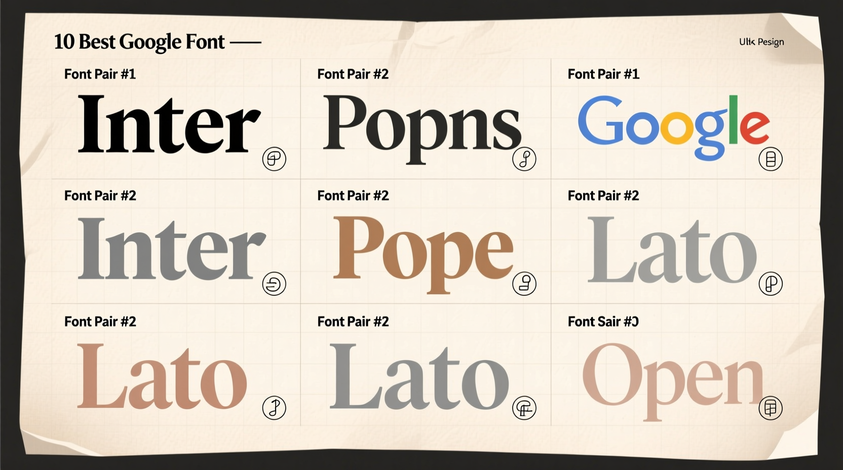
Top 10 Google Font Combinations for Visual Harmony
The following selections balance beauty, usability, and accessibility. Each includes a headline font (for titles and emphasis) and a body font (optimized for long-form reading). All are freely available via Google Fonts and load efficiently on most devices.
- Playfair Display + Lato
A classic editorial duo. Playfair’s high-contrast serifs evoke luxury and tradition, while Lato’s neutral, open curves ensure readability. Ideal for blogs, magazines, or wedding websites. - Montserrat + Merriweather
Modern geometry meets timeless readability. Montserrat offers clean, urban sophistication for headings; Merriweather provides warm, book-like comfort for paragraphs. Perfect for corporate sites and personal journals. - Poppins + Noto Serif
Poppins brings cheerful rounded sans-serif energy, excellent for tech or creative brands. Paired with Noto Serif’s balanced proportions, this combo supports multilingual content without sacrificing elegance. - Oswald + Open Sans
A robust pairing for data-heavy layouts. Oswald’s condensed uppercase style grabs attention; Open Sans delivers exceptional legibility across screen sizes. Widely used in dashboards and news platforms. - Cormorant Garamond + Karla
For refined minimalism. Cormorant’s delicate serifs suggest artistry; Karla’s soft corners and generous spacing keep body text approachable. Great for galleries, fashion labels, or literary sites. - Raleway + Source Sans Pro
Elegant yet efficient. Raleway’s thin weights suit premium branding; Source Sans Pro—the first open-source sans-serif from Adobe—offers professional neutrality for supporting text. - Roboto Slab + Inter
A functional powerhouse. Roboto Slab adds typographic texture with its monolithic serifs; Inter maintains clarity even at small sizes. Ideal for documentation, SaaS tools, and educational platforms. - Bebas Neue + Roboto
Bold impact meets everyday utility. Bebas Neue’s all-caps intensity works for hero banners; Roboto handles everything else with quiet reliability. Common in event promotions and product launches. - Libre Baskerville + Work Sans
Literary charm with contemporary flow. Libre Baskerville honors traditional book typography; Work Sans bridges the gap with friendly, humanist forms. Excellent for storytelling and long-read articles. - Anton + Ubuntu
High-energy contrast. Anton’s heavy, wide letters command attention; Ubuntu’s legible, slightly rounded shapes soften the layout. Best suited for youth-oriented or entertainment-focused sites.
Do’s and Don’ts of Font Pairing
To avoid common pitfalls, refer to this quick-reference table before finalizing your choices.
| Do’s | Don’ts |
|---|---|
| Choose fonts with contrasting roles (e.g., decorative headline + neutral body) | Pair two highly stylized fonts (e.g., script + stencil) |
| Test readability at different sizes and screen types | Ignore loading performance—avoid more than two font weights per family |
| Ensure adequate letter spacing and line height in body copy | Use all caps or italics extensively in paragraph text |
| Check accessibility contrast ratios (text vs. background) | Select overly trendy fonts that may date quickly |
Real Example: Redesigning a Lifestyle Blog
Consider \"Urban Bloom,\" a wellness blog struggling with low engagement. Its original design used two playful scripts that were difficult to read. After switching to Playfair Display + Lato, bounce rates dropped by 34% within six weeks. Readers reported improved navigation and clearer content separation.
The new typography created instant visual hierarchy: Playfair introduced each article with grace, while Lato carried longer sections comfortably. Even mobile users noted faster comprehension. This case illustrates how strategic font pairing directly impacts user behavior—not just aesthetics.
How to Implement These Combinations
Integrating these fonts into your project is straightforward. Follow this step-by-step process:
- Visit Google Fonts and search for your chosen pair.
- Select font weights: Typically, use 400 (regular), 700 (bold) for body; 500–900 for headings. Avoid loading too many variants.
- Copy the embed link provided by Google Fonts and paste it into your HTML
<head>. - Add CSS rules to assign fonts to elements:
body {
  font-family: 'Lato', sans-serif;
}
h1, h2, h3 {
  font-family: 'Playfair Display', serif;
}
This method ensures fast loading and cross-browser compatibility. For advanced control, consider self-hosting fonts or using font-display: swap to prevent invisible text during load.
Frequently Asked Questions
Can I use more than two fonts on a website?
Technically yes, but it's generally advised to limit yourself to two type families. Introducing a third font should serve a distinct purpose—such as code blocks or callouts—and must align with the overall typographic system.
Are these font combinations mobile-friendly?
All recommended fonts render clearly on mobile devices when properly sized and spaced. Ensure minimum body text is at least 16px and test on actual devices, not just emulators.
What if my brand already has a custom font?
You can still use Google Fonts for secondary text. Pair your branded display font with a neutral Google option like Open Sans or Inter to maintain harmony without compromising identity.
Final Thoughts: Typography as Design Foundation
Great design begins with thoughtful typography. The right font pairing doesn’t just look good—it guides users, builds trust, and enhances communication. Whether you're launching a portfolio, refining a blog, or designing a startup landing page, these 10 Google Font combinations offer a reliable starting point grounded in design principles.
Start with one pairing that matches your project’s tone. Test it across contexts. Refine spacing and hierarchy. Typography is an evolving craft, not a one-time decision. As your design matures, so can your typographic voice.


 浙公网安备
33010002000092号
浙公网安备
33010002000092号 浙B2-20120091-4
Comments
No comments yet. Why don't you start the discussion?