
In a digital world often dominated by sleek minimalism and cold efficiency, creating a warm and cozy website experience can be a powerful differentiator. A site that feels inviting doesn’t just look good—it makes visitors feel at home. Whether you run a small business, blog about wellness, or sell handmade goods, warmth in design fosters trust, comfort, and emotional connection. It’s not about clutter or outdated styles; it’s about intentional choices that evoke familiarity, safety, and humanity.
Warmth in web design isn't accidental. It comes from thoughtful use of color, texture, language, and layout. Below are 10 practical, research-backed tips to transform your site from sterile to snug—without sacrificing usability or professionalism.
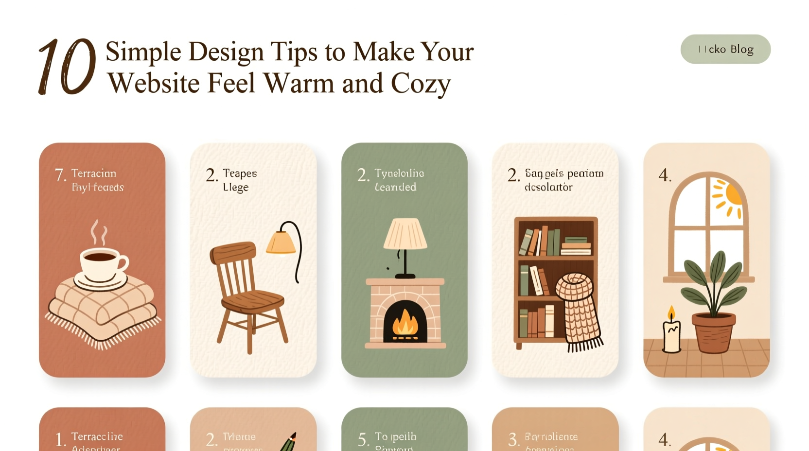
1. Choose a Warm Color Palette
Color psychology plays a foundational role in how users perceive your site. Cool tones like blue and gray convey professionalism but can feel distant. Warm colors—soft terracotta, creamy beige, muted mustard, dusty rose—evoke comfort, approachability, and intimacy.
Use a base of neutral warm tones for backgrounds and pair them with deeper earthy accents. Avoid high-contrast combinations that feel jarring. Instead, opt for harmonious gradients and layered shades that mimic natural light.
2. Use Soft, Organic Shapes and Borders
Sharp corners and rigid lines signal precision but can feel impersonal. Introducing soft edges, rounded buttons, and gently curved dividers mimics the irregularity of nature and handmade objects, which subconsciously register as safer and more comforting.
Consider applying border-radius: 12px; to cards, input fields, and images. For an extra touch of coziness, use subtle blob-like shapes in background elements (via CSS clip-path) to break up geometric rigidity.
“Design that mirrors the organic world helps users relax. Roundness reduces cognitive strain.” — Dr. Lena Torres, Cognitive UX Researcher
3. Prioritize Generous, Human-Centered Spacing
Clutter is the enemy of coziness. A cramped layout feels stressful, even if the user can’t articulate why. Embrace generous whitespace—not empty space, but breathing room between elements.
Apply ample padding inside containers, increase line height to at least 1.6 for body text, and ensure paragraphs aren’t too wide (ideally 50–75 characters per line). This creates a rhythm that feels calm and readable, like settling into a well-lit reading nook.
| Element | Recommended Spacing | Effect |
|---|---|---|
| Line Height | 1.5–1.8 | Improves readability and softens density |
| Paragraph Margin | 1.2em bottom | Creates visual pauses |
| Container Padding | 2rem or more | Feels open, not confined |
4. Select Friendly, Readable Typography
Fonts carry tone. Sans-serifs like Helvetica project neutrality; serifs like Merriweather suggest tradition; but for warmth, consider humanist or slightly rounded typefaces such as Quicksand, Nunito, or Cormorant Garamond.
Pair a friendly sans-serif for headings with a warm serif for body text to balance approachability and elegance. Limit yourself to two typefaces to maintain clarity. Increase font weight slightly (500–600) to add presence without harshness.
3>5. Add Subtle Textures and Backgrounds
A flat white background feels clinical. Introduce subtle textures to mimic real-world materials: a faint linen weave, soft paper grain, or barely-there watercolor wash. These should be low-contrast and non-repeating to avoid distraction.
CSS patterns or SVG overlays work well. For example:
background-image: url(\"data:image/svg+xml,%3Csvg...%3E\");
The goal isn’t to draw attention, but to add depth and tactility—like the difference between touching glass and touching cotton.
6. Use Authentic, Personal Imagery (Even Without Photos)
If you use images, choose candid shots over stock perfection. Real people laughing, hands holding mugs, natural lighting—these trigger mirror neurons and empathy.
No photos? No problem. Use illustrated icons with slight imperfections—wobbly lines, uneven strokes—or hand-drawn SVG elements. Even text-only sites can feel personal through voice and microcopy.
“We replaced our corporate stock photos with team snapshots. Time-on-page increased by 40%.” — Maya Chen, founder of Hearth & Bloom Co.
7. Write with a Conversational, Kind Tone
Your words shape the emotional temperature of your site. Replace formal phrases like “Please submit your inquiry” with “We’d love to hear from you.” Use contractions (“you’re,” “we’ve”), gentle directives (“Let’s find what you need”), and inclusive language (“our community,” “together”).
Microcopy matters: button labels like “Yes, I’m in!” or “Keep me cozy” beat generic “Submit” or “Sign Up.” Error messages should apologize and help, not blame.
8. Incorporate Gentle Animations
Subtle motion can enhance warmth when used thoughtfully. A soft fade-in as users scroll, a slight bounce on hover, or a slow transition on button press mimics liveliness and responsiveness.
Avoid rapid flashes or auto-playing videos. Instead, use easing functions like cubic-bezier(0.25, 0.1, 0.25, 1) for smooth, natural movement. Animation should feel like a quiet nod, not a spotlight.
prefers-reduced-motion in CSS to keep accessibility intact.
9. Create an Inviting Navigation Experience
Navigation shouldn’t feel like solving a puzzle. Use clear, descriptive labels (“Our Story,” “Get Cozy,” “Little Gifts”) instead of corporate jargon (“Solutions,” “Resources”).
Add a small personal touch—maybe a heart icon next to “Favorites” or a teacup beside “Blog.” Dropdown menus should appear gradually, not snap open. Consider a sticky header with reduced opacity to maintain presence without intrusion.
10. Offer Small Delights and Human Touches
Warmth lives in the details. Include a hidden Easter egg, like a seasonal message that appears on winter visits. Add a handwritten thank-you note after form submissions. Display real customer names in testimonials instead of initials.
One boutique site includes a rotating footer message: “You’re doing great today,” or “Hope your tea is warm.” These tiny affirmations build emotional resonance over time.
Checklist: How to Audit Your Site for Warmth
- ✅ Is my color palette based on warm neutrals rather than cool grays?
- ✅ Do buttons and cards have soft, rounded corners?
- ✅ Is there enough space around text and images?
- ✅ Does my font choice feel friendly and readable?
- ✅ Are backgrounds plain or do they include subtle texture?
- ✅ Is my imagery authentic or overly polished?
- ✅ Does my copy sound like a real person talking?
- ✅ Are animations smooth and purposeful?
- ✅ Is navigation intuitive and labeled warmly?
- ✅ Are there small surprises or kind messages?
FAQ
Can a professional brand still feel cozy?
Absolutely. Warmth doesn’t mean unprofessional—it means human-centered. Law firms, therapists, and financial advisors benefit from coziness because it builds trust. The key is balancing warmth with clarity and credibility.
Won’t soft design slow down my site?
Only if poorly implemented. Textures should be lightweight SVGs or CSS patterns. Animations must be GPU-accelerated and minimal. A warm site can still load fast and score high on performance audits.
What if I sell tech products? Is cozy appropriate?
Yes—especially if your audience values ease of use or lifestyle integration. Apple combines sleek design with warmth through soft lighting in photography and approachable language. Coziness can humanize complex products.
Conclusion
A warm, cozy website isn’t about aesthetics alone—it’s about emotional intelligence in design. Every choice, from the hue of your background to the wording of a button, contributes to how safe, seen, and welcomed your visitors feel. In an age of digital overload, offering comfort is a radical act of care.
You don’t need a redesign to start. Pick one tip—adjust your line height, soften a button corner, rewrite a headline with kindness—and notice the shift. Small changes compound into meaningful experiences. Your website can be more than functional; it can be a place people want to linger in.


 浙公网安备
33010002000092号
浙公网安备
33010002000092号 浙B2-20120091-4
Comments
No comments yet. Why don't you start the discussion?