
Typography is one of the most powerful tools in visual communication. When used effectively, custom fonts can elevate a website’s aesthetic, reinforce brand identity, and improve readability. However, integrating custom fonts into HTML requires more than just aesthetics—it demands technical precision, performance awareness, and cross-browser compatibility. This guide walks through the essential steps, best practices, and common pitfalls of using custom fonts to create visually compelling and functionally sound websites.
Why Custom Fonts Matter in Web Design
While system fonts like Arial or Georgia are reliable and fast-loading, they lack personality. Custom fonts allow designers and developers to express uniqueness—whether it's a sleek sans-serif for a modern tech startup or an elegant serif for a luxury brand. Typography influences perception: studies show users associate font style with trustworthiness, professionalism, and creativity.
Google Fonts reports that over 70% of the top 1 million websites use at least one custom web font. But popularity doesn’t guarantee success. Poorly implemented fonts can slow down page loads, cause layout shifts, or fail to render on certain devices.
“Typography is not just about choosing pretty letters—it’s about creating hierarchy, emotion, and clarity.” — Karen Cheng, Type Designer & Former Lead at Google Fonts
Step-by-Step Guide to Implementing Custom Fonts
Adding custom fonts to your site involves several key stages: sourcing the font, loading it correctly, applying it via CSS, and ensuring fallbacks. Follow this timeline to integrate fonts seamlessly:
- Select Your Font: Choose from trusted sources like Google Fonts, Adobe Fonts, or self-hosted typefaces with proper licensing.
- Download or Link the Font Files: For external services, grab the embed code; for self-hosting, download WOFF2, WOFF, and optionally TTF formats.
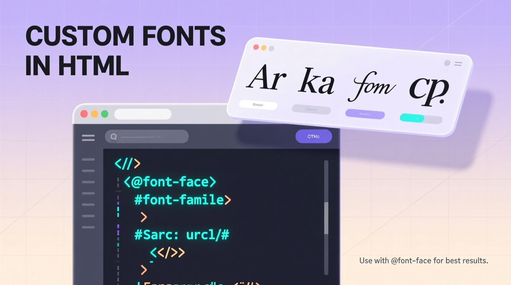
- Declare the Font in CSS Using @font-face: Define the font family and point to each file format.
- Apply the Font to Elements: Use the
font-familyproperty in your CSS rules. - Test Across Devices and Browsers: Ensure rendering consistency on mobile, desktop, and older browsers.
- Optimize Performance: Preload critical fonts, subset characters, and set font-display strategies.
Using @font-face: The Core Technique
The @font-face rule is the foundation of custom font implementation in CSS. It allows you to define a font family and specify where the browser should load the font files.
Here’s a properly structured example:
@font-face {
  font-family: 'CustomSans';
  src: url('fonts/custom-sans.woff2') format('woff2'),
       url('fonts/custom-sans.woff') format('woff');
  font-weight: normal;
  font-style: normal;
  font-display: swap;
}
- font-family: The name you’ll reference in your CSS (e.g.,
font-family: 'CustomSans';). - src: Lists font files in order of preference. WOFF2 is recommended for modern browsers due to its high compression.
- font-weight / font-style: Match these to the actual font file properties to avoid synthetic bolding or italicizing.
- font-display: Controls how the font appears during loading.
swapshows fallback text immediately and swaps once loaded—ideal for UX.
Best Practices for Performance and Compatibility
Custom fonts enhance design but can hurt performance if misused. A single large font file can delay text rendering and increase bounce rates. Follow these best practices to balance beauty and speed:
| Practice | Benefit | Implementation Tip |
|---|---|---|
| Use WOFF2 Format | Smaller file size (~30% less than WOFF) | Convert fonts using tools like Font Squirrel’s Generator |
| Subset Characters | Reduces file size by removing unused glyphs | Only include Latin characters if targeting English audiences |
| Preload Critical Fonts | Speeds up initial render | Add <link rel=\"preload\" as=\"font\" href=\"font.woff2\" type=\"font/woff2\"> |
| Limit Font Weights & Styles | Fewer HTTP requests, faster load | Avoid loading Light, Regular, Medium, Bold, Italic, etc., unless all are used |
| Define Fallback Stacks | Ensures legibility if custom font fails | Use generic families: serif, sans-serif, monospace |
font-display: swap; to prevent invisible text during loading (FOIT). This ensures content remains readable from the start.
Mini Case Study: Revamping a Portfolio Site with Custom Typography
Jessica Lin, a freelance graphic designer, redesigned her portfolio to reflect her minimalist branding. She selected \"Manrope,\" a clean geometric sans-serif from Google Fonts, to replace the default system font. Initially, she embedded all eight weights, causing her homepage load time to jump from 1.4s to 3.8s.
After auditing her usage, she found only three weights (Regular, Medium, Bold) were actually applied. She switched to self-hosting the WOFF2 versions, preloaded the Regular weight, and subsetted non-Latin characters. The result? Load time dropped to 1.9s, Cumulative Layout Shift improved by 60%, and user engagement increased by 27% over six weeks.
This case illustrates how thoughtful font optimization directly impacts both performance and user experience.
Checklist: Launch-Ready Custom Font Integration
Before deploying a site with custom fonts, run through this checklist to ensure quality and reliability:
- ✅ Verified font license permits web use
- ✅ Used WOFF2 format for primary source
- ✅ Defined fallback font stack (e.g., sans-serif)
- ✅ Set
font-display: swap;in @font-face - ✅ Preloaded critical font files
- ✅ Limited to only necessary weights and styles
- ✅ Tested rendering on iOS, Android, Chrome, Safari, Firefox, and Edge
- ✅ Checked for layout shifts during font swap
- ✅ Confirmed accessibility (sufficient contrast, readable size)
Frequently Asked Questions
Can I use any font I download online?
No. Many fonts are licensed only for print or personal use. Always verify the license allows web embedding. Sites like Google Fonts and Fontspring offer clear commercial licensing.
What’s the difference between self-hosting and using a CDN?
CDNs like Google Fonts are easy to implement and often cached across sites, improving load times. Self-hosting gives full control over delivery, avoids third-party dependencies, and enhances privacy—but requires proper server configuration and maintenance.
Why does my text look pixelated or blurry?
This usually happens when browsers generate fake bold or italic versions because the correct font file isn’t linked. Always match font-weight and font-style in @font-face to the actual font file.
Conclusion: Elevate Design with Intentional Typography
Custom fonts are more than decorative elements—they’re strategic assets in web design. When implemented with care, they strengthen brand voice, guide user attention, and create memorable experiences. But their power comes with responsibility: every font file adds weight, and every rendering quirk affects usability.
By following technical best practices, optimizing for performance, and testing rigorously, you can harness the full potential of typography without compromising speed or accessibility. Whether you're building a personal blog or a corporate platform, treat fonts as integral components of your development workflow—not afterthoughts.


 浙公网安备
33010002000092号
浙公网安备
33010002000092号 浙B2-20120091-4
Comments
No comments yet. Why don't you start the discussion?