Combining images in Photoshop is a foundational skill for designers, photographers, and digital artists. Whether you're creating surreal composites, realistic product mockups, or layered photo edits, the ability to merge multiple images so they appear natural and cohesive separates amateur work from professional-grade results. The key lies not just in layering but in attention to lighting, perspective, color harmony, and edge refinement. This guide walks through the essential steps, tools, and techniques needed to blend images seamlessly—without visible seams or inconsistencies.
1. Prepare Your Workspace and Source Images
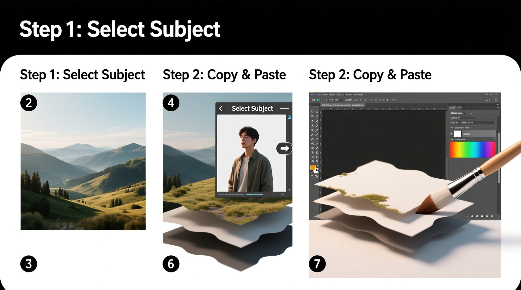
Before diving into editing, ensure your environment supports precision. Open Photoshop and set up a dual-monitor workspace if possible—one screen for your canvas, the other for layers, history, and adjustments. Use high-resolution source images with similar lighting conditions when possible. Mismatched resolutions or extreme lighting differences will complicate blending later.
Start by opening your base image—the background onto which other elements will be added. Then drag or place additional images as new layers above it. Always work non-destructively: convert each placed image into a Smart Object (right-click the layer > Convert to Smart Object) to preserve original data and allow future scaling without quality loss.
2. Align Images Using Perspective and Scale
Seamless integration begins with accurate alignment. If you’re adding a person to a street scene, their feet should align with the ground plane, and their height must match surrounding objects based on perspective. Use the Free Transform tool (Ctrl+T / Cmd+T) to resize and rotate layers. Hold Shift while transforming to maintain proportions.
For complex scenes, activate rulers (Ctrl+R) and draw guides to match vanishing points. Enable Snap to Guides under View > Snap To to help position elements precisely. If necessary, use the Perspective Warp tool (Edit > Perspective Warp) to adjust how an object sits within 3D space, especially useful for architectural integrations.
“Perspective accuracy is the silent foundation of believable compositing. Get this wrong, and no amount of color matching can save the illusion.” — Jordan Lee, Digital Compositing Artist at Framestore
3. Cut Out and Refine Edges with Precision
The next critical phase is isolating the subject from its original background. Use the Object Selection Tool or Quick Selection Tool to make an initial selection, then refine it using Select and Mask. This workspace allows detailed control over edges.
In Select and Mask, choose the Refine Edge Brush to paint over hair, fur, or translucent areas. Adjust sliders like Smooth, Feather, Contrast, and Shift Edge to clean up jagged borders. Output the result to a new layer with a layer mask, preserving flexibility.
| Edge Type | Recommended Settings | Tool Used |
|---|---|---|
| Hard edges (buildings, furniture) | Feather: 0–1 px, Smooth: 2–5 | Polygonal Lasso + Refine Edge |
| Soft edges (hair, smoke) | Feather: 2–4 px, Decontaminate Colors: On | Refine Edge Brush |
| Translucent edges (glass, fabric) | Shift Edge: -10% to -20%, Output to Layer Mask | Brush + Opacity Control |
4. Blend Layers Using Masks, Opacity, and Blending Modes
Once elements are positioned and masked, blending becomes the focus. Layer masks are non-destructive tools that hide parts of a layer without deleting pixels. Paint with black to conceal, white to reveal, and gray for partial transparency. Use soft brushes at low opacity (10–30%) to gradually fade edges into the background, mimicking atmospheric depth.
Adjust the top layer’s opacity temporarily to see underlying details during alignment. Experiment with blending modes such as Multiply (for shadows), Screen (for light elements), or Overlay (for contrast enhancement). These rarely provide final results but can inspire direction.
Color discrepancies break realism. Use adjustment layers clipped to individual elements (Alt+Click between layers to clip) to fine-tune appearance. Common corrections include:
- Curves – Match brightness and contrast gradients.
- Hue/Saturation – Tweak color intensity to match scene mood.
- Color Balance – Adjust shadows, midtones, and highlights separately for warmth or coolness.
- Selective Color – Fine-tune specific color ranges (e.g., make greens more earthy).
5. Match Lighting, Shadows, and Atmosphere
No composite looks real without consistent lighting. Observe the direction, intensity, and color temperature of light in the base image. Are shadows falling left or right? Is the light soft (overcast) or harsh (midday sun)? Recreate these conditions on added elements.
To add realistic shadows:
- Duplicate the subject layer and fill it with black (Image > Adjustments > Invert).
- Blur the shadow using Gaussian Blur (Filter > Blur > Gaussian Blur) based on light softness.
- Warp and distort the shadow to follow ground contours (Edit > Transform > Warp).
- Lower opacity (30–60%) and set blend mode to Multiply.
- Use a layer mask to fade shadow edges where they lift off the surface.
For atmosphere, subtle effects unify a scene:
- Add a global Vignette via a darkened Curves layer with feathered corners.
- Apply slight Camera Raw Filter noise to match grain levels across images.
- Use a low-opacity Brush Tool with soft round tip to paint ambient occlusion where objects meet.
Mini Case Study: Urban Portrait Composite
A photographer wanted to place a studio-lit model into a rainy cityscape. The original composite failed due to mismatched lighting—studio flash created flat illumination, while the street scene had directional side lighting from streetlamps. By duplicating the model layer, applying a gradient mask to darken one side, and painting subtle rim light with a warm orange brush at 10% opacity, the model appeared integrated. A motion-blurred shadow beneath her feet, angled to match nearby lampposts, completed the illusion. Final color grading with a blue-teal tint across all layers tied everything together.
Essential Checklist for Seamless Image Compositing
- ✅ Source High-Quality Images
- Use photos with similar resolution and minimal compression artifacts.
- ✅ Match Perspective and Scale
- Align horizons, vanishing points, and relative sizes accurately.
- ✅ Refine Edges with Select and Mask
- Pay special attention to fine details like hair or foliage.
- ✅ Use Layer Masks, Not Eraser
- Maintain editability and smooth transitions.
- ✅ Correct Colors and Exposure
- Apply targeted adjustment layers per element.
- ✅ Add Realistic Shadows and Highlights
- Reinforce depth and grounding.
- ✅ Apply Global Finishing Touches
- Noise, vignette, and sharpening applied last for cohesion.
Frequently Asked Questions
Can I combine images taken at different times of day?
Yes, but it requires significant color grading. For example, placing a subject photographed at noon into a sunset scene means desaturating blues, boosting oranges/reds, and adding warm rim lighting. It’s easier when both images have neutral white balance initially.
Why does my composite look “flat”?
This usually stems from missing depth cues. Ensure shadows are present and correctly angled, atmospheric perspective is simulated (distant objects slightly blurred and less contrasty), and foreground elements have sharper detail than background ones.
How do I handle mismatched resolutions?
If one image is much lower resolution, avoid enlarging it excessively. Instead, reposition the composition to use only the sharpest portion, or apply mild sharpening (Unsharp Mask) after scaling. Alternatively, consider sourcing higher-quality replacements.
Final Thoughts
Seamless image combination isn’t magic—it’s methodical craftsmanship. Mastery comes from practicing alignment, refining edges, and obsessing over lighting consistency. Every great composite starts with intention: knowing how light behaves, how perspective works, and how colors interact in real environments. With these techniques, you’re equipped to create visuals that don’t just impress technically but tell convincing visual stories.


 浙公网安备
33010002000092号
浙公网安备
33010002000092号 浙B2-20120091-4
Comments
No comments yet. Why don't you start the discussion?