
Two way tables, also known as contingency tables, are foundational tools in statistics and data analysis. They allow researchers, analysts, and students to explore relationships between two categorical variables. Whether you're analyzing survey responses, customer preferences, or medical outcomes, mastering two way tables enables you to uncover patterns that raw numbers alone might obscure.
Unlike complex statistical models, two way tables are intuitive and accessible, making them ideal for both beginners and professionals. When used correctly, they can reveal associations, highlight disparities, and support decision-making with clear, structured evidence.
Understanding the Purpose of Two Way Tables
A two way table organizes data into rows and columns, where each row represents a category of one variable and each column represents a category of another. The cells contain frequencies (counts) or relative frequencies (percentages) showing how often combinations occur.
For example, suppose a school surveys students on their preferred lunch option (sandwiches, salads, wraps) and whether they participate in sports. A two way table would display how many athletes prefer sandwiches, how many non-athletes choose salads, and so on. This structure makes it easy to compare groups and detect trends.
The power of two way tables lies not just in organization but in interpretation. By examining marginal totals (row and column sums), conditional distributions, and proportions, you can answer questions like: \"Are athletes more likely to choose wraps than non-athletes?\" or \"Is there a significant difference in food preference across activity levels?\"
“Contingency tables turn abstract survey data into actionable insight. They’re the first step in any categorical data investigation.” — Dr. Linda Tran, Biostatistician and Data Science Educator
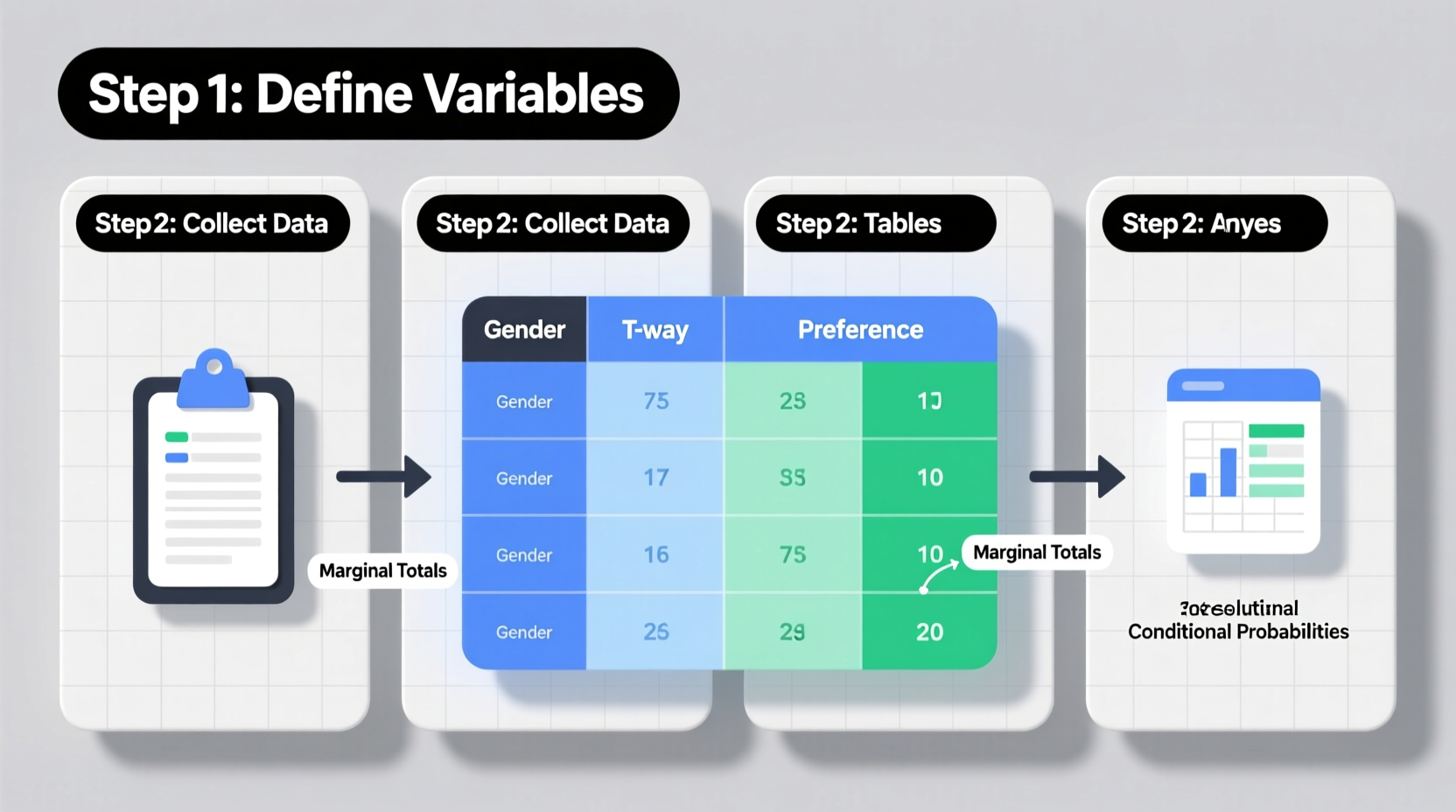
Step-by-Step Guide to Creating a Two Way Table
Constructing an accurate two way table involves careful planning and attention to detail. Follow these steps to ensure clarity and correctness:
- Identify the two categorical variables: Determine which variables you want to compare. For instance, “Gender” (Male/Female/Non-binary) and “Preferred Learning Method” (Online/In-Person/Hybrid).
- Collect and categorize your data: Gather responses or observations and assign each to the appropriate category pair. Ensure no overlap or misclassification.
- Create the table structure: Set up a grid with one variable along the rows and the other along the columns. Include an extra row and column for totals.
- Fill in the frequencies: Count how many observations fall into each combination of categories and enter those numbers into the corresponding cells.
- Add marginal totals: Sum each row and column to get the totals. These help in calculating percentages and identifying overall distributions.
- Review for accuracy: Double-check entries against raw data to prevent errors that could distort analysis.
Interpreting Results: From Frequencies to Insights
Once your table is complete, the real analysis begins. Raw counts tell part of the story, but deeper understanding comes from examining proportions and relationships.
Consider a study on smartphone brand preference (iOS vs Android) across age groups (Under 30, 30–50, Over 50). Suppose the two way table shows:
| iOS | Android | Total | |
|---|---|---|---|
| Under 30 | 45 | 30 | 75 |
| 30–50 | 50 | 40 | 90 |
| Over 50 | 35 | 60 | 95 |
| Total | 130 | 130 | 260 |
At first glance, iOS and Android appear equally popular overall. But look closer: among users over 50, Android is clearly dominant (60 vs 35). Meanwhile, younger users lean toward iOS. To quantify this, calculate conditional relative frequencies—proportions within each row:
- Under 30: 45 ÷ 75 = 60% prefer iOS
- 30–50: 50 ÷ 90 ≈ 55.6% prefer iOS
- Over 50: 35 ÷ 95 ≈ 36.8% prefer iOS
This reveals a trend: iOS preference decreases with age. Without converting to percentages, such a pattern might go unnoticed. Always consider context—demographics, sample size, and potential biases—when drawing conclusions.
Common Pitfalls and Best Practices
Mistakes in creating or reading two way tables can lead to flawed interpretations. Avoid these common errors:
| Do’s | Don’ts |
|---|---|
| Use clear, descriptive labels for rows and columns | Assume association implies causation |
| Include marginal totals for reference | Ignore small sample sizes in subgroups |
| Convert to percentages when comparing unequal group sizes | Mix up joint, marginal, and conditional frequencies |
| Double-check arithmetic and categorization | Present only raw counts without context |
Real-World Example: Customer Feedback Analysis
A retail company surveyed 200 customers about satisfaction (Satisfied/Not Satisfied) and store location (Downtown, Suburban, Rural). The two way table revealed:
- Downtown: 60 satisfied, 10 not satisfied
- Suburban: 45 satisfied, 25 not satisfied
- Rural: 25 satisfied, 35 not satisfied
While downtown had the highest absolute number of satisfied customers, calculating satisfaction rates told a different story:
- Downtown: 60 ÷ 70 ≈ 85.7%
- Suburban: 45 ÷ 70 ≈ 64.3%
- Rural: 25 ÷ 60 ≈ 41.7%
The analysis prompted management to investigate rural store conditions—staffing, product availability, cleanliness—which were later improved, leading to a 22% increase in satisfaction within three months. This case illustrates how two way tables can drive operational decisions grounded in data.
Frequently Asked Questions
Can two way tables include more than two categories per variable?
Yes. While the table remains \"two way\" (comparing two variables), each variable can have multiple categories. For example, one variable could have four income brackets and another three education levels, resulting in a 4×3 table.
What’s the difference between a two way table and a Venn diagram?
Two way tables show joint frequencies across two categories systematically, including totals. Venn diagrams visually represent overlaps but struggle with larger datasets and don’t display totals or percentages as clearly.
How do I know if there’s a significant association in my table?
For basic analysis, examine conditional percentages. For statistical rigor, apply a chi-square test of independence, which determines whether the observed relationship is likely due to chance.
Conclusion: Turn Data Into Decisions
Mastering two way tables equips you with a powerful yet simple method for exploring relationships in categorical data. From classroom projects to business analytics, the ability to construct and interpret these tables enhances your analytical fluency. Start with clean data, build your table methodically, and always dig beyond raw numbers to uncover meaningful patterns.


 浙公网安备
33010002000092号
浙公网安备
33010002000092号 浙B2-20120091-4
Comments
No comments yet. Why don't you start the discussion?