
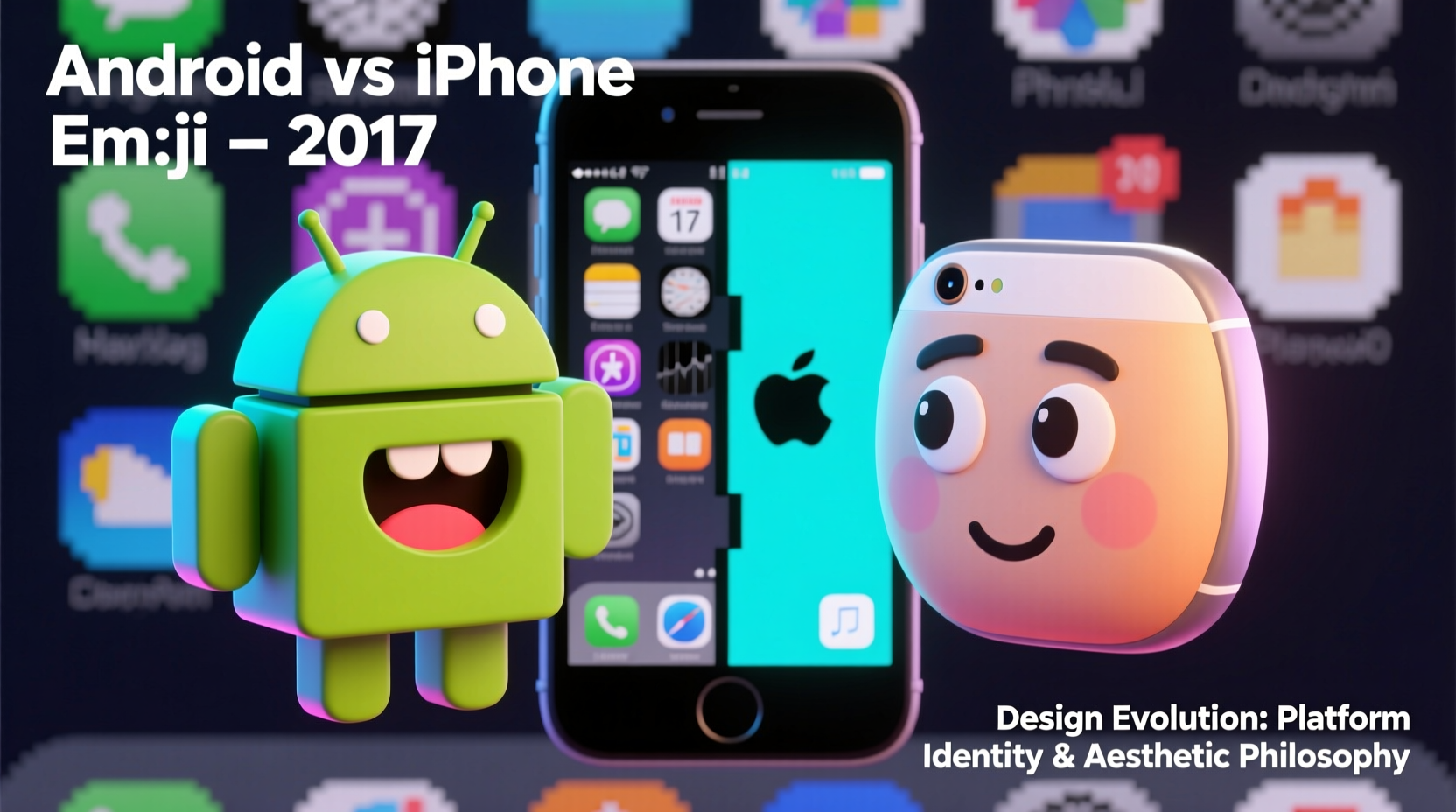
In 2017, a simple emoji could instantly reveal whether someone used an iPhone or an Android device. The visual gap between Apple’s and Google’s emoji designs was stark—so much so that it became a cultural talking point. While both sets adhered to the Unicode standard for meaning and function, their appearance diverged dramatically in style, tone, and expression. This wasn’t accidental. The differences stemmed from deliberate design philosophies, brand identities, and user experience priorities unique to each company.
The contrast went beyond mere aesthetics. It reflected deeper approaches to digital communication, emotional expression, and even cultural perception. Understanding why Android and iPhone emojis differed so much in 2017 offers insight into how tech giants shape everyday digital interactions through subtle but powerful design choices.
The Design Philosophy Divide
Apple and Google approached emoji design with fundamentally different goals. Apple prioritized clarity, expressiveness, and emotional nuance. Their 2017 iOS emoji set featured smooth gradients, soft lighting, and exaggerated facial expressions designed to convey emotion clearly at small sizes. Each emoji was crafted as a miniature illustration, consistent with Apple’s broader design language of realism and polish.
Google, on the other hand, embraced a flatter, more cartoonish aesthetic. The Android Oreo (8.0) emoji introduced in 2017 featured bold outlines, simplified shapes, and a playful, almost sticker-like quality. This aligned with Google’s Material Design principles—clean, functional, and scalable across devices and screen resolutions.
These differing philosophies led to direct comparisons that often sparked debate. For example, the “face with tears of joy” emoji (😂) on iPhone had a wide grin and realistic streaming tears, while the Android version showed a simpler, rounder face with two large teardrops—less detailed, but arguably more whimsical.
“Emoji are a form of digital body language. How they look affects how people interpret tone.” — Dr. Jennifer Daniel, Chair of the Unicode Emoji Subcommittee
A Side-by-Side Comparison: Key Differences in 2017
The visual distinctions weren’t limited to a few emojis. They permeated the entire set. Below is a comparison of notable examples from that era:
| Emoji | iPhone (iOS 11) | Android (Oreo 8.0) |
|---|---|---|
| 😂 Face with Tears of Joy | Realistic smile, dynamic tears, warm skin tone | Circular face, two symmetrical tears, flat colors |
| 😍 Heart Eyes | Glossy eyes with heart reflections, subtle blush | Bold black outline, solid hearts, minimal shading |
| 😡 Pouting Angry | Red face, scrunched brows, visible teeth | Simple red circle, dot eyes, steam lines above head |
| 🤔 Thinking | Hand on chin, furrowed brow, contemplative look | Head with lightbulb, no hand, abstract thought symbol |
| 👍 Thumbs Up | Natural hand posture, detailed knuckles and skin texture | Stylized hand, blocky fingers, uniform color |
This table highlights not just artistic variance, but differing interpretations of the same concept. Apple aimed for human realism; Google leaned toward symbolic representation. These choices influenced how users perceived tone and intent when sending messages.
The Role of Brand Identity and Platform Ecosystem
Apple has long treated its operating system as a curated, closed ecosystem where every pixel is intentional. Emoji are no exception. In 2017, iOS emoji were designed in-house by Apple’s Human Interface team, ensuring consistency with other UI elements like fonts, icons, and animations. The goal was seamless integration into the user experience, reinforcing Apple’s reputation for premium design.
Google, by contrast, developed Android as an open platform used by dozens of manufacturers. A standardized, less detailed emoji set ensured visual consistency across devices from Samsung, LG, HTC, and others. Google’s 2017 redesign was partly a response to fragmentation—earlier Android versions displayed emojis inconsistently across brands. By introducing a unified set with Android Oreo, Google improved coherence while maintaining flexibility.
Moreover, Apple’s emoji subtly reinforced its global brand image: friendly, expressive, and emotionally intelligent. Google’s approach emphasized universality, functionality, and scalability—values central to its mission of organizing information for everyone.
Timeline: The Evolution Leading to 2017
The divergence didn’t happen overnight. Here’s how we got to the peak of cross-platform emoji disparity:
- 2011: Apple introduces emoji support in iOS 5, popularizing emoji outside Japan.
- 2013: Google launches its first full-color emoji set, but designs remain basic and inconsistent across devices.
- 2015: Unicode standardizes emoji meanings, but allows platform-specific designs. Apple refines its emoji with depth and lighting.
- 2016: Google begins overhauling emoji design, testing blob-like prototypes internally (dubbed “Blobmoji”).
- 2017: Android Oreo releases with finalized, simplified emoji. The gap between Apple and Google reaches its most noticeable point.
User Experience and Cross-Platform Confusion
The visual mismatch created real-world communication issues. A 2017 study by Lin et al. published in *Human–Computer Interaction* found that recipients interpreted the same emoji differently based on the sender’s platform. For instance, Android’s 😬 (grimacing face) appeared more negative on iPhone due to its exaggerated expression, leading to misunderstandings in tone.
One user reported: “I sent the ‘laughing crying’ emoji to my friend after a joke. She replied, ‘Why are you upset?’ Turns out, she saw the iPhone version, which looked way more intense than what I’d seen on my Pixel.”
This disconnect illustrated a growing problem: emoji had become essential to digital language, yet lacked visual standardization. What felt lighthearted on one device could seem sarcastic or angry on another.
Mini Case Study: The Great Eggplant Debate
In 2017, the eggplant emoji (🍆) became infamous for its suggestive connotation. But the interpretation varied by platform. On iPhone, the emoji had a glossy sheen and curved shape that many users associated with phallic symbolism. On Android, the Oreo version was shorter, thicker, and more realistically proportioned—reducing, but not eliminating, the double entendre.
Brands using emoji in marketing campaigns had to consider these differences. A clothing company promoting a “hot summer sale” with fire and eggplant emojis risked unintended implications on iOS, while appearing innocuous on Android. This case highlighted how design nuances could impact brand messaging and public perception.
Tips for Navigating Emoji Differences
- Be aware that emoji meaning can shift based on the recipient’s device.
- Use additional text to clarify tone when necessary (e.g., “just kidding :)”).
- Avoid relying solely on ambiguous emoji like 🙃 or 😏 in professional or sensitive conversations.
- Test messages across devices if managing social media or customer communications.
FAQ
Why don’t all phones show the same emoji?
Unicode defines what emoji exist and what they mean, but not how they should look. Each platform (iOS, Android, Windows, etc.) designs its own version, leading to visual differences while preserving universal recognition.
Did Apple and Google ever collaborate on emoji design?
No. While both companies participate in the Unicode Consortium, they develop emoji independently. Collaboration would conflict with their distinct brand identities and design strategies.
Were Android’s 2017 emoji really called “blobmoji”?
Yes—unofficially. During development, Google’s rounded, amorphous designs earned the nickname “blobmoji” among designers and fans. Though the final Oreo release was refined, the term stuck as a cultural reference.
Conclusion: Design Choices with Lasting Impact
The stark difference between Android and iPhone emojis in 2017 was more than a quirky tech footnote—it was a reflection of competing visions for digital expression. Apple championed emotional fidelity through detailed, lifelike designs. Google prioritized clarity, consistency, and adaptability across a fragmented ecosystem. Neither approach was objectively better; each served its platform’s broader goals.
Over time, both companies have moved toward greater neutrality and inclusivity—introducing diverse skin tones, gender options, and accessibility improvements. Yet the 2017 divide remains a landmark moment in digital communication history, reminding us that even the smallest pixels can carry profound cultural weight.


 浙公网安备
33010002000092号
浙公网安备
33010002000092号 浙B2-20120091-4
Comments
No comments yet. Why don't you start the discussion?