As families gather during the holiday season, small details can make a big difference—especially when it comes to inclusivity. One such detail is the legibility of Christmas gift tags. For many elderly recipients, standard printed labels are difficult to read due to age-related vision changes. Choosing the right font size isn’t just about aesthetics; it’s about respect, dignity, and ensuring everyone can fully participate in the joy of unwrapping presents. This guide breaks down optimal font sizes, typeface choices, layout considerations, and real-world applications to help you create accessible, thoughtful gift tags this holiday season.
Understanding Age-Related Vision Changes
By the time most people reach their 60s, they experience some degree of presbyopia—a natural hardening of the eye’s lens that makes focusing on close objects more difficult. Additional conditions like cataracts, macular degeneration, or glaucoma further reduce contrast sensitivity, color perception, and visual acuity. According to the National Eye Institute, over half of Americans over 80 have cataracts or have had surgery for them. These conditions don’t eliminate vision but do require adaptations in how information is presented.
Standard gift tags often use fonts between 8 and 10 points, assuming good near vision. But for someone with even mild visual impairment, that same text may appear blurred or indistinct. The solution isn’t simply “bigger letters,” but rather an intentional design approach that accounts for spacing, contrast, and cognitive load.
“Accessibility in holiday traditions starts with simple acts—like making sure Grandma can read who gave her that scarf without needing reading glasses she forgot upstairs.” — Dr. Linda Reyes, Low Vision Rehabilitation Specialist, Boston Eye Care Center
Recommended Font Sizes: Elderly vs. Standard Print
Font size is measured in \"points,\" where one point equals approximately 1/72 of an inch. However, perceived size also depends on typeface, weight, and screen-to-print scaling. Below is a comparative breakdown of recommended font sizes based on audience needs.
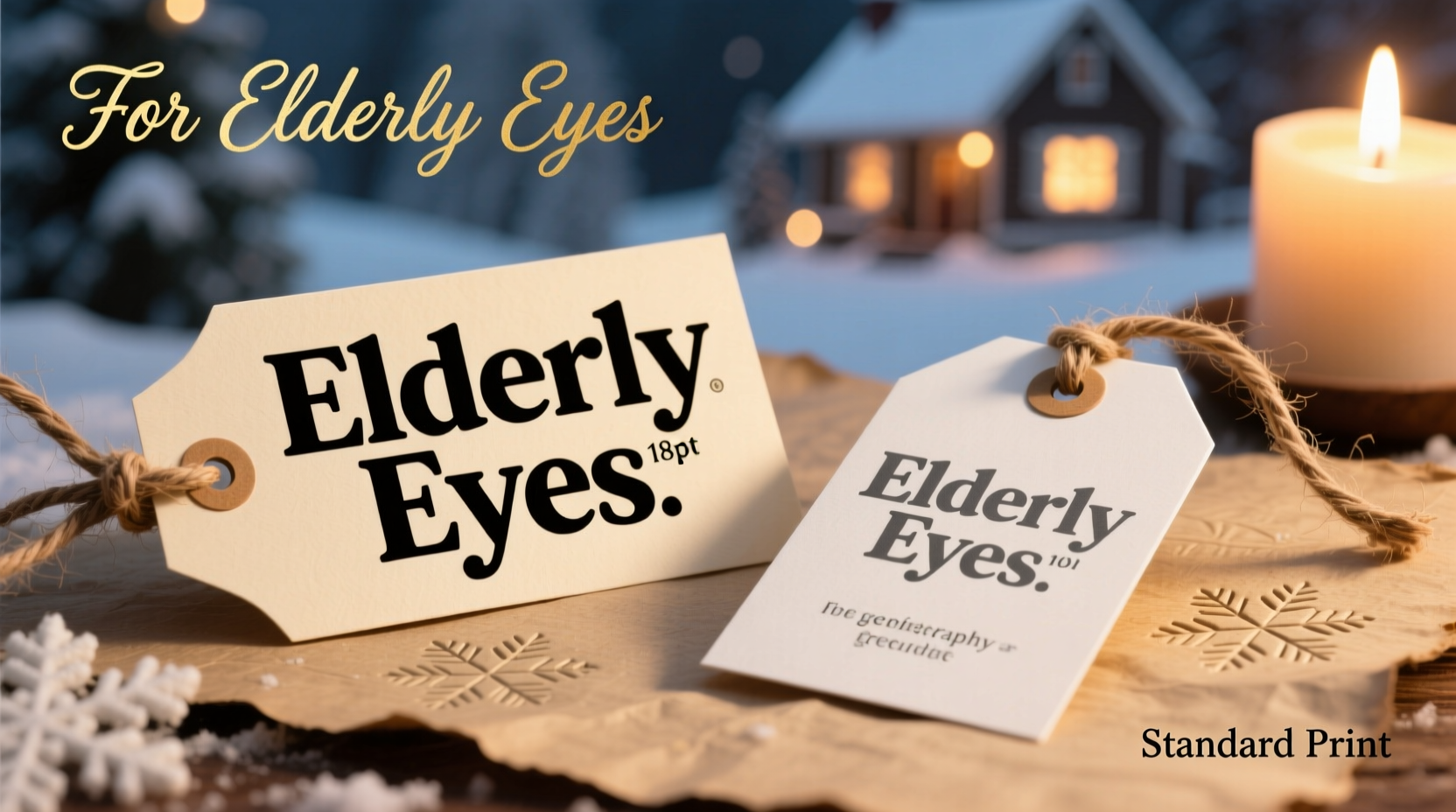
| Audience | Minimum Font Size (Print) | Optimal Font Size | Notes |
|---|---|---|---|
| General Adult (Standard Vision) | 10 pt | 12 pt | Suitable for most packaging; assumes normal 20/20 vision at 12–16 inches viewing distance |
| Adults Aged 55–70 | 12 pt | 14 pt | Mild presbyopia common; benefits from slightly larger type and increased spacing |
| Adults Aged 70+ | 14 pt | 16–18 pt | Significant improvement in readability; especially important for those with diagnosed eye conditions |
| Low Vision Users | 18 pt | 20–24 pt | May also benefit from high-contrast colors and tactile markers |
The jump from 12 to 16 points may seem minor, but it increases character height by nearly 33%, dramatically improving recognition speed and reducing eye strain. For context, 16-point text appears roughly equivalent to 21 pixels on a typical monitor—large enough to be comfortably read at arm’s length.
Typography Best Practices for Maximum Readability
Font size alone doesn't guarantee legibility. Typeface selection, line spacing, and background contrast play equally critical roles.
Choose Simple, Sans-Serif Typefaces
Sans-serif fonts like Arial, Calibri, Helvetica, or Open Sans are easier to read than serif fonts (e.g., Times New Roman) for older adults. Serifs—the small strokes at the ends of characters—can visually clutter text, especially at smaller sizes. Clean, open letterforms reduce ambiguity between similar-looking letters like I, l, and 1.
Use Bold Weight for Key Information
Bolding the recipient's name or gift giver adds visual hierarchy. Avoid italicized text, which distorts letter shapes and slows reading speed. Underlining should also be minimized, as it can interfere with descenders (like in 'g' or 'y').
Ensure Sufficient Line Spacing and Margins
Crowded text is harder to parse. Use at least 1.5x line spacing (leading) and maintain generous margins around the text block. On a standard 2” x 3.5” gift tag, aim for no more than two lines of text if using 16–18 pt font.
Maximize Color Contrast
High contrast between text and background is essential. Black text on white or cream works best. Avoid light gray, pastels, or colored paper with matching ink (e.g., red on burgundy). The Web Content Accessibility Guidelines (WCAG) recommend a contrast ratio of at least 4.5:1 for normal text and 3:1 for large text (18pt+).
“Contrast matters more than people think. A well-chosen dark-on-light combination can improve readability more than doubling the font size.” — Dr. Elena Torres, Vision Scientist, University of Michigan
Step-by-Step Guide: Creating Accessible Gift Tags
Follow this practical workflow to design inclusive holiday gift tags that honor all recipients.
- Determine your audience: Identify which gifts will go to elderly relatives or those with known vision issues. Prioritize these for enhanced formatting.
- Select a clean, sans-serif font: Use Arial, Calibri, or another universally supported typeface. Avoid script or decorative fonts, even if they feel “festive.”
- Set minimum font size to 16 pt: Adjust based on recipient age—use 18 pt for those over 75 or with visible difficulty reading.
- Use bold for names: Format “To: [Name]” and “From: [Name]” in bold to distinguish key elements quickly.
- Print on high-contrast paper: Choose white or off-white cardstock with black or dark blue ink. Test print a sample and view it under typical indoor lighting.
- Add extra spacing: Leave at least 0.25 inches of margin on all sides. If including a short message, limit to one sentence in 14 pt font below the main text.
- Proofread and test-read: Ask a younger family member to read the tag from 18 inches away. Then ask someone over 65 to do the same under normal room lighting—no magnifiers allowed.
Real Example: The Thompson Family Holiday Experiment
Last December, Sarah Thompson noticed her 82-year-old father struggled to identify his gifts during their annual gathering. He repeatedly asked others to read the tags aloud, which embarrassed him. Determined to fix this, Sarah redesigned all gift tags for the following year.
She used 18-point Calibri Bold on ivory cardstock with deep navy ink. Each tag included only “To: Dad” and “From: [Child’s Name],” printed vertically to fit on a 2” x 4” tag. She tested visibility under living room lighting and confirmed her father could read them clearly from 16 inches away—his typical arm extension.
The result? Her father smiled as he opened each gift independently, recognizing names without assistance. “I felt included,” he later told her. “It wasn’t just about seeing better—it was about being seen.”
Checklist: Inclusive Gift Tag Design
- ☐ Use font size 16 pt minimum for elderly recipients
- ☐ Choose sans-serif, non-decorative typeface (Arial, Calibri, Helvetica)
- ☐ Print names in bold; avoid italics and underlines
- ☐ Ensure high contrast (black/dark ink on white/light paper)
- ☐ Maintain ample margins and line spacing
- ☐ Limit text to essential info: To, From, and optional short note
- ☐ Test readability under real-world lighting conditions
- ☐ Consider pre-printed tags for consistency and professionalism
Frequently Asked Questions
Can I use cursive or calligraphy fonts for elderly recipients?
It’s best to avoid cursive or highly stylized fonts. While elegant, they reduce letterform clarity and increase cognitive effort to decode. If you wish to include a decorative touch, use it only for borders or accents—not for the core message. Stick to clear, printed text for “To” and “From” lines.
What if I’m writing by hand? How big should my handwriting be?
Aim for uppercase block letters at least 1/4 inch tall (about 18 pt equivalent). Write slowly and evenly on flat surfaces. Use lined paper as a guide if needed, then transfer to the tag. Practice on scrap paper first to ensure consistency.
Are there any tools to help design accessible gift tags?
Yes. Free tools like Canva, Google Docs, or Microsoft Word allow you to customize templates with accessible fonts and sizes. Many offer pre-sized gift tag layouts (2” x 3.5” or 3” x 4”) and support high-resolution PDF export for crisp printing. Look for templates labeled “accessible” or “senior-friendly.”
Conclusion: Thoughtfulness Begins With Clarity
The holidays are built on connection—between generations, memories, and shared moments. When we overlook basic accessibility, we risk excluding those who’ve given us the most. A properly sized gift tag isn’t just a label; it’s an invitation to participate fully in the celebration.
Adopting larger, clearer fonts for elderly loved ones costs nothing but a few minutes of attention. Yet the return is immeasurable: independence, dignity, and the quiet joy of recognition. As you prepare your gifts this season, remember that the smallest typographic choice can carry the biggest emotional weight.


 浙公网安备
33010002000092号
浙公网安备
33010002000092号 浙B2-20120091-4
Comments
No comments yet. Why don't you start the discussion?