
Christmas villages evoke nostalgia, warmth, and quiet storytelling—a miniature world where snow falls gently on gingerbread roofs and candlelight glows from tiny windows. Yet many homeowners abandon the idea before December begins: “I don’t have room,” “It’ll look messy,” or “I tried it last year and it overwhelmed the mantel.” The truth is, scale isn’t the barrier—intention is. A magical village doesn’t require square footage; it demands thoughtful curation, spatial awareness, and design discipline. This guide distills years of experience from professional holiday stylists, interior designers who specialize in seasonal transitions, and collectors who’ve refined their displays across decades. It focuses not on acquiring more pieces, but on elevating what you already own—or choose deliberately—to build charm that breathes, not crowds.
Start with Spatial Truths—Not Assumptions
Before selecting a single figurine or lighting strand, measure your intended display zone—not just its length and width, but its vertical rhythm and sightlines. Most people overestimate usable surface area because they ignore three-dimensional flow: how light travels across the space, where the eye lands first, and where visual weight accumulates. A 36-inch mantel isn’t just 36 inches wide—it’s also framed above by a mirror or artwork and flanked by sconces or bookends. That context determines whether a tall church steeple enhances or competes.
Professional stylist Lena Torres, who designs holiday installations for boutique hotels and residential clients across New England, emphasizes this principle: “A village fails when it fights the architecture instead of partnering with it. I always begin by identifying the ‘anchor point’—a natural focal area like a fireplace opening, a built-in shelf recess, or even the curve of a bay window. Then I treat everything else as supporting cast—not equal players.”
Curate, Don’t Collect: The 70/30 Rule for Village Harmony
A common misconception is that a “full” village equals a “successful” one. In reality, visual rest is what makes magic legible. Apply the 70/30 rule: 70% of your designated area should remain intentionally unoccupied—serving as negative space that frames and honors each piece. The remaining 30% holds your curated selection: buildings, figures, terrain, and lighting.
This ratio isn’t arbitrary. Interior researcher Dr. Aris Thorne, whose team studied seasonal display perception across 127 homes, found that viewers consistently rated arrangements with ≥25% negative space as “calming,” “intentional,” and “inviting”—while those exceeding 85% occupancy were described as “busy,” “distracting,” and “tiring to absorb.” The human eye needs breathing room to process narrative detail.
Apply the rule in practice:
- Measure your surface (e.g., 48\" x 12\" mantel = 576 sq in)
- Multiply by 0.3 → 173 sq in maximum occupied area
- Translate that into physical footprints: a standard village building occupies ~12–18 sq in; a cluster of three trees ~8 sq in; a figurine pair ~3 sq in
- That math allows for roughly 6–8 key pieces—not dozens
“The most memorable villages aren’t the biggest—they’re the ones that leave room for the imagination to wander. Silence between notes makes music. Space between buildings makes story.” — Lena Torres, Holiday Stylist & Author of Seasonal Spaces
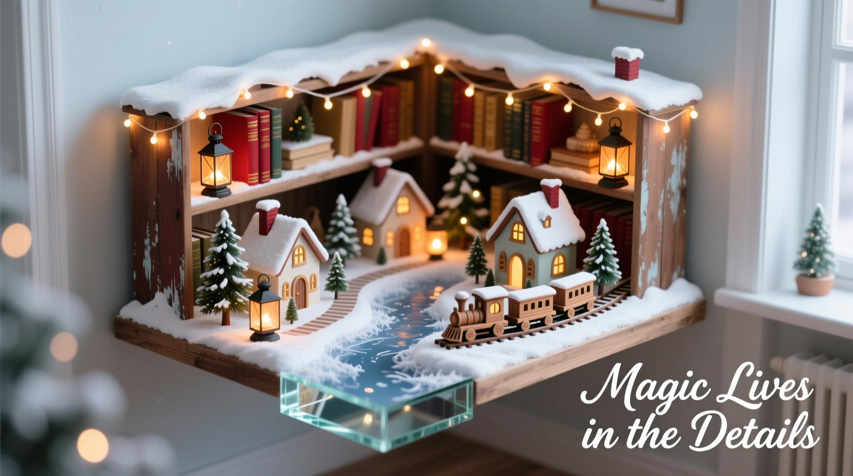
Build Depth, Not Density: A Step-by-Step Layering System
A flat arrangement—everything lined up like soldiers—feels static and retail-like. Magic lives in dimension: foreground intrigue, midground activity, background serenity. Follow this five-step layering sequence, designed for any surface under 6 feet:
- Base Terrain (Foundation): Lay down a textured base—felt, burlap, or handmade paper snow—cut 2–3 inches larger than your footprint. This creates visual containment and absorbs stray light.
- Background Structure (Silhouette): Place 1–2 tallest elements (e.g., a church steeple, clock tower, or evergreen grove) at the rear corners or center-back. Keep heights staggered—no two tallest items at identical height.
- Midground Architecture (Narrative Core): Position 3–4 primary buildings (bakery, post office, cottage) slightly forward and off-center. Rotate them 5–15 degrees—not perfectly parallel—to suggest organic settlement.
- Foreground Details (Human Scale): Add 2–3 figurines or animal pairs (carolers, deer, a sleigh) near the front edge, angled toward the midground. Their orientation invites the viewer inward.
- Lighting & Final Touch (Atmosphere): Weave warm-white micro-LED string lights *under* terrain edges or *behind* buildings—not draped over everything. Add one subtle accent: a single flickering candle in a glass holder, or a dusting of iridescent mica “snow” only on rooftops.
This system works because it mirrors how we perceive real towns: distant landmarks anchor us, midtown bustles with purpose, and sidewalks invite approach. It also prevents clutter—each layer has defined boundaries and purpose.
Do’s and Don’ts: A Practical Comparison Table
| Category | Do | Don’t |
|---|---|---|
| Color Palette | Stick to 3 dominant hues (e.g., ivory, forest green, burgundy) + white snow accents | Mix 5+ competing colors (red/green/blue/yellow/pink) without tonal harmony |
| Scale Consistency | Use pieces from the same manufacturer line or verify all are 1:100 or 1:120 scale | Combine oversized “decorator” houses with delicate miniatures—creates visual dissonance |
| Lighting | Use battery-operated warm-white LEDs (2700K–3000K); hide cords beneath terrain | Plug-in cords visible across surfaces; cool-white or multicolor lights that compete with ambiance |
| Surface Prep | Clean and declutter the surface *before* placing anything; remove unrelated decor | Build village atop existing books, photos, or knickknacks—creates visual competition |
| Storytelling | Give the village a quiet theme: “First Snowfall,” “Carolers’ Eve,” or “Bakery at Dusk” | Include random, unrelated items (Santa on a rocket, beach-themed palm tree, Easter bunny) |
Real Example: How Maya Transformed Her 28-Inch Bookshelf Nook
Maya, a graphic designer in Portland, had long avoided setting up a village. Her living room features floor-to-ceiling shelves, but her favorite spot—a shallow 28-inch-wide nook beside the fireplace—was dominated by a vintage typewriter, two stacked art books, and a trailing pothos plant. She felt it was “too small and too busy.”
She applied the principles above over a single Sunday afternoon:
- Removed all non-seasonal items (typewriter went to her desk; books relocated to a lower shelf)
- Taped off a 24\"x10\" rectangle—the “70/30 footprint” (72 sq in max occupied)
- Chose a cohesive set: three 1:120 scale buildings (general store, chapel, cottage), all in matte white with charcoal roofs
- Laid ivory wool-felt base, then placed a single 8-inch birch branch diagonally across the back as a natural “skyline”
- Added two caroler figurines facing inward, plus a tiny wooden sled angled toward them
- Wove 3 feet of warm-white micro-LEDs behind the branch and under the felt edge—only visible as soft glow
The result? A serene, story-rich vignette that guests describe as “like stepping into a storybook page.” Crucially, Maya kept the pothos—now trained to drape *beside*, not over, the display—adding living texture without intrusion. She didn’t add square footage. She subtracted distraction and amplified intention.
Village Setup Checklist: Your Pre-Launch Audit
Before assembling, run through this concise checklist. Tick each box only when verified—not assumed:
- ✅ Surface is completely cleared and dusted
- ✅ All village pieces belong to the same scale family (check packaging or measure door heights)
- ✅ Color palette limited to ≤3 dominant tones (plus white/black/wood)
- ✅ Lighting is warm-white, battery-powered, and cord-free in final placement
- ✅ You’ve identified one clear “hero” piece (e.g., the tallest building or central figurine group)
- ✅ Negative space accounts for ≥25% of total footprint (verified with tape or grid overlay)
- ✅ No item obstructs sightlines to adjacent decor or architectural features (mirror, window, artwork)
FAQ: Common Village Concerns, Clarified
How do I choose a village theme that feels personal—not generic?
Begin with memory, not marketing. What small-town detail resonates? A bakery window from childhood? The shape of your grandparents’ porch? A specific winter sound (crunching snow, distant bells)? Translate that sensory cue into one anchor object—then select supporting pieces that echo its material (wood grain), color (frost-gray brick), or mood (soft light). Authenticity comes from specificity, not ornamentation.
Can I mix vintage and new pieces without looking chaotic?
Yes—if you unify them through finish, not era. A 1950s ceramic church and a 2023 resin cottage can coexist if both share a matte, chalky white glaze and muted green roof. Conversely, mixing glossy red and distressed navy pieces—even from the same year—creates tension. Let texture and tone be your bridge, not timeline.
What’s the best way to store my village so pieces stay pristine year after year?
Invest in rigid, compartmentalized storage—not cardboard boxes. Use archival-quality plastic trays with individual foam slots (like jewelry organizers), labeled by layer (background/midground/foreground). Store terrain fabric rolled—not folded—to prevent creases. Keep LED lights coiled loosely in labeled bags with battery compartments removed. And always store in climate-controlled, dark space—humidity warps wood, UV light fades paint, and temperature swings loosen glue joints.
Conclusion: Your Village Is a Pause Button, Not a Production
A Christmas village isn’t about spectacle. It’s about creating a moment of stillness in a season of rush—a place where the eye can settle, the mind can soften, and the heart can remember what wonder feels like at human scale. Clutter isn’t measured in square inches; it’s measured in cognitive load. Every extra piece, every competing color, every visible cord asks something of the viewer. But a thoughtfully edited village? It gives back: calm, continuity, quiet joy.
You don’t need more space. You need clearer boundaries. You don’t need more pieces. You need deeper attention to the ones you love. Start small—this year, commit to one shelf, one mantel, one corner. Apply the 70/30 rule. Choose three colors. Light it warmly. Then step back and let the silence between the buildings speak.


 浙公网安备
33010002000092号
浙公网安备
33010002000092号 浙B2-20120091-4
Comments
No comments yet. Why don't you start the discussion?