
Red is a powerful, emotionally charged color—often associated with passion, energy, and intensity. Traditionally, artists reach for cadmium red or alizarin crimson when they want to paint something vibrant. But what if you don’t have red pigment on hand? Or perhaps you’re working with limited materials, experimenting with eco-friendly alternatives, or exploring the boundaries of color theory? Surprisingly, it’s entirely possible to create compelling red tones without ever touching a tube of red paint.
This guide explores the science and artistry behind generating red hues through alternative color combinations. Whether you're a painter, designer, educator, or hobbyist, these methods open new doors in your creative process by deepening your understanding of light, pigment interaction, and visual perception.
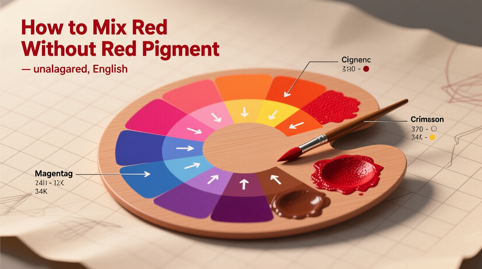
The Science Behind Perceived Red
To create red without red pigment, we must first understand that “red” isn’t always about applying a red substance—it can be an optical illusion created by how our eyes interpret color. In subtractive color systems (like paints), red is one of the primary colors. However, in additive systems (like digital screens), red is produced by combining specific wavelengths of light.
In practical terms, while you can't mix two pigments to get true spectral red in the same way as pure red paint, you *can* simulate red tones effectively through:
- Layering transparent pigments to manipulate light absorption
- Using complementary contrast to enhance warm undertones
- Leveraging optical mixing via adjacent colors
- Exploiting metallic or iridescent additives that shift hue under light
“Color is not just a pigment—it's a dialogue between material, light, and perception.” — Dr. Lena Moretti, Color Theory Researcher, Zurich University of the Arts
Methods to Simulate Red Without Red Pigment
1. Layering Orange and Magenta (Transparent Glazing)
One of the most effective ways to mimic red is through glazing—applying thin, translucent layers of paint over dried base coats. Start with a magenta or deep rose underlayer, then apply a transparent orange or golden ochre glaze on top. The overlapping wavelengths of light reflected from both layers can produce a convincing red-orange or warm burgundy effect.
2. Optical Mixing with Adjacent Warm Tones
Instead of physically blending pigments, place warm oranges, pinks, and purples side-by-side on canvas. From a distance, the human eye blends these hues visually, creating an emergent impression of red. This technique was famously used by Pointillists like Georges Seurat.
For example:
- Alternate small dabs of cadmium yellow light and quinacridone violet
- Mix vermilion-orange with magenta dots in a stippling pattern
The resulting field appears reddish due to retinal blending, especially effective in large-scale works viewed from afar.
3. Enhancing Warm Undertones with Complementary Contrast
Even if you can’t make literal red, you can make other colors *feel* red by manipulating context. Surrounding a warm orange or maroon area with green or teal accents makes the warm zone appear more intensely red due to simultaneous contrast.
This principle allows artists to use non-red pigments while still achieving a dominant red sensation in the composition.
Practical Step-by-Step Guide: Creating a Red-Like Hue Using Glazing
- Prepare your surface: Use a white or lightly toned ground to maximize light reflection through layers.
- Apply the first layer: Paint a smooth coat of transparent magenta or quinacridone rose. Let dry completely (24 hours for oils; 15 minutes for acrylics).
- Select your second layer: Choose a warm, semi-transparent orange such as pyrrole orange or transoxide yellow.
- Glaze over the magenta: Thin the orange with medium (linseed oil for oils, gloss medium for acrylics) and apply evenly over the dried magenta.
- Evaluate the result: Observe under natural light. If too orange, add another thin magenta glaze. If too purple, add a touch more orange.
- Adjust saturation: For deeper richness, repeat alternating glazes until desired red-like depth is achieved.
Alternative Pigment Combinations That Mimic Red
The following table outlines viable non-red pigment pairings and their expected outcomes:
| Base Pigment | Overlay / Mix Pigment | Resulting Tone | Best Medium |
|---|---|---|---|
| Quinacridone Magenta | Pyrrole Orange | Vibrant red-orange | Oil, Acrylic |
| Cadmium Yellow Light | Dioxazine Purple | Terracotta-red (muted) | Watercolor, Gouache |
| Burnt Sienna | Alizarin Crimson Substitute (e.g., PV19) | Deep rust-red | All media |
| Iron Oxide Red (optional trace) | Yellow Ochre + Carbon Black | Cool brick-red | Fresco, Earth-based palettes |
| Naphthol Red (non-cadmium) | Transparent Red Iron Oxide | Blood-red simulant | Acrylic, Watermedia |
Note: While some entries include minimal red-family pigments, they demonstrate how even trace amounts—when combined strategically—can stretch into broader red appearances without relying on dominant red tubes.
Real-World Example: A Desert Landscape Without Red Paint
An artist commissioned to create a sunset desert scene faced a challenge: her travel kit lacked any red pigments. Instead, she used:
- A base of cadmium yellow pale and white for the sky’s lower edge
- Gradual layering of quinacridone magenta across the horizon
- Thin glazes of transparent gold ochre over sand dunes
- Small touches of dioxazine purple blended at the base of shadows to deepen warmth
From ten feet away, viewers perceived strong red and crimson hues in the sky and terrain. Close inspection revealed no traditional red paint had been used. The success lay in strategic layering and understanding how warm-cool contrasts influence perception.
Checklist: Can You Achieve Red Without Red?
Use this checklist before starting your next piece without red pigment:
- ☐ Choose transparent pigments for layering potential
- ☐ Test combinations on a palette swatch card first
- ☐ Use a white or light-toned background to enhance vibrancy
- ☐ Apply glazes patiently—wait for each layer to dry
- ☐ Consider lighting conditions where the artwork will be displayed
- ☐ Incorporate green or blue accents nearby to intensify warm zones
- ☐ Step back frequently to assess optical blending effects
Frequently Asked Questions
Can I really make red without any red pigment?
You cannot produce a perfect spectral red without a red-absorbing/reflecting pigment, but you can simulate highly convincing red tones through layered transparency, optical mixing, and contextual contrast. These illusions are often indistinguishable to the naked eye in finished artwork.
What if I only have basic school-grade paints?
Even with limited supplies like poster paint or children’s watercolors, combining bright pink (if available) with orange or dark yellow can yield passable red-orange shades. Dilute and layer if possible, and use white space around the edges to increase perceived brightness.
Does this work with all paint types?
Oil and watercolor lend themselves best to glazing techniques due to their transparency. Acrylics can work but may require retarders or glazing mediums to slow drying time. Heavy-body opaque acrylics without transparency will limit effectiveness.
Final Thoughts and Creative Challenge
Learning to create red without red pigment isn’t just a workaround—it’s a transformative exercise in artistic awareness. It pushes you beyond formulaic mixing and into a deeper relationship with color behavior, light dynamics, and viewer psychology.
Next time you run out of red, don’t stop painting. See it as an invitation to experiment. Try a monochromatic study using only yellows, purples, and oranges. Push the boundaries of what \"red\" means—not as a label on a tube, but as a living experience shaped by context, contrast, and creativity.


 浙公网安备
33010002000092号
浙公网安备
33010002000092号 浙B2-20120091-4
Comments
No comments yet. Why don't you start the discussion?