
Yellow is one of the most vibrant and psychologically stimulating colors in the visual spectrum. From the soft glow of dawn to the bold intensity of a sunflower, yellow evokes warmth, energy, and optimism. Yet, achieving the perfect yellow shade—whether in painting, graphic design, or textile work—requires more than just squeezing lemon yellow from a tube. Understanding how to create nuanced variations of yellow through blending, layering, and material selection can elevate your artistic expression and design precision.
This guide explores practical, creative methods for producing a wide range of yellow tones, backed by technical insight and real-world application. Whether you're working with oils, watercolors, digital palettes, or natural dyes, mastering yellow means understanding its relationships with other pigments and environmental factors that influence perception.
Selecting the Right Base Yellow
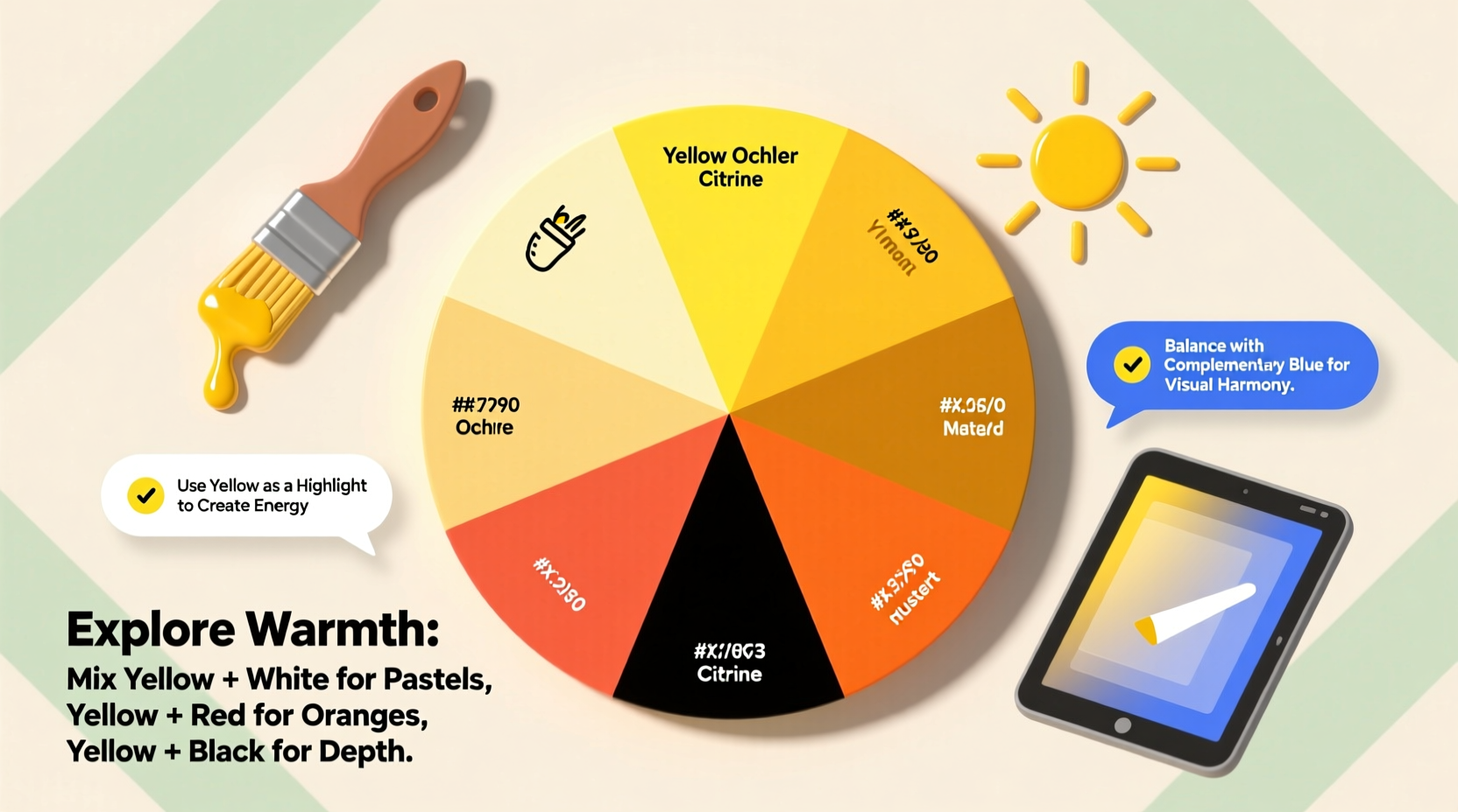
The foundation of any yellow variation begins with choosing the correct primary yellow. Not all yellows are created equal—some lean warm (toward orange), others cool (toward green). The undertone drastically affects how they mix with other colors.
- Cadmium Yellow: A warm, opaque pigment ideal for rich golden hues.
- Lemon Yellow: Cooler and brighter, excellent for creating greens when mixed with blue.
- Arylide Yellow: A cost-effective synthetic alternative often used in printing and textiles.
- Indian Yellow (modern non-toxic versions): Offers deep, earthy warmth with slight brownish undertones.
Mixing Techniques for Custom Yellow Shades
Creating custom yellows involves both additive and subtractive color principles depending on the medium. In physical media like paint, mixing follows subtractive color theory; in digital design, it’s additive (RGB-based).
Physical Media: Paint and Pigments
To modify yellow in traditional media:
- Add white (e.g., titanium dioxide) to create tints such as buttercream or pale sun.
- Incorporate small amounts of red to produce warmer ambers or mustard tones.
- Introduce blue carefully—one drop at a time—to mute yellow into olive or khaki shades.
- Mix with earth tones like raw sienna or burnt umber for vintage, muted yellows.
| Desired Shade | Base Yellow | Additive | Ratio Suggestion |
|---|---|---|---|
| Lemon Chiffon | Lemon Yellow | White + touch of red | 4:1:0.2 |
| Goldenrod | Cadmium Yellow | Red + tiny black | 5:1:0.1 |
| Olive Drab | Lemon Yellow | Phthalo Blue + Burnt Umber | 3:1:0.5 |
| Mustard | Cadmium Yellow Deep | Burnt Sienna | 2:1 |
Digital Design: RGB and HSL Adjustments
In digital environments like Adobe Photoshop or Figma, precise control over yellow comes from adjusting hue, saturation, and luminance (HSL) sliders.
- For a sunny yellow, use RGB values around (255, 237, 0).
- To create a soft pastel yellow, increase lightness in HSL and reduce saturation slightly.
- Use hex codes like #FFD700 for gold, #FFFACD for lemon chiffon, or #F4C430 for saffron.
Layering and Glazing for Depth
One of the most effective ways to build complex yellow tones is through transparent layering. This technique is especially powerful in oil and watercolor painting.
Apply a thin glaze of transparent yellow (such as Hansa Yellow Medium) over a dried underlayer of warm gray or light orange to achieve a glowing effect. The underlying tone subtly shifts the final perceived color. For instance, a yellow glaze over pink creates a radiant apricot; over green, it produces chartreuse highlights.
“Glazing allows light to pass through layers and reflect back, giving yellows a luminous quality no flat mix can replicate.” — Lena Torres, Muralist & Color Theory Instructor
In print design, simulate this effect using overlay blending modes in software. Set a semi-transparent yellow layer above textured or colored backgrounds to mimic depth and translucency.
Working with Natural and Sustainable Materials
Artists exploring eco-conscious practices often turn to plant-based dyes and pigments. Yellow is abundant in nature—from turmeric and onion skins to marigold petals and weld herb.
To extract yellow naturally:
- Simmer plant matter (e.g., turmeric powder) in water for 30–60 minutes.
- Strain the liquid and add a mordant like alum to fix the dye to fabric.
- Adjust pH: alkaline solutions (with baking soda) shift yellow toward greenish tones; acidic (vinegar) keeps it bright.
These organic sources yield subtle, variable results—ideal for handmade paper, textiles, or experimental illustrations where uniformity isn’t the goal.
Mini Case Study: Hand-Dyed Textile Collection
A sustainable fashion designer in Portland sought to replace synthetic dyes with plant-based alternatives for her spring line. Using fermented onion skins, she achieved a range of antique yellows—from pale parchment to deep amber—depending on soak time and fabric type. Cotton absorbed richer tones, while silk revealed delicate golden sheens. By batching tests and recording variables, she developed a repeatable process without sacrificing aesthetic consistency.
Common Pitfalls and How to Avoid Them
Even experienced creators can misjudge yellow due to its high visibility and sensitivity to context. Below are frequent mistakes and corrections:
| Do | Don’t |
|---|---|
| Test yellow swatches next to adjacent colors—contrast affects perception. | Assume a yellow will look the same on canvas as it does on palette. |
| Use UV-protective varnish on paintings to prevent yellowing over time. | Leave acrylic or oil yellows exposed to direct sunlight long-term. |
| Balance intense yellows with neutral tones to avoid visual fatigue. | Fill entire compositions with bright yellow without breaks. |
Checklist: Creating Your Ideal Yellow
Follow this step-by-step checklist to develop consistent, intentional yellow shades:
- ☐ Define the emotional tone (cheerful, earthy, retro, etc.)
- ☐ Choose the appropriate base pigment or digital starting point
- ☐ Test mixtures on scrap material or digital mockups
- ☐ Adjust saturation and value incrementally
- ☐ Evaluate under intended viewing conditions (natural light, screen, gallery lighting)
- ☐ Document formulas or hex/RGB values for future replication
- ☐ Consider longevity and fading resistance, especially for public installations
FAQ
Why does my yellow paint dry darker than it looks wet?
Many yellow pigments, especially oil-based ones, undergo a slight darkening or shift in chroma as solvents evaporate. To anticipate this, let a small sample dry completely before proceeding. Mixing slightly lighter than desired compensates for this change.
Can I make yellow by mixing other colors?
In subtractive color systems (paint, print), yellow is a primary color and cannot be created by mixing others. However, in additive light (LEDs, screens), combining red and green light at full intensity produces yellow. Do not confuse these two models.
How do I keep yellow from looking garish or cheap?
Modulate intensity with complementary grays, use texture to break up large fields, and anchor yellow elements with grounding neutrals like charcoal or walnut brown. Contextual balance prevents visual overwhelm.
Final Thoughts and Call to Action
Mastering yellow isn’t about finding one perfect formula—it’s about embracing its variability and harnessing its power with intention. Whether you’re crafting a joyful children’s book illustration, designing a brand identity, or layering oils on canvas, thoughtful manipulation of yellow enhances emotional resonance and visual harmony.
Start experimenting today: mix a new batch of custom yellows, document your process, and observe how small changes affect mood and meaning. Share your discoveries with fellow artists or designers—color is a language best spoken together.


 浙公网安备
33010002000092号
浙公网安备
33010002000092号 浙B2-20120091-4
Comments
No comments yet. Why don't you start the discussion?