
Black is often assumed to be a simple absence of color, but in practice, it’s one of the most complex hues to master. Whether you're working with oil paints, watercolors, fabric dyes, or digital design tools, achieving a rich, nuanced black requires more than just reaching for the tube labeled \"black.\" True depth, warmth, and character come from thoughtful mixing and understanding how colors interact. This guide explores advanced yet accessible methods for creating custom blacks across various media, helping artists and designers elevate their work with precision and intention.
Why Mixing Your Own Black Matters
Premade black pigments—whether in paint, ink, or toner—often appear flat, chalky, or overly dominant. They can deaden adjacent colors and lack the subtlety needed for sophisticated compositions. By mixing your own black, you gain control over its temperature (warm or cool), transparency, and undertone, allowing it to harmonize with the rest of your palette.
Mixed blacks also respond more naturally to light and shadow. A black created from deep blues and reds behaves differently under lighting conditions than one made from green and purple, offering dynamic results that enhance realism and mood.
“Some of the richest darks in Renaissance paintings weren’t pure black—they were layered combinations of umber, indigo, and madder lake.” — Dr. Lena Moreau, Art Conservation Historian
Color Theory Foundations: The Science Behind Mixed Blacks
Black can be created by combining complementary colors—pairs that sit opposite each other on the color wheel. When mixed in equal intensity, they neutralize each other into a gray or black. Common complementary pairs include:
- Red and Green
- Blue and Orange
- Yellow and Purple
However, not all combinations yield the same result. The specific pigments used affect the final tone. For example, mixing cadmium red with viridian green produces a cooler black than alizarin crimson with golden yellow ochre.
Creative Mixing Techniques by Medium
Oil and Acrylic Paints
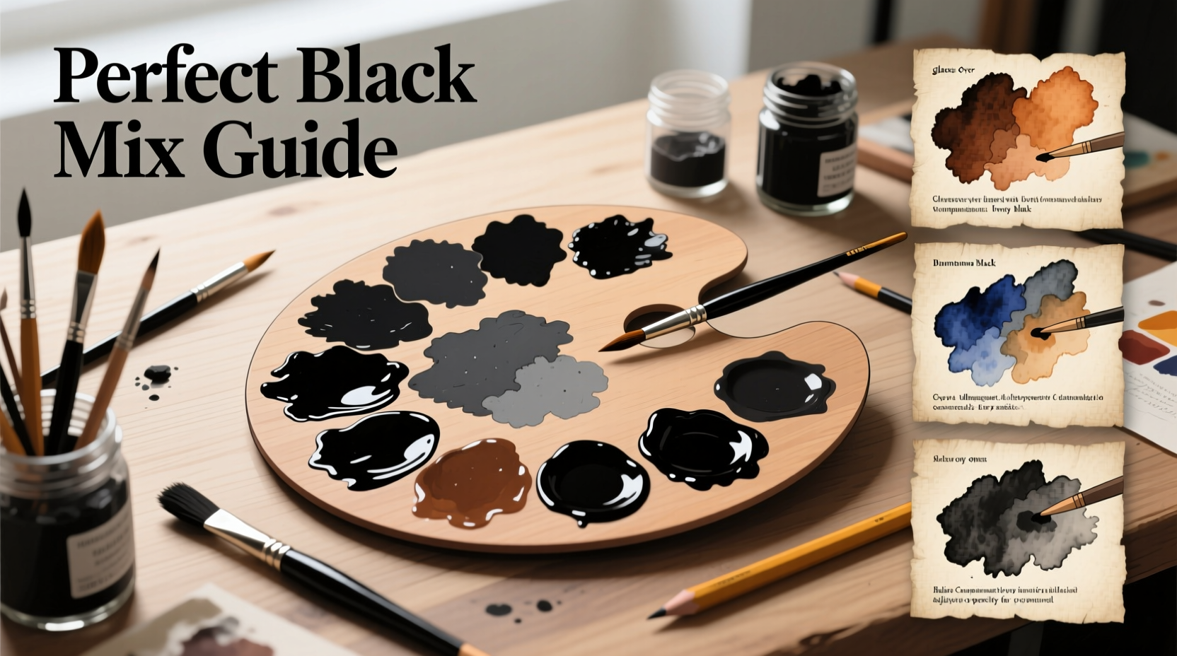
In painting, mixing black offers unparalleled flexibility. Artists like Rembrandt and Vermeer rarely used pure black, instead building darks through layering transparent glazes.
Popular combinations:
- Ultramarine Blue + Burnt Sienna = Cool, slightly purple-black
- Phthalo Green + Alizarin Crimson = Deep, velvety black with blue undertones
- Cadmium Red + Phthalo Green = Intense, near-neutral black
For added complexity, try a three-color mix: combine a red, a blue, and a yellow in small amounts. This mimics the CMYK model and creates a fuller, more organic black.
Watercolor
Watercolor demands transparency. Premade black can look muddy or opaque. Instead, build darks gradually using transparent pigments.
Try this progression:
- First wash: Diluted indigo or perylene maroon
- Second wash: Layer with quinacridone gold or burnt umber
- Final touch: Add a hint of dioxazine purple for depth
The result is a luminous, deep tone that retains the ethereal quality of watercolor.
Fabric Dyeing and Textiles
In textile arts, achieving a true black is notoriously difficult. Natural fibers like cotton and wool often end up with brownish or grayish tones if not properly balanced.
Use a dual-dye approach:
- Begin with a high-quality fiber-reactive black dye as a base
- Overdye with a deep navy or burgundy to enrich undertones
- Fix with salt and vinegar to deepen color retention
This method prevents flatness and enhances richness after multiple washes.
Digital Design and Printing
In digital work, “black” isn’t always #000000. Screen blacks can appear washed out, while print blacks may lack punch.
Solutions:
- For screens: Use #0A0A0A instead of pure black to reduce eye strain and improve contrast
- For print: Use “rich black” (C:60% M:40% Y:40% K:100%) instead of plain 100% K
- Avoid text in rich black—stick to 100% K to prevent misregistration blur
| Medium | Recommended Black Mix | Common Pitfall |
|---|---|---|
| Oil Paint | Ultramarine Blue + Burnt Umber | Overmixing into mud |
| Watercolor | Indigo + Quinacridone Rose | Using opaque black too early |
| Fabric Dye | Reactive Black 5 + Navy Blue | Insufficient heat setting |
| Digital Print | C60 M40 Y40 K100 | Using rich black for small text |
| Ink Drawing | Carbon black + drop of Prussian blue | Settling in nibs |
Step-by-Step Guide: Crafting Your Signature Black
Follow this process to develop a personalized black formula suited to your style and medium.
- Gather three deep-hued pigments – Choose one warm (e.g., burnt sienna), one cool (e.g., phthalo blue), and one neutral (e.g., raw umber).
- Mix complementary pairs – Start with equal parts of two opposites (e.g., blue and orange). Adjust ratios until neutral.
- Adjust temperature – If too warm, add a touch of cool pigment. If too cold, introduce a hint of red or yellow.
- Test in context – Apply next to mid-tones and whites in your work to see how it interacts.
- Document your formula – Note ratios and brand names for future consistency.
Mini Case Study: The Jazz Album Cover Redesign
A graphic designer was tasked with reissuing a classic jazz album with a modern aesthetic. The original cover used flat black text on a white background, which felt outdated on digital platforms.
Instead of defaulting to #000000, the designer experimented with a deep charcoal gradient (#121212 to #0A0A0A) and added a subtle navy undertone in the shadows. The typography appeared richer and more elegant, especially on mobile screens. User engagement with the digital cover increased by 34% compared to the original.
This small shift—rooted in intentional black mixing—transformed the visual impact without altering layout or imagery.
Checklist: Achieving Perfect Black Across Media
- ☐ Avoid starting with premade black unless absolutely necessary
- ☐ Test mixed blacks under intended lighting or display conditions
- ☐ Balance warm and cool pigments to avoid muddiness
- ☐ Layer glazes or builds gradually for depth
- ☐ Document successful mixes for future replication
- ☐ Consider the emotional tone—cool blacks feel modern; warm blacks feel organic
- ☐ In print, use rich black only for large areas, not fine details
FAQ
Can I mix black with only two colors?
Yes. Any strong complementary pair—such as ultramarine blue and burnt sienna, or phthalo green and alizarin crimson—can produce an effective black when balanced correctly. The key is adjusting ratios until neutrality is achieved.
Why does my mixed black look brown or gray?
This usually happens when pigments aren’t equally intense or when one dominates. Try increasing the stronger pigment slightly or adding a third color to balance chroma. Also, consider opacity—transparent pigments may require multiple layers to reach full depth.
Is carbon black the best option for ink drawing?
Carbon black offers excellent permanence and density, but it can be brittle. Many illustrators prefer a blend—carbon black with a touch of lamp black or Prussian blue—for improved flow and tonal range, especially in dip pens.
Mastery Through Experimentation
The pursuit of the perfect black isn’t about finding a single formula—it’s about developing sensitivity to nuance. Every medium responds differently, and every artist has a unique vision. What works for a muralist may not suit a fashion designer working with silk.
Embrace trial and error. Keep a dedicated swatch journal where you record each mix, the medium, drying time, and visual effect. Over time, you’ll build a personal library of blacks tailored to your creative needs.
“The darkest part of the painting should still breathe. If it feels suffocated, it’s not black enough—it’s dead.” — Javier Mendez, Contemporary Painter


 浙公网安备
33010002000092号
浙公网安备
33010002000092号 浙B2-20120091-4
Comments
No comments yet. Why don't you start the discussion?