
Pillow covers are more than just decorative accents—they’re powerful design tools that can transform the mood, texture, and character of a room. When chosen thoughtfully, patterned pillow covers add depth, rhythm, and individuality to your interiors. The right combination doesn’t just complement your furniture; it tells a story. Whether you're refreshing a living room, adding warmth to a bedroom, or injecting energy into a reading nook, understanding how to select visually appealing and harmonious patterns is essential.
Patterns influence perception—bold geometrics can energize, soft florals bring serenity, and textured weaves add subtle sophistication. But pairing them effectively requires balance, intention, and an eye for detail. This guide explores practical, creative strategies to help you choose pillow cover patterns that don’t just look good, but truly elevate your space.
Understand Pattern Types and Their Impact
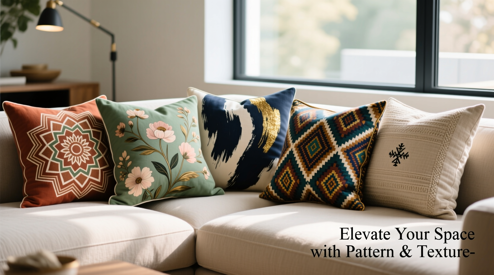
Different patterns evoke different emotions and suit distinct design styles. Recognizing the characteristics of common pattern families helps in making intentional choices.
- Geometric: Stripes, chevrons, and hexagons convey modernity and structure. Ideal for contemporary or minimalist spaces.
- Floral: From vintage damasks to abstract blooms, florals introduce softness and organic flow. Best suited for traditional, bohemian, or cottage-style interiors.
- Abstract: Freeform designs with irregular shapes and colors add artistic flair and conversation-worthy intrigue.
- Textural (tone-on-tone): Subtle patterns like herringbone or basketweave offer depth without overwhelming the eye—perfect for layered elegance.
- Ethnic/Tribal: Inspired by global traditions, these patterns bring cultural richness and bold contrast.
Create Visual Harmony with the 60-30-10 Rule
A principle borrowed from color theory, the 60-30-10 rule applies beautifully to pattern layering. Allocate your pillow covers across three tiers of visual weight:
- 60% Dominant Pattern: This aligns with your primary upholstery or room tone—usually the most neutral or widely repeated design.
- 30% Secondary Pattern: A coordinating print that contrasts yet complements, such as a geometric paired with a small-scale floral.
- 10% Accent Pattern: A bold or unexpected choice—a pop of animal print, metallic thread, or vibrant ethnic motif—to serve as a focal point.
| Pattern Role | Example Use | Recommended Scale |
|---|---|---|
| Dominant (60%) | Linen with subtle stripe | Large or medium scale |
| Secondary (30%) | Tonal geometric in accent color | Medium scale |
| Accent (10%) | Black-and-white tribal print | Small to bold |
Balance Scale, Color, and Contrast
One of the most common mistakes in styling pillows is clashing scales or mismatched color intensity. To achieve cohesion:
- Mix large-scale patterns with smaller ones—never pair two oversized prints side by side.
- Use a shared color thread across all patterns. Even if designs differ, a unifying hue ties them together.
- Incorporate solids or textural neutrals to break up busyness and give the eye a resting point.
For example, a sofa in deep navy velvet might be accented with a large-scale ivory-and-blue botanical print (secondary), a tiny charcoal dot (accent), and a solid indigo linen (dominant). The shared blue palette ensures continuity, while varied scales add dimension.
“Pattern mixing isn’t about matching—it’s about creating rhythm. Think of your pillows like notes in a melody: contrast, repetition, and pacing matter.” — Lena Torres, Interior Stylist & Textile Designer
Step-by-Step Guide to Curating Your Pillow Collection
Follow this sequence to confidently assemble a balanced, stylish arrangement:
- Assess your base fabric: Identify the color and texture of your sofa, bed, or chair. This sets your foundation.
- Pick a color story: Choose 3–4 colors—one dominant, one secondary, one accent, and optionally a neutral.
- Select your dominant pattern: Often a solid or lightly textured fabric that echoes your largest surface.
- Add a secondary pattern: Introduce a moderate-scale design using your secondary color.
- Introduce an accent: Choose one bold or detailed pattern in your accent hue—limit to one per seating area.
- Test in natural light: Arrange pillows during daytime to see how colors shift and patterns interact.
- Edit ruthlessly: Remove any piece that feels out of sync. Less is often more.
Real-Life Example: Transforming a Dull Living Room
Sophie had a beige sectional that felt flat and impersonal. She wanted warmth and character without overhauling her furniture. Her solution? A curated set of patterned pillow covers.
She began with a dominant beige-and-cream herringbone linen (60%), then added a secondary rust-and-charcoal geometric (30%). As an accent, she chose a single 10” square pillow with a hand-blocked Moroccan trellis in terracotta and gold (10%). To soften the mix, she included a nubby oatmeal-colored knit pillow for texture.
The result? A cohesive, inviting vignette that drew compliments and made the entire room feel intentional. The patterns created movement without clutter, and the warm undertones brought life to the neutral sofa.
Checklist: Choosing Pillows That Work Together
- ☐ I’ve identified my room’s dominant color and texture.
- ☐ My pillow palette includes no more than 4 main colors.
- ☐ I’m mixing at least two different pattern scales.
- ☐ One unifying color appears across all selected covers.
- ☐ I’ve included at least one solid or textural neutral.
- ☐ My boldest pattern is used sparingly (one pillow).
- ☐ I’ve tested the arrangement in natural and artificial light.
Frequently Asked Questions
Can I mix different pattern styles, like floral and geometric?
Absolutely—if they share a color family and vary in scale. For instance, pair a large floral with a small geometric in a matching accent color. Avoid equal-sized competing prints.
How many patterned pillows are too many?
On a standard sofa, 3–5 pillows is ideal. If using multiple patterns, limit yourself to two patterned designs plus one accent and one solid. Overcrowding dilutes impact.
What if my furniture already has a pattern?
Lean into solids and textures. If your sofa has a subtle check or weave, opt for bold solid colors or tonal fabrics. Avoid introducing another strong pattern unless it’s much smaller in scale and shares key colors.
Final Thoughts: Design with Confidence
Choosing attractive pillow cover patterns isn’t about following rigid rules—it’s about cultivating confidence in your aesthetic instincts. With a clear framework, even beginners can create arrangements that feel curated and elevated. Remember that patterns are expressions of personality. Don’t shy away from bold choices; instead, ground them with balance and intention.
Your space should reflect who you are, not just what’s trending. By thoughtfully combining scale, color, and texture, you turn simple pillow covers into transformative design elements. Start small, experiment fearlessly, and let your home tell a richer, more vibrant story—one pillow at a time.


 浙公网安备
33010002000092号
浙公网安备
33010002000092号 浙B2-20120091-4
Comments
No comments yet. Why don't you start the discussion?