
Yellow is one of the most vibrant and emotionally charged colors in the spectrum. Associated with energy, optimism, and clarity, it can elevate any visual composition when used thoughtfully. However, its intensity can also make it challenging to work with—too much can overwhelm, while too little may go unnoticed. The key lies not just in using yellow as-is, but in creatively mixing and enhancing it to achieve depth, harmony, and sophistication across painting and design projects.
From adjusting saturation to blending with unexpected hues, mastering yellow means understanding both its chemistry and psychology. Whether you're a painter working on canvas or a designer crafting a digital interface, these strategies will help you harness yellow’s full potential.
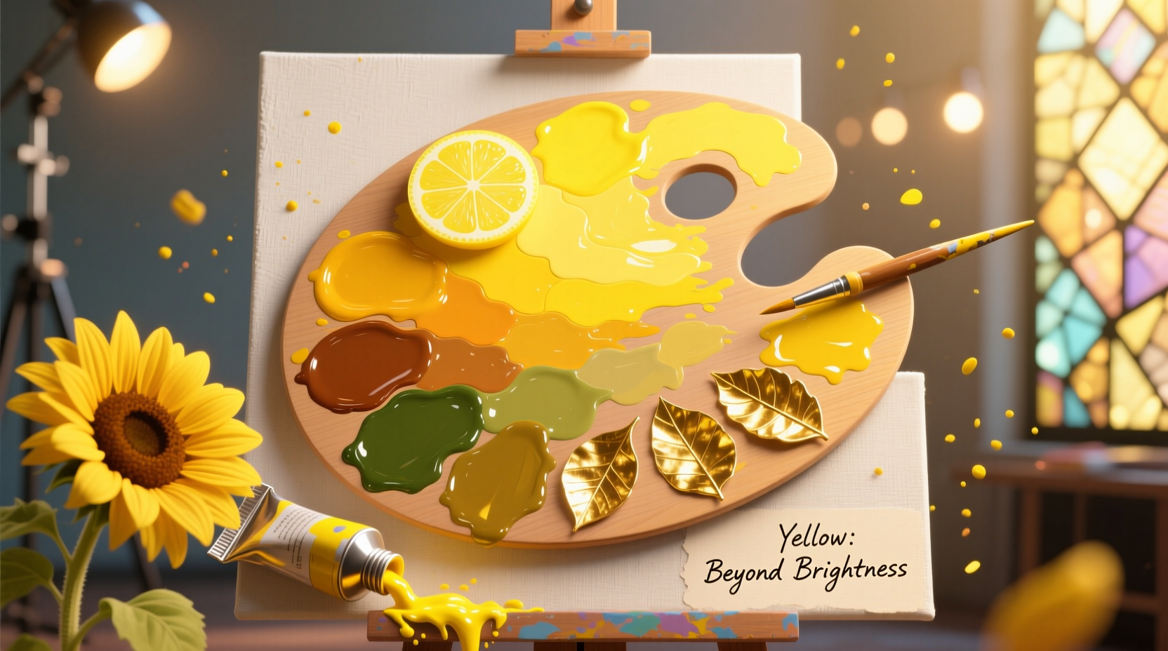
Understanding Yellow: Beyond the Basics
Yellow isn’t a single entity—it exists in a wide range of tones, from pale lemon to deep mustard. Each variation carries different undertones (cool, warm, or neutral) that affect how it interacts with other colors. For instance, cadmium yellow leans warm and pairs beautifully with reds and oranges, while lemon yellow has a cooler bias, making it ideal for brightening blues and greens.
In design, yellow demands attention. It’s often used for call-to-action buttons, warning signs, and highlights because it naturally draws the eye. In fine art, it symbolizes light and life—think Van Gogh’s sunflowers or Monet’s sun-drenched landscapes. But raw yellow straight from the tube or palette can appear flat or garish without proper modulation.
“Yellow is the most luminous of all colors. When mixed with intelligence, it becomes radiant; when mishandled, it screams.” — Dr. Lena Moretti, Color Theory Researcher, Royal College of Art
Creative Mixing Techniques for Richer Yellows
Instead of relying solely on pre-mixed yellows, experiment with layering and blending to create more nuanced versions. Here are several methods:
1. Layering Transparent Glazes
Apply thin, translucent layers of yellow over dried base colors to build luminosity. A glaze of transparent yellow oxide over white creates a glowing warmth, while over gray it adds subtle vibrancy without overpowering.
2. Mixing with Earth Tones
Combine pure yellow with ochres, siennas, or umbers to produce natural, grounded variations. For example:
- Yellow + Raw Sienna = Warm golden hue
- Yellow + Burnt Umber = Subtle olive-yellow
- Yellow + Yellow Ochre = Muted, vintage tone
3. Introducing Complementary Shadows
To deepen yellow without dulling it, use its complement—purple—in tiny amounts. A touch of violet-gray in the shadow areas of a yellow object creates realistic dimension. This technique is widely used in portrait painting where skin highlights contain yellow undertones.
Enhancing Yellow in Design Contexts
In graphic and interior design, yellow must be balanced carefully within a broader palette. Consider these approaches:
Use Contrast Strategically
Pair yellow with high-contrast neutrals like charcoal, navy, or black to prevent visual fatigue. A mustard yellow sofa pops beautifully against a dark gray wall, while a neon yellow logo stands out on a deep indigo background.
Create Gradients for Depth
Instead of flat yellow fills, use gradients that transition from pale cream to intense gold. This mimics natural light effects and adds sophistication to digital interfaces or branding materials.
Leverage Texture and Finish
In physical design—such as textiles or furniture—matte yellows feel soft and modern, while glossy finishes amplify brightness. Combine satin-finish yellow cabinets with rough stone countertops to balance energy and calm.
| Design Goal | Recommended Yellow Mix | Best Paired With |
|---|---|---|
| Warmth & Comfort | Yellow + Raw Sienna | Beige, Walnut Wood |
| Modern Minimalism | Lemon Yellow + White | Charcoal Gray, Chrome |
| Vintage Aesthetic | Yellow Ochre + Sepia | Olive Green, Cream Linen |
| High Energy Branding | Cadmium Yellow + Touch of Orange | Black, Electric Blue |
Step-by-Step Guide: Creating a Dynamic Yellow Palette
Follow this process to develop a custom yellow-based scheme for your next project:
- Select Your Base Yellow: Choose a primary yellow based on mood—lemon for freshness, cadmium for boldness, ochre for earthiness.
- Mix 3 Variants: Create a lighter tint (add white), a darker shade (add a hint of burnt umber), and a softened tone (add gray or complementary purple).
- Test Against Neutrals: Place each variant next to black, white, gray, and beige to observe contrast and harmony.
- Add an Accent Pairing: Introduce one strong contrasting color (e.g., teal or deep plum) to energize the palette.
- Apply in Layers: Use the darkest yellow for outlines or text, medium for backgrounds, and lightest for highlights.
“In our rebranding project for a wellness startup, we replaced their flat canary yellow with a layered gradient from saffron to sand. Engagement increased by 37%—proof that thoughtful yellow use impacts perception.” — Diego Ruiz, Creative Director at Chroma Studio
Avoiding Common Pitfalls
Even experienced artists and designers misstep with yellow. Here’s what to avoid:
- Overusing pure yellow in large areas—it can cause visual strain.
- Mixing yellow with green without intention—this often results in muddy, unappealing tones.
- Ignoring context—yellow looks different under LED vs. natural light, so test swatches in real environments.
- Forgetting cultural associations—while yellow means joy in Western cultures, it can signify caution or mourning elsewhere.
Do’s and Don’ts at a Glance
| Action | Do | Don't |
|---|---|---|
| Color Mixing | Use small increments of complements | Add purple or blue freely |
| Application Area | Use bright yellow for accents | Cover entire walls in neon yellow |
| Lighting | Test under actual viewing conditions | Rely only on screen previews |
| Combining Hues | Pair with deep blues or grays | Combine with pastel pink (can look juvenile) |
Frequently Asked Questions
Can I mix yellow with gray without losing vibrancy?
Yes, but choose your gray carefully. A warm gray (with brown or red undertones) preserves yellow’s energy better than a cool gray (with blue). Start with a 4:1 ratio of yellow to gray and adjust gradually.
What’s the best way to mute yellow for a sophisticated look?
Add a tiny amount of its complement—purple—or blend with earth tones like raw umber or yellow ochre. Avoid black, which can make yellow look dirty. Instead, use Payne’s gray for smoother desaturation.
Why does my mixed yellow look dull?
Dullness usually comes from unintentional mixing of complements. Ensure your brushes and palettes are clean. Also, some pigments have lower chroma—try switching to artist-grade paints like Hansa Yellow or Arylamide Yellow for brighter results.
Checklist: Mastering Yellow in Your Work
- ☑ Identify the emotional tone you want (cheerful, warm, bold, vintage)
- ☑ Select a base yellow with the right undertone
- ☑ Mix at least three variations: tint, shade, and tone
- ☑ Test combinations under real lighting conditions
- ☑ Limit high-saturation yellow to accent areas
- ☑ Pair with strong neutrals or strategic contrasts
- ☑ Document successful mixes for future reference
Conclusion
Yellow, when approached with intention and technical care, becomes far more than a simple accent—it transforms into a dynamic force in visual storytelling. By mastering mixing techniques, respecting contextual balance, and avoiding common errors, you unlock yellow’s ability to illuminate, energize, and inspire. Whether on canvas or screen, the goal isn’t to dominate with yellow, but to let it glow with purpose.


 浙公网安备
33010002000092号
浙公网安备
33010002000092号 浙B2-20120091-4
Comments
No comments yet. Why don't you start the discussion?