
Your iPhone home screen is more than just a launchpad for apps—it’s a daily interface that shapes how you interact with your device. A cluttered or disorganized layout can slow you down, while a thoughtfully designed one enhances efficiency, reduces stress, and reflects your personality. With iOS offering powerful customization tools—from widgets and app libraries to shortcuts and folders—there’s no reason to settle for the default setup. By reimagining your home screen with intention, you can create an experience that’s both functional and uniquely yours.
Design with Purpose: Start with Your Daily Routine
Before diving into aesthetics, consider function. The most effective home screens align with how you actually use your phone. Begin by mapping out your typical day: when do you check messages? What apps do you open first in the morning? Which tools are mission-critical for work or personal goals?
Group apps into categories based on usage patterns. Common groupings include:
- Morning Essentials: Weather, Calendar, Notes, Fitness
- Work & Productivity: Email, Slack, Notion, Zoom
- Social & Communication: Messages, Instagram, WhatsApp
- Entertainment: Spotify, YouTube, Podcasts
- Utilities: Wallet, Camera, Maps
Once categorized, assign each group to specific home screen pages. Keep high-frequency apps on the first page; reserve later pages for less-used tools. This simple act of prioritization cuts through digital noise and makes your iPhone feel faster—even if it isn’t.
Create Visual Harmony with Themes and Wallpapers
A cohesive visual theme transforms your home screen from chaotic to calming. Choose a color palette inspired by your favorite wallpaper—whether minimalist monochrome, earthy tones, or vibrant gradients. Then, align app icons and widget designs to match.
iOS supports third-party icon packs via Shortcuts. Apps like Widgetsmith and Color Widgets let you recolor icons and design custom-sized widgets. For example, turn all social media icons blue-gray to blend with a slate-themed background, or give productivity apps warm orange accents for visual urgency.
Pair this with a dual-wallpaper setup: a subtle lock screen image and a bolder home screen backdrop. Avoid overly busy images—opt for abstract textures, soft gradients, or blurred photos that don’t compete with app labels.
“We often overlook the psychological impact of digital environments. A visually balanced home screen reduces cognitive load and promotes mindful usage.” — Dr. Lena Torres, Digital Wellbeing Researcher at Stanford University
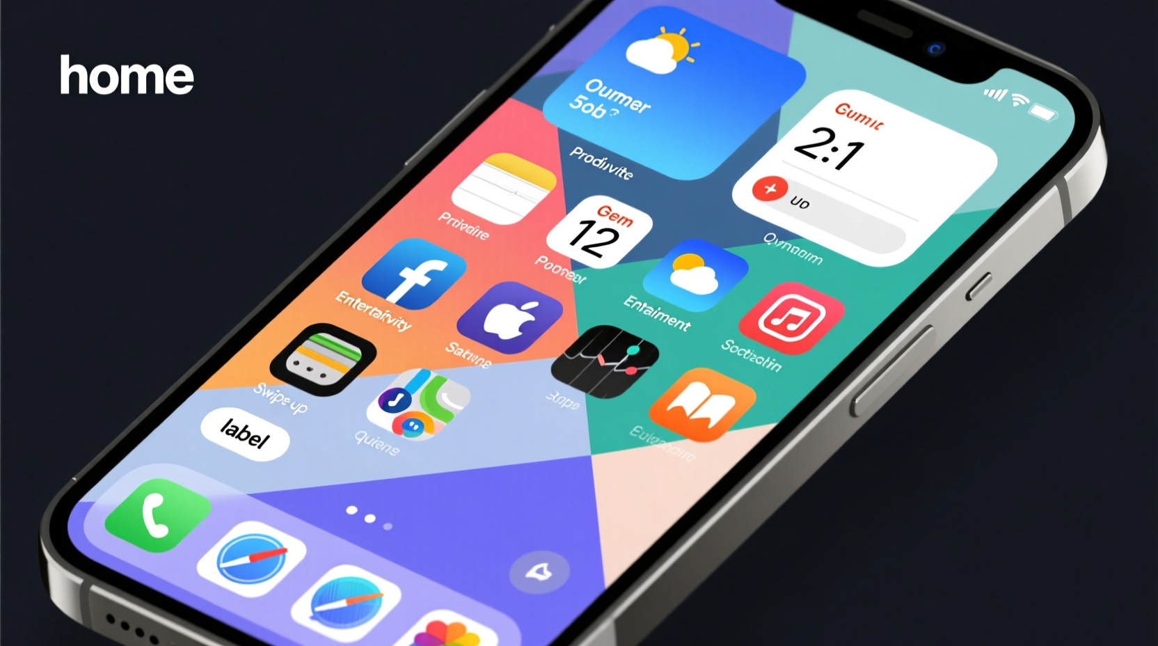
Maximize Widgets for At-a-Glance Information
Widgets aren’t just decorative—they’re actionable information hubs. Instead of opening apps to check details, bring the data to you. The key is strategic placement and relevance.
On your primary home screen, limit widgets to three essentials: one large (like a calendar), one medium (a to-do list), and one small (weather or battery). Overloading leads to visual fatigue.
| Widget Size | Ideal Use Case | Recommended Apps |
|---|---|---|
| Small | Status updates (time, weather, battery) | Weather, Battery, Time |
| Medium | To-dos, reminders, headlines | Things, Apple Reminders, News |
| Large | Calendar, fitness stats, notes | Apple Calendar, Fitness+, Notion |
Use the Shortcuts app to build custom widgets that display dynamic content—like your next meeting, unread emails, or water intake. These micro-updates keep you informed without requiring app switching.
Real Example: Sarah’s Workday Flow
Sarah, a freelance designer, optimized her home screen around client deadlines. Her first page features a large calendar widget showing upcoming milestones, a medium Things 3 widget listing today’s tasks, and a small weather widget. App icons are uniformly styled in muted teal using Widgetsmith. When she unlocks her phone, she instantly knows what to focus on—no scrolling, no guessing. This small change reduced her morning decision fatigue by over 70%, according to her self-tracked habits.
Master Folder Organization with Smart Naming and Covers
Folders are essential for reducing clutter, but most people underuse them. Go beyond generic names like “Utilities” or “Social.” Use descriptive, action-oriented labels: “Banking & Bills,” “Learn Spanish,” “Weekend Fun.” This turns folders into behavioral cues.
To make folders easier to identify, place a representative app at the front. Want quick access to your camera? Put the Camera app in the top-left corner of a “Quick Tools” folder. Need fitness motivation? Place Health or Strava at the front of your “Wellness” folder.
You can even create “mini dashboards” inside folders. For instance, a “Travel” folder might include Airlines, Uber, Google Translate, TripIt, and Hotel Tonight—all grouped behind a single tap.
Step-by-Step: Build a Personalized Home Screen in 30 Minutes
Follow this timeline to redesign your home screen efficiently:
- Minute 0–5: Audit your apps. Delete unused ones and group others into categories.
- Minute 6–10: Choose a wallpaper theme. Set matching lock and home screen backgrounds.
- Minute 11–15: Create and name folders. Drag apps into logical groups.
- Minute 16–20: Add widgets. Select one per size category and position them below the dock or between app rows.
- Minute 21–25: Customize icons using Shortcuts and Widgetsmith (optional).
- Minute 26–30: Test the flow. Unlock your phone and simulate morning actions. Adjust placements as needed.
Optimization Checklist
Use this checklist to ensure your home screen delivers peak performance:
- ✅ Removed all unused or redundant apps
- ✅ Grouped apps into clear, labeled categories
- ✅ Limited first home screen to 6–8 essential apps
- ✅ Added 1–3 functional widgets (not decorative only)
- ✅ Applied consistent icon styling (if desired)
- ✅ Selected a non-distracting wallpaper
- ✅ Tested accessibility and thumb reach (especially on larger iPhones)
Frequently Asked Questions
Can I hide apps without deleting them?
Yes. Remove apps from all home screens—iOS automatically archives them in the App Library. You can still find them by swiping left and searching. They remain fully functional.
Do custom icons affect app functionality?
No. Custom icons created via the Shortcuts app are just visual overlays. The original app remains unchanged and receives updates normally. However, you must manually relink shortcuts after major iOS updates.
How many home screen pages should I have?
Aim for 2–3 pages max. More than that encourages disorganization. Use the App Library for deep storage and keep only frequently used apps visible.
Final Thoughts: Make It Yours, Keep It Clean
Your iPhone home screen should serve you—not distract you. By combining intentional layout, smart widgets, and aesthetic harmony, you create a digital environment that supports your goals and reflects your style. But personalization isn’t a one-time task. Revisit your setup every few weeks. As your habits evolve, so should your interface.


 浙公网安备
33010002000092号
浙公网安备
33010002000092号 浙B2-20120091-4
Comments
No comments yet. Why don't you start the discussion?