
Combining floral and checkered patterns on throw pillows might seem like a risky design move, but when done thoughtfully, it creates a dynamic, layered aesthetic that feels both intentional and inviting. The contrast between organic florals and structured checks introduces visual interest without chaos—provided balance is maintained. Whether your space leans traditional, bohemian, or modern farmhouse, integrating these two patterns can elevate your decor with personality and depth. The key lies not in avoiding clashing, but in orchestrating harmony through scale, color, texture, and placement.
Understand the Design Dynamics of Floral and Checkered Patterns
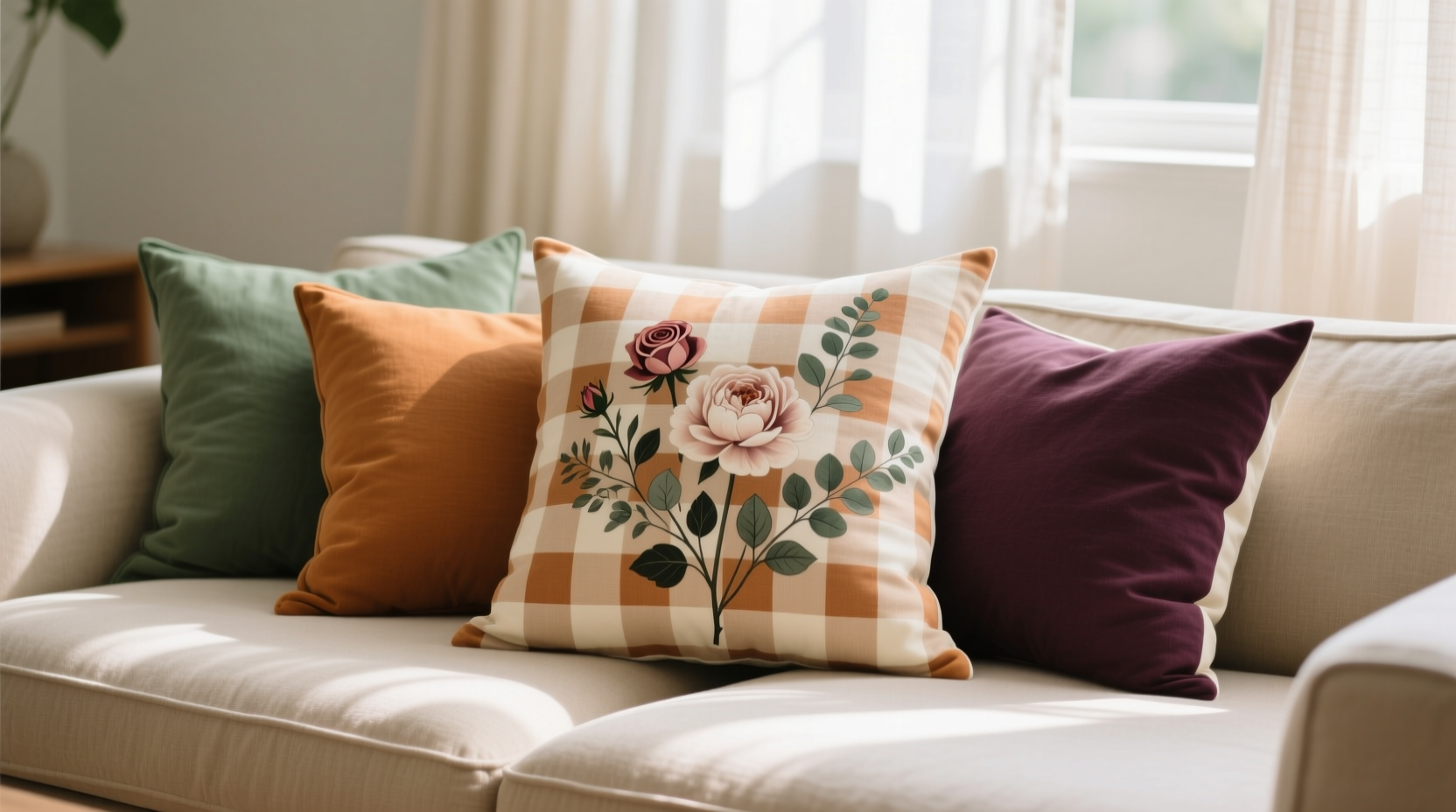
Floral patterns evoke softness, movement, and nature. Their irregular shapes and flowing lines bring warmth and whimsy to a room. In contrast, checkered patterns—whether gingham, tartan, or simple two-tone grids—offer structure, rhythm, and a sense of order. When paired, they create a yin-and-yang effect: one fluid, the other geometric. This contrast is precisely what makes the combination compelling.
The challenge isn’t whether these patterns can coexist—it’s how to ensure they complement rather than compete. Successful styling hinges on three core principles: color cohesion, scale variation, and intentional spacing. Without alignment in these areas, the result can feel chaotic or overly busy.
“Pattern mixing is not about avoiding conflict—it’s about creating dialogue. When florals and checks share a color story, they stop arguing and start conversing.” — Lena Torres, Interior Stylist & Textile Curator
Choose a Unifying Color Palette
Color is the glue that binds disparate patterns. Start by selecting a base palette of 3–4 colors that appear in both the floral and checkered pillows. For example, if your floral pillow features soft pinks, sage green, and cream, choose a checkered pillow that echoes at least two of those hues.
Avoid introducing new dominant colors in the checkered pillow that don’t appear anywhere in the floral design. This creates visual dissonance. Instead, use neutrals—like beige, gray, or off-white—as grounding elements within the check pattern to tone down intensity.
Vary Pattern Scale for Visual Hierarchy
Scale determines dominance. A large-scale floral paired with a small-check pattern allows the eye to rest on each element without overwhelm. Conversely, pairing two large-scale patterns (e.g., big blooms with wide black-and-white checks) risks visual fatigue.
Follow this rule: when combining bold patterns, offset size with subtlety in another area. For instance:
- Pair a large floral pillow with a fine gingham in matching tones.
- Combine a small all-over floral with a bold windowpane check for contrast.
- Use medium-scale florals with mid-sized checks, but introduce a solid-color pillow to break the rhythm.
This approach creates a natural flow, guiding the eye from one focal point to the next without crowding.
Strategic Placement for Balanced Composition
How and where you place your pillows matters as much as their design. A common mistake is clustering all patterned pillows together, which can create a “busy corner” effect. Instead, distribute them intentionally.
On a sofa, alternate floral and checkered pillows with solid cushions in a neutral fabric like linen or cotton. This creates a rhythmic sequence—floral, solid, checkered, solid—that feels balanced and curated. For a loveseat, limit yourself to one floral and one checkered pillow, flanking them with solids or textures like bouclé or corduroy.
In a bedroom, layer the patterns vertically. Use a checkered pillow at the back (against the headboard) and a floral one in front. This adds depth while keeping the top layer—the one most visible when seated—as the softer, more decorative floral.
| Placement Strategy | Recommended Setup | Why It Works |
|---|---|---|
| Sofa Arrangement | Floral – Solid – Checkered – Solid | Creates rhythm and prevents visual overload |
| Accent Chair | One floral + one textured solid | Allows pattern to shine without competition |
| Bed Layering | Checkered (back) + Floral (front) + Lumbar (solid) | Adds dimension while maintaining balance |
Integrate Texture and Solid Elements
Texture acts as a buffer between competing prints. A nubby wool blend, smooth velvet, or woven cotton-linen pillow in a solid hue can sit between floral and checkered pieces, softening the transition. These tactile layers also add sensory richness, making the arrangement feel more lived-in and intentional.
For example, place a deep green velvet pillow between a rose-print floral and a forest green-and-white check. The shared color ties them together, while the plush texture provides a luxurious pause in the visual journey.
Mini Case Study: Revamping a Sunroom Seating Nook
Sarah, a homeowner in Portland, wanted to refresh her sunroom’s wicker seating area. She loved her existing floral pillow (peach blossoms on ivory) but found it clashed with her new charcoal-and-cream gingham cushion. After consulting a local stylist, she adjusted her approach:
- Added a solid peach linen pillow to echo the floral’s dominant color.
- Replaced the charcoal gingham with a smaller-scale cream-and-peach check.
- Introduced a nubby oat-colored throw at the back for texture.
The result? A cohesive vignette where both patterns felt intentional. The shared peach tones unified the look, while the varied textures and scales prevented flatness. Visitors now consistently compliment the “effortlessly put-together” vibe.
Step-by-Step Guide to Styling Your Pillows
Follow this five-step process to achieve a balanced, stylish arrangement:
- Select a Base Pillow: Choose either the floral or checkered pillow that best represents your room’s dominant color or mood. This becomes your anchor.
- Pick a Complementary Partner: Find a second pillow (the other pattern) that shares at least two colors with the first. Prioritize subtle checks over bold ones if the floral is complex.
- Add a Solid Buffer: Insert a solid-color pillow in a shared hue or neutral to separate the two patterns visually.
- Layer in Texture: Include at least one textured solid—knit, velvet, or woven—to add depth and break up flat surfaces.
- Step Back and Assess: View the arrangement from across the room. Adjust spacing or swap one element if the balance feels off.
Common Mistakes to Avoid
- Matching Patterns Exactly: Don’t try to find a checkered pillow that mimics the floral’s exact colors. Subtle coordination works better than forced matching.
- Overcrowding: Limit patterned pillows to 2–3 per seating area. Too many prints dilute impact and create noise.
- Ignoring Room Context: A rustic checkered plaid may clash with a delicate vintage floral in a minimalist space. Ensure the style ethos aligns.
“The most elegant interiors aren’t devoid of risk—they’re full of thoughtful contrasts. Florals and checks, when grounded in color and scale, are a masterclass in controlled tension.” — Julian Reed, Design Director at Hearth & Form Studio
Frequently Asked Questions
Can I mix different types of checks with florals?
Yes, but stick to one check type per arrangement. Mixing gingham, tartan, and windowpane in one space can feel disjointed. Choose either classic gingham or a muted tartan, then pair it with one floral design.
What if my floral pillow has too many colors?
Focus on the dominant 2–3 colors. Use those as your guide when selecting the checkered pillow. Ignore minor accent hues in the floral to avoid overcomplicating the palette.
Are there room types where this combo doesn’t work?
It works in nearly every space, but exercise caution in very formal or monochromatic rooms. In such settings, keep the check subtle (like a tonal weave) and the floral understated to maintain elegance.
Final Checklist for Success
- ✅ Shared color palette between floral and checkered pillows
- ✅ Variation in pattern scale (one large, one small)
- ✅ At least one solid-color or textured neutral pillow included
- ✅ Balanced placement with breathing room between patterns
- ✅ Natural light test performed to confirm harmony
Conclusion: Create Harmony Through Intentional Contrast
Styling floral pillows with checkered patterns isn’t about playing it safe—it’s about embracing contrast with confidence. When guided by color unity, scale variation, and thoughtful composition, these seemingly opposing designs can coexist beautifully. The result is a space that feels curated, lively, and deeply personal.


 浙公网安备
33010002000092号
浙公网安备
33010002000092号 浙B2-20120091-4
Comments
No comments yet. Why don't you start the discussion?