
In an era where digital convenience collides with minimalist design, the question of how we display our memories has never been more nuanced. On one side: timeless printed photos in elegant frames, quietly anchoring a room’s warmth. On the other: sleek digital picture frames cycling through hundreds of images, updating remotely, even playing videos. But as these smart displays become more common, a quiet backlash has emerged—some say they feel outdated, impersonal, or simply too “techy” for refined interiors. So, are digital picture frames really too tacky for modern decor, or is that judgment overdue?
This isn’t just about nostalgia versus innovation. It’s about intentionality, aesthetic cohesion, and how technology integrates—or disrupts—our living spaces. The answer lies not in choosing one over the other, but in understanding when, where, and how each form enhances a home.
The Emotional Weight of Printed Photos
Printed photographs carry a tangible presence. They age with us, yellow slightly at the edges, sometimes creased from being tucked into drawers or passed hand-to-hand. There’s a permanence to them—a curated moment frozen in time, chosen deliberately for display. That selectivity gives them emotional weight.
Interior designers often favor printed photos because they blend seamlessly into a space. A black-and-white portrait in a slim matte frame complements a gallery wall. A vintage family snapshot in a brass case adds character to a bookshelf. These objects don’t announce their function; they simply belong.
“Photographs on paper are like heirlooms—they invite touch, memory, and pause. In design, less is more, and a single print can say everything.” — Lena Torres, Interior Stylist & Author of *Quiet Spaces*
The ritual of printing, framing, and placing a photo also forces curation. You can’t wallpaper your home with 500 prints. Each choice matters. That scarcity makes each image more meaningful.
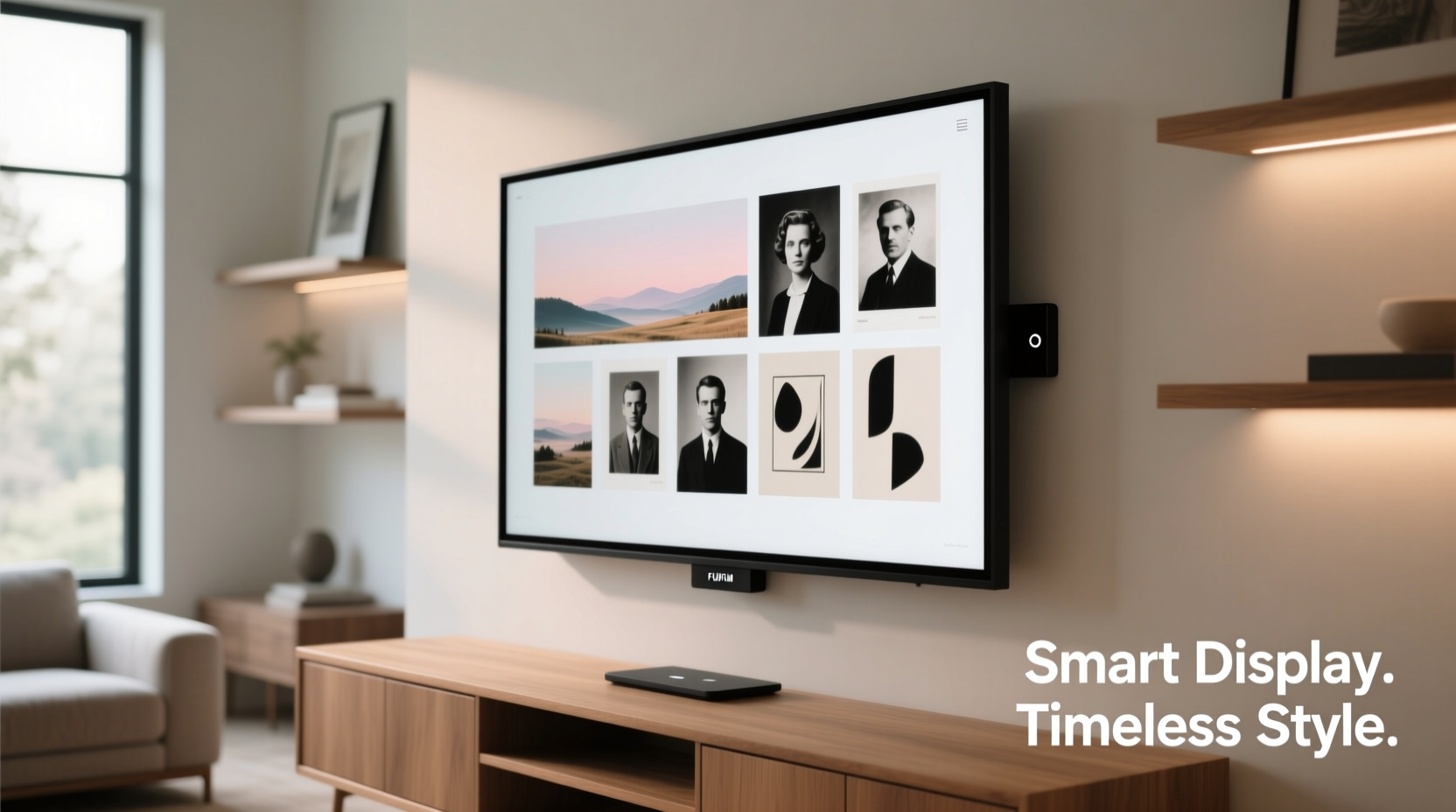
The Rise—and Reputation—of Digital Picture Frames
Digital picture frames entered the market as novelty gadgets: clunky, low-resolution screens flashing vacation photos with garish transitions. Early models looked like repurposed security monitors, often perched awkwardly on desks with blinking LEDs. Unsurprisingly, they gained a reputation for being kitschy—more “tech clutter” than tasteful decor.
But today’s smart displays are different. Modern digital frames like the Pix-Star, Nixplay, or Skylight offer high-resolution screens, customizable bezels, app-based control, and even ambient light sensors that adjust brightness. Some double as clocks or weather stations. Others integrate with cloud storage, allowing families to share albums in real time—especially valuable for aging parents or distant relatives.
Yet despite these upgrades, many design-conscious homeowners still hesitate. Why?
- Perceived impermanence: Images cycle too fast to form lasting visual anchors.
- Visual noise: Bright screens compete with room lighting and mood.
- Lack of materiality: No texture, no depth, no frame craftsmanship.
- Association with outdated tech: Lingering stigma from early 2000s models.
The core issue isn’t the device itself, but how it’s used. A digital frame left on autoplay in a dim corner, stuck on a rotating Christmas slideshow from 2017, feels abandoned. But one thoughtfully programmed with seasonal albums, subtle transitions, and a neutral wood-grain finish? That tells a different story.
Comparing Practicality: When Each Option Shines
Neither format is universally superior. Their value depends on context—room type, user needs, and design goals. Below is a comparison to help determine the best fit.
| Feature | Printed Photos | Digital Picture Frames |
|---|---|---|
| Aesthetic Integration | Easily matches any decor; feels organic | Can clash if poorly styled; better with neutral frames |
| Emotional Impact | High—tactile, permanent, curated | Moderate—dynamic but fleeting |
| Practicality | Low maintenance, but static | Remote updates, large capacity, but requires power |
| Best For | Gallery walls, mantels, bedside tables | Kitchens, entryways, senior homes, shared family spaces |
| Lifespan | Decades (if protected from light/moisture) | 3–7 years (screen degradation, obsolescence) |
| Cost Over Time | Higher upfront (framing, printing) | Lower per image, but device cost + electricity |
The data suggests a hybrid approach may be optimal. Use prints where permanence and elegance matter—living rooms, hallways, bedrooms. Reserve digital frames for functional areas where content changes frequently or accessibility is key.
Real Example: The Multigenerational Home
Consider the Miller family: grandparents in Florida, parents in Chicago, and a toddler who takes 200 photos a day. Sending prints monthly is impractical. Instead, they placed a walnut-finished digital frame in the grandparents’ living room. It syncs automatically with a shared album. New baby steps, birthday parties, and school drawings appear within hours.
At first, the grandparents found the screen “cold.” But after customizing the frame to show one photo at a time with a 10-second fade (no flashy effects), and pairing it with a real plant and ceramic lamp, it became a cherished centerpiece. “It’s like she’s visiting,” says Grandma Miller. “And I don’t have to worry about replacing batteries in a tablet.”
This isn’t tech intrusion—it’s thoughtful integration.
Design Tips for Making Digital Frames Feel Elegant
The key to avoiding the “tacky” label is treating digital frames as design elements, not gadgets. Here’s how to elevate their presence:
- Choose the right frame style: Opt for models with wooden or fabric-wrapped bezels. Avoid glossy black plastic unless it fits a modern tech-themed room.
- Control the lighting: Place the frame where ambient light doesn’t cause glare. Use auto-brightness settings to prevent it from glowing too brightly at night.
- Curate the content: Rotate themes seasonally—spring gardens, summer travels, holiday moments. Avoid random slideshows.
- Limit motion: Disable flashy transitions. Use simple fades or static displays with manual advance.
- Pair with analog elements: Surround the frame with books, candles, or real plants to soften its digital nature.
Step-by-Step: Creating a Cohesive Display Zone
If you want to blend both formats harmoniously, follow this sequence:
- Define the purpose: Is this area for daily joy (kitchen), reflection (bedroom), or storytelling (entryway)?
- Select a focal point: Choose one dominant piece—either a large print or a digital frame.
- Build around it: Add 1–2 smaller printed photos in matching frames. Keep spacing balanced (2–3 inches apart).
- Unify the style: Use similar color tones in the images. For example, convert all to black-and-white or apply a warm filter digitally.
- Test the flow: Step back. Does the mix feel chaotic or intentional? Adjust until the eye moves naturally.
This method turns a potential clash into a layered narrative—one that honors both memory and modernity.
FAQ: Addressing Common Concerns
Are digital picture frames bad for your eyes or sleep?
Most modern frames emit low blue light and can be scheduled to turn off at night. Placed outside bedrooms or set to dim after sunset, they pose minimal risk. However, avoid placing them directly in your line of sight while relaxing.
Do printed photos really last longer than digital files?
Paradoxically, yes—if properly preserved. Archival-quality prints in UV-protected frames can outlive hard drives, cloud services, or proprietary file formats. Digital files require active backup management; neglect them, and they vanish. A print, once made, persists.
Can a digital frame look expensive or high-end?
Absolutely. Brands like Meural (now under Netgear) and Aura Frame offer museum-grade finishes, anti-glare glass, and artwork modes that mimic classic paintings. At $300+, they’re positioned as luxury objects, not gadgets.
Final Verdict: Tacky or Timeless?
Calling all digital picture frames “tacky” is like dismissing all watches as outdated because of a cheap plastic toy from childhood. The label reflects outdated assumptions, not current reality. Yes, poorly implemented smart displays can feel jarring in a serene interior. But so can cluttered photo shelves or mismatched frames.
The real issue isn’t the medium—it’s intentionality. A single, well-placed digital frame showing a loved one’s smile can be more moving than a dozen forgotten prints in an album drawer. Conversely, a beautifully printed wedding photo deserves pride of place over a screen.
Modern decor isn’t defined by the absence of technology, but by harmony. When a digital frame is styled with care—its content meaningful, its form respectful of its surroundings—it ceases to be a gadget and becomes part of the home’s soul.
“The future of home design isn’t analog versus digital. It’s about weaving both into a story that feels human.” — David Kim, Smart Home Integration Designer
Your Next Steps
Instead of choosing sides, consider auditing your current photo displays. Walk through your home. Where do memories feel absent? Where does decor feel static? Could a digital frame bring life to a dull corner? Could a single print add warmth to a tech-heavy room?
📋 Checklist: Evaluating Your Photo Display Strategy- ☐ Identify 2–3 key display zones in your home
- ☐ Decide which spaces need dynamic content vs. permanent meaning
- ☐ Test a digital frame in a low-pressure area (e.g., kitchen counter)
- ☐ Print 1–2 favorite recent photos for physical display
- ☐ Schedule quarterly updates for both digital and printed collections
The goal isn’t perfection. It’s presence. Whether through ink on paper or pixels on glass, what matters is that the people and moments we love remain visible—not buried in phones or cloud folders, but woven into the fabric of daily life.


 浙公网安备
33010002000092号
浙公网安备
33010002000092号 浙B2-20120091-4
Comments
No comments yet. Why don't you start the discussion?