
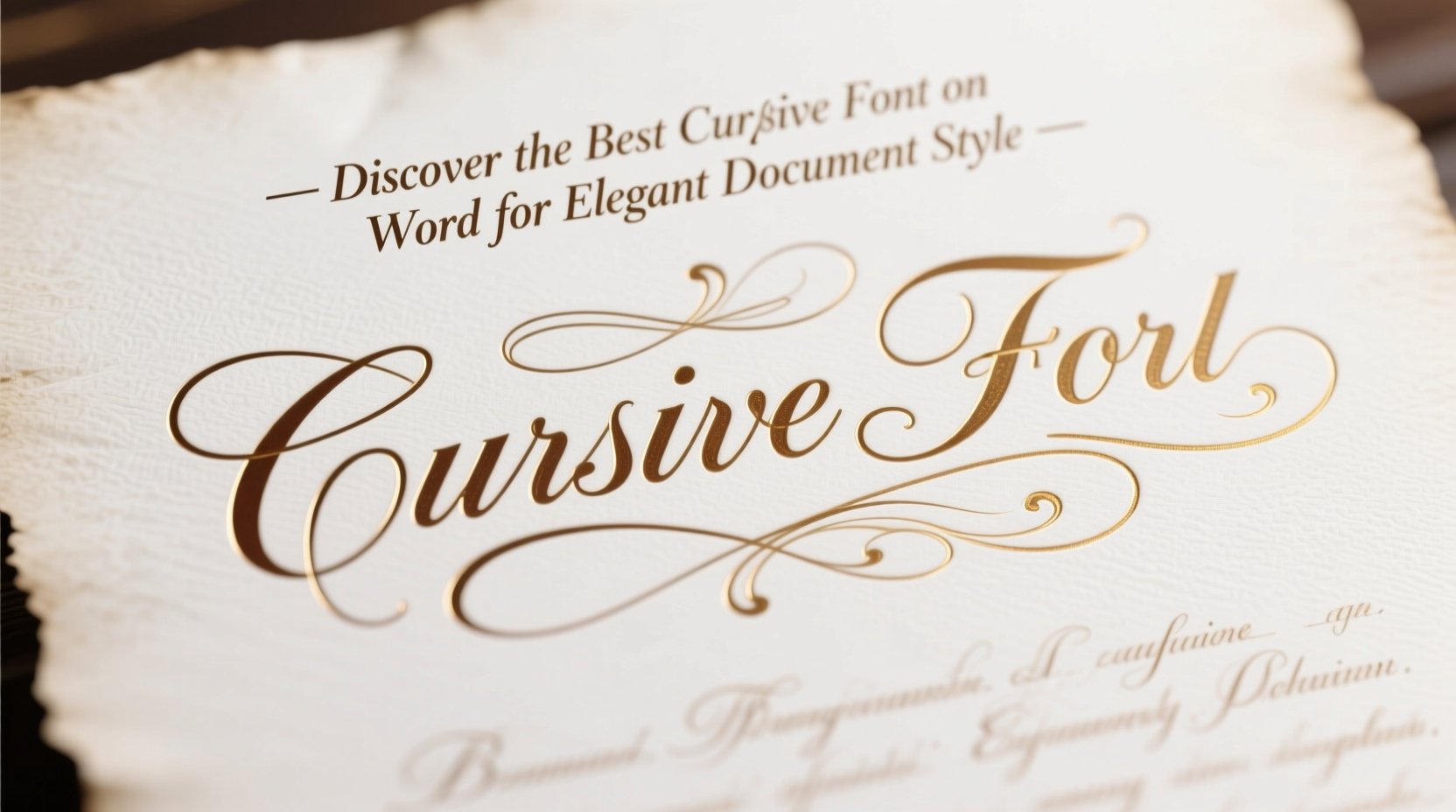
Cursive fonts evoke sophistication, grace, and timeless charm. Whether you're designing a wedding invitation, crafting a personal letter, or adding flair to a creative resume, selecting the right cursive font in Microsoft Word can elevate your document from ordinary to exceptional. While Word doesn’t offer the vast library of design-focused platforms like Adobe Illustrator or Canva, it does include several high-quality cursive options that balance readability and elegance. The key lies in knowing which fonts deliver visual impact without sacrificing professionalism.
Understanding Cursive Fonts in Microsoft Word
Cursive, or script, fonts mimic handwritten lettering with flowing strokes and connected letters. In Microsoft Word, these fonts fall into two broad categories: formal scripts and casual scripts. Formal scripts resemble calligraphy—elegant, structured, and often used in formal contexts. Casual scripts are more relaxed, imitating everyday handwriting with a friendly tone.
Word’s default font menu includes a range of pre-installed cursive fonts such as Brush Script MT, Lucida Handwriting, and Freestyle Script. Some versions also support additional downloadable fonts like Monotype Corsiva and Edwardian Script. Each has distinct characteristics that make them suitable for different purposes.
Top 5 Cursive Fonts for Elegant Documents
Not all cursive fonts are created equal. Some appear outdated or overly decorative, while others strike the perfect balance between beauty and clarity. Below is a curated list of the most effective cursive fonts available in Microsoft Word, ranked by elegance, versatility, and professional suitability.
- Edwardian Script – A classic formal script with ornate flourishes, ideal for certificates, invitations, and headers.
- Monotype Corsiva – Inspired by Renaissance calligraphy, this font exudes refinement and works well in academic or artistic documents.
- Lucida Handwriting – A natural-looking casual script, readable and warm, great for personal notes or informal announcements.
- Brush Script MT – Bold and expressive, reminiscent of hand-painted signs; best used sparingly for titles or quotes.
- Freestyle Script – Looser and more playful, suitable for creative projects but less appropriate for formal use.
Among these, Edwardian Script consistently stands out as the top choice for elegant document styling due to its balanced proportions, historical authenticity, and widespread recognition in high-end design.
How to Use Cursive Fonts Effectively
Selecting an elegant font is only half the battle. Poor usage can undermine even the most beautiful typography. Overuse of cursive text reduces readability, especially in long paragraphs. The goal is to enhance visual appeal while maintaining clarity.
| Font Name | Best Use Case | Recommended Size | Pairing Suggestion |
|---|---|---|---|
| Edwardian Script | Invitations, Certificates, Headers | 16–24 pt | Times New Roman (body) |
| Monotype Corsiva | Poetry, Quotes, Academic Titles | 14–18 pt | Georgia (body) |
| Lucida Handwriting | Personal Letters, Greeting Cards | 12–16 pt | Arial (body) |
| Brush Script MT | Posters, Banners, Emphasis Lines | 20–36 pt | Helvetica (body) |
| Freestyle Script | Creative Projects, Artistic Layouts | 14–20 pt | Calibri (body) |
“Typography is where design meets language. A well-chosen cursive font doesn’t just decorate—it communicates tone, intention, and care.” — Daniel Kim, Typography Consultant & Design Educator
Step-by-Step Guide to Applying Cursive Fonts in Word
Implementing cursive fonts correctly ensures your document looks polished and intentional. Follow this sequence to integrate them effectively:
- Open your document in Microsoft Word and identify the section needing stylistic enhancement (e.g., title, header, signature).
- Select the text you want to format. If creating a new heading, type it first.
- Navigate to the Font dropdown in the Home tab and browse available cursive options.
- Choose your preferred font (e.g., Edwardian Script) and apply it.
- Adjust the font size to ensure visibility—larger sizes work better for cursive due to intricate details.
- Modify spacing if needed: Go to Paragraph > Spacing to add extra space before or after cursive lines for visual breathing room.
- Pair with a neutral body font like Times New Roman or Calibri to maintain readability throughout the document.
- Print a test copy or view in Print Layout mode to assess how the font appears on paper.
Real-World Example: Elevating a Wedding Invitation
Sophia was designing her wedding invitations using Microsoft Word. She initially used Arial for all text, but the result felt sterile and generic. Wanting a romantic, personalized touch, she decided to experiment with cursive fonts.
She applied Edwardian Script to the couple’s names and the event title, sizing them at 24 pt for prominence. For the date, location, and RSVP details, she switched to a clean serif font—Garamond at 12 pt—to ensure guests could read the information easily. By combining elegance with functionality, Sophia transformed a simple template into a keepsake-quality invitation that matched the tone of her ceremony.
This example illustrates how strategic font pairing enhances both aesthetic and usability—proving that even basic software like Word can produce refined results with thoughtful choices.
Common Mistakes to Avoid
- Using cursive for entire paragraphs – It strains the reader’s eyes and slows comprehension.
- Mixing multiple script fonts – This creates visual clutter. Stick to one cursive font per document.
- Ignoring print quality – Some cursive fonts lose detail when printed on low-resolution printers. Always test print first.
- Over-decorating – Adding excessive borders or colors alongside cursive fonts can overwhelm the design.
FAQ
Can I download more cursive fonts for Microsoft Word?
Yes, you can install additional fonts on your system from trusted sources like Google Fonts or DaFont. Once installed, they will appear in Word’s font menu. Note that sharing documents using custom fonts may cause display issues on computers that don’t have them installed.
Is it appropriate to use cursive fonts in professional resumes?
Generally, no. While a subtle cursive font might work for a creative field (e.g., fashion, art, or branding), most industries prefer clean, modern sans-serif or serif fonts. If used at all, limit cursive to your name at the top—and only if it aligns with your personal brand.
Why does my cursive font look pixelated?
This usually occurs when the font size is too small or the screen resolution is low. Increase the font size or view the document in Print Layout mode for a more accurate representation. Also, ensure you’re using a vector-based font rather than a bitmap version.
Final Checklist Before Publishing
Before finalizing your document, run through this checklist to ensure optimal presentation:
- ✅ Used cursive font only for headings, titles, or short highlights
- ✅ Paired cursive with a highly readable body font
- ✅ Set appropriate font size (minimum 14 pt for cursive)
- ✅ Checked alignment and spacing around cursive elements
- ✅ Tested print output or shared PDF preview
- ✅ Ensured consistency across all pages
Conclusion
Finding the best cursive font in Microsoft Word isn’t about chasing trends—it’s about choosing a typeface that conveys elegance with purpose. Edwardian Script remains a benchmark for formal beauty, but Lucida Handwriting and Monotype Corsiva offer compelling alternatives depending on context. When applied thoughtfully, cursive fonts transform functional documents into expressions of personality and refinement.


 浙公网安备
33010002000092号
浙公网安备
33010002000092号 浙B2-20120091-4
Comments
No comments yet. Why don't you start the discussion?