
In a digital landscape saturated with visual content, standing out requires more than just good photography or clever copy. Before-and-after ads remain one of the most persuasive formats in marketing because they provide tangible proof of transformation. Whether promoting fitness results, home renovations, skincare products, or personal development, a well-crafted before-and-after ad can instantly communicate value. But not all designs are equally effective. The difference between scroll-past mediocrity and high-converting brilliance lies in intentional design choices.
Why Before-and-After Ads Work So Well
The human brain is wired to respond to contrast. A side-by-side comparison triggers cognitive recognition of change, making benefits immediate and undeniable. Unlike abstract claims like “Lose weight fast,” a visual transformation turns promises into evidence. This psychological principle—known as social proof combined with visual persuasion—makes before-and-after ads especially potent across platforms like Instagram, Facebook, Google Display, and even print media.
However, simply placing two images next to each other isn’t enough. Poor lighting, inconsistent angles, cluttered layouts, or lack of context can undermine credibility and reduce impact.
“Visual proof is the fastest way to build trust in under three seconds.” — Dana Lee, Conversion Design Strategist at GrowthPixel Labs
Core Design Principles for Maximum Impact
To make your before-and-after ads impossible to ignore, adhere to these foundational principles:
- Consistency in framing: Use the same camera angle, distance, and posture in both images. Any shift distracts viewers and casts doubt on authenticity.
- Natural lighting: Avoid filters or heavy editing. Natural daylight ensures accurate color representation and enhances realism.
- Clear focal point: Highlight the area of transformation—whether it’s skin texture, body shape, or room layout—with subtle cropping or zoom emphasis.
- Minimal distractions: Remove background clutter, logos, or clothing patterns that compete for attention.
- Textual reinforcement: Add concise labels such as “Before” and “After” directly on the image, using bold, readable fonts.
5 Proven Layout Strategies That Convert
How you arrange your visuals determines how quickly your message is understood. Below are five tested layout approaches used by top-performing campaigns:
- Split-Screen Format: Divide the frame vertically or horizontally with a clean line separating before (left) and after (right). Ideal for facial transformations or product effects.
- Slider Overlays: Interactive sliders allow users to reveal the “after” result manually. Commonly used in web ads and landing pages for engagement.
- Grid Comparison: Use a 2x2 grid showing front/side views before and after. Great for fitness or surgical results.
- Timeline Strip: Present multiple stages in sequence (e.g., Week 1 → Week 8) beneath a main before/after pair to show progression.
- Overlay Transparency: Place the before image semi-transparent over the after image to highlight changes through fading techniques—best for architectural or landscaping work.
Choosing the Right Format by Industry
| Industry | Recommended Layout | Best For |
|---|---|---|
| Fitness & Weight Loss | Split-Screen + Grid View | Front/side body comparisons |
| Skincare & Beauty | Close-Up Split or Slider | Texture, clarity, wrinkle reduction |
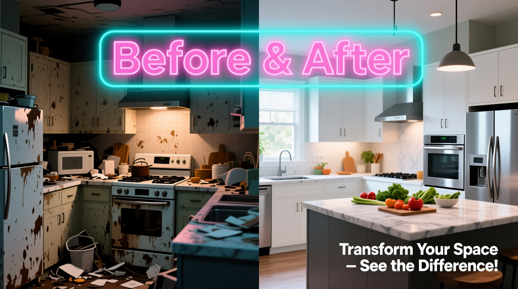
| Home Renovation | Overlay Transparency | Kitchens, bathrooms, outdoor spaces |
| Digital Products | Side-by-Side Screenshots | Website redesigns, app interfaces |
| Personal Development | Timeline Strip + Testimonial | Habit tracking, confidence journeys |
Enhancing Credibility with Smart Copy and Context
A compelling visual needs supporting narrative. Without context, even strong imagery may fail to convert. Viewers ask: How long did this take? Was there surgery involved? Is this typical?
Include brief but specific details near the image:
- Duration: “Results in 12 weeks”
- Conditions: “With daily use of Product X”
- Disclaimer: “Individual results may vary” (required in regulated industries)
Pair the visual with a short testimonial quote to add emotional resonance. Instead of saying “I love this product,” encourage real language: “I finally feel confident wearing shorts again.” Authenticity builds connection faster than perfection.
Mini Case Study: Skincare Brand Gains 3X Engagement
A mid-tier skincare brand struggled with low click-through rates on their Facebook ads. Their initial creatives featured stylized models and vague promises. After switching to user-submitted before-and-after photos with handwritten captions (“Day 1 vs. Day 60 – No filters”), engagement jumped by 287% within four weeks. They also added a small badge indicating “Verified Customer” below each photo, which increased perceived trustworthiness. Sales rose 42% during the same period despite no change in budget or targeting.
Step-by-Step Guide to Creating High-Impact Before-and-After Ads
Follow this workflow to ensure professional-quality output every time:
- Define the transformation goal: Identify exactly what improvement you're showcasing—weight loss, space organization, software efficiency, etc.
- Set up controlled photo conditions: Use a neutral background, consistent lighting, and fixed camera position. Mark floor spots if needed.
- Capture baseline (before) image: Ensure subject wears simple, non-distracting clothing; avoid makeup or styling enhancements unless part of the process.
- Document progress consistently: Take weekly or biweekly updates under identical conditions.
- Select final after image: Choose the clearest example of change without exaggeration.
- Design the layout: Use split-screen or slider format with clear “Before” and “After” labels.
- Add minimal text overlay: Include timeframe, key benefit, and a call-to-action like “Start Your Journey Today.”
- Test variations: Run A/B tests with different headlines, color contrasts, or customer types (e.g., male vs. female).
Common Mistakes That Kill Credibility
Even minor missteps can make audiences skeptical. Watch out for these pitfalls:
| Do’s | Don’ts |
|---|---|
| Use real customer photos when possible | Never use stock images labeled as real results |
| Maintain consistent scale and distance | Avoid zooming in only on the after photo |
| Add dates or duration markers | Don’t claim instant results without proof |
| Disclose any adjunct treatments | Never hide the use of surgery, fillers, or professional help |
| Keep edits minimal (brightness/contrast OK) | Don’t airbrush, slim, or digitally enhance |
FAQ
Can I use filters or edit brightness in before-and-after photos?
Yes, but apply the exact same adjustments to both images. Slight corrections for exposure or white balance are acceptable as long as they don’t alter the appearance of the transformation itself.
How do I handle privacy concerns when using customer photos?
Always obtain written consent. Offer opt-in forms during checkout or follow-up emails. Allow anonymity if requested—use silhouettes or cropped sections instead.
Are video before-and-after ads better than static images?
Videos can be more engaging, especially for dynamic transformations like hair growth or cleaning processes. However, static images load faster and perform better in feed-based platforms where autoplay is limited. Use both, but prioritize static for paid ads unless motion is essential.
Final Thoughts: Make Proof Irresistible
The most effective before-and-after ads don’t just show change—they make it undeniable. By combining technical precision with emotional storytelling, you turn skepticism into belief and interest into action. Every element, from camera angle to caption tone, should serve the singular purpose of proving value in seconds.
Great design isn’t about being flashy—it’s about being clear. When your audience immediately sees the gap between problem and solution, your product becomes the obvious bridge.


 浙公网安备
33010002000092号
浙公网安备
33010002000092号 浙B2-20120091-4
Comments
No comments yet. Why don't you start the discussion?