
In today’s digital landscape, where content appears on everything from smartwatches to 4K monitors, controlling text size is more important than ever. Whether you're formatting a document, designing a website, or adjusting readability on a mobile app, knowing how to reduce text size efficiently—without sacrificing clarity—is a practical skill. The goal isn’t just to shrink text, but to do so in a way that maintains legibility, accessibility, and visual harmony. This guide explores proven techniques and reliable tools to help you scale down text effectively across different platforms.
Understanding Text Scaling: Why Size Matters
Text size directly influences readability, user experience, and design balance. Oversized text can overwhelm a layout; undersized text risks becoming illegible. When reducing text, it's crucial to consider context: Is the content for print, screen, or mobile? Who is the audience? A font that looks crisp at 10px on a desktop may be unreadable on a phone screen.
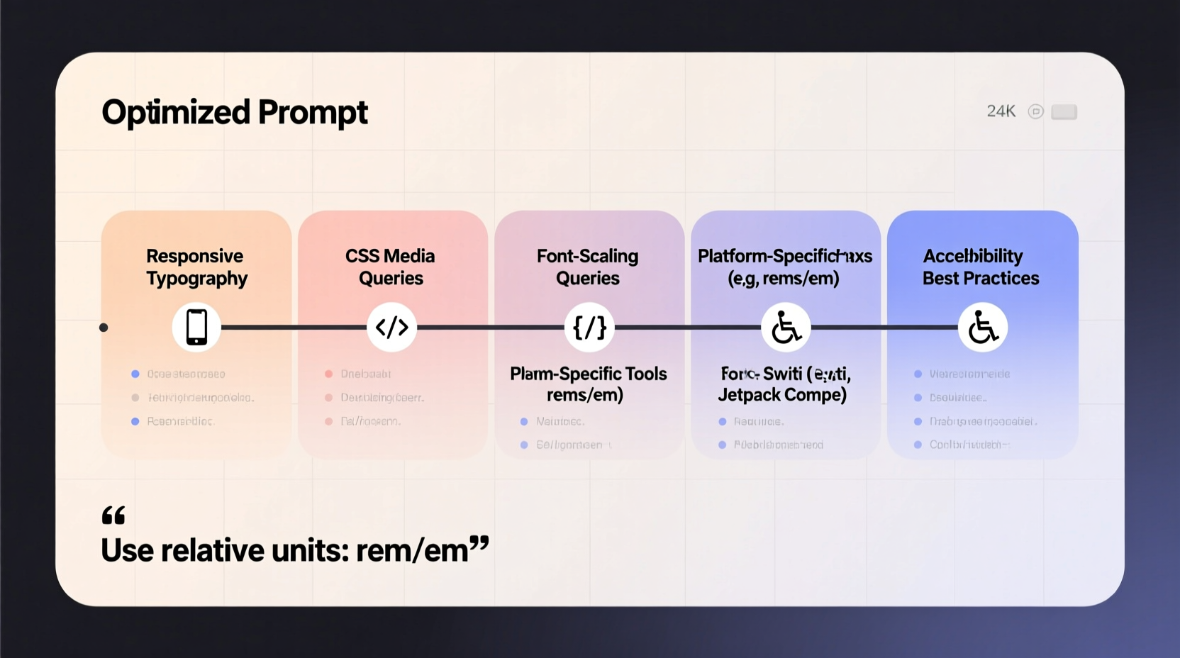
Scalability depends on both technical and aesthetic factors. Digital platforms use different units—pixels (px), ems, rems, points (pt), and percentages—each with unique behaviors. For example, relative units like em and rem adjust based on parent elements or root font size, making them ideal for responsive design. Absolute units like px offer precision but lack flexibility on varying screen sizes.
Methods for Reducing Text Size Across Platforms
On Web Pages Using CSS
Cascading Style Sheets (CSS) provide granular control over text size. The most common property is font-size. You can apply it globally or to specific elements:
p {
  font-size: 0.9rem;
}

.small-text {
  font-size: 12px;
}
For responsive designs, use relative units. rem is tied to the root element (usually 16px by default), so setting font-size: 0.75rem; results in 12px text. This approach ensures consistency when users adjust their browser’s default font size.
In Word Processors (Microsoft Word, Google Docs)
Desktop and cloud-based word processors allow quick font resizing via toolbar controls. To minimize text:
- Select the desired text.
- Open the font size dropdown.
- Choose a smaller size (e.g., 8pt or 9pt).
- Alternatively, press Ctrl + [ (Windows) or Cmd + [ (Mac) to decrease incrementally.
Google Docs also supports custom styles. Save a “Small Caption” style with 9pt font and specific spacing to reuse across documents.
On Mobile Devices (iOS and Android)
System-wide text scaling is available in device settings. While this doesn't let you shrink individual text blocks, it changes overall display size. However, for app-specific adjustments:
- iOS Safari: Use Reader Mode to reformat pages with adjustable font sizes.
- Android Chrome: Enable “Force enable zoom” in Developer Options for finer control.
- Third-party apps like Pocket allow manual font resizing within saved articles.
In Design Software (Figma, Adobe XD, Canva)
Design tools offer precise typography controls. In Figma, for instance, select a text layer and adjust the font size field. Use constraints and auto-layout features to ensure smaller text resizes appropriately in responsive frames. Canva allows batch resizing: hold Shift, select multiple text boxes, and change the font size simultaneously.
Essential Tools for Efficient Text Reduction
Manual adjustments work for small-scale tasks, but automation and specialized tools save time when dealing with large volumes of content.
| Tool | Platform | Best For | Key Feature |
|---|---|---|---|
| CSS Preprocessors (Sass) | Web Development | Responsive websites | Nested rules and variables for consistent small text styling |
| Stylus (Browser Extension) | Any Website | Customizing site appearance | Apply custom CSS to override font sizes on any page |
| Adobe InDesign | Print & Digital Publishing | Multi-page layouts | Paragraph styles with predefined small text settings |
| Notion Formatters | Notion Workspaces | Internal documentation | Inline code blocks render smaller monospace text |
| Markdown Editors | Technical Writing | Code documentation | Use HTML tags like <small> for fine-grained control |
“Typography is not just about aesthetics—it's about hierarchy and function. Smaller text should serve a purpose, like captions or disclaimers, not obscure information.” — Lena Torres, UX Design Lead at TypeForma
Step-by-Step Guide: How to Shrink Text Without Losing Clarity
Follow this sequence to safely reduce text size while preserving usability:
- Define the Purpose: Determine if the text is a footnote, label, caption, or body copy. Only reduce size when contextually appropriate.
- Choose the Right Unit: Use
remfor web,ptfor print, and scalable units in design software. - Adjust Line Height: Reduce line-height proportionally (e.g., 1.2x font size) to avoid cramped spacing.
- Test Legibility: View the text on actual target devices. Ask: Can it be read comfortably at normal viewing distance?
- Maintain Contrast: Ensure text color contrasts well with background. WCAG recommends at least 4.5:1 for small text.
- Preserve Accessibility: Avoid using size alone to convey meaning. Pair small text with icons or labels when needed.
clamp(0.75rem, 2vw, 1rem) to set fluid typography that scales smoothly between minimum and maximum sizes.
Common Pitfalls and How to Avoid Them
Reducing text size seems simple, but mistakes are common. Here’s what to watch out for:
- Over-shrinking: Text below 12px on screens often becomes hard to read, especially for older users.
- Inconsistent scaling: Mixing absolute and relative units without a system leads to layout breaks.
- Ignoring accessibility: Screen readers don’t care about size, but low vision users rely on sufficient contrast and scalable fonts.
- Using images of text: Never convert small text into an image—it harms SEO and isn’t accessible.
Mini Case Study: Improving a Newsletter Layout
A marketing team was redesigning their monthly email newsletter. They wanted to fit more content without increasing scroll length. Initially, they reduced all body text from 16px to 12px. Feedback showed a 30% increase in complaints about readability, particularly on mobile.
The solution? They kept body text at 14px, used 12px only for disclaimers and footers, increased contrast from gray (#888) to dark gray (#444), and added more white space. Engagement rose by 18%, and readability complaints dropped to zero. The lesson: strategic reduction beats uniform shrinking.
FAQ
Can I make text smaller than the platform allows?
Some platforms restrict minimum font sizes for accessibility. On iOS, for example, Safari prevents text from going below a certain threshold unless overridden via Reader Mode or custom CSS extensions. In such cases, consider rephrasing content instead of forcing illegibly small text.
Is smaller text bad for SEO?
Not inherently. Search engines index text regardless of size. However, hiding keywords in tiny, invisible text (e.g., font-size: 1px) is considered spammy and can trigger penalties. Always prioritize user experience over manipulation.
How do I make text smaller in HTML emails?
Email clients have limited CSS support. Use inline styles with <font size=\"2\"> or style=\"font-size: 11px;\". Test across clients like Gmail, Outlook, and Apple Mail. Tools like Email on Acid help preview rendering.
Conclusion
Reducing text size is more than a formatting tweak—it’s a design decision that affects communication, accessibility, and user satisfaction. By understanding the tools and principles behind scalable typography, you can make informed choices across platforms. Whether you're crafting a minimalist webpage, tightening a report, or optimizing a mobile interface, precision and empathy should guide your approach. Choose the right method for your platform, test rigorously, and never sacrifice clarity for compactness.


 浙公网安备
33010002000092号
浙公网安备
33010002000092号 浙B2-20120091-4
Comments
No comments yet. Why don't you start the discussion?