
In today’s digital landscape, images are essential for engagement, but large files can cripple website performance. Slow-loading pages frustrate users, increase bounce rates, and hurt search engine rankings. The challenge lies in balancing visual appeal with efficiency. Fortunately, reducing image size without compromising quality is not only possible—it’s achievable with the right techniques and tools.
Whether you're managing a blog, e-commerce site, or portfolio, optimizing your images enhances user experience and boosts SEO. This guide outlines practical, tested strategies that professionals use to maintain crisp visuals while minimizing load times and bandwidth usage.
Choose the Right File Format
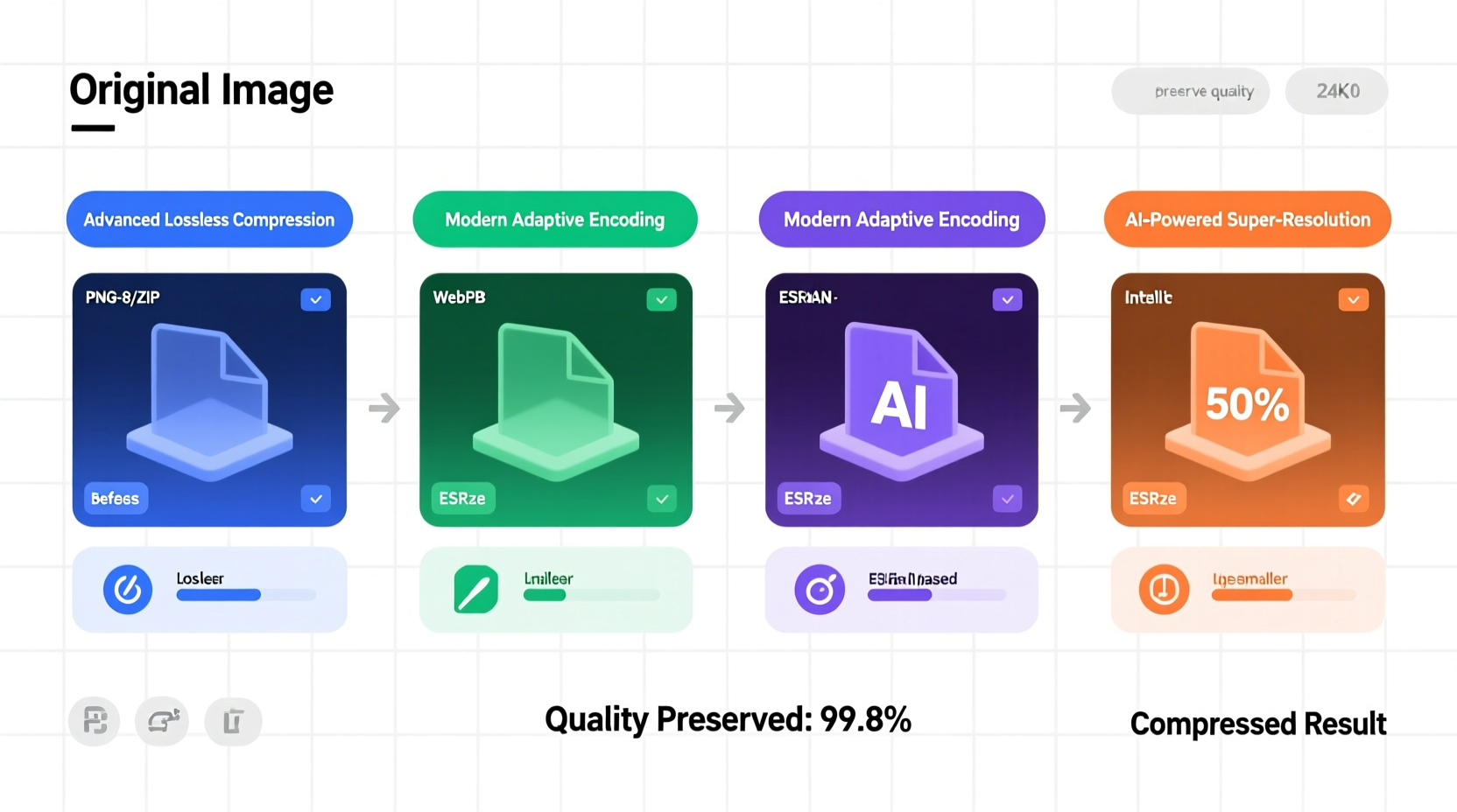
The foundation of image optimization begins with selecting an appropriate format. Each format has strengths depending on the type of image and its intended use.
| Format | Best For | Compression Type | Transparency Support |
|---|---|---|---|
| JPEG | Photographs, complex color gradients | Lossy | No |
| PNG | Graphics with transparency, text-heavy images | Lossless | Yes |
| WebP | All-purpose (photos & graphics), modern browsers | Lossy or Lossless | Yes |
| AVIF | High-efficiency compression, future-proofing | Lossy or Lossless | Yes |
For example, JPEG excels with photographs due to its efficient compression algorithm, while PNG preserves sharp edges and supports alpha transparency—ideal for logos or icons. WebP, developed by Google, delivers up to 35% smaller file sizes than JPEG at equivalent quality, making it a top choice for responsive websites.
Resize Images to Match Display Dimensions
Uploading a 4000-pixel-wide photograph to display at 400 pixels wastes bandwidth and processing power. Always resize images to match their largest intended display size before uploading.
A high-resolution image scaled down via HTML or CSS still loads the full file, delaying page rendering. Instead, use image editing software or automated build tools to generate appropriately sized versions.
- Determine the maximum display width (e.g., 1200px for desktop layouts).
- Resize the original image to that dimension using photo editing tools.
- Save multiple versions if needed (e.g., mobile: 768px, tablet: 1024px).
This step alone can reduce file sizes by 50–90%, especially when dealing with smartphone-captured images that often exceed 3MB.
Leverage Compression Tools and Algorithms
Compression is the most direct method of reducing file size. However, not all compression is equal. Understanding the difference between lossy and lossless methods is key.
- Lossless compression retains all original data, ideal for archival or detailed graphics. Formats like PNG and TIFF support this, though file sizes remain relatively large.
- Lossy compression removes non-essential data imperceptible to the human eye. JPEG and WebP use this approach effectively, offering dramatic reductions with minimal visible impact.
Use specialized tools to fine-tune compression settings:
- ImageOptim (Mac): Strips metadata and applies advanced lossless compression.
- Squoosh.app (Web-based): Open-source tool from Google allowing real-time comparison of formats and compression levels.
- TinyPNG / TinyJPG: Cloud-based compressor using smart quantization to reduce file size while preserving perceived quality.
“Smart compression isn’t about removing detail—it’s about eliminating redundancy. Modern algorithms can cut file size in half without altering how the image looks to users.” — Dr. Lena Torres, Digital Imaging Researcher, MIT Media Lab
Implement Responsive Images with srcset
Even optimized images can be inefficient if the wrong version loads on different devices. Use the HTML srcset attribute to serve context-appropriate images based on screen resolution and device capabilities.
Example:
<img src=\"image-480w.jpg\"
     srcset=\"image-480w.jpg 480w,
             image-800w.jpg 800w,
             image-1200w.jpg 1200w\"
     sizes=\"(max-width: 600px) 480px,
            (max-width: 1000px) 800px,
            1200px\"
     alt=\"Descriptive text\">
This tells the browser to select the best-fitting image based on viewport width, preventing mobile users from downloading desktop-sized assets. Combined with modern formats like WebP via the <picture> element, this technique maximizes delivery efficiency.
Mini Case Study: E-Commerce Site Speed Improvement
An online fashion retailer was experiencing high cart abandonment rates. Performance audits revealed that product pages loaded over 5 seconds, primarily due to unoptimized images averaging 2.1MB each.
The team implemented the following changes:
- Resized all product images to max 1200px width.
- Converted JPEGs to WebP with moderate lossy compression.
- Added
srcsetfor responsive variants. - Enabled lazy loading.
Result: Average image size dropped to 380KB, page load time improved to under 1.8 seconds, and conversion rates increased by 27% within six weeks. The visual quality remained indistinguishable to customers.
Automate Optimization in Your Workflow
Manual optimization doesn’t scale. Integrate automation early in your development or content pipeline to ensure consistency.
Popular solutions include:
- Build tools: Use Webpack with
image-minimizer-webpack-pluginor Gulp withgulp-imagemin. - Content Management Systems: Plugins like Smush (WordPress) or ImageKit (Shopify) auto-optimize uploads.
- CDNs with Image Optimization: Services like Cloudinary, Imgix, or Akamai Image Manager dynamically resize, compress, and format-shift images at delivery time.
Checklist: Optimize Images Without Quality Loss
- ✅ Assess image purpose: photo, graphic, or icon?
- ✅ Select the optimal format (prefer WebP when supported).
- ✅ Resize to maximum display dimensions.
- ✅ Compress using lossy (JPEG/WebP) or lossless (PNG) as appropriate.
- ✅ Strip metadata (EXIF, GPS, comments) unless required.
- ✅ Implement
srcsetandsizesfor responsive design. - ✅ Automate optimization in your workflow or CMS.
- ✅ Test visual output across devices and zoom levels.
Frequently Asked Questions
Can I reduce image size without any visible quality drop?
Yes, especially with modern formats like WebP and AVIF. Using perceptual quality metrics (e.g., SSIM), tools can remove redundant data while preserving visual fidelity. Aim for “visually lossless” compression—where differences are imperceptible to the human eye.
What’s the ideal file size for web images?
For standard content images, aim for under 150KB. Hero banners or high-DPI displays may go up to 300–500KB, but anything above 1MB should be scrutinized. Product thumbnails should ideally be under 100KB.
Does compression affect SEO?
Indirectly, yes. Google includes page speed as a ranking factor. Large images slow down load times, increasing bounce rates and reducing crawlability. Optimized images improve Core Web Vitals scores, directly benefiting SEO performance.
Final Thoughts
Reducing image size without sacrificing quality isn't a compromise—it's a strategic advantage. By combining format selection, intelligent resizing, compression, and automation, you create faster, more responsive websites that deliver excellent user experiences.
Start small: pick one page, audit its images, apply these methods, and measure the results. Over time, integrate these practices into your standard workflow. The gains in performance, engagement, and search visibility are well worth the effort.


 浙公网安备
33010002000092号
浙公网安备
33010002000092号 浙B2-20120091-4
Comments
No comments yet. Why don't you start the discussion?