
Maps are no longer just paper guides folded in backpacks. Today, they’re dynamic tools used for travel planning, business logistics, real estate analysis, urban development, and personal exploration. Whether you're visualizing hiking trails, plotting delivery routes, or mapping historical sites for a community project, a one-size-fits-all approach rarely works. A tailored map—designed with your exact purpose, audience, and data in mind—offers clarity, relevance, and impact that generic maps cannot match.
Creating a custom map requires more than selecting a few points on a screen. It involves thoughtful planning, accurate data collection, smart tool selection, and effective design principles. The process transforms raw geographic information into a meaningful visual story. This guide walks through the key stages of crafting a personalized map, highlighting practical tools and expert-backed strategies to ensure your final product is both functional and compelling.
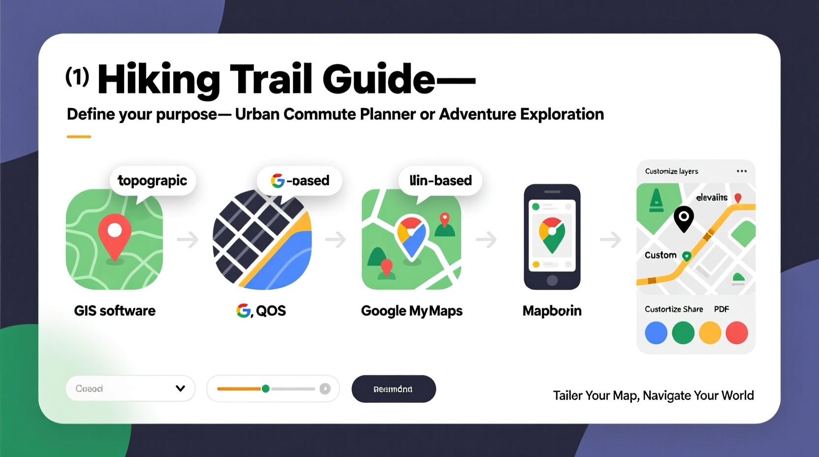
Define Your Map’s Purpose and Audience
Before opening any software, ask: Why does this map exist? Is it to help tourists navigate a city? To track environmental changes over time? Or to present sales territories to a board of directors? The answer shapes every subsequent decision—from what data to include, to how complex the design should be.
Audience matters just as much. A map intended for emergency responders during a crisis must prioritize speed and legibility under stress. In contrast, an educational map for schoolchildren should simplify geography and highlight engaging visuals. Misjudging your audience leads to cluttered layouts, confusing symbols, or missed insights.
Collect and Prepare Accurate Data
No map is better than the data behind it. Reliable, up-to-date, and relevant data forms the foundation of any effective custom map. Sources vary widely depending on your goal:
- Public datasets: Government portals like USGS, OpenStreetMap, or national statistical offices offer free access to topographic, demographic, and transportation data.
- GPS tracking: Use handheld devices or smartphone apps (like GPS Logger or OsmAnd) to collect field observations such as trail conditions or site locations.
- Surveys and spreadsheets: Convert customer addresses, event locations, or inventory sites from CSV or Excel files into geospatial coordinates using geocoding tools.
- Remote sensing: Satellite imagery from platforms like Google Earth Engine or Sentinel Hub can provide land cover, vegetation, or urban growth data.
Data cleaning is often overlooked but critical. Remove duplicates, standardize formats (e.g., consistent address formatting), and validate coordinates. Errors here propagate into misleading visuals. Tools like QGIS or OpenRefine excel at preparing messy data for mapping.
Select the Right Mapping Tool for Your Skill Level
The right software balances functionality with usability. Below is a comparison of popular mapping tools based on features, learning curve, and ideal use cases.
| Tool | Best For | Learning Curve | Cost |
|---|---|---|---|
| Google My Maps | Simple route planning, personal travel maps | Low | Free |
| Mapbox Studio | Custom-styled web maps, developers | Medium | Freemium |
| QGIS | Advanced spatial analysis, public sector projects | High | Free |
| ArcGIS Online | Enterprise dashboards, team collaboration | Medium-High | Paid (free trial) |
| Leaflet.js | Interactive web maps, coders | Medium | Free |
“Choosing a tool isn’t about the flashiest interface—it’s about matching capabilities to your objectives. A well-designed simple map often outperforms a complex, confusing one.” — Dr. Lena Torres, Geospatial Analyst at Urban Insights Lab
Design for Clarity and Usability
A beautiful map fails if users can’t interpret it quickly. Effective design follows core cartographic principles:
- Choose appropriate symbology: Use intuitive icons and colors. Red doesn’t always mean “danger”—in some contexts, it might indicate high volume or popularity.
- Control visual hierarchy: Emphasize important layers (e.g., primary roads) with size, color intensity, or placement. Background elements should recede, not compete.
- Include essential map elements: Legend, scale bar, north arrow, data source, and title ensure the map stands alone without explanation.
- Limit clutter: Avoid overcrowding labels or overlapping markers. Use clustering or filtering when displaying large point sets.
Color choice impacts accessibility. Ensure sufficient contrast and avoid red-green combinations that challenge colorblind users. Tools like ColorBrewer.org help generate scientifically tested palettes for thematic maps.
Mini Case Study: Community Bike Route Initiative
In Portland, a neighborhood group wanted to advocate for safer bike lanes. They collected accident reports, surveyed cyclists about dangerous intersections, and pulled traffic volume data from the city’s open data portal. Using QGIS, they layered this information onto a base map, highlighting high-risk zones in amber and proposed route improvements in blue.
The resulting map was presented at a city council meeting. Council members immediately grasped the spatial patterns, leading to a pilot project for protected bike lanes. The success wasn’t due to advanced tech—it was the clear, targeted presentation of local concerns in a visual format decision-makers could act on.
Step-by-Step Guide to Building Your Custom Map
Follow this timeline to go from idea to finished map in under a week:
- Day 1: Clarify purpose and audience. Draft a brief outlining goals and key messages.
- Days 2–3: Gather and clean data. Verify sources and convert into usable formats (GeoJSON, KML, shapefile).
- Day 4: Select and set up your mapping platform. Import data and test layer visibility.
- Day 5: Design layout—choose colors, fonts, symbols, and add supporting elements (legend, title).
- Day 6: Test with a small user group. Ask: What do they notice first? Is anything confusing?
- Day 7: Revise based on feedback and publish. Share via web link, PDF, or embed in a website.
Frequently Asked Questions
Can I create a custom map without coding experience?
Absolutely. Tools like Google My Maps, Scribble Maps, and ArcGIS StoryMaps allow full customization through drag-and-drop interfaces. No programming required.
How do I make my map accessible online?
Most modern platforms (Mapbox, ArcGIS Online, Leaflet) offer built-in sharing options. You can generate a public URL, embed code for websites, or download interactive HTML exports.
Is it legal to use satellite imagery in my map?
It depends on the source. Google Earth imagery has strict usage policies. However, Copernicus (Sentinel) and USGS Landsat data are freely available for commercial and non-commercial use with proper attribution.
Conclusion: Turn Geography Into Insight
A tailored map is more than a visual aid—it's a communication tool that turns abstract locations into actionable knowledge. By defining your objective clearly, sourcing reliable data, choosing the right platform, and applying sound design principles, you can create maps that inform, persuade, and inspire.
The barriers to entry have never been lower. With free tools and abundant public data, anyone—from educators to entrepreneurs—can harness the power of custom cartography. Start small, iterate often, and let your map evolve with your needs.


 浙公网安备
33010002000092号
浙公网安备
33010002000092号 浙B2-20120091-4
Comments
No comments yet. Why don't you start the discussion?