
Black is more than just an absence of color—it’s a statement. In visual arts and design, true black carries weight, depth, and sophistication. Yet achieving a rich, authentic black is rarely as simple as selecting #000000 or squeezing black paint from the tube. Many artists and designers struggle with flat, lifeless blacks that lack dimension or appear muddy when layered. Understanding how to craft compelling black tones—whether on canvas, screen, or print—requires knowledge of material behavior, light interaction, and subtle color dynamics.
The Science Behind True Black
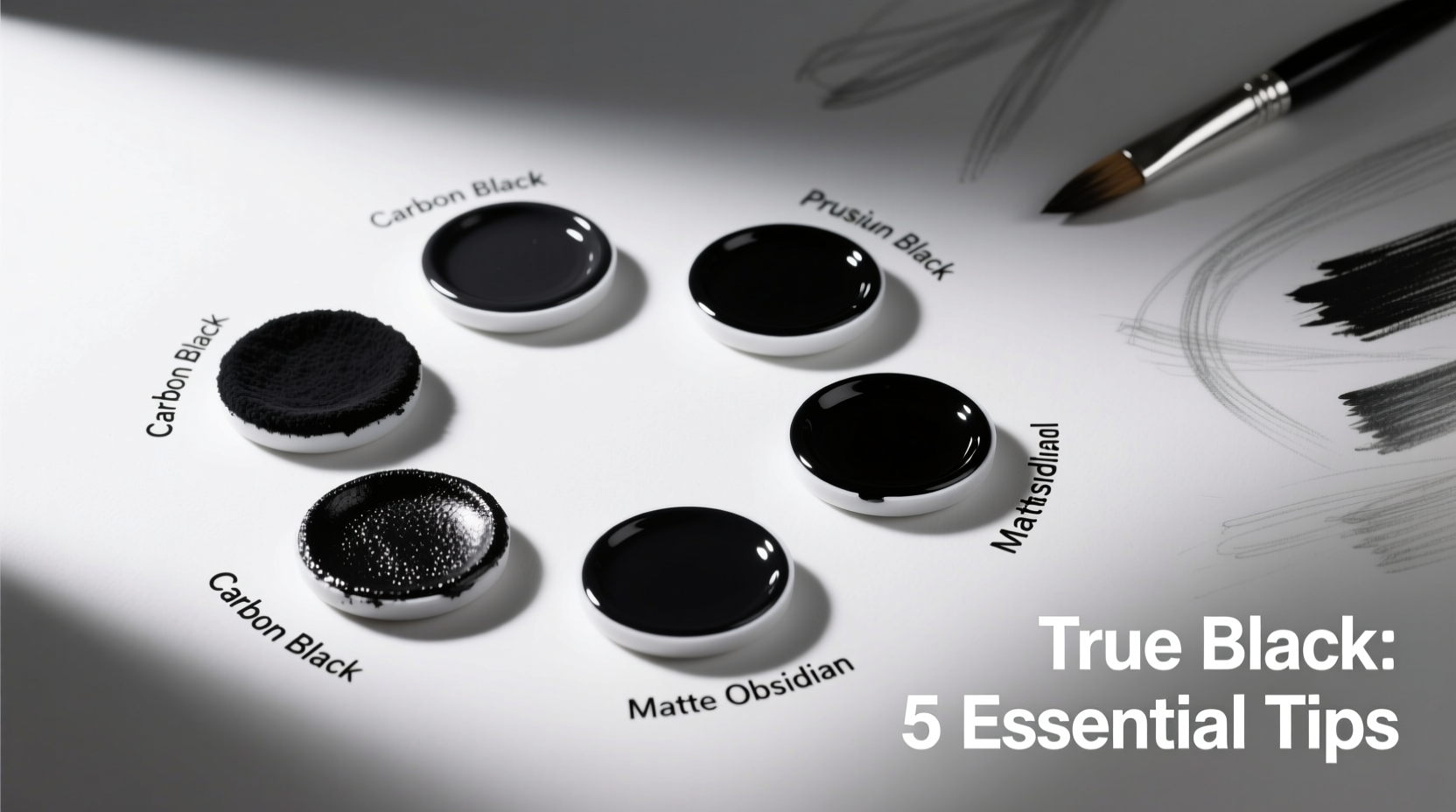
True black isn’t always pure black. In digital design, #000000 represents absolute black—the complete absence of light. However, physical media like paint, ink, or fabric interact differently with ambient light, often reflecting subtle hues based on pigment composition. For example, many commercial black paints lean toward blue, brown, or green undertones due to their chemical makeup. Recognizing this helps explain why two blacks can appear mismatched even when labeled identically.
In printing, CMYK black (composed of 100% cyan, magenta, yellow, and black) often results in a muddy tone. Instead, designers use \"rich black,\" which combines high values of all four inks—typically C:60 M:40 Y:40 K:100—to produce a deeper, more saturated result. This distinction is critical for professional-grade output where depth matters.
“Black is the most important color in any palette. It defines edges, creates mood, and anchors contrast—but only if it’s handled with intention.” — Dr. Lena Torres, Color Theory Researcher, Royal College of Art
Choosing the Right Medium-Specific Approach
The method for achieving true black varies significantly across mediums. What works in oil painting may not translate to web design or textile printing. Below is a comparison of best practices by medium:
| Medium | Recommended Black Formula | Common Pitfall |
|---|---|---|
| Digital Design (RGB) | #000000 (pure black) | Overuse leading to poor contrast on dark backgrounds |
| Print (CMYK) | C:60 M:40 Y:40 K:100 (rich black) | Using 100% K only, resulting in dull appearance |
| Oil Painting | Ivory Black + Ultramarine Blue or Burnt Umber | Mixing with white too early, causing grayish cast |
| Watercolor | Payne’s Gray or layered cool/warm darks | Over-saturating paper, leading to buckling |
| Textile Dyeing | Reactive black dyes with mordant fixation | Insufficient rinsing, causing fading |
Layering Techniques for Depth and Dimension
Flat black lacks visual interest. To create depth, layer dark values strategically. In painting, glazing—a technique involving thin, transparent layers over dried base coats—can deepen black without losing luminosity. A base of deep violet or navy followed by a translucent black glaze produces a black that feels alive, absorbing and subtly reflecting light.
In digital illustration, using multiply or overlay blending modes allows underlying textures or gradients to influence the black layer, preventing it from appearing flat. Designers working in UI/UX often apply subtle gradients (e.g., #0A0A0A to #000000) to black backgrounds to enhance perceived depth while maintaining readability.
For print materials, consider spot varnishes or embossing over black ink. These tactile enhancements emphasize form and draw attention through contrast in texture rather than hue.
Step-by-Step: Building a Rich Black in Oil Painting
- Begin with a toned ground (e.g., raw umber) to avoid stark white interference.
- Mix a base black using Ivory Black and a small amount of Ultramarine Blue for cool depth.
- Apply the mixture thinly at first, allowing for adjustments.
- Glaze with a transparent oxide or alizarin crimson to warm specific areas.
- Add final details with near-black mixtures (e.g., black + white + complementary color) to suggest shadow variation.
Avoiding Common Mistakes
Even experienced creators fall into traps when handling black. One frequent error is relying solely on tube black without adjusting for context. Another is failing to balance black with surrounding colors, which can make compositions feel heavy or unbalanced.
- Don’t oversaturate surfaces—especially in water-based media, where pooling can damage substrates.
- Avoid premature contrast—introducing pure black too early in a piece limits tonal development.
- Don’t ignore ambient light—a black that looks perfect under studio lights may appear greenish under fluorescent bulbs.
- Resist using black to darken colors—mixing black into other hues often dulls them; instead, use complementary colors for richer shadows.
“I once spent weeks repainting a mural because the ‘black’ I used reflected blue under evening streetlights. Now I swatch and test every black in situ.” — Marco Velez, Public Art Installations Specialist
Practical Checklist for Creating True Black
Use this checklist before finalizing any work involving black tones:
- ☐ Define the purpose of black
- Is it structural (outlines), atmospheric (shadows), or symbolic (mood)?
- ☐ Select the correct formulation
- Digital? Print? Paint? Choose the appropriate black type.
- ☐ Test under real conditions
- View samples in intended lighting or environment.
- ☐ Layer for depth
- Use glazes, gradients, or textures to prevent flatness.
- ☐ Balance with adjacent colors
- Ensure black enhances, not overwhelms, the composition.
- ☐ Proof final output
- Print a sample or view on target device before full production.
Frequently Asked Questions
Why does my printed black look gray or faded?
This usually occurs when only 100% black (K) is used in CMYK printing. Without supporting cyan, magenta, and yellow inks, the black appears weak. Use a rich black formula (e.g., C:60 M:40 Y:40 K:100) for deeper results, but avoid applying rich black to small text to prevent misregistration issues.
Can I mix true black using primary colors?
Theoretically, yes—combining equal parts of cyan, magenta, and yellow should produce black. In practice, pigments are imperfect, so the result is often a dark brown or muddy gray. This is why black ink (K) exists in the CMYK model. However, mixing dark neutrals from complements (e.g., purple and yellow) can yield more natural-looking darks than straight black.
How do I keep black from making my design feel heavy?
Balance black with ample negative space, textured whites, or accent colors. Break up large black areas with subtle patterns or gradients. In interior design, pairing matte black with reflective surfaces (glass, metal) adds airiness. In graphic design, use black as an accent rather than a dominant field unless intentional.
Conclusion: Elevate Your Use of Black
True black is not a default—it’s a deliberate choice shaped by context, medium, and intent. Whether you're designing a sleek brand identity, painting a nocturnal landscape, or producing premium packaging, mastering black elevates your work from competent to exceptional. By understanding its nuances, testing rigorously, and layering thoughtfully, you transform black from a mere color into a powerful design element.


 浙公网安备
33010002000092号
浙公网安备
33010002000092号 浙B2-20120091-4
Comments
No comments yet. Why don't you start the discussion?