
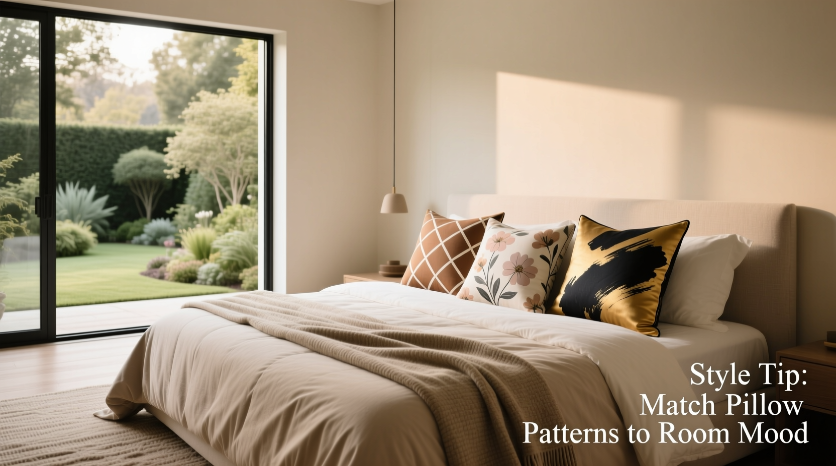
A bedroom or living space isn’t complete without attention to the details—and few details are as impactful yet overlooked as pillowcase patterns. More than just protective coverings for your pillows, these textiles serve as subtle design statements that influence mood, cohesion, and visual interest. When chosen with intention, pillowcase patterns can elevate a bland room into a curated retreat. The right pattern adds rhythm, texture, and personality without overwhelming the space. But selecting one that harmonizes with your decor requires more than personal preference—it demands an understanding of scale, color theory, and interior context.
Understand Pattern Scale and Room Proportion
The size of a pattern relative to your furniture and room dimensions plays a critical role in how it’s perceived. A large-scale floral print may look dramatic on a bedding catalog but can overwhelm a small guest bedroom. Conversely, tiny pinstripes might get lost on a king-sized bed in a spacious master suite.
Consider this: large patterns draw attention and work best in expansive rooms where they have room to breathe. Small patterns suit compact spaces by adding detail without cluttering the eye. Medium-scale geometrics or abstract motifs often strike the ideal balance, offering visual intrigue while remaining versatile across room sizes.
Match Patterns to Your Existing Color Palette
Color is the bridge between your pillowcases and the rest of your room. Even the most elegant pattern will clash if its hues don’t align with your walls, flooring, or furniture. Begin by identifying your dominant, secondary, and accent colors. Then select a pillowcase pattern that incorporates at least two of these tones.
For neutral-dominated interiors—think beige, gray, or white—patterns with soft pastels or earthy accents (terracotta, sage, navy) introduce warmth without disrupting serenity. In boldly colored rooms, opt for patterns that echo existing shades rather than compete with them. For instance, a deep emerald wall pairs beautifully with a botanical print featuring olive, cream, and hints of rust.
“Pattern works best when it feels like part of the story, not a sudden plot twist.” — Lena Torres, Interior Stylist & Textile Curator
Balance Pattern with Texture and Solid Elements
A room filled entirely with patterned textiles risks visual fatigue. To maintain harmony, follow the 60-30-10 rule: 60% solid neutrals (walls, duvet), 30% complementary textures (knit throws, linen curtains), and 10% pattern (pillowcases, art). This ratio ensures cohesion while allowing the pattern to shine as a focal point.
Pairing a busy pillowcase with textured solids—such as a waffle-weave duvet or cable-knit throw—adds depth without chaos. Alternatively, use patterned pillowcases against a solid backdrop to create contrast. For example, geometric print pillowcases pop against a matte charcoal duvet, especially when grounded by a nubby wool rug.
| Room Style | Suitable Patterns | Potential Pitfalls |
|---|---|---|
| Minimalist | Subtle stripes, tonal geometrics | Overly intricate designs |
| Bohemian | Global prints, ikat, tribal motifs | Lack of anchoring neutrals |
| Traditional | Florals, damask, toile | Mismatched color undertones |
| Modern | Clean lines, abstract asymmetry | Dated or overly ornate styles |
Align Patterns with Your Design Aesthetic
Your pillowcase pattern should reflect the overarching theme of your room. A mismatch here—like placing a rustic gingham case in a sleek Scandinavian bedroom—can undermine even the most thoughtfully arranged space.
For traditional interiors, classic patterns such as toile, brocade, or vintage florals lend timeless elegance. Modern and contemporary spaces benefit from crisp geometrics, asymmetric line work, or monochromatic repeats. Boho-chic rooms thrive on layered global influences—think Moroccan trellis, batik, or suzani-inspired embroidery. Meanwhile, minimalist settings call for understated patterns: micro-checks, tonal jacquards, or single-line illustrations in muted ink.
Real Example: Transforming a Dated Master Bedroom
Sarah, a homeowner in Portland, struggled with a master bedroom that felt outdated despite recent paint and new lighting. The cream-colored bedding lacked character, and the space felt sterile. After consulting a local stylist, she introduced two sets of patterned pillowcases: one with a soft watercolor fern motif in sage and blush, and another with a narrow indigo stripe. Paired with a textured ivory duvet and light oak nightstands, the new pillowcases bridged the gap between nature and modern simplicity. Within days, guests commented on the room’s “effortless calm.” The change was minor in cost but transformative in effect.
Step-by-Step Guide to Choosing the Right Pillowcase Pattern
- Assess your room’s current palette – Note dominant, secondary, and accent colors using paint swatches or fabric samples.
- Determine the desired mood – Calm (soft florals, tonal weaves), energetic (bold geometrics), or eclectic (mixed cultural prints).
- Choose the appropriate scale – Small rooms favor smaller patterns; larger beds accommodate bolder designs.
- Limit pattern quantity – Use no more than two complementary patterns per bed to avoid visual overload.
- Test in natural light – View fabric samples at different times of day to see how colors shift.
- Layer with solids and textures – Ensure at least 70% of visible bedding remains solid or textural.
- Washability check – Confirm the fabric can be cleaned easily, especially for high-use bedrooms.
Checklist: Before You Buy Patterned Pillowcases
- ☐ Does the pattern complement my wall color and furniture?
- ☐ Is the scale appropriate for my bed size and room dimensions?
- ☐ Do the colors align with my existing accent palette?
- ☐ Have I balanced it with enough solid or textured elements?
- ☐ Is the fabric durable and easy to care for?
- ☐ Does it reflect my room’s overall design style?
- ☐ Have I viewed it in both daylight and artificial light?
Frequently Asked Questions
Can I mix different patterns on the same bed?
Yes, but with strategy. Combine one dominant pattern (e.g., large floral) with a supporting one (e.g., small stripe or dot) in shared colors. Avoid pairing two bold prints unless separated by solid buffers like a throw blanket.
How do I keep patterned pillowcases from looking cheap?
Focus on fabric quality. Printed cotton percale or sateen holds patterns better than polyester blends, which can appear shiny or pixelated. Also, ensure clean registration—misaligned prints are a sign of lower craftsmanship.
Should all pillowcases on a bed match?
Not necessarily. Coordinated mismatching—using two complementary patterns in the same color family—adds curated charm. However, in formal or minimalist spaces, uniformity tends to look more polished.
Final Thoughts: Let Your Pillows Tell a Story
Pillowcase patterns are more than decorative afterthoughts—they’re opportunities to express taste, set tone, and unify a room’s narrative. Whether you lean toward serene linens with whisper-thin stripes or vibrant cases adorned with Moroccan mosaics, each choice shapes the atmosphere you live in. Thoughtful selection doesn’t require a designer’s eye, only intention and attention to balance. By considering scale, color, texture, and style alignment, you turn functional bedding into expressive design.


 浙公网安备
33010002000092号
浙公网安备
33010002000092号 浙B2-20120091-4
Comments
No comments yet. Why don't you start the discussion?