
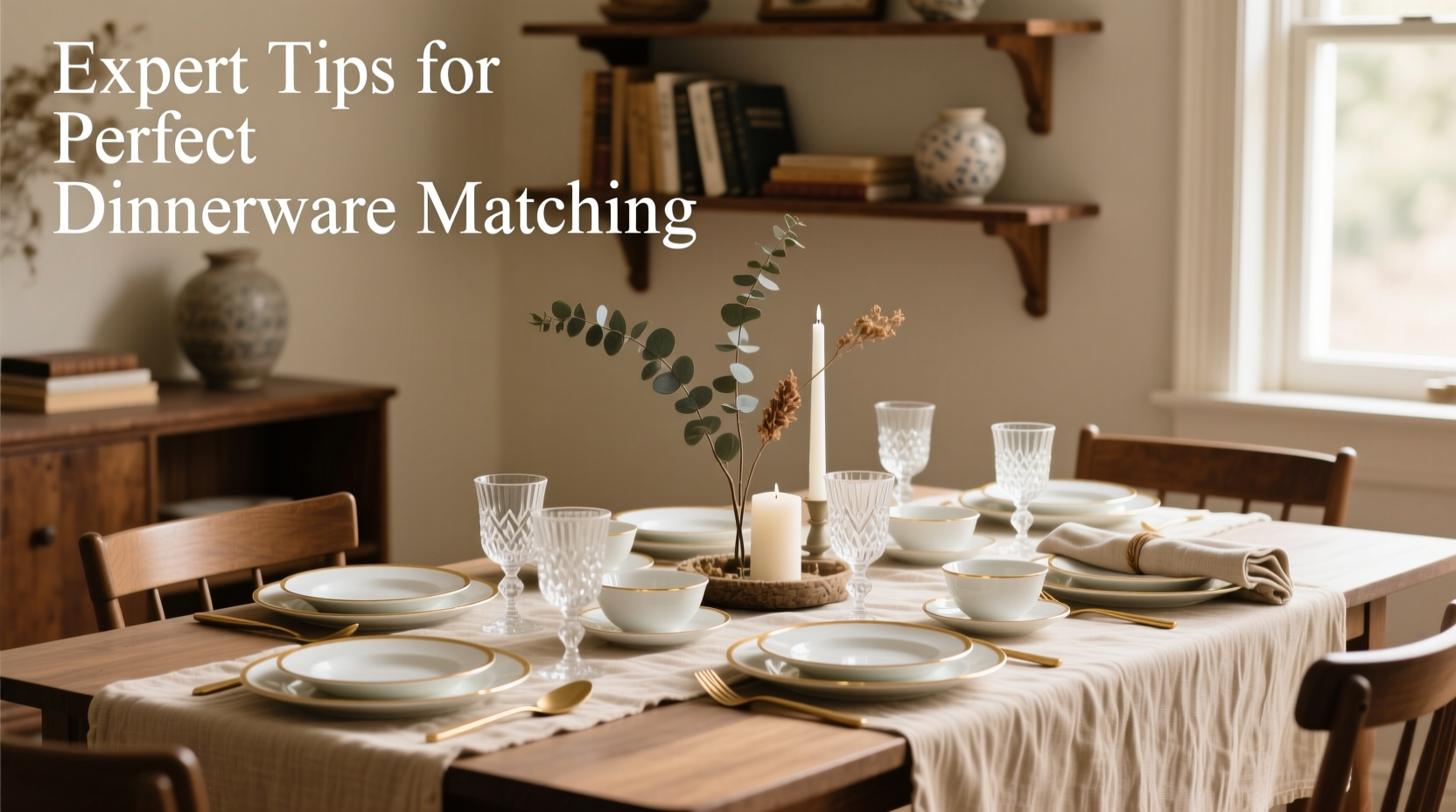
A beautifully set table does more than serve food—it tells a story. The right dinnerware doesn’t just hold your meal; it elevates the entire dining experience. Whether you're hosting a formal dinner or enjoying a quiet family supper, harmonizing your dinnerware with your table decor is essential for creating a visually balanced and inviting atmosphere. Yet, many overlook this subtle art, defaulting to mismatched pieces or overly safe choices that lack personality. With thoughtful coordination, you can turn an ordinary meal into a memorable moment.
Understand Your Table’s Aesthetic Foundation
Before selecting dinnerware, define the overall style of your dining space. Is your home modern minimalist, rustic farmhouse, or classic traditional? Each aesthetic calls for different materials, colors, and shapes in dinnerware. For example, clean-lined white porcelain complements a Scandinavian interior, while hand-glazed stoneware suits a bohemian tablescape. Recognizing your foundational style ensures cohesion rather than clash.
Consider these common design themes and their ideal dinnerware matches:
| Decor Style | Dinnerware Characteristics | Recommended Materials |
|---|---|---|
| Modern Minimalist | Sleek, monochrome, geometric shapes | Porcelain, tempered glass |
| Rustic Farmhouse | Earthy tones, textured finishes, matte glaze | Stoneware, earthenware |
| Classic Traditional | Intricate patterns, gold or silver trim | China, bone china |
| Coastal Chic | Light blues, whites, nautical motifs | Ceramic, melamine (for outdoor use) |
| Eclectic Bohemian | Mixed patterns, bold colors, artisanal flair | Hand-painted ceramics, mixed media |
Color Theory and Coordination Principles
Color plays a pivotal role in visual harmony. While it's tempting to match dinnerware exactly to your tablecloth or wall color, subtlety often wins. Use complementary or analogous color schemes to create balance without monotony.
For instance, pairing sage green napkins with warm terracotta plates on a cream linen tablecloth creates depth through earthy contrast. Alternatively, navy plates with coral accents pop against a pale yellow runner, using the color wheel to energize the setting.
“Dinnerware should enhance the mood of the room, not dominate it. Think of it as part of a larger palette.” — Lila Monroe, Interior Stylist & Tabletop Designer
Avoid clashing hues by testing combinations under natural light. If your dining area has warm undertones (wood floors, golden lighting), choose dinnerware with warm bases—cream, beige, or soft yellow. Cool-toned rooms (gray walls, stainless steel fixtures) pair best with cool whites, grays, or blue-tinted ceramics.
Layering Textures and Materials for Depth
A truly polished table engages multiple senses. Visual texture—from matte versus glossy finishes, ribbed edges, or embossed patterns—adds dimension even in monochrome settings. Pair smooth porcelain with woven rattan placemats or velvet napkin rings to introduce tactile contrast.
Consider mixing materials thoughtfully. A stoneware plate on a lacquered charger creates weight and elegance. Glass overlays or metallic-rimmed bowls catch candlelight, adding sparkle without overwhelming simplicity.
- Use fabric runners under placemats for softness and sound absorption.
- Choose flatware with a finish that echoes another element—brushed gold cutlery if your lamps are brass, for example.
- Incorporate organic elements like wood chargers or ceramic salt cellars to ground modern settings.
Step-by-Step Guide to Building a Cohesive Tablescape
- Define the occasion: Casual brunch vs. holiday feast dictates formality and color intensity.
- Select your centerpiece: Let flowers, candles, or a decorative bowl anchor the table’s theme.
- Choose dinnerware: Pick plates, bowls, and mugs that align with your decor style and color scheme.
- Add layers: Introduce placemats, napkins, and chargers for texture and structure.
- Coordinate flatware and glassware: Ensure metals and shapes complement each other.
- Test the layout: Set the full table during daylight to assess balance and flow.
Real Example: A Spring Garden Dinner Party
Sophie, a lifestyle host in Portland, wanted to create a fresh, airy tablescape for her spring garden gathering. Her dining area features large windows, white oak furniture, and soft gray walls. She chose a simple white stoneware set with a slight ripple edge for subtle texture. To bring in seasonal color, she added blush pink linen napkins tied with twine and eucalyptus sprigs.
The centerpiece was a low rectangular vase filled with peonies and ranunculus in coral and cream. Gold-rimmed wine glasses reflected the afternoon sun, while matte black flatware provided modern contrast. The result? A table that felt both elegant and approachable—guests commented that the setting enhanced the meal’s enjoyment.
This success came from restraint: Sophie didn’t try to match every flower color in the dishes. Instead, she let the dinnerware stay neutral and allowed accents to shine.
Common Mistakes to Avoid
Even experienced hosts make missteps when coordinating dinnerware. Here’s what to watch for:
- Over-matching: Trying to perfectly match plate color to napkin or centerpiece often looks forced.
- Ignoring scale: Oversized platters on a small table overwhelm; tiny dessert forks on large dinner plates look out of place.
- Clashing metals: Mixing polished silver, brushed nickel, and rose gold flatware without intention creates visual noise.
- Neglecting practicality: Delicate china may not suit everyday family dinners—choose durability when needed.
“Harmony isn’t about perfection. It’s about intention. One unexpected piece, like a hand-thrown mug among uniform plates, can add soul.” — Rafael Torres, Culinary Stylist
Checklist: Perfect Dinnerware & Decor Match
Use this checklist before your next dinner party:
- ✅ Dinnerware style aligns with room decor (modern, rustic, etc.)
- ✅ Plate color complements—but doesn’t copy—the centerpiece
- ✅ Napkin material and fold style suit the formality level
- ✅ Flatware finish coordinates with other metal accents (light fixtures, frames)
- ✅ There’s enough negative space between elements for visual breathing room
- ✅ Lighting enhances the table (candles, pendant lights, natural glow)
- ✅ All pieces are clean, unchipped, and uniformly oriented (handles at 45 degrees)
Frequently Asked Questions
Can I mix different dinnerware patterns at one table?
Yes—if done intentionally. Stick to a unified color palette and vary scale: pair a small floral salad plate with a large stripe or geometric charger. Avoid more than two distinct patterns unless they share a motif or hue.
Should my dinnerware match my kitchen cabinets or wall color?
Not necessarily. Dinnerware should relate to the dining space’s overall mood, not duplicate existing colors. Complementary tones create interest; exact matches can feel flat. Use dinnerware as an accent, not a replica.
How do I transition dinnerware from season to season?
Keep a neutral base set (white or soft gray) and rotate accessories: napkins, chargers, and serving bowls. In fall, add burnt orange linens; in summer, switch to aqua glassware. This keeps your core investment relevant year-round.
Final Thoughts: Elevate Every Meal with Intention
Matching dinnerware to your table decor isn’t about rigid rules—it’s about cultivating intention. Every choice, from plate shape to napkin fold, contributes to the atmosphere you create. When dinnerware and decor work together, meals become moments worth remembering. You don’t need expensive sets or designer linens; you need awareness, balance, and a touch of creativity.


 浙公网安备
33010002000092号
浙公网安备
33010002000092号 浙B2-20120091-4
Comments
No comments yet. Why don't you start the discussion?