
Selecting the right pillow covers can transform a room from ordinary to exceptional. While they may seem like small details, throw pillows are powerful tools in interior design—offering texture, contrast, and visual interest. The key to their success lies not just in fabric or pattern but in how well they integrate with your current color palette. When done thoughtfully, pillow covers enhance cohesion; when mismatched, they disrupt balance. Achieving seamless integration requires more than instinct—it demands strategy.
Understand Your Existing Color Scheme
Before introducing any new textile, take inventory of your space. Identify the dominant, secondary, and accent colors present in walls, furniture, rugs, and artwork. Most interiors fall into one of several common schemes: monochromatic, analogous, complementary, or neutral-based with pops of color.
A monochromatic room uses varying tones and tints of a single hue. In such spaces, pillow covers should deepen the narrative through subtle shifts in saturation or introduce textural contrast—like a velvet cover in a slightly darker shade of blue against a linen sofa.
Analogous schemes (colors adjacent on the wheel, like green, teal, and blue) allow for layered coordination. Here, pillow covers can echo neighboring tones while reinforcing flow. A coral pillow in a peach-and-terracotta living area adds warmth without clashing.
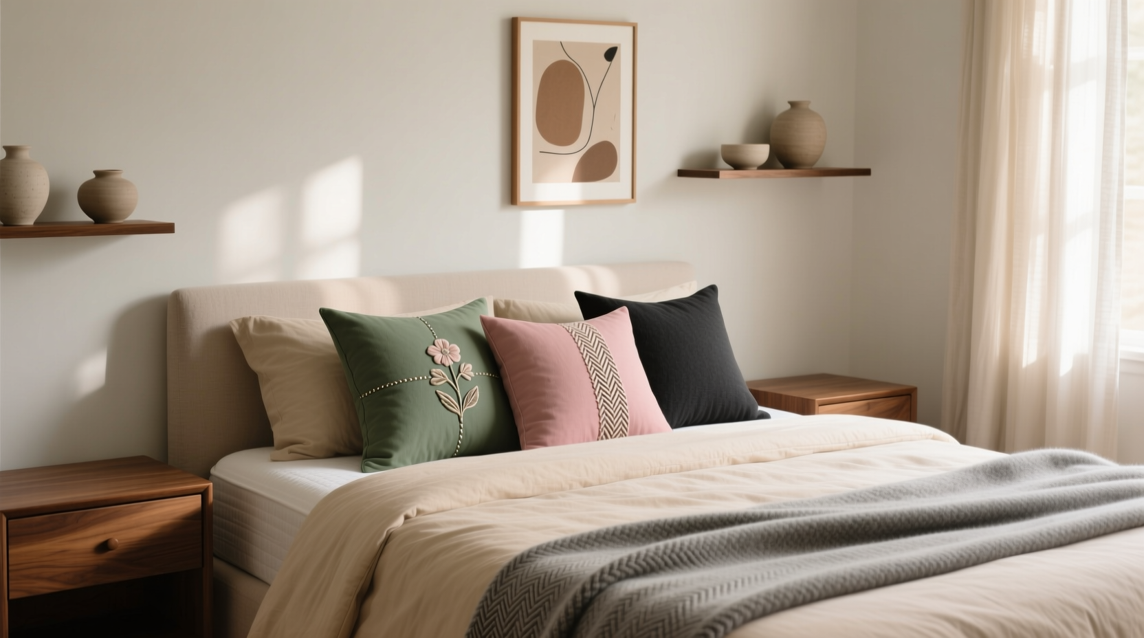
Apply the 60-30-10 Rule for Visual Balance
Professional designers often rely on the 60-30-10 principle to create balanced color distribution. This rule allocates 60% of the room to a dominant color (usually walls or large furniture), 30% to a secondary tone (such as curtains or area rugs), and 10% to an accent (like decorative pillows).
If your sofa is gray (60%), and your drapes are warm taupe (30%), your pillow covers should represent the final 10%—ideally in a bold or contrasting hue like mustard yellow or deep plum. This ensures they stand out without overwhelming the space.
Alternatively, if you prefer a more subdued look, reverse the emphasis: use neutral-toned pillow covers in a room dominated by colorful art or patterned wallpaper. The goal is proportionate harmony, not uniformity.
“Pillows are the jewelry of a room—they should complement the outfit, not compete with it.” — Lila Monroe, Interior Stylist & Author of *Textile Harmony*
Choose Fabrics That Enhance Tone and Texture
Color isn’t the only factor—fabric impacts how a hue appears under different lighting. A matte cotton cover absorbs light, making colors appear softer, while a satin or silk blend reflects it, intensifying vibrancy.
In low-light rooms, consider using lightly reflective fabrics to brighten the space. For sun-drenched areas, matte finishes prevent glare and maintain a calm atmosphere. Mixing textures—such as pairing a nubby bouclé cover with a smooth cotton-linen blend—adds depth even when colors are similar.
| Fabric Type | Color Effect | Best For |
|---|---|---|
| Cotton | Soft, natural appearance | Neutral or pastel palettes |
| Linen | Slightly muted, earthy tone | Rustic, minimalist, or coastal styles |
| Vinyl or Faux Leather | Glossy, bold presence | Modern or high-contrast schemes |
| Velvet | Rich, deep color saturation | Jewel tones in formal or moody spaces |
| Weave (e.g., ikat, brocade) | Multi-tonal complexity | Adding intrigue to neutral bases |
Step-by-Step Guide: Matching Pillow Covers to Your Palette
Follow this five-step process to ensure every pillow enhances your space:
- Document your current colors. Take photos in natural light and isolate dominant hues using a digital color picker tool or paint swatches.
- Determine your room’s mood. Is it calming (cool tones), energizing (warm tones), or balanced (neutrals)? Choose pillow colors that align with the intended feeling.
- Select a base cover. Start with one pillow in a neutral or dominant color that matches your largest furnishing.
- Add contrast or harmony. Introduce a second pillow in a complementary or analogous shade. For contrast, try navy with rust; for harmony, sage with olive.
- Incorporate pattern strategically. If using patterned covers, ensure at least one color in the print ties back to your existing scheme. Avoid patterns where all colors are foreign to the room.
Mini Case Study: Transforming a Beige Living Room
Sarah, a homeowner in Portland, struggled with a beige sectional and tan walls that made her living room feel flat. She wanted to add color but feared making a mistake. Using the 60-30-10 rule, she designated beige as her 60% (walls and sofa), added a textured charcoal rug for 30%, then introduced three pillow covers in varying shades of terracotta, olive green, and deep indigo—each representing 10% accents.
She chose a mix of fabrics: one velvet indigo cover for richness, a woven terracotta piece for texture, and a printed pillow featuring all three colors in a geometric pattern. The result? A once-dull space now felt grounded, intentional, and inviting. Visitors consistently commented on the “effortless” elegance—proof that strategic pillow selection can redefine a room’s character.
Do’s and Don’ts: Common Pitfalls to Avoid
| Do | Don't |
|---|---|
| Use at least one color from your largest textile (e.g., rug or curtain) | Introduce a completely new color not present elsewhere |
| Mix matte and shiny fabrics for dimension | Use all glossy or all flat covers—lacks contrast |
| Lay out all pillow covers together before placing them | Buy covers individually over time without testing combinations |
| Limit bold patterns to one or two pillows per seating area | Overload with multiple busy prints |
Checklist: Perfect Pillow Pairing in 7 Steps
- ☐ Audit your room’s current color palette
- ☐ Identify dominant, secondary, and accent colors
- ☐ Apply the 60-30-10 rule to determine coverage needs
- ☐ Select fabrics that suit both color goals and room function
- ☐ Choose one statement pillow for focal interest
- ☐ Ensure at least one color in each pillow repeats elsewhere in the room
- ☐ Style and step back—view from across the room to assess balance
FAQ
Can I use black or white pillow covers in a colorful room?
Absolutely. Black and white are neutrals that ground vibrant schemes. A black cover can anchor bright colors, while white introduces airiness. Just ensure the shade matches your room’s undertones—warm white with beige, cool white with gray.
How many pillow covers should I use on a couch?
Odd numbers tend to be more visually pleasing. For a standard three-seater, three pillows work well—one at each end and one centered. For larger sectionals, groupings of three or five maintain balance. Avoid overcrowding; leave breathing space between pieces.
What if my room has no clear color scheme?
Start by choosing a central inspiration piece—a piece of art, a favorite throw blanket, or even a vacation photo—and build around its most prominent colors. This creates a natural, cohesive foundation.
Final Thoughts: Elevate Your Space One Pillow at a Time
Matching pillow covers to your color scheme isn’t about perfection—it’s about intention. With a thoughtful approach, even the smallest decor element can contribute to a sense of unity and comfort. Whether you’re refreshing a tired corner or designing from scratch, remember that consistency in color, contrast in texture, and restraint in quantity yield the most elegant results.


 浙公网安备
33010002000092号
浙公网安备
33010002000092号 浙B2-20120091-4
Comments
No comments yet. Why don't you start the discussion?