
Choosing the right phone case isn’t just about protection—it’s a personal style statement. Among the most popular design categories are floral and abstract patterns, each offering distinct visual appeal. But when held in hand, viewed under natural light, or seen in daily use, which one truly stands out? The answer depends on more than just preference; it involves psychology, material quality, context of use, and how designs age over time.
While online images can be deceiving, real-world perception hinges on color harmony, texture, and emotional resonance. This article dives deep into both styles, comparing their strengths and weaknesses not through marketing gloss, but through practical observation and user experience.
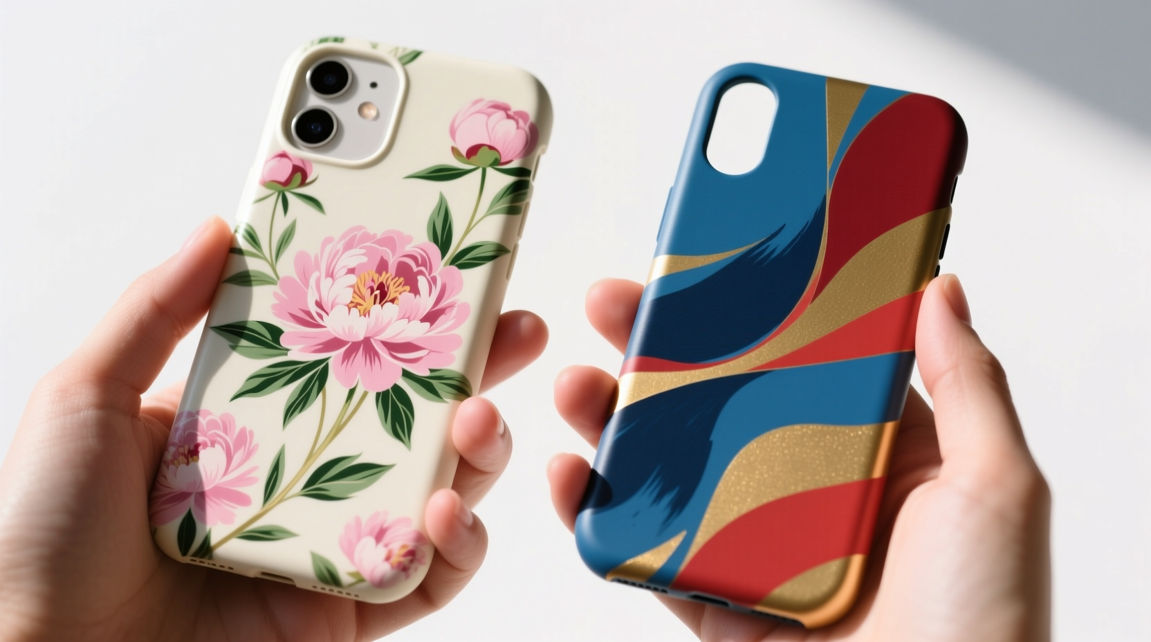
The Visual Psychology Behind Floral Designs
Floral patterns tap into deeply rooted associations with nature, renewal, and femininity. Research in environmental psychology suggests that exposure to floral imagery—even digitally rendered—can reduce stress and elevate mood. A 2021 study published in *Environment and Behavior* found that participants exposed to floral visuals reported higher feelings of calmness and approachability.
In the context of phone cases, this translates to a design that feels warm, inviting, and timeless. Classic rose motifs, daisy arrangements, or watercolor-style botanical prints often evoke nostalgia and elegance. However, the success of a floral case in real life depends heavily on execution. Poor print quality can make flowers look plasticky or pixelated, especially around fine petal edges.
Another consideration is scale. Small, intricate florals tend to look more refined in person than oversized, cartoonish blooms, which may appear garish up close. When viewed at arm’s length, subtle gradients and realistic shading make a significant difference in perceived quality.
Abstract Art: Boldness Meets Ambiguity
Abstract phone cases thrive on contrast, movement, and unpredictability. Swirls of paint, geometric layering, or digital glitch effects create dynamic visuals that catch the eye. Unlike floral designs, which communicate specific themes, abstract art invites interpretation. This ambiguity can be a strength—making the case feel unique and artistically bold.
In person, high-quality abstract prints often shine due to their vibrant color transitions and depth. Metallic inks, holographic finishes, or layered textures can give the illusion of motion as light shifts. These tactile qualities are lost in flat product photos, making the physical experience far more impactful.
That said, abstract designs carry a risk of clashing with personal style or environment. A neon-heavy abstract pattern might look striking in a gallery setting but feel overwhelming in a minimalist workspace. Similarly, overly busy compositions can distract from the device itself, making the phone feel like a moving canvas rather than a functional tool.
“Abstract design works best when it complements the user’s lifestyle, not competes with it.” — Lena Torres, Product Designer at Forma Studio
Direct Comparison: Key Factors That Matter in Real Life
Appearance in person is influenced by multiple tangible factors beyond the initial image. Below is a side-by-side analysis of floral versus abstract phone cases across critical dimensions.
| Factor | Floral Case | Abstract Case |
|---|---|---|
| First Impression | Soft, pleasant, familiar | Bold, modern, attention-grabbing |
| Print Clarity (Close View) | High detail needed; smudging ruins realism | Forgiving of imperfections; blur can add effect |
| Color Longevity | Pastels fade faster in sunlight | Bright hues hold up well; metallics chip |
| Skin Tone Harmony | Warm tones suit most complexions | Clashes possible with vibrant reds/blues |
| Dirt Visibility | Light backgrounds show grime quickly | Dark abstracts hide smudges better |
| Style Longevity | Timeless but can feel dated if too traditional | Trendy; may feel outdated in 1–2 years |
Real-World Example: Office Worker vs Creative Freelancer
Consider two users: Sarah, a corporate lawyer, and Marcus, a freelance graphic designer. Sarah chose a delicate lavender-and-ivy floral case. In client meetings, colleagues frequently compliment her phone’s “elegant” look. The muted colors match her tailored wardrobe and project professionalism without being flashy.
Marcus opted for a high-contrast black-and-magenta abstract case with splatter effects. At co-working spaces, it sparks conversations. Clients associate his aesthetic with creativity and innovation. However, after six months, he noticed the glossy finish chipped near the corners, revealing the underlying plastic—a flaw less visible on textured floral cases with softer edges.
This illustrates a key insight: the “better-looking” case depends on context. Sarah’s choice excels in environments valuing subtlety; Marcus’s thrives where self-expression is rewarded.
How to Choose Based on Lifestyle, Not Just Taste
Selecting between floral and abstract shouldn’t be arbitrary. A structured approach ensures your case remains satisfying long after purchase.
- Assess Your Daily Environment: Do you work in a formal office, creative studio, or hybrid space? Neutral florals blend; bold abstracts stand out.
- Check Lighting Conditions: Natural light enhances floral softness; artificial lighting amplifies abstract vibrancy.
- Evaluate Your Wardrobe Palette: If you wear mostly neutrals, a floral case adds gentle color. If your style is already bold, an abstract case might overcomplicate your look.
- Touch Before You Buy (If Possible): Texture affects perception. Soft-touch coatings on floral cases feel premium; rubberized abstracts offer grip but may feel industrial.
- Think Long-Term Appeal: Ask yourself: Will I still like this design in nine months? Florals tend to age gracefully; abstracts can feel trendy and fleeting.
FAQ: Common Questions About Phone Case Aesthetics
Do floral phone cases look childish?
Not inherently. Mature floral designs use sophisticated color palettes (like sage green, navy, or burgundy) and realistic illustrations. Avoid cartoonish fonts or glitter overlays if aiming for a professional look.
Are abstract cases harder to match with outfits?
Sometimes. If your wardrobe is monochrome or earth-toned, a neon abstract case may clash. Opt for abstract designs using your dominant colors—such as charcoal gray with gold accents—to maintain cohesion.
Which design hides wear and tear better?
Abstract cases with dark bases and busy patterns camouflage scratches and yellowing better than light-colored floral cases, which show every fingerprint and edge discoloration.
Final Verdict: It’s About Harmony, Not Hype
There’s no universal winner between floral and abstract phone cases. What looks better in person ultimately comes down to alignment—between the design, your personality, and your environment. A beautifully printed floral case with subtle shading and a soft finish often feels more refined and enduring. An expertly crafted abstract piece with dimensional ink and balanced composition can be a wearable art statement.
The most overlooked factor is longevity of satisfaction. Many people regret flashy abstract cases within months, while floral designs, though quieter, often grow on their owners. As designer Lena Torres puts it: “Aesthetic endurance matters more than instant impact.”
“A phone case should feel like an extension of you—not a decoration you tolerate.” — Lena Torres, Product Designer at Forma Studio
Checklist: Choosing the Right Design for You
- ✅ Determine your dominant style: classic, modern, eclectic, or minimalist
- ✅ Test print quality by zooming in on product images
- ✅ Consider the case’s finish: matte, glossy, or textured
- ✅ Think about visibility of dirt and aging
- ✅ Match the dominant color to your everyday accessories
- ✅ Prioritize tactile feel over screen appearance
The next time you browse phone cases, pause before clicking “add to cart.” Ask not just which one catches your eye, but which one will still feel like you three months from now. Whether it’s the quiet charm of blooming petals or the electric pulse of abstract form, the best design is the one that resonates—consistently, quietly, and authentically.


 浙公网安备
33010002000092号
浙公网安备
33010002000092号 浙B2-20120091-4
Comments
No comments yet. Why don't you start the discussion?