
When it comes to gift-giving, presentation is everything. A beautifully wrapped present with a thoughtfully designed gift tag elevates the experience from ordinary to memorable. But one detail often overlooked? The legibility and aesthetic harmony of the fonts used on that tiny piece of cardstock. With dark wrapping paper growing in popularity—deep emerald, matte black, royal navy—the challenge of making your message readable becomes more complex. Script, sans serif, and serif fonts each bring their own character, but not all perform equally well under low-contrast conditions.
Understanding how typography interacts with color, texture, and context allows you to create gift tags that are both elegant and easy to read. This guide dives into the strengths and weaknesses of each major font category when paired with dark wrapping paper, offering practical advice for choosing combinations that enhance clarity without sacrificing style.
The Science of Readability on Dark Backgrounds
Before evaluating specific font types, it’s essential to understand what makes text legible on dark surfaces. Unlike white or light-colored paper, dark backgrounds absorb more light, reducing contrast unless the ink or print is sufficiently bright. The human eye relies on contrast to distinguish shapes quickly, especially at small sizes like those found on standard gift tags (typically 2–3 inches wide).
Three factors dominate readability in this context:
- Contrast Ratio: Light-colored text (white, gold, silver) against dark paper works best. Black text on black wrapping is nearly invisible.
- Font Weight: Thin strokes disappear easily; medium to bold weights maintain visibility.
- Letter Spacing (Tracking): Tight spacing can cause letters to blur together, especially in scripts or serifs with fine details.
A study by the W3C Web Content Accessibility Guidelines recommends a minimum contrast ratio of 4.5:1 between text and background for optimal readability. While these standards were developed for digital screens, they apply equally to physical materials viewed under indoor lighting.
Script Fonts: Elegance at a Cost
Script fonts mimic handwriting or calligraphy, evoking romance, sophistication, and personal touch. They're popular for wedding favors, holiday gifts, and feminine presentations. However, their ornate nature often compromises legibility—especially on dark backgrounds where fine lines may vanish.
Cursive styles frequently feature:
- Delicate stroke variation (thick downstrokes, thin upstrokes)
- Connected letters that can blur into illegible loops
- Narrow letterforms with minimal spacing
That said, some modern scripts are designed specifically for clarity. Look for “elegant casual” or “display script” variants with open counters (the enclosed spaces inside letters like 'o' or 'e') and consistent baseline alignment. Avoid overly flourished designs such as Edwardian Script or Monotype Corsiva for dark paper—they simply don’t hold up at small sizes.
“A beautiful script should whisper elegance, not shout confusion. If you have to squint to read it, the design has failed.” — Lena Torres, Typography Designer & Stationery Art Director
Best Practices for Using Scripts on Dark Paper
- Use only with high-contrast ink: metallic gel pens (gold, silver), opaque white ink, or foil stamping.
- Limited use: Reserve scripts for names or short messages (\"To Clara\") rather than full sentences.
- Pair with a simpler secondary font (sans serif) for recipient details or occasion notes.
Sans Serif Fonts: Clarity First
Sans serif fonts—literally “without serifs”—are known for clean lines, geometric simplicity, and excellent legibility. Think Helvetica, Futura, or Montserrat. Their uniform stroke weight and lack of decorative terminals make them ideal for environments where clarity trumps ornamentation.
On dark wrapping paper, sans serifs consistently outperform other categories due to:
- High x-height (taller lowercase letters)
- Even stroke distribution
- Open apertures (open ends of letters like 'c' or 's')
For formal occasions, consider geometric sans serifs like Gotham or Avenir. For casual or modern themes, try rounded options like Quicksand or Nunito. All work exceptionally well when printed in white, cream, or soft pastel tones over deep-colored paper.
When to Choose Sans Serif
Select sans serif fonts when:
- The tag will be viewed briefly (e.g., placed under a tree)
- The audience includes older adults or children
- You're labeling multiple gifts quickly
- Minimalist or contemporary aesthetics are desired
Serif Fonts: Tradition Meets Legibility
Serif fonts include small projecting features at the end of strokes—called serifs—which guide the eye across lines of text. Historically used in print publishing, serifs like Georgia, Times New Roman, or Playfair Display offer a classic, authoritative feel.
While traditionally associated with long-form reading, certain serif styles work surprisingly well on gift tags. Transitional and slab serifs—with bolder, more pronounced features—retain visibility on dark backgrounds better than delicate old-style serifs.
Slab serifs (e.g., Rockwell, Courier) have thick, block-like serifs and uniform stroke widths, making them highly legible even in small formats. They pair beautifully with kraft brown tags or charcoal-gray paper. Meanwhile, high-contrast modern serifs (like Bodoni) can struggle if too thin, but become striking when used in bold weights with metallic finishes.
| Font Type | Example Use Case | Recommended Ink Color | Readability on Dark Paper |
|---|---|---|---|
| Thin Script (e.g., Lobster) | Wedding favor tag | Gold foil | Moderate – requires large size |
| Sans Serif (e.g., Montserrat) | Birthday gift for colleague | White or silver | Excellent |
| Slab Serif (e.g., Rockwell) | Anniversary present | Cream or copper | Very Good |
| Old-Style Serif (e.g., Garamond) | Book as a gift | Ivory | Fair – needs magnification |
| Modern Serif (e.g., Didot) | Fashion accessory | Matte white | Good (only in bold) |
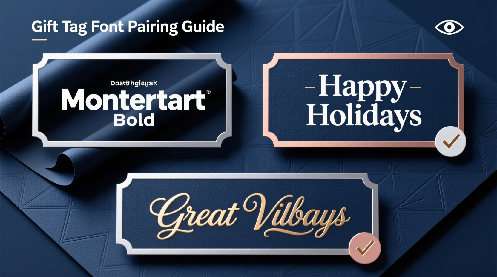
Effective Font Pairing Strategies
One of the most impactful decisions isn’t just which font to use—but how to combine them. Thoughtful pairing creates visual hierarchy, guiding the reader’s eye naturally from name to message.
Start with a dominant font for the recipient’s name, then support it with a complementary style for additional text (“Happy Birthday,” “With Love,” etc.). Here are proven pairings:
- Script + Sans Serif: Use an elegant script for \"Emma\" and a clean sans serif for \"Merry Christmas 2024.\" This balances flair with function.
- Serif + Sans Serif: Combine a refined serif (Playfair Display) with a neutral sans (Lato) for timeless sophistication.
- Bold Sans + Light Sans: Vary weight within the same family (e.g., Oswald Bold + Oswald Light) for subtle contrast without clashing.
Avoid combining two decorative fonts—even if one is script and one is serif. Doing so creates visual noise and distracts from the message.
Step-by-Step Guide to Designing Your Gift Tag
- Choose your wrapping paper color – Know your base before selecting fonts.
- Determine primary information – Is it the name? The occasion? Prioritize accordingly.
- Select a dominant font – Based on tone: playful, formal, modern?
- Pick a supporting font – Ensure contrast in style or weight.
- Test contrast – Print a draft or simulate under indoor lighting.
- Adjust spacing – Loosen tracking if letters appear crowded.
- Finalize material – Use thick cardstock and quality printing or writing tools.
Real-World Example: Holiday Gift Line Redesign
A boutique gift shop in Portland noticed customers frequently misread tags during their annual holiday pop-up. Many used dark green and burgundy wrapping with handwritten cursive labels in black marker—nearly invisible upon close inspection.
The owner consulted a local graphic designer who recommended switching to pre-printed tags using a combination of Great Vibes (a restrained script) for names and Open Sans (a highly legible sans serif) for greetings. Tags were printed in off-white ink on matte black cardstock, then attached with twine.
Customer feedback improved dramatically. One shopper noted, “I could actually tell whose gift was whose without holding it up to the lights.” Sales increased by 18% compared to the previous year, with staff reporting fewer exchanges due to mislabeled presents.
Checklist: Choosing the Right Font for Dark Wrapping Paper
- ✅ Is there strong contrast between text and background?
- ✅ Is the font weight bold enough to be seen at arm’s length?
- ✅ Are letterforms simple and widely spaced?
- ✅ Does the font match the tone of the gift and occasion?
- ✅ Have I tested a physical sample under real lighting?
- ✅ If using script, is it limited to short text like a name?
- ✅ Is there a clear visual hierarchy between elements?
Frequently Asked Questions
Can I use black ink on dark wrapping paper?
No—black ink on dark paper creates near-zero contrast and is extremely difficult to read. Always opt for light or metallic colors: white, ivory, gold, silver, or pale pastels.
Which font is easiest for seniors to read on gift tags?
Sans serif fonts like Arial, Calibri, or Montserrat are generally clearest. They have uniform strokes and open shapes that remain legible even with reduced vision. Avoid thin or tightly spaced scripts.
Is handwriting ever acceptable on dark paper?
Handwriting can work—if done with the right tool. Use opaque gel pens (e.g., Uni-Ball Signo, Sakura Gelly Roll) in white or metallic ink. Write slowly and clearly, avoiding cursive if your penmanship is tight or slanted. Print uppercase letters for maximum clarity.
Final Thoughts: Balance Beauty and Function
A gift tag is more than a label—it's part of the emotional reveal. It carries intention, care, and identity. But no matter how poetic the sentiment, it fails its purpose if it cannot be read.
While script fonts enchant with their fluid grace, they demand ideal conditions to remain legible. Serifs lend tradition and depth but vary widely in performance. Sans serifs, though sometimes perceived as plain, deliver unmatched clarity—especially when contrast is limited by dark substrates.
The smartest approach blends aesthetics with accessibility. Pair a graceful script name with a crisp sans serif subtitle. Use foil accents to draw attention without sacrificing form. And always, always test before finalizing.


 浙公网安备
33010002000092号
浙公网安备
33010002000092号 浙B2-20120091-4
Comments
No comments yet. Why don't you start the discussion?