
At first glance, the choice between a graphic tee and a plain tee might seem trivial—after all, both are cotton, casual, and widely available. But in the language of fashion, every detail speaks volumes. The decision to wear a bold print or a minimalist solid isn’t just about comfort; it’s a deliberate expression of identity, intention, and aesthetic philosophy. One carries messages, art, and rebellion. The other whispers sophistication, restraint, and timeless simplicity. So, which truly makes a stronger style statement? The answer depends not on trend cycles, but on context, confidence, and clarity of purpose.
The Power of the Graphic Tee: When Clothing Becomes Communication
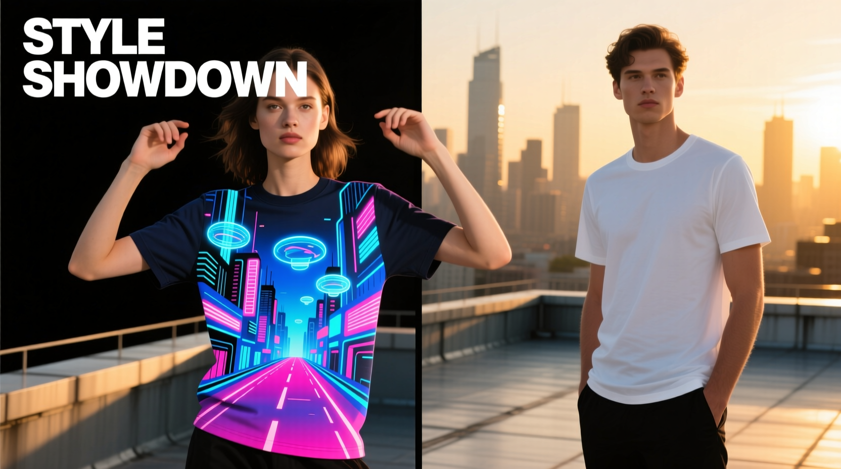
A graphic tee is more than a shirt—it's a canvas. From vintage band logos and political slogans to abstract illustrations and pop culture references, graphic tees turn clothing into conversation starters. They allow wearers to broadcast interests, affiliations, humor, or beliefs without saying a word. In subcultures—from punk and skateboarding to streetwear and hip-hop—graphic tees have long been tools of self-definition.
In urban environments, a well-chosen graphic tee can signal belonging to a particular scene. A faded Nirvana logo doesn’t just suggest musical taste; it evokes an era, an attitude, and a sense of authenticity. Similarly, limited-edition artist collaborations or underground brand drops carry social currency in fashion-forward circles.
“Graphic tees are wearable manifestos. They let people curate their public persona with precision.” — Darius Lin, Streetwear Curator & Fashion Editor at *Urban Thread Journal*
Yet strength in statement doesn’t always mean loudness. Some of the most powerful graphics are subtle: a small emblem, a cryptic phrase, or monochrome typography that rewards closer inspection. These designs appeal to those who value depth over flash, inviting engagement rather than demanding attention.
The Quiet Confidence of the Plain Tee: Minimalism as a Statement
On the surface, a plain tee appears unremarkable—a blank slate. But in the hands of someone with intention, it becomes a masterstroke of minimalism. The strength of a plain tee lies not in what it displays, but in what it implies: confidence in subtlety, appreciation for quality, and mastery of understated elegance.
Unlike its illustrated counterpart, the plain tee shifts focus to fit, fabric, and form. A perfectly tailored crew neck in heavyweight organic cotton speaks of discernment. It signals that the wearer prioritizes craftsmanship over novelty and values longevity over trends. This is the philosophy behind “quiet luxury”—a movement gaining momentum in modern wardrobes where less is not only more, but bolder.
Moreover, the plain tee offers unmatched versatility. It layers seamlessly under blazers, jackets, and cardigans. It transitions from gym to brunch to evening outings with simple accessory changes. Its neutrality allows it to serve as the foundation of countless outfits, making it indispensable in capsule wardrobes.
When Simplicity Commands Attention
Consider this: in a room full of loud prints, the person wearing a flawlessly fitted white tee often draws the eye. Not because the shirt shouts, but because it stands apart through purity of form. In high-fashion contexts, designers like Jil Sander, COS, and The Row have built empires on the idea that restraint is revolutionary. A plain tee, when worn with intention, becomes a declaration of self-assurance—an assertion that you don’t need external validation through logos or artwork.
Comparative Analysis: Strength of Statement Across Contexts
To determine which tee makes a stronger statement, we must examine different environments and intentions. The “strength” of a style statement isn’t universal; it fluctuates based on setting, audience, and personal goals.
| Context | Graphic Tee Impact | Plain Tee Impact |
|---|---|---|
| Social Gathering (Friends) | High – sparks conversation, shows personality | Moderate – conveys ease, but may blend in |
| Professional Casual Setting | Low to Moderate – depends on design appropriateness | High – clean, polished, universally acceptable |
| Fashion Event / Street Style | Very High – standout potential, media appeal | Moderate to High – if styled innovatively |
| Daily Wear / Errands | Moderate – comfortable self-expression | High – effortless, reliable, adaptable |
| Creative Industry Workplace | High – aligns with expressive culture | Moderate – safe, but less distinctive |
The data suggests that while graphic tees dominate in expressive or informal settings, plain tees excel in environments where polish and adaptability matter. The strongest statement, then, isn’t determined by the presence or absence of graphics—but by alignment with context and consistency with personal branding.
Real-World Example: Two Paths, One Goal
Take the case of two designers launching their own lifestyle brands. Maya opts for a series of limited-run graphic tees featuring hand-drawn feminist quotes and surreal illustrations. Her launch event draws press coverage, influencers, and lines around the block. Her shirts become Instagram staples, tagged in thousands of posts. The message is clear: she stands for art, activism, and visibility.
Meanwhile, Julian releases a line of premium plain tees in six core colors, made from GOTS-certified cotton, with reinforced stitching and a proprietary cut. No logos. No slogans. He markets not through imagery, but through testimonials, fabric swatches, and fit guides. His audience grows slowly but loyally—professionals, minimalists, and sustainability advocates. His statement? Quality over quantity. Substance over spectacle.
Both make strong statements. Maya’s is immediate, emotional, viral. Julian’s is enduring, quiet, cumulative. Neither approach is inherently stronger—each resonates differently depending on the viewer and the moment.
How to Choose: A Strategic Checklist
Selecting between a graphic and plain tee should be intentional, not arbitrary. Use this checklist to ensure your choice aligns with your desired impact:
- Define your goal: Are you expressing identity, fitting in, standing out, or blending?
- Assess the setting: Is it creative, corporate, casual, or ceremonial?
- Evaluate your wardrobe: Do you need a focal point (graphic) or a foundational piece (plain)?
- Consider maintenance: Graphic tees may fade or crack over time; plain tees show stains more easily.
- Think long-term: Will this tee still feel authentic in six months? Does it reflect evolving taste?
- Test the fit: A poorly fitted graphic tee looks sloppy; a bad-cut plain tee looks cheap.
- Ask: Does it represent me—or just a trend?
Building a Balanced Wardrobe: The Best of Both Worlds
Rather than treating graphic and plain tees as opposites, consider them complementary tools in a strategic wardrobe. The most stylish individuals don’t rely on one type—they know when to speak and when to listen.
A balanced approach might include:
- 3–5 high-quality plain tees in neutral tones (white, black, gray, navy) for layering and daily wear.
- 2–3 statement graphic tees that reflect current passions or milestones (e.g., concert merch, artist collabs).
- 1–2 elevated basics with subtle texture or tonal branding—bridging the gap between plain and graphic.
- Seasonal rotation of graphics to keep the wardrobe dynamic without clutter.
This method ensures versatility without sacrificing individuality. You can project quiet confidence on Monday, express creativity on Friday, and remain effortlessly put-together throughout.
Frequently Asked Questions
Can a plain tee ever be as impactful as a graphic tee?
Absolutely. Impact isn’t solely about visual noise. A perfectly fitted plain tee in luxurious fabric can convey more about taste, discipline, and self-awareness than a dozen loud graphics. In many professional and high-fashion settings, minimalism is perceived as more powerful and sophisticated.
Do graphic tees go out of style quickly?
Some do—especially those tied to fleeting trends or dated references. However, classic graphics (vintage band logos, iconic film art, culturally significant slogans) often gain value over time. The key is curation: choose designs with lasting meaning, not just momentary appeal.
How can I make a plain tee look more stylish?
Focus on fit, fabric, and styling. Tuck it into tailored trousers for structure, layer under a denim jacket with rolled sleeves, or knot it at the side for a casual twist. Accessories like minimalist chains or watches elevate simplicity. The goal is to treat the plain tee not as default, but as a deliberate choice.
Conclusion: Statement Strength Lies in Intention, Not Print
The debate between graphic tees and plain tees isn’t about superiority—it’s about strategy. A graphic tee makes a bold, immediate statement, turning clothing into a medium for storytelling and connection. A plain tee asserts quiet confidence, emphasizing form, function, and timelessness. Neither is inherently stronger; the power comes from how intentionally each is used.
True style isn’t measured by decibels, but by authenticity. Whether you choose to wear your values on your sleeve—literally—or embody them through disciplined simplicity, what matters is coherence. Your wardrobe should reflect not just what you like, but who you are and who you aim to be.


 浙公网安备
33010002000092号
浙公网安备
33010002000092号 浙B2-20120091-4
Comments
No comments yet. Why don't you start the discussion?