
Color plays a critical role in design, influencing how users perceive information, navigate interfaces, and interpret data. However, for the approximately 300 million people worldwide with some form of color vision deficiency (CVD), commonly known as colorblindness, poor color choices can make content confusing or even unusable. Designing with inclusivity in mind isn’t just ethical—it’s practical. Accessible designs reach broader audiences, reduce user frustration, and comply with modern web standards like WCAG (Web Content Accessibility Guidelines). The key lies in selecting color combinations that remain distinguishable regardless of color perception differences.
Understanding Color Vision Deficiency
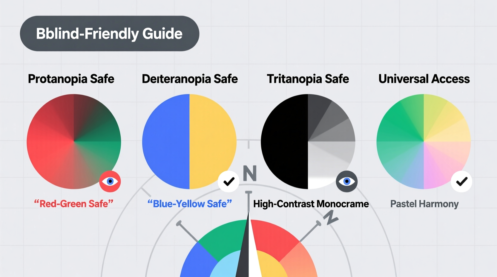
Colorblindness is not a single condition but a spectrum of visual impairments affecting how individuals perceive color. The most common types are red-green deficiencies, including protanopia (reduced sensitivity to red light) and deuteranopia (reduced sensitivity to green light). Less common are blue-yellow deficiencies (tritanopia), and extremely rare is complete monochromacy, where no color is perceived at all.
Designers often assume that avoiding red and green together is enough, but true accessibility requires deeper consideration. For instance, certain shades of pink, orange, and brown may appear nearly identical to someone with deuteranopia. Similarly, pastel blues and purples can blend together for those with tritanopia.
“Accessibility isn’t an afterthought—it’s foundational. When you design for the edges, you improve the experience for everyone.” — Dr. Sarah Kim, Human-Centered Design Researcher
Best Color Combinations for Colorblind Users
Choosing accessible colors doesn’t mean sacrificing aesthetics. With thoughtful pairing, you can create visually appealing designs that work for all viewers. The goal is contrast and distinction—not just in hue, but in brightness and saturation.
Here are proven color combinations that perform well across common forms of colorblindness:
- Blue and Orange: One of the most reliable pairs. High contrast and easily distinguishable by nearly all CVD types.
- Navy and Yellow: Offers strong luminance difference, making it ideal for charts and alerts.
- Teal and Maroon: A sophisticated pair that maintains separation under colorblind simulations.
- Black and Any Bright Color: Classic high-contrast combinations like black text on white or yellow backgrounds remain universally readable.
- Gray and Red: Use only when there's significant brightness contrast; avoid with low-saturation reds.
Practical Checklist for Colorblind-Friendly Design
Follow this checklist to ensure your visuals are inclusive from the start:
- Use tools like Coblis or Color Oracle to simulate how your design appears to different types of colorblindness.
- Avoid relying solely on color to convey meaning (e.g., “Click the red button”).
- Incorporate patterns, textures, or labels in graphs and charts.
- Ensure sufficient luminance contrast between foreground and background elements.
- Test text readability over colored backgrounds using contrast checkers (aim for at least 4.5:1 ratio).
- Use bold or italic styles to differentiate states (e.g., active vs. inactive links).
- Provide alternative indicators such as icons or symbols alongside color cues.
Do’s and Don’ts: Color Use in Practice
| Do’s | Don’ts |
|---|---|
| Use blue and orange in infographics | Use red and green to indicate success/failure without labels |
| Add texture to chart segments | Rely on color alone for navigation cues |
| Label data points directly | Use similar pastel tones next to each other |
| Apply consistent iconography with color | Use low-contrast combinations like beige on light gray |
| Test designs with real users who have CVD | Assume all colorblind people see the same way |
Case Study: Improving a Dashboard for Healthcare Workers
A regional hospital redesigned its patient monitoring dashboard after receiving feedback that nurses were misreading critical alerts. Originally, the system used red for high risk, yellow for moderate, and green for stable. During night shifts, staff with mild deuteranomaly reported difficulty distinguishing between yellow and green indicators, leading to delayed responses.
The design team revised the interface by introducing shape coding: circles for stable, triangles for warning, and diamonds for critical. They changed the palette to deep red, bright orange, and dark blue—colors with greater perceptual separation. Text labels were added inside each status indicator. After implementation, error rates dropped by 67%, and usability scores improved significantly across all user groups, including those without color vision issues.
Step-by-Step Guide to Creating an Accessible Palette
Building a colorblind-friendly design system takes planning. Follow these steps:
- Define your functional color needs: Identify what each color represents (e.g., error, success, neutral).
- Select base hues with high contrast: Start with known safe pairs like blue/orange or black/yellow.
- Adjust brightness and saturation: Use tools like Adobe Color or Coolors to tweak values for maximum distinction.
- Simulate colorblind views: Run your palette through online simulators to verify visibility.
- Add non-color indicators: Integrate icons, borders, or patterns to reinforce meaning.
- Validate with real-world testing: If possible, get feedback from users with diagnosed CVD.
- Document your system: Create a style guide specifying approved combinations and usage rules.
Frequently Asked Questions
Can I still use red and green if they’re bright enough?
You can, but only if they are accompanied by additional signals like text labels, icons, or shape differences. Brightness helps, but many red-green deficient users will still struggle to interpret meaning based on hue alone.
What’s the best way to label a color-coded chart?
Place labels directly on or near the data points instead of using a separate legend. This reduces cognitive load and eliminates the need to constantly cross-reference. In digital formats, consider adding tooltips that appear on hover or tap.
Are there fonts or text styles better suited for colorblind users?
While font choice has less impact than color contrast, highly legible sans-serif fonts like Open Sans or Roboto enhance readability. Use bold or underline styles to emphasize important sections, especially when color cannot be relied upon.
Final Thoughts and Call to Action
Designing for colorblind accessibility is not about limitation—it’s about clarity and inclusion. By choosing thoughtful color combinations, incorporating redundant cues, and validating designs with real-world testing, you create experiences that work for everyone. These practices benefit more than just those with color vision deficiency; they improve usability for aging populations, users in bright sunlight, and anyone navigating complex information under stress.
Start today: audit one of your current projects using a colorblind simulation tool. Replace any ambiguous color-only indicators with multi-modal signals. Share your updated design with a colleague or user group for feedback. Small changes compound into meaningful improvements in accessibility and user satisfaction.


 浙公网安备
33010002000092号
浙公网安备
33010002000092号 浙B2-20120091-4
Comments
No comments yet. Why don't you start the discussion?