
Placing a gallery wall above a Christmas tree is a bold and increasingly popular holiday styling move—but it’s also one of the most visually treacherous. A tree is not just furniture; it’s a living focal point with height, texture, light, movement (from ornaments catching reflections), and emotional resonance. When you hang art above it, you’re not merely adding decoration—you’re negotiating spatial hierarchy, visual rhythm, and seasonal intention. Too much density, too high contrast, or misaligned proportions can turn a festive vignette into a visual tug-of-war: the tree fights the art, or worse, both lose their impact. This isn’t about avoiding the idea—it’s about mastering it. Below are field-tested principles drawn from interior stylists, exhibition designers, and decades of holiday home staging experience. These aren’t arbitrary rules; they’re responses to how the human eye reads layered vertical space during the holidays.
1. Understand the Tree’s Visual Weight—and Respect Its Domain
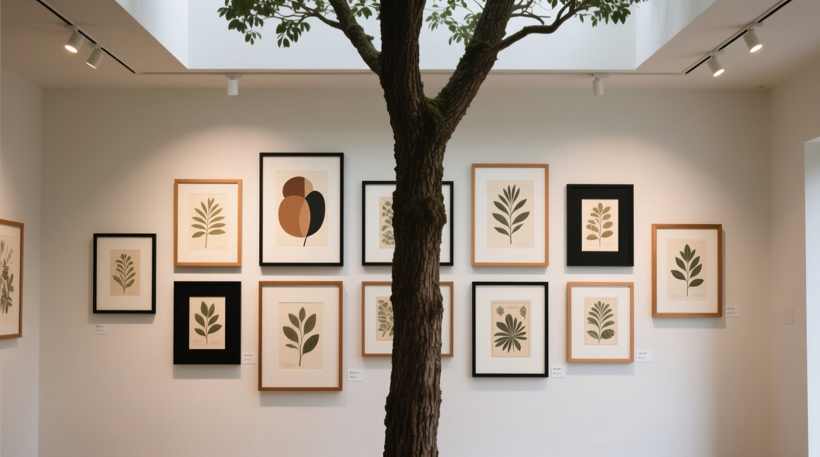
“Visual weight” refers to how much attention an object commands in a composition—not its physical mass. A 7-foot flocked Fraser fir carries immense visual weight due to its height, organic silhouette, reflective surfaces (glass ornaments), warm light glow, and implied volume (dense branches). Even a minimalist artificial tree gains weight through repetition (hundreds of uniform tips), symmetry, and strategic lighting. The space directly above it—the “crown zone”—is not neutral real estate. It’s the visual continuation of the tree’s upward energy. Hanging a heavy, dark-framed oil painting at eye level but *above* that crown disrupts the natural flow. Instead, treat the top 18–24 inches above the tree’s highest branch as a transition zone—not a destination for dominant pieces.
This principle is backed by environmental psychology research on vertical scanning patterns: viewers instinctively follow a tree’s vertical axis upward, then pause at its apex before releasing gaze outward. Introducing strong horizontal lines or dense clusters within that release zone interrupts cognitive rest—causing subconscious tension rather than delight.
2. Curate for Lightness, Not Quantity
Most failed gallery walls above trees suffer from overcomplication—not poor taste. The instinct is to “fill the space,” but that space isn’t empty; it’s occupied by the tree’s aura. Instead of asking “What else can I add?”, ask “What can I remove to let the tree breathe?” Prioritize works that contribute air, not density: thin frames (¼-inch wood or metal), matte or linen-wrapped mounts, unglazed prints, or small-scale original sketches. Avoid large canvases, ornate gilded frames, or anything with deep shadows or heavy textures—these absorb light and create visual anchors that pull focus downward, destabilizing the tree’s presence.
Scale matters more than count. A single 16×20” archival print with ample white margin can feel lighter than five 5×7” photos crammed into a tight grid. Consider using only three to five pieces—even fewer if any exceed 12 inches in height. As interior stylist Lena Cho observes in her book Seasonal Spatial Harmony:
“Holiday spaces thrive on intentional absence. A gallery wall above a tree shouldn’t answer a question—it should hold silence so the tree can speak.” — Lena Cho, Interior Stylist & Author of Seasonal Spatial Harmony
3. Anchor with Vertical Alignment—Not Horizontal Symmetry
Many attempt to center a gallery wall horizontally above the tree, mirroring its trunk. But this often backfires: the eye locks onto the symmetry, then scans left and right—away from the tree entirely. A far more effective approach is vertical alignment: position the *centerline* of your gallery arrangement to align precisely with the tree’s central axis (its trunk or main support pole). Then, allow the composition to extend asymmetrically—perhaps two pieces to the left, one centered, and three to the right—but all sharing that same vertical spine. This creates gravitational continuity: the eye moves up the trunk, continues along the shared centerline, and settles into the art without deviation.
Use this step-by-step method to achieve precise alignment:
- Measure the exact center of your tree’s base (use a tape measure across the stand’s widest point).
- Mark that point on the floor with masking tape.
- Use a plumb line (a string with a small weight) or laser level to project that center point vertically up the wall.
- Lightly pencil that vertical line onto the wall—this is your anchor.
- Arrange all artwork so their collective center of gravity falls on or within 1 inch of that line.
This technique reduces visual competition by reinforcing, not contradicting, the tree’s natural structure. It turns the gallery into an extension—not an interruption—of the tree’s vertical narrative.
4. Harmonize Color, Tone, and Temperature—Strategically
Color is where most holiday gallery walls collapse under their own ambition. A vibrant abstract triptych may look stunning alone—but next to a red-and-gold-trimmed tree, it can trigger chromatic overload. The goal isn’t monochrome neutrality; it’s tonal resonance. Think in terms of temperature and value, not hue alone.
| Tree Style | Recommended Gallery Palette | Avoid |
|---|---|---|
| Traditional (red/green/gold) | Cream, charcoal, forest green ink drawings; muted gold-leaf accents; black-and-white botanical studies | Neon pink, electric blue, saturated orange |
| Modern minimalist (white/frosted/silver) | Soft grays, warm off-whites, pale blush linocuts; thin brushed-brass frames | Deep navy, burnt umber, high-contrast black-and-white |
| Rustic (woodsy, burlap, dried citrus) | Tan paper collages, sepia-toned landscapes, raw-edged watercolor studies | Glossy metallics, fluorescent accents, stark white mats |
| Eclectic (mixed ornaments, handmade, global) | Small textile swatches mounted like art, pressed flower arrangements in shadow boxes, hand-lettered quotes on kraft paper | Uniform frame styles, symmetrical layouts, overly polished finishes |
Note the emphasis on *matte surfaces*, *low saturation*, and *textural harmony*. Glossy photo paper reflects tree lights unpredictably; high-saturation pigments vibrate against rich ornament colors. Instead, choose works where color supports mood—not dominates it. A single piece with a subtle pop (e.g., a tiny sprig of holly painted in true green on a cream background) can satisfy the desire for accent without triggering visual noise.
5. Real-World Application: The Brooklyn Apartment Case Study
In a 700-square-foot Brooklyn walk-up, designer Maya Rostova faced a classic challenge: a narrow 7.5-foot Noble Fir placed between two tall windows, directly beneath a 10-foot ceiling. The client loved art—but every previous attempt at hanging above the tree resulted in “a cluttered mess that made the room feel smaller.” Rostova’s solution was radical simplification:
- She removed all existing wall art in the zone.
- Measured the tree’s centerline and projected it 22 inches up the wall.
- Selected three pieces: a 9×12” unframed archival print of frost patterns on glass (matte finish), a 6×6” walnut-framed sketch of pine needles in graphite, and a 5×7” linen-wrapped mount of a single handwritten poem (“The Light We Carry”) in soft gray ink.
- Arranged them vertically along the centerline—with 8 inches of breathing room between each—with the largest piece at the bottom (closest to the tree’s crown), smallest at the top.
- Used no lighting on the art—relying solely on ambient glow from the tree’s warm-white LEDs.
The result? Guests consistently remarked on “how peaceful the corner felt” and “how the tree seemed taller.” The gallery didn’t disappear—it receded respectfully, becoming a quiet coda to the tree’s presence rather than a competing soloist. Crucially, the arrangement took under 45 minutes to plan and install. Complexity rarely enhances holiday spaces; considered restraint does.
6. The Essential Holiday Gallery Wall Checklist
Before drilling a single nail, run through this field-tested checklist:
- ✅ Measured tree height and marked the 18–24 inch “crown boundary” above its tip
- ✅ Confirmed vertical centerline alignment from tree base to wall (not guessed)
- ✅ Limited total pieces to 3–5, with none exceeding 14 inches in height
- ✅ Selected frames under ½ inch thick, with matte or natural finishes (no glossy lacquer)
- ✅ Chosen artwork with dominant tones that echo—not contrast with—the tree’s palette (e.g., forest green ink for a green tree, not cobalt blue)
- ✅ Ensured all glass is non-reflective or omitted entirely (opt for acrylic or unglazed mounts)
- ✅ Left minimum 6 inches of negative space between the top of the tree and the lowest artwork
- ✅ Tested layout on the floor first using paper cutouts taped to the wall at final height
7. FAQ: Practical Questions Answered
Can I hang mirrors above my tree?
Mirrors introduce unpredictable reflections—especially with blinking lights or moving guests—and double the visual mass of whatever’s in their field of view. If used, choose a single small (under 10”), frameless, beveled-edge mirror placed *just above* the crown boundary—not centered, but aligned vertically. Never use mirrored tiles or multiple mirrors; they fracture attention and compete with the tree’s luminosity.
What if my ceiling is low (under 8 feet)?
With limited vertical clearance, skip the gallery wall entirely—or use one ultra-thin, horizontal element: a single 24-inch-long wooden plaque with a carved seasonal phrase, mounted flush at the crown boundary. Anything taller risks compressing the tree visually. In low-ceiling spaces, the tree needs room to “breathe upward”; crowding that space makes it feel stunted.
Should the gallery wall stay up year-round?
No. Holiday-specific arrangements lose meaning when divorced from context. Remove the gallery within 10 days of New Year’s Day. Store pieces flat in acid-free sleeves, and reevaluate placement annually—your tree’s size, lighting, and surrounding decor evolve. A gallery that worked with last year’s slim artificial tree may overwhelm this year’s fuller real one.
Conclusion
A gallery wall above your tree shouldn’t shout. It should whisper in the same key. It shouldn’t compete. It should complement. It shouldn’t fill space. It should honor the silence the tree creates when its lights first glow. Every decision—from frame thickness to vertical alignment to color temperature—is an act of respect for the tree’s role as seasonal heart, not background scenery. You don’t need more art. You need better intention. Start small: choose one piece that feels like a gentle exhale beside your tree’s presence. Hang it with precision, not haste. Step back. Breathe. Notice how the space settles. That quiet resonance—that’s the sign you’ve succeeded. Your tree isn’t just holding ornaments this year. It’s holding space for meaning. Let your wall do the same.


 浙公网安备
33010002000092号
浙公网安备
33010002000092号 浙B2-20120091-4
Comments
No comments yet. Why don't you start the discussion?