
Creating a cohesive and visually stunning holiday lighting display begins with one often-overlooked detail: color balance. Many homeowners purchase multiple sets of Christmas lights over the years or from different brands, only to discover that once lit, the bulbs emit slightly different tones—some appearing too warm, others too cool. This inconsistency can disrupt the harmony of your display, making it look mismatched or amateurish. The solution lies in calibrating the color balance across all light sets so they blend seamlessly into a unified glow. Whether you're decorating a porch, wrapping trees, or outlining your roofline, achieving consistent color temperature and brightness ensures a polished, professional result.
Understanding Color Temperature in LED Lighting
Before adjusting any lights, it's essential to understand what drives color variation. The key factor is color temperature, measured in Kelvins (K). For Christmas lights, common ranges include:
- Warm White (2700K–3000K): Mimics traditional incandescent bulbs, offering a cozy, golden glow.
- Natural White (3500K–4100K): A balanced, neutral tone often used for modern displays.
- Cool White (5000K–6500K): Crisp and bluish-white, resembling daylight; can appear harsh if mixed with warmer tones.
Differences in manufacturing, age, and brand can cause even “warm white” lights from two sets to emit noticeably different hues. One may lean yellow, another slightly pink or green. This discrepancy becomes glaring when lights are placed side by side. Calibration isn't just about matching brightness—it's about aligning the spectral output so the eye perceives uniformity.
“Even small differences in color temperature—just 200K—can be detected by the human eye when lights are adjacent,” says Dr. Lena Pruitt, lighting design researcher at the Institute for Environmental Aesthetics. “Harmony matters more than absolute precision.”
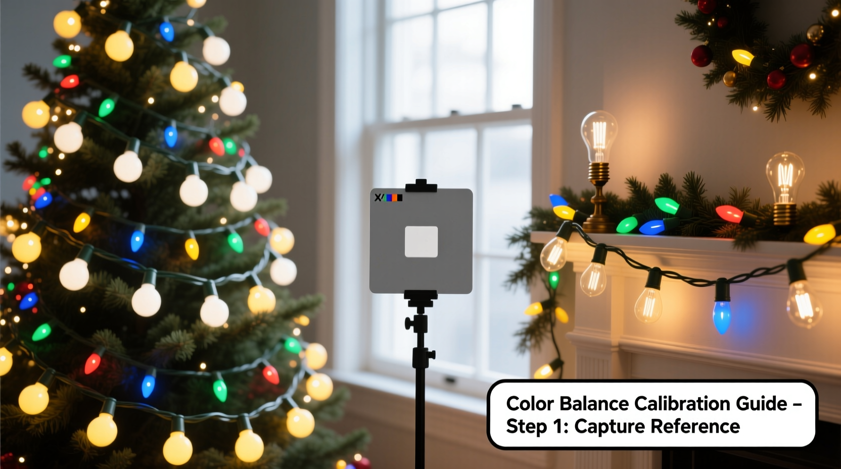
Step-by-Step Guide to Calibrating Color Balance
Follow this practical process to harmonize your Christmas light sets before installation.
- Gather all light sets you plan to use. Unpack them completely and inspect for damage or flickering.
- Power each set individually in a dark room during evening hours. Avoid natural light interference.
- Observe each set’s emitted tone against a neutral backdrop (white wall or sheet). Note whether it appears warm, cool, or tinted (e.g., greenish).
- Group lights by visual similarity. Place sets that look nearly identical together. Discard or replace those with obvious discoloration or aging.
- Use a digital color meter or smartphone app (such as Luxi or SpectraCal) to measure Kelvin values if available. This adds objectivity to subjective perception.
- Test combinations by placing two different sets side by side. Look for blending quality from a typical viewing distance (10–15 feet).
- Adjust placement strategically. If perfect match isn’t possible, position dissimilar sets in separate zones (e.g., roof vs. tree) to minimize contrast.
Tools and Techniques for Fine-Tuning Appearance
While you can’t change the inherent color temperature of most non-smart LEDs, several techniques help bridge the gap between mismatched sets.
Using Diffusion Materials
Sheer white fabric, frosted plastic sleeves, or nylon stockings stretched over strands can soften and scatter light, reducing perceived color differences. This method works best outdoors where airflow prevents overheating.
Applying Gel Filters (Temporary Fix)
Theatrical lighting gels—available in amber, blue, or CTB (color temperature blue)—can be wrapped around sections of cooler or warmer lights to bring them closer in tone. Secure with zip ties or adhesive clips. While not permanent, this technique is useful for seasonal setups.
Leveraging Smart LED Technology
If using RGB or tunable white smart lights (like Philips Hue or Govee), calibration becomes precise. Use the companion app to set exact color temperatures across devices. For example, assign all strands to 2850K for a uniform warm white. You can also create custom scenes that blend fixed-color strings with adjustable ones for seamless integration.
Strategic Layering and Spacing
Physically interweaving two similar-but-not-identical sets can trick the eye into averaging their colors. When warm and slightly cool whites are tightly bundled, the brain perceives a middle-ground tone. Maintain at least six inches between distinct groupings to avoid jarring transitions.
| Method | Effectiveness | Best For | Limitations |
|---|---|---|---|
| Visual grouping | High | All users | Subjective; requires good eyesight |
| Color meter apps | Moderate-High | Tech-savvy decorators | Smartphone sensors vary in accuracy |
| Diffusion materials | Moderate | Outdoor displays | May reduce brightness; weather-sensitive |
| Gel filters | Moderate | Short-term fixes | UV degradation; fire risk if near heat |
| Smart LED tuning | Very High | Modern installations | Higher cost; learning curve |
Real-World Example: Matching Vintage and New Lights
Consider Sarah, a homeowner in Portland who inherited her mother’s vintage warm white mini-lights—cherished but now discontinued. She bought new “warm white” C7 bulbs online, only to find the new set had a greenish cast compared to the original’s golden hue. Instead of replacing everything, she tested both under her garage eaves at dusk. Using a color meter app, she confirmed the old lights ran at 2700K while the new ones were 3100K with a slight green spike.
Sarah decided to relegate the newer bulbs to less visible areas—the backyard fence—while reserving the heirloom-quality lights for the front porch. For future purchases, she noted the exact model number and manufacturer of the older strand and searched for current equivalents using forums like Holiday Forums and Reddit’s r/ChristmasLights. She eventually found a close match from a specialty supplier and now stores all cords labeled by batch and year.
Her strategy? Prioritize emotional value and visibility when assigning strands, then supplement with calibrated replacements. Her display now looks intentional and nostalgic—not haphazard.
Checklist: Pre-Installation Calibration Routine
Use this checklist every season before hanging your lights:
- ✅ Unpack and power on all intended light sets
- ✅ Inspect for burnt-out sections or inconsistent brightness
- ✅ Group sets by visual warmth/coolness in low ambient light
- ✅ Measure color temperature if using a meter or app
- ✅ Test side-by-side pairings at typical viewing distance
- ✅ Replace or isolate mismatched sets
- ✅ Plan layout based on color groups (e.g., warm on house, cool on trees)
- ✅ Label storage bins by color type and location used
Frequently Asked Questions
Can I mix LED and incandescent Christmas lights?
You can, but expect noticeable differences. Incandescents naturally emit a warmer, fuller spectrum (around 2700K) with excellent color rendering. Most LEDs, especially budget ones, have narrower spectral peaks and may lack reds or deepen greens. Mixing them often results in an uneven appearance. If combining is necessary, place them far apart or use diffusers to blur distinctions.
Why do two “warm white” light sets look different?
Manufacturers define “warm white” loosely. One brand might label 2800K as warm, another uses 3200K. Additionally, phosphor coatings in LEDs degrade differently over time, causing older sets to shift toward blue or pink. Batch variations and raw material sourcing also contribute. Always test visually rather than relying on packaging labels.
Do smart lights solve color balance issues?
Yes, significantly. Tunable white smart LEDs allow you to dial in exact Kelvin values across all connected strips. Some systems even support scene syncing, so every device emits the same calibrated white. However, ensure all models in your setup support the same temperature range—entry-level bulbs may only go down to 2200K or up to 6500K, limiting flexibility.
Expert Insight: The Psychology of Light Harmony
Consistent lighting does more than please the eye—it influences mood and perception. According to environmental psychologist Dr. Marcus Tran, “Uniform lighting signals intentionality and care. Viewers subconsciously associate harmonious displays with stability and thoughtfulness.” In contrast, erratic color shifts suggest disorganization, which can detract from festive joy. “When lights flow smoothly from one area to the next,” he adds, “it creates a sense of rhythm and calm—key elements in holiday well-being.”
“People don’t just see your lights—they feel them. A balanced display doesn’t shout; it welcomes.” — Dr. Marcus Tran, Environmental Psychologist
Final Thoughts and Call to Action
Calibrating color balance across Christmas lights may seem meticulous, but the payoff is undeniable: a display that feels intentional, elegant, and joyful. It transforms decoration from mere illumination into storytelling. By understanding color temperature, testing before installing, and applying simple correction methods, you can unify disparate sets into a single radiant vision.
This holiday season, take an extra evening to assess your lights not just for function—but for harmony. Match, adjust, and organize with purpose. Your neighbors will notice. More importantly, you’ll enjoy a display that reflects true craftsmanship.


 浙公网安备
33010002000092号
浙公网安备
33010002000092号 浙B2-20120091-4
Comments
No comments yet. Why don't you start the discussion?