
Accurate color representation on your monitor is essential whether you're editing photos, designing graphics, or simply want to enjoy true-to-life visuals. While professional calibration devices can cost hundreds of dollars, most users don’t need that level of precision — especially when effective alternatives exist. With the right techniques and a bit of patience, you can achieve reliable color accuracy using only what’s already at your disposal: your eyes, operating system tools, and free online resources.
The goal isn't perfection in a scientific sense, but consistency and realism across viewing conditions. This guide walks through practical, no-cost methods to bring your display closer to standard color behavior, ensuring that what you see reflects real-world tones as closely as possible without breaking the bank.
Why Monitor Calibration Matters
Every monitor displays colors differently out of the box. Manufacturers often prioritize brightness and vibrancy over accuracy to make products stand out in retail settings. This leads to oversaturated reds, exaggerated contrasts, and overly cool (blue-tinted) whites — all of which distort your perception of color.
Without calibration, a photo edited on your screen may look drastically different when viewed on another device. A designer might choose a shade that appears neutral on their monitor but looks yellowish elsewhere. Even casual users benefit from better color balance, as it reduces eye strain and improves visual comfort during long sessions.
“Color accuracy starts with a properly tuned display. You can’t trust your edits if your canvas lies to you.” — Daniel Kim, Digital Imaging Specialist
Professional-grade hardware calibrators like the X-Rite i1Display Pro or Datacolor SpyderX deliver precise results by measuring emitted light and generating custom ICC profiles. But for many creatives and home users, software-based adjustments combined with careful observation offer more than enough improvement over factory defaults.
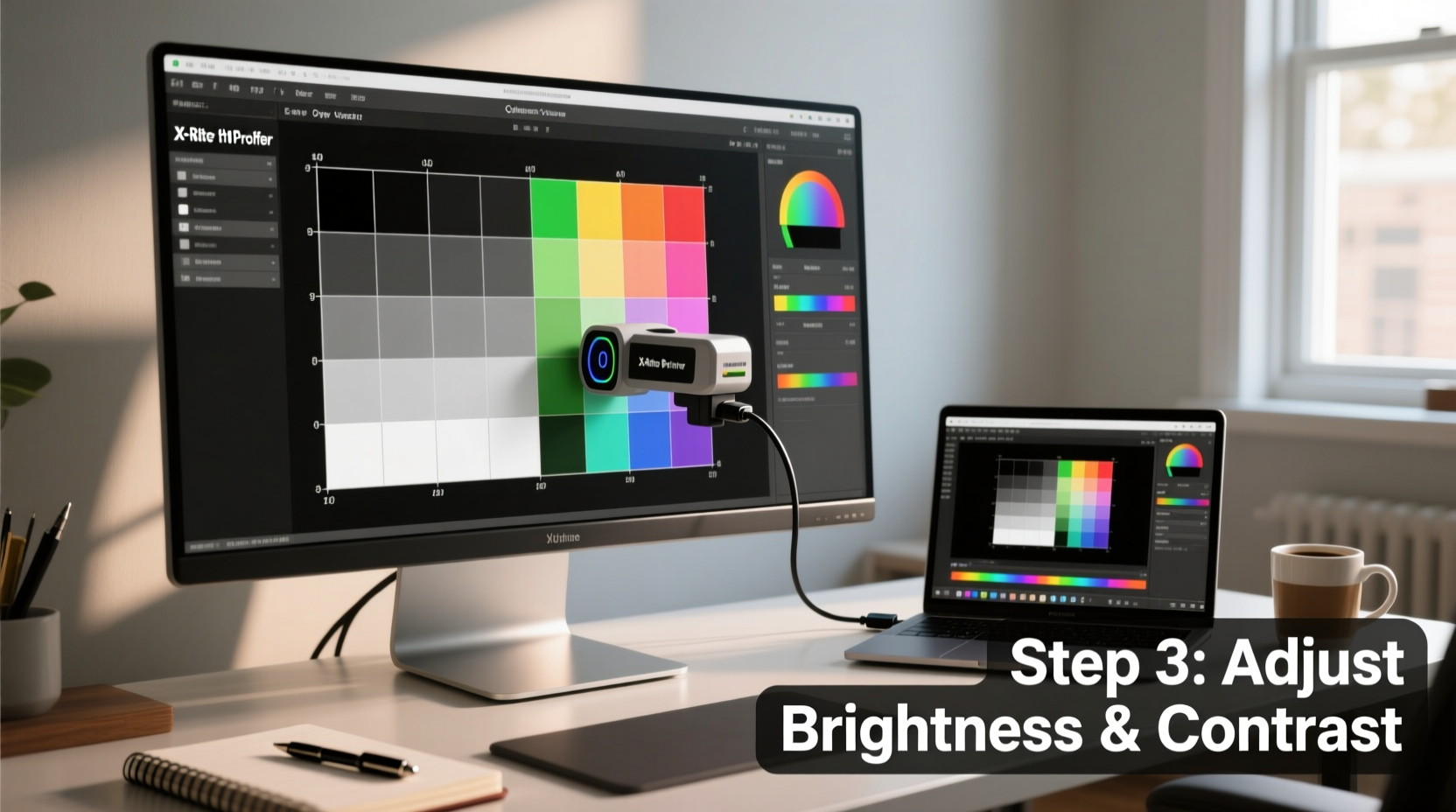
Step-by-Step Guide to Software-Based Calibration
You don’t need specialized equipment to begin improving your monitor’s color output. Follow this structured process to manually tune brightness, contrast, gamma, and white balance using only free tools and built-in features.
- Prepare Your Environment: Turn off bright lights and avoid direct sunlight hitting the screen. Let your monitor warm up for at least 30 minutes to stabilize its output.
- Reset to Factory Settings: Enter your monitor’s OSD (On-Screen Display) menu and reset all image settings to default. Disable any dynamic contrast, eco-modes, or “vivid” presets.
- Set Native Resolution: Ensure your display runs at its native resolution. For most modern monitors, this will be 1920x1080, 2560x1440, or 3840x2160 depending on size and panel type.
- Select Correct Color Temperature: In the monitor menu, set the color temperature to 6500K (D65), which is the standard daylight reference point used in photography and design.
- Adjust Brightness and Contrast via Test Images: Use online test patterns such as those from Lagom.nl or EIZO’s monitor test site.
Calibrating Brightness & Contrast
Brightness controls black levels; contrast affects white intensity. Misconfigured values lead to crushed shadows or blown-out highlights.
Navigate to a brightness test pattern showing a gradient from black to slightly above black with faint gray boxes. Lower the brightness until the darkest box is just barely visible. If all boxes disappear, it's too low. If you see them clearly, it's too high.
For contrast, use a white saturation test. Increase contrast until white areas remain clean and detailed — stop just before they \"glow\" or bleed into surrounding pixels.
Tuning Gamma and Color Balance
Gamma determines midtone luminance. Most content assumes a gamma of 2.2, common for Windows and general use. Macs traditionally use 2.4, though recent versions align closer to 2.2.
Visit a gamma correction chart where a gray square overlays a black-and-white checkerboard. Adjust your monitor’s gamma setting (if available) so the gray blends seamlessly with the background. If no gamma control exists, rely on OS-level calibration later.
Next, assess red, green, and blue balance using grayscale ramps. These show smooth transitions from black to white using only one channel at a time. Ideally, each ramp should appear uniform without tint shifts. Use your monitor’s RGB gain controls to minimize obvious color casts in neutral grays.
Using Built-In Operating System Tools
All major operating systems include basic calibration assistants. These walk you through adjusting gamma, brightness, contrast, and color balance interactively.
Windows Display Color Calibration
Press Win + S, type “calibrate,” and select Calibrate display color. The wizard guides you through:
- Setting gamma using an interactive target
- Adjusting brightness and contrast with test panels
- Selecting the best-looking grayscale image to correct color balance
Upon completion, Windows creates an ICC profile stored in C:\\Windows\\System32\\spool\\drivers\\color, applying your preferences automatically.
macOS Display Calibrator Assistant
Go to System Settings > Displays > Color Profile > Calibrate. Choose “Expert Mode” for granular control over:
- White point (select D65 for standard)
- Gamma (choose 2.2 for cross-platform consistency)
- Target luminance and color sliders for fine-tuning
After calibration, assign a descriptive name and let macOS apply the new profile system-wide.
Linux (GNOME/KDE)
Most Linux desktop environments support color management via colord and Argyll CMS. Install gnome-color-manager or kded-color, then follow prompts to run visual calibration routines similar to Windows.
Note: Manual ICC profile installation is supported in advanced settings for users who generate profiles externally.
Free Online Calibration Tools and Resources
A variety of web-based tools help refine your settings without downloads or installations. These are particularly useful for quick checks or secondary monitors.
| Tool | Purpose | Access Method |
|---|---|---|
| Lagom LCD Monitor Test Pages | Brightness, contrast, response time, gamma tests | Visit lagom.nl/lcd-test |
| EIZO Monitor Test | Color uniformity, sharpness, viewing angle checks | eizo.com/support/monitor-test |
| Normlicht.de Calibration Tool | Interactive grayscale and color balance adjustment | normlicht.de |
| Online Monitor Test (online-monitor-test.com) | Comprehensive suite including dead pixel and color blindness tests | online-monitor-test.com |
These sites work best on browsers that support sRGB consistently, such as Chrome or Firefox. Avoid Safari on non-Apple displays due to aggressive color management overrides.
Real-World Example: A Photographer’s Workflow Without Hardware
Sophie Reyes, a freelance travel photographer based in Portland, works primarily on a five-year-old IPS laptop display. She doesn’t own a colorimeter but needed consistent results for client deliverables.
Her routine includes:
- Daily use of the Windows calibration tool after resetting her display monthly
- Viewing standardized test images from Adobe’s grayscale series to verify neutrality
- Cross-checking critical edits on her calibrated iPad (which uses True Tone but allows manual profile application)
- Exporting JPEGs with embedded sRGB profiles to ensure predictable rendering online
She reports that clients rarely request adjustments due to color mismatches. “It’s not lab-grade,” she says, “but it’s close enough that I save money and still deliver quality work.”
Checklist: Monitor Calibration Without Expensive Tools
Follow this checklist to systematically improve your monitor’s color fidelity:
- ✅ Warm up the monitor for 30+ minutes
- ✅ Work in a dim, neutral-light environment
- ✅ Reset monitor settings to default
- ✅ Set color temperature to 6500K (D65)
- ✅ Use test images to adjust brightness and contrast
- ✅ Calibrate gamma visually using overlay patterns
- ✅ Fine-tune RGB gains for neutral grays
- ✅ Run OS calibration utility (Windows/macOS/Linux)
- ✅ Save and label the resulting ICC profile
- ✅ Periodically recheck settings every 4–6 weeks
This process takes about 20–30 minutes initially and becomes faster with repetition.
Common Mistakes to Avoid
Even well-intentioned users fall into traps that undermine calibration efforts. Be mindful of these pitfalls:
- Ignoring ambient lighting: Overhead fluorescents or warm lamps skew perceived color. Use neutral white LED lighting around 5000K if room light is necessary.
- Trusting default “sRGB” modes: Many monitors’ sRGB modes still boost saturation or sharpen edges. Verify behavior with test patterns.
- Over-relying on automatic modes: Features like adaptive brightness or dynamic contrast constantly shift output, negating manual tuning.
- Not checking multiple devices: Compare your adjusted screen against a known-good reference (e.g., smartphone with factory calibration) to validate results.
“Your eyes adapt quickly — what looks ‘normal’ today might be wildly inaccurate tomorrow without regular checks.” — Dr. Lena Patel, Vision Scientist
Frequently Asked Questions
Can I calibrate a laptop screen effectively?
Yes, though limitations exist. Laptop displays often have narrower color gamuts and poor viewing angles. Use the same principles: adjust internal settings via function keys or software, then apply OS-level calibration. Keep in mind that glossy screens reflect ambient light, affecting perceived color.
How often should I recalibrate?
Every 4 to 6 weeks under regular use. LCD backlights degrade slowly over time, shifting brightness and color balance. Heavy users (e.g., designers, editors) may prefer monthly checks. Re-calibrate immediately after changing workspace lighting.
Do free tools match hardware calibrators?
No, but they come surprisingly close for everyday needs. Hardware devices measure actual light output and create highly accurate profiles. Free methods rely on subjective judgment, making them less repeatable. However, for social media sharing, web design, or personal photo editing, the difference is often imperceptible.
Conclusion: Take Control of Your Visual Accuracy
Accurate colors don’t require expensive gear. By understanding your display’s behavior and leveraging freely available tools, you can significantly improve color fidelity and visual consistency. The key is discipline: taking the time to set things right, avoiding shortcuts, and maintaining your setup over time.
Start today by running through the step-by-step guide, saving your custom profile, and making calibration part of your seasonal maintenance routine. Whether you’re crafting digital art, retouching memories, or simply enjoying movies as intended, a well-tuned monitor enhances every pixel you see.


 浙公网安备
33010002000092号
浙公网安备
33010002000092号 浙B2-20120091-4
Comments
No comments yet. Why don't you start the discussion?