
Selecting the right finish for your photographic wall art is more than a matter of personal taste—it directly impacts how your image appears in a space, how it ages over time, and how it interacts with light and surroundings. Matte and glossy finishes each offer distinct advantages and drawbacks, and understanding their differences allows you to make a decision that enhances both the artwork and the environment it occupies. Whether you're framing a family portrait, a landscape shot, or modern abstract photography, the surface texture of the print plays a critical role in its final presentation.
Understanding Matte and Glossy Finishes
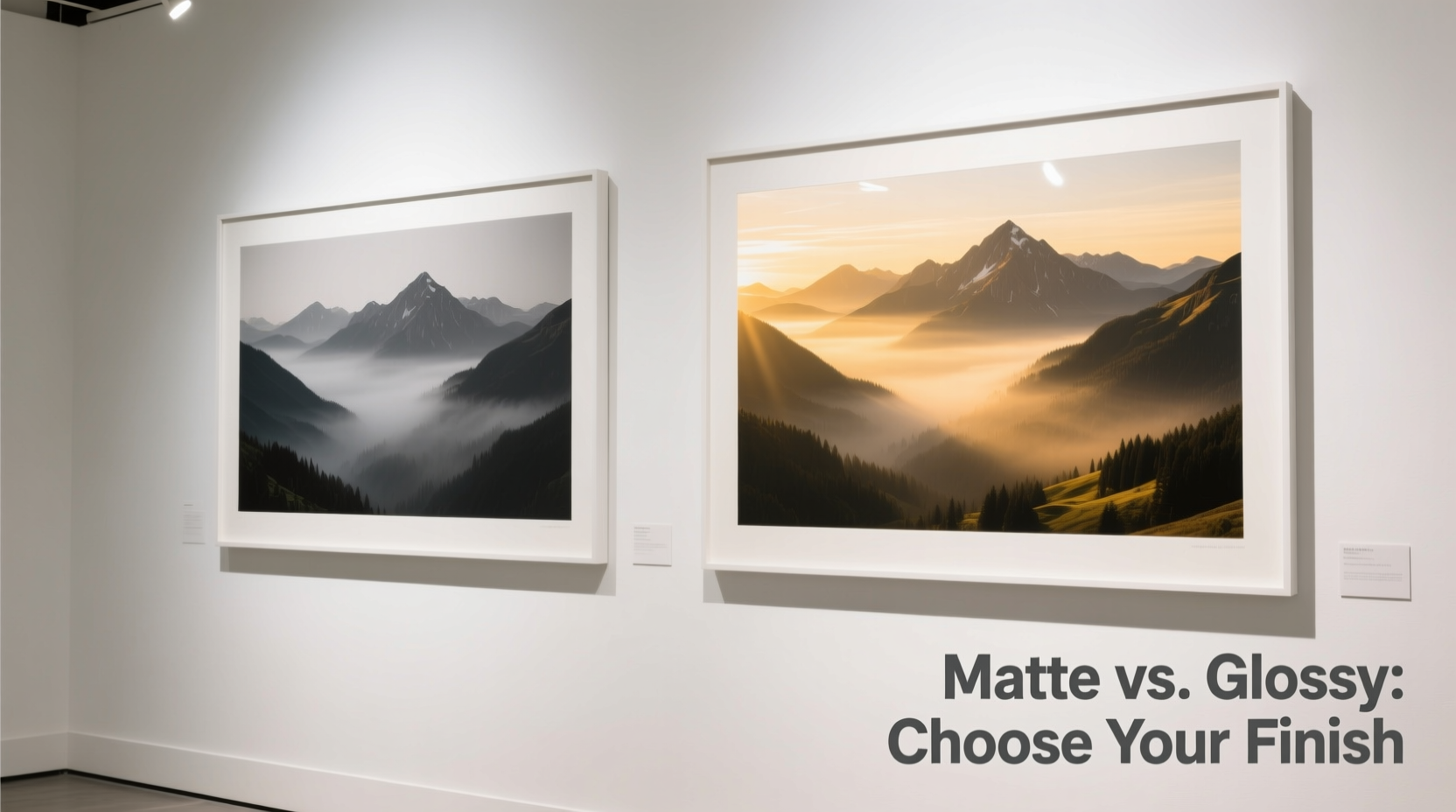
A photo’s finish refers to the texture and reflectivity of the surface coating applied during printing. This layer protects the ink and defines how light interacts with the image. The two most common options—matte and glossy—create very different visual experiences.
Matte finish features a non-reflective, flat surface. It scatters ambient light rather than reflecting it directly, which reduces glare and makes viewing from multiple angles easier. This finish often gives photos a softer, more subdued appearance, with slightly muted colors and lower contrast. Because of its low sheen, matte is frequently associated with fine art prints and gallery-style presentations.
Glossy finish, by contrast, has a high-shine surface that reflects light like glass. This reflective quality intensifies color saturation and deepens blacks, making images appear sharper and more vibrant. However, this same reflectivity can cause glare under bright lighting or when positioned opposite windows, potentially distracting from the image itself.
How Lighting Affects Your Choice
One of the most decisive factors in choosing between matte and glossy is the lighting in the room where the artwork will hang. Natural and artificial light interact differently with each finish, altering the perceived clarity, tone, and emotional impact of the photograph.
In rooms with abundant natural light—such as living rooms with large windows or sunrooms—glossy finishes can become problematic. Direct sunlight creates hotspots and mirror-like reflections, making parts of the image unreadable depending on the viewer’s position. This issue is especially pronounced during midday or in west-facing rooms exposed to afternoon sun.
Matte finishes excel in these conditions. Their diffuse surface minimizes glare, allowing consistent visibility regardless of light angle. This makes matte ideal for spaces designed for relaxation or conversation, where viewers move around frequently and appreciate unobstructed viewing.
Conversely, in dimly lit areas such as hallways, basements, or accent walls with focused track lighting, glossy finishes come into their own. Directed light enhances the depth and vibrancy of the image without causing widespread reflection. In such settings, a glossy print can become a luminous focal point, drawing attention with its jewel-like quality.
“Lighting isn’t just about visibility—it shapes mood. A glossy finish under warm spotlighting can evoke drama; matte in soft daylight feels intimate and authentic.” — Lena Torres, Interior Visual Consultant
Matching Finish to Room Style and Decor
The aesthetic of your space should guide your finish choice as much as technical considerations. Different finishes complement various interior design styles and contribute to the overall atmosphere of a room.
- Modern and minimalist interiors: Glossy finishes align well with sleek, contemporary designs. Their polished look echoes the clean lines and reflective surfaces found in chrome, glass, and lacquered furniture.
- Traditional or rustic spaces: Matte finishes tend to feel more organic and timeless, pairing naturally with wood tones, textured walls, and vintage decor.
- Gallery walls or mixed-media displays: For collections featuring multiple frames and media types, matte provides visual consistency. Its uniform surface prevents one piece from appearing overly shiny compared to others.
- Commercial or professional environments: Offices and lobbies often favor matte for its professional, understated elegance and reduced glare under fluorescent lighting.
Consider also the emotional tone you wish to convey. A glossy wedding portrait might emphasize joy and celebration through vivid colors, while a matte black-and-white cityscape could evoke nostalgia and quiet contemplation.
Practical Differences: Durability and Maintenance
Beyond aesthetics, practical concerns such as fingerprint resistance, scratch tolerance, and ease of cleaning vary significantly between finishes.
| Feature | Matte Finish | Glossy Finish |
|---|---|---|
| Glare Resistance | High – ideal for bright rooms | Low – prone to reflections |
| Color Vibrancy | Muted – softer tones | High – rich, saturated colors |
| Fingerprint Visibility | Low – less likely to show smudges | High – shows oils easily |
| Scratch Resistance | Moderate – surface can scuff | Lower – scratches are highly visible |
| Cleaning Ease | Easier – less sensitive to wiping | Harder – requires careful handling |
Glossy prints demand more careful handling during installation and cleaning. Even clean fingers can leave marks on the smooth surface, requiring microfiber cloths and specialized cleaners. Matte, while not immune to damage, hides fingerprints and minor abrasions better, making it a low-maintenance option for high-traffic areas like hallways or children’s rooms.
For long-term preservation, both finishes benefit from UV-protective glass or acrylic when framed. However, matte prints are generally less susceptible to environmental degradation because they don’t attract dust and static as readily as glossy surfaces.
Step-by-Step Guide to Choosing the Right Finish
Follow this structured approach to confidently select between matte and glossy for your wall art:
- Assess the lighting in the room. Spend time observing how light moves throughout the day. Note direct sunlight, overhead fixtures, and accent lights.
- Determine the primary viewing distance. Close-up art (within 3 feet) benefits from glossy detail; distant pieces may lose vibrancy and instead suffer from glare.
- Consider the room’s function. Is it a calm bedroom, an active family room, or a formal dining area? Match the finish to the energy of the space.
- Hold sample prints under similar lighting. Print small test versions or request physical samples from your printer to compare side by side.
- Evaluate the image content. High-contrast scenes, portraits, and colorful subjects often gain impact from glossy. Subtle gradients, monochrome work, or atmospheric shots suit matte better.
- Think long-term. Will the frame be touched often? Is the location dusty or humid? Prioritize durability if needed.
- Align with your decor style. Choose the finish that harmonizes with existing materials, colors, and textures in the room.
Real-World Example: A Living Room Transformation
Sarah, a homeowner in Portland, wanted to display a series of travel photographs above her sofa. The room receives strong morning light from east-facing windows and features neutral walls with walnut furniture and woven textiles. Initially drawn to glossy for its “professional” look, she ordered two versions of her favorite image—one matte, one glossy—for testing.
When hung in place, the glossy version created a glaring hotspot at 10 a.m., obscuring details in the sky of her mountain photo. The matte version, though slightly less vibrant up close, remained clear and inviting from all angles. It also blended more naturally with the earthy tones of the room. After a week of observation, Sarah chose matte for all eight prints in her gallery wall. The final result felt cohesive, serene, and true to the memories she wanted to preserve.
Expert Recommendations and Common Misconceptions
Many assume glossy is inherently “higher quality” because of its sharpness and shine. In reality, finish choice is contextual. Professional photographers and framers often prefer matte for exhibitions precisely because it eliminates distractions and focuses attention on composition and tone.
Likewise, some believe matte prints look “flat” or “low-resolution.” While early inkjet technology sometimes produced dull results on matte paper, modern archival pigment inks and premium fine art papers deliver exceptional depth and tonal range—even without gloss.
“Choosing glossy just because it looks flashy in a store under perfect lights is a common mistake. Real-world performance matters more.” — James Reed, Master Printer at Lumina Editions
FAQ
Can I mix matte and glossy finishes in the same room?
Yes, but do so intentionally. Mixing finishes can create visual tension unless balanced thoughtfully. For example, use glossy for a single statement piece surrounded by matte works to draw focus. Avoid random mixing, which can appear disorganized.
Does the type of frame affect the finish choice?
Indirectly, yes. A thick, ornate frame draws attention to the entire piece, reducing the prominence of surface shine. A thin, modern frame or float mount emphasizes the print itself, making finish characteristics more noticeable. UV-protective glazing is recommended for both finishes, especially in sunny rooms.
Is one finish better for black-and-white photography?
Matte is traditionally favored for black-and-white images due to its soft tonal transitions and lack of glare, which supports a classic, timeless feel. However, glossy can enhance dramatic contrasts in noir-style or high-key portraits. Test both to see which complements your image’s mood.
Final Checklist Before You Decide
- ✅ I’ve observed the lighting in the room at different times of day.
- ✅ I’ve considered who will view the art and from what distance.
- ✅ I’ve tested sample prints in the actual space if possible.
- ✅ I’ve evaluated how the finish matches my room’s decor and atmosphere.
- ✅ I’ve thought about long-term maintenance and handling.
- ✅ I’ve prioritized image integrity over temporary visual appeal.
Conclusion
Choosing between matte and glossy photo finishes isn’t about finding a universal “best”—it’s about alignment. The right finish harmonizes with your space, honors the intent of the photograph, and withstands the realities of daily life. Matte offers subtlety, flexibility, and resilience, making it ideal for most home environments. Glossy delivers intensity and precision, best suited for controlled lighting and bold visual statements. By considering light, room style, durability, and personal goals, you ensure your wall art doesn’t just look good today—but continues to inspire for years to come.


 浙公网安备
33010002000092号
浙公网安备
33010002000092号 浙B2-20120091-4
Comments
No comments yet. Why don't you start the discussion?