
Selecting the perfect finish for your photo prints is more than an aesthetic decision—it directly impacts how your artwork interacts with light, space, and time. Whether you're curating a gallery wall in your living room or framing a cherished family portrait for the hallway, the choice between matte and glossy finishes can make or break the visual experience. While both options have their strengths, understanding their differences in texture, reflection, color vibrancy, and maintenance will help you match the print to its environment and purpose.
Understanding Matte and Glossy Finishes
At first glance, the difference between matte and glossy photo prints may seem purely visual. But the distinction runs deeper than surface shine—it affects readability, longevity, and even emotional tone.
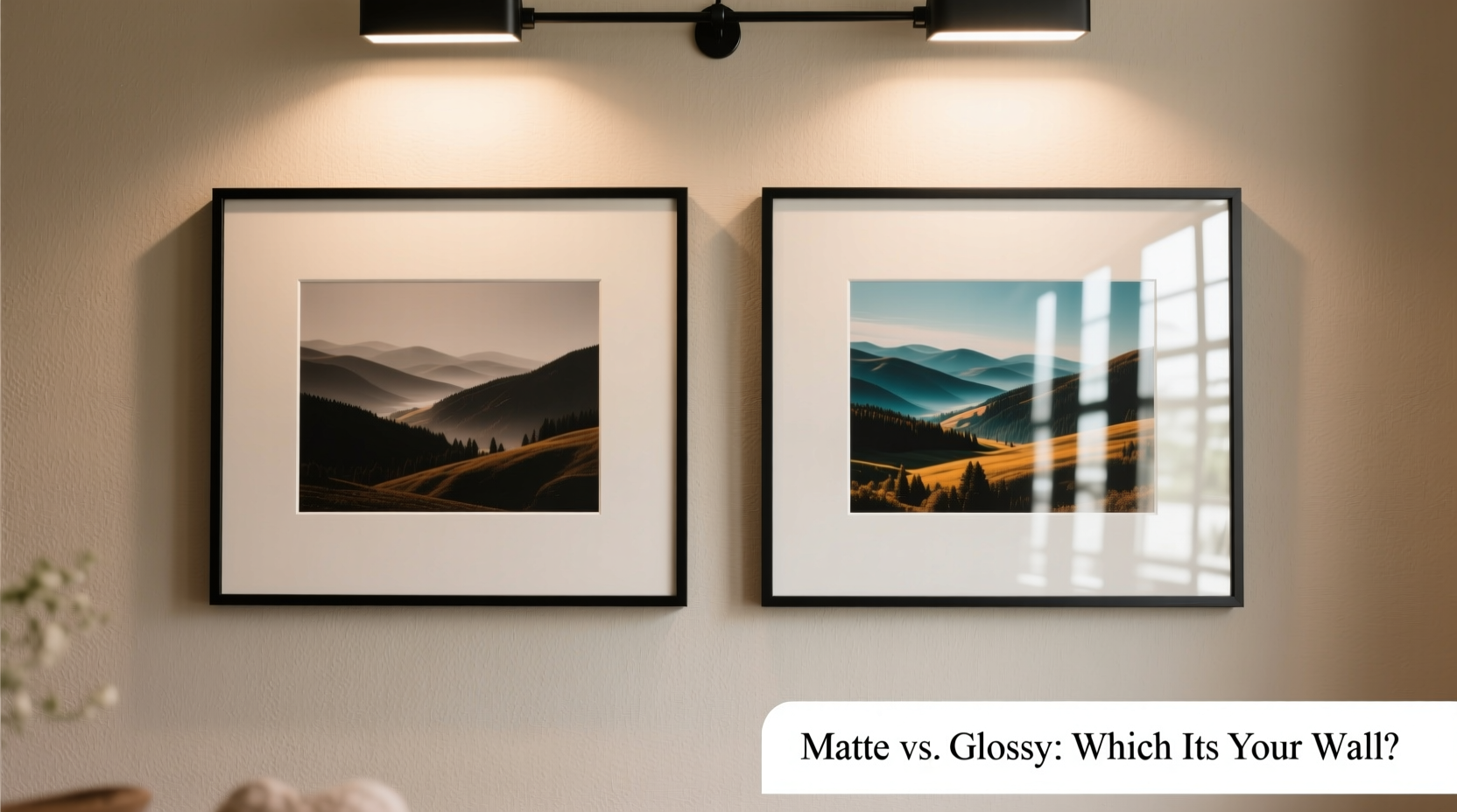
Matte prints feature a non-reflective, flat surface achieved through a micro-porous coating that diffuses light evenly. This finish minimizes glare, making it ideal for spaces with bright or variable lighting. The subdued sheen gives photos a soft, artistic quality often favored in fine art photography and minimalist interiors.
Glossy prints, on the other hand, use a smooth, shiny coating that enhances contrast and color saturation. Light reflects uniformly off the surface, creating a vibrant, almost three-dimensional appearance. This finish makes details pop and is commonly used in commercial photography, portraits, and dynamic imagery where impact matters.
The core trade-off lies in reflection versus richness: matte reduces glare but slightly dulls colors; glossy amplifies depth and brightness but risks distracting reflections.
Key Factors Influencing Your Choice
Choosing between matte and glossy isn’t about which is “better,” but which is better suited to your specific context. Consider these critical factors before making a decision.
1. Lighting Conditions
Light plays a decisive role. In rooms with abundant natural light, overhead fixtures, or spotlights, glossy prints can become mirrors, reflecting windows, lamps, or viewers themselves. This can obscure the image and create visual fatigue.
Matte finishes excel in such environments by scattering light rather than reflecting it. They maintain visibility from multiple angles, making them a safer bet for sunlit living rooms, kitchens, or near large windows.
Conversely, in dimly lit areas—such as hallways, basements, or bedrooms with controlled lighting—glossy prints benefit from enhanced luminance. The reflective surface helps images stand out without appearing flat.
2. Room Function and Traffic
High-traffic areas like entryways, children’s rooms, or offices require durable finishes. Glossy prints are more resistant to smudging and easier to clean with a soft, dry cloth. However, they show fingerprints and dust more readily, demanding regular maintenance.
Matte prints absorb ambient oils and are more prone to surface damage if touched frequently. Yet, they hide fingerprints and dust better, making them lower-maintenance in practice despite being less resilient to abrasion.
3. Artistic Intent and Image Type
The nature of the photograph itself should guide your decision. Landscape and black-and-white photography often benefit from matte finishes, which emphasize texture, tonal gradation, and mood. The lack of shine supports a contemplative, timeless feel.
Glossy is ideal for colorful, high-contrast images—think vibrant travel shots, fashion photography, or detailed macro work. The enhanced clarity and punchy colors draw immediate attention, making them effective focal points in modern or eclectic decor.
“Finish is part of the storytelling. A glossy portrait captures the sparkle in someone’s eye; a matte landscape whispers quiet solitude.” — Daniel Reeves, Fine Art Photographer
4. Framing and Mounting Considerations
If you plan to frame your print, the interaction between glass and finish becomes crucial. Standard glass adds its own reflectivity. Pairing it with a glossy print can double the glare, especially if the glass touches the print surface.
Using non-glare or anti-reflective glass mitigates this issue and works well with either finish. For matte prints, consider using spacers to prevent contact with the glass, preserving the texture and preventing static adhesion.
Alternatively, opt for acrylic instead of glass in high-glare environments. It’s lighter, shatter-resistant, and available with anti-static coatings that pair well with matte surfaces.
Comparison Table: Matte vs. Glossy at a Glance
| Feature | Matte Finish | Glossy Finish |
|---|---|---|
| Glare Resistance | Excellent – ideal for bright rooms | Poor – reflective under direct light |
| Color Vibrancy | Subdued – softer tones | High – rich, saturated colors |
| Detail Clarity | Good – emphasizes texture | Excellent – sharp, crisp edges |
| Fingerprint Visibility | Low – hides smudges | High – shows oils easily |
| Durability | Moderate – susceptible to scratches | High – resistant to moisture and smudging |
| Best For | Fine art, monochrome, textured subjects | Portraits, vibrant scenes, modern decor |
Real-World Example: Choosing for a Home Office Gallery Wall
Sarah, a graphic designer in Portland, wanted to create a curated gallery wall in her home office featuring her favorite travel photos and design inspirations. The room has two large north-facing windows, providing consistent but strong daylight. She initially leaned toward glossy prints for their vividness but tested both finishes under actual conditions.
She hung sample prints side by side. The glossy versions reflected the window during midday, turning parts of the images into blinding mirrors. The matte prints, however, remained clear and readable from any angle. Though the colors were slightly less intense, the overall viewing experience was more comfortable and professional.
Sarah chose matte for all prints, paired with frames using anti-reflective glass. The result was a cohesive, distraction-free display that enhanced focus without sacrificing visual appeal. Her decision was rooted not in preference, but in environmental response.
Step-by-Step Guide to Making Your Decision
Follow this structured approach to confidently select the right finish for your wall decor:
- Assess the room’s lighting: Note the direction and intensity of natural and artificial light. Does sunlight hit the wall directly? Are there overhead lights or picture lights?
- Define the room’s purpose: Is it a calm space (bedroom, study) or a social one (living room, dining area)? High-use areas may favor durable glossy finishes.
- Analyze your photo content: Are the images high in contrast and color, or do they rely on subtlety and tone? Match the finish to the image’s emotional and visual goals.
- Consider framing plans: Will the print be behind glass? If yes, factor in reflection and spacing. Non-glare glass expands your options.
- Test physically: Order or create small samples. Hang them on the wall and observe at various times. Pay attention to visibility, glare, and emotional impact.
- Evaluate long-term care: Are you willing to dust and clean glossy prints regularly? Do you need a low-maintenance solution? Choose accordingly.
Checklist: Finalizing Your Photo Print Finish
- ✅ Checked lighting conditions at different times of day
- ✅ Identified primary image types (portrait, landscape, abstract)
- ✅ Determined room traffic and potential for physical contact
- ✅ Decided on framing method (glass, acrylic, open mount)
- ✅ Compared sample prints in person
- ✅ Considered ease of cleaning and maintenance
- ✅ Aligned finish with overall interior design style (minimalist, modern, traditional)
Frequently Asked Questions
Can I mix matte and glossy prints in the same gallery wall?
Yes, but with caution. Mixing finishes can add visual interest, but it risks looking inconsistent. To blend them successfully, ensure uniform framing styles and spacing. Limit the combination to a deliberate theme—e.g., glossy for central focal pieces, matte for supporting images. Test the layout with mockups first.
Do matte prints fade faster than glossy ones?
No—not inherently. Fade resistance depends on ink type, paper quality, and UV exposure, not finish. Both matte and glossy archival papers, when printed with pigment inks and protected from direct sunlight, can last over 100 years. Use UV-filtering glass or acrylic for maximum protection regardless of finish.
Is one finish more expensive than the other?
Typically, no. Most professional labs charge similarly for matte and glossy options. However, premium matte papers (like cotton rag or baryta) may cost more due to material quality. Always compare based on paper type, not just finish.
Making the Right Choice for Lasting Impact
The decision between matte and glossy photo prints ultimately hinges on harmony: alignment between image, environment, and intention. There’s no universal winner. A glossy finish might dazzle in a dimly lit dining room, while a matte print could bring serenity to a sun-drenched bedroom. What matters is thoughtful selection grounded in observation and purpose.
Wall decor is more than decoration—it’s curation. Each print contributes to the atmosphere of your space. By choosing the right finish, you honor both the photograph and the room it inhabits. Whether you value clarity, calm, or contrast, the power lies in informed choice.
“The best print finish is the one that lets the image speak without interference—from glare, dust, or mismatched intent.” — Lena Torres, Interior Visual Consultant
Take Action Today
Don’t guess—test. Select one or two of your favorite images and order small prints in both matte and glossy finishes. Hang them where they’ll live. Live with them for a few days. Notice how they look in morning light, evening shadows, and artificial glow. Let your space guide you. Once you’ve seen the difference firsthand, your decision won’t just be informed—it will feel inevitable.


 浙公网安备
33010002000092号
浙公网安备
33010002000092号 浙B2-20120091-4
Comments
No comments yet. Why don't you start the discussion?