
A personal blog is more than just words on a screen—it’s an expression of identity, tone, and intention. While content drives engagement, design determines first impressions. Among the most subtle yet powerful design decisions is typography. The fonts you select—and how they work together—shape readability, mood, and credibility. Poor font pairings can make even well-written posts feel disjointed or unprofessional. Thoughtful combinations, on the other hand, elevate your message and create a cohesive visual voice.
Choosing the right font pairing isn’t about random experimentation. It’s a deliberate process rooted in contrast, hierarchy, and emotional resonance. Whether your blog shares travel stories, wellness routines, or tech tutorials, your typography should support—not distract from—your purpose.
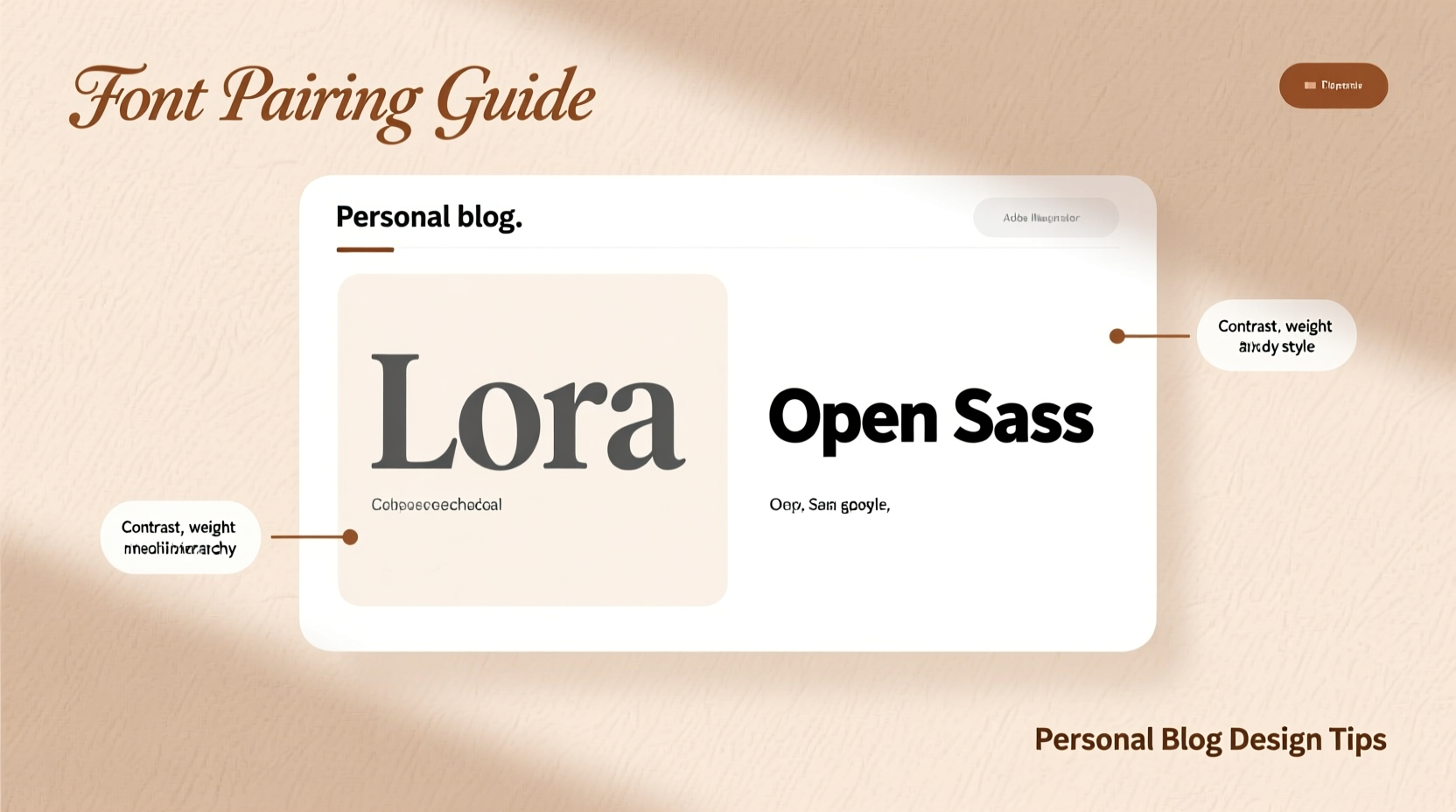
Understand the Role of Typography in Blog Design
Typography does more than deliver text; it communicates tone. A serif font like Georgia might suggest tradition and authority, while a clean sans-serif like Inter conveys modernity and approachability. When readers land on your page, they absorb these cues before reading a single sentence.
Font pairing refers to combining two (or occasionally three) typefaces that complement each other while serving distinct roles. Typically, one font handles headlines and titles, while another manages body text. The goal is harmony through contrast—different enough to distinguish function, similar enough to feel intentional.
Effective typography enhances user experience by guiding attention, improving legibility, and reinforcing brand personality. For personal blogs, where authenticity matters, your fonts should reflect your voice: warm, bold, minimalist, or playful.
“Typography is the silent ambassador of your brand. It speaks before your words do.” — Erik Spiekermann, Type Designer and Author
Establish Clear Typographic Hierarchy
Before selecting fonts, define their roles within your blog’s layout. A clear typographic hierarchy helps readers navigate content effortlessly. Consider the following structure:
- Headlines (H1–H3): Designed to grab attention. These benefit from expressive or distinctive fonts.
- Body Text: Must prioritize readability over flair. Opt for neutral, highly legible typefaces.
- Captions & Metadata: Dates, author bios, or image descriptions often use smaller, simpler fonts.
- Call-to-Actions: Buttons or prompts may use bolder weights or contrasting styles.
Each role demands different characteristics. Headline fonts can afford to be decorative, but body fonts must perform under long-form scrutiny. They need even spacing, open counters, and appropriate x-heights to ensure comfort during extended reading.
Apply the Principles of Contrast and Compatibility
The foundation of successful font pairing lies in balancing contrast with compatibility. Fonts should differ enough to serve separate functions but share subtle qualities that unify them visually.
Common contrast axes include:
- Style: Pair a serif with a sans-serif for classic contrast.
- Weight: Combine light headings with medium-weight body text.
- Width: Use narrow display fonts with standard-width paragraphs.
- Case: All-caps headings with sentence-case body copy.
However, avoid excessive differences. A script font paired with a monospaced coding font may clash in tone unless carefully contextualized.
Compatibility often comes down to shared design DNA: similar stroke contrast, proportions, or terminal shapes. For example, pairing Playfair Display (a high-contrast serif) with Lato (a warm sans-serif) works because both have humanist characteristics and generous letterforms.
Common Font Pairing Combinations That Work
| Pairing Style | Example Combination | Best For |
|---|---|---|
| Serif + Sans-Serif | Merriweather & Open Sans | Classic blogs, literary sites, professional portfolios |
| Sans-Serif Duo | Raleway & Lora | Modern lifestyle blogs, minimalist designs |
| Display + Neutral | Bebas Neue & Roboto | Creative blogs, photography journals, editorial layouts |
| Monospace Accent | Source Code Pro & PT Serif | Tech blogs, developer diaries, documentation-style sites |
These combinations succeed because they balance visual interest with functional clarity. The headline font commands attention; the body font ensures sustained readability.
Follow a Step-by-Step Selection Process
Choosing fonts shouldn’t be guesswork. Follow this structured approach to build confidence in your choices.
- Define Your Blog’s Personality
Is your tone formal or casual? Creative or technical? A food blog with rustic recipes might lean into handwritten or slab-serif fonts, while a career advice blog benefits from crisp, professional sans-serifs. - Select a Body Font First
Prioritize legibility. Test potential body fonts with sample paragraphs at 16–18px size. Look for even color (consistent grayness), comfortable line spacing, and clarity across devices. - Choose a Complementary Headline Font
Now add contrast. If your body font is a neutral sans-serif, consider a serif or geometric display font for headlines. Avoid pairing two equally bold or decorative faces. - Test Across Devices and Sizes
Preview your pairing on mobile, tablet, and desktop. Small screens amplify poor spacing or overly thin strokes. Ensure headlines remain legible at smaller breakpoints. - Limit Weights and Styles
Stick to 2–3 font weights total (e.g., regular, bold, and italic). Too many variants increase load time and visual noise. - Check Licensing and Web Performance
If using Google Fonts or commercial libraries, confirm web-use permissions. Prefer variable fonts when possible—they reduce HTTP requests and improve loading speed.
Real Example: Revamping a Personal Travel Blog
Sarah runs a personal travel blog called *Wander With Words*, sharing narrative essays from her solo trips across Southeast Asia. Initially, she used the default system fonts: Times New Roman for headings and Arial for body text. The result felt generic and lacked warmth.
She wanted her site to feel inviting, adventurous, and slightly poetic. After analyzing her content’s tone, she chose Cormorant Garamond for headlines—a refined serif with old-style elegance—and paired it with Quicksand, a friendly rounded sans-serif for body text.
The contrast between the traditional serif and soft sans-serif created visual interest without sacrificing cohesion. Readers commented that the new design “felt more personal” and “easier to read on phones.” Sarah also noticed a 15% increase in average session duration after the redesign, suggesting improved engagement.
This case illustrates how intentional font pairing aligns design with narrative intent. Her fonts didn’t overpower her writing—they framed it.
Avoid Common Font Pairing Mistakes
Even experienced designers slip into pitfalls. Watch out for these frequent errors:
- Over-pairing: Using three or more typefaces without clear justification.
- Misaligned tone: A futuristic techno-font on a cozy baking blog creates cognitive dissonance.
- Poor readability: Light fonts on white backgrounds, narrow letter-spacing, or tiny sizes hinder reading.
- Ignoring performance: Loading multiple custom fonts slows page speed, hurting SEO and UX.
- Forgetting fallbacks: Not specifying system alternatives if web fonts fail to load.
To prevent mismatched expectations, always test your fonts with real blog content—not placeholder text like “Lorem ipsum.” See how they handle quotes, lists, captions, and subheadings.
Do’s and Don’ts of Font Pairing
| Do | Don't |
|---|---|
| Pair fonts from the same superfamily (e.g., Fira Sans & Fira Mono) | Combine two highly decorative fonts |
| Use contrast in style, not just size | Choose fonts that are nearly identical (creates confusion) |
| Test readability at various screen sizes | Ignore line height and letter spacing |
| Leverage free resources like Google Fonts, Fontshare, or Adobe Fonts | Assume all free fonts are optimized for web use |
Frequently Asked Questions
Can I use only one font for my entire blog?
Yes, and it’s often recommended for simplicity. Using a single versatile typeface—especially a variable font—allows you to create hierarchy through weight, width, and size alone. This approach promotes consistency and reduces loading time. For example, Inter or Roboto offer multiple weights and excellent readability across contexts.
How do I know if two fonts go well together?
Start by assessing contrast and shared characteristics. Ask: Do they serve different purposes (headline vs. body)? Do they share subtle traits like x-height or stroke angle? Print them side by side at actual usage sizes. If one overwhelms the other or they look randomly chosen, reconsider. Trust your eye—but validate with usability testing.
Are Google Fonts good enough for professional blogs?
Absolutely. Google Fonts includes professionally designed, open-source typefaces such as Roboto, Montserrat, PT Serif, and Work Sans. Many are crafted by renowned typographers and optimized for screen readability. With proper pairing and performance considerations, Google Fonts can form the basis of a polished, professional blog design.
Final Checklist Before Launching Your Font Choice
Before finalizing your blog’s typography, run through this checklist:
- ✅ Have I defined the tone and personality of my blog?
- ✅ Is my body font highly legible at 16px or larger?
- ✅ Does my headline font contrast meaningfully with the body font?
- ✅ Have I limited font weights to 2–3 per family?
- ✅ Are web font files optimized (preferably variable fonts)?
- ✅ Do I have CSS fallbacks specified (e.g., sans-serif, serif)?
- ✅ Have I tested the pairing on mobile and dark mode?
- ✅ Does the combination enhance, not distract from, my content?
Conclusion: Let Your Typography Reflect Your Voice
Your personal blog is a digital extension of your thoughts, experiences, and passions. Every design choice—from layout to color to spacing—should serve that authenticity. Typography is no exception. The right font pairing doesn’t shout for attention; it quietly supports your message, guides your reader, and reinforces your unique voice.
You don’t need dozens of fonts or complex design software to get this right. Start simple. Choose one strong body font. Pair it with a complementary headline face. Test relentlessly. Refine based on feedback and analytics. Over time, your typographic choices will become second nature—and your blog will feel unmistakably yours.


 浙公网安备
33010002000092号
浙公网安备
33010002000092号 浙B2-20120091-4
Comments
No comments yet. Why don't you start the discussion?