
Creating your own invitation cards offers a personal touch that store-bought designs often lack. But one of the most overlooked — yet critical — aspects of DIY invitations is typography. The fonts you choose set the tone, convey emotion, and influence readability. A mismatched or poorly paired font combination can undermine even the most thoughtfully designed card. Choosing the right font pairing isn’t just about aesthetics; it’s about harmony, contrast, and purpose.
Whether you're designing wedding invites, birthday announcements, or holiday greetings, understanding how to pair fonts effectively transforms your project from amateur to professional. With countless typefaces available online, the challenge lies not in finding options, but in selecting two (or sometimes three) fonts that work together seamlessly.
Understand the Role of Typography in Invitations
Typography is more than just letters on paper — it’s visual language. Each font carries its own personality: elegant, playful, formal, rustic, modern, or vintage. When you combine fonts, you’re essentially having them converse. The goal is a balanced dialogue where one doesn’t overpower the other.
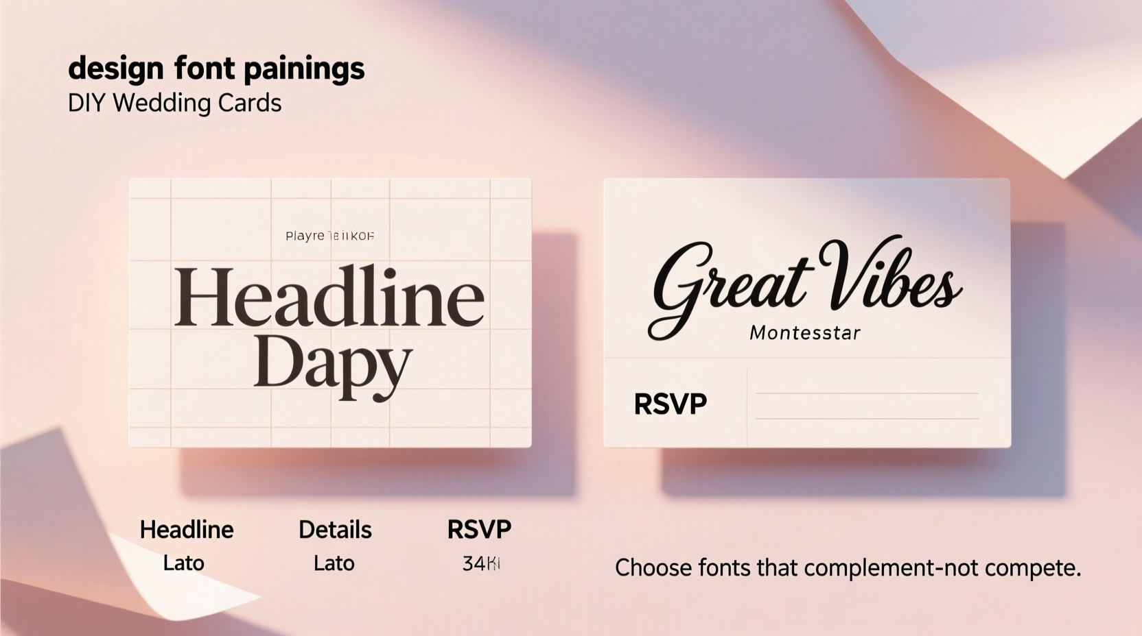
In invitation design, typography typically serves multiple functions:
- Headline text – Names, event titles, or main messages
- Body copy – Details like date, time, location, RSVP instructions
- Accent elements – Decorative flourishes, quotes, or small notes
Each of these roles may require a different typographic treatment. For example, a bold script might work beautifully for names, while a clean sans-serif ensures clarity in logistical details.
“Typography is the voice of the page. Choose fonts that speak the same emotional language as your event.” — Clara Nguyen, Editorial Designer & Typography Educator
Step-by-Step Guide to Effective Font Pairing
Pairing fonts successfully follows a few foundational principles. Follow this sequence to build strong, cohesive combinations for your DIY cards.
- Determine the mood of your event. Is it formal? Rustic-chic? Playful? Modern minimalist? Your theme should guide your font choices.
- Select a dominant font first. This will usually be your display or headline font — something eye-catching but appropriate.
- Choose a complementary secondary font. This should contrast the first in style but harmonize in tone. Use it for body text or supporting information.
- Avoid overly similar fonts. Two serifs that look almost identical create confusion rather than contrast.
- Test readability at small sizes. A beautiful script may lose legibility when used for address lines or fine print.
- Limit yourself to two (maximum three) fonts. More than that creates visual clutter.
- Print a test version. Screen rendering can differ significantly from printed output.
Principles of Contrast and Harmony
The secret to successful font pairing lies in contrast. Fonts should differ enough to distinguish hierarchy, yet align in overall style and mood. Here are key contrast categories to consider:
- Font classification: Combine serif with sans-serif, script with geometric, or slab serif with handwritten.
- Weight: Pair a bold headline font with a light or regular body font.
- Size: Create visual hierarchy through proportional sizing (e.g., 36pt for names, 12pt for details).
- Style: Italic or oblique styles can add emphasis without introducing a new font.
Harmony comes into play when ensuring both fonts “feel” like they belong together. A Victorian-era script paired with a futuristic monospace font may clash in tone, even if they contrast technically.
Common Font Pairing Combinations That Work
| Combination Type | Example Use Case | Sample Pairings |
|---|---|---|
| Classic Serif + Clean Sans-Serif | Weddings, formal events | Playfair Display + Lato |
| Elegant Script + Minimalist Sans | Bridal showers, anniversary invites | Lobster + Montserrat |
| Handwritten + Typewriter-style | Birthdays, casual gatherings | Patrick Hand + Courier Prime |
| Modern Geometric + Vintage Serif | Art exhibitions, gallery openings | Helvetica Neue + Merriweather |
| Decorative Display + Neutral Body | Holiday cards, themed parties | Fredoka One + Open Sans |
Note: While these are digital font examples, many free alternatives exist on platforms like Google Fonts and DaFont. Always check licensing for commercial use, even if you're only printing physical copies.
Checklist: Before You Finalize Your Font Pair
Use this checklist to ensure your font pairing is effective and production-ready:
- ✅ Have I chosen no more than three typefaces?
- ✅ Does the headline font stand out clearly from the body text?
- ✅ Can all text be easily read at standard viewing distance (12 inches)?
- ✅ Do both fonts reflect the tone of the event?
- ✅ Have I tested the pairing in both color and black-and-white prints?
- ✅ Are special characters (accents, ampersands, numerals) styled consistently?
- ✅ Does the spacing (kerning and leading) feel balanced?
- ✅ Is the file saved in a high-resolution format suitable for printing?
Real Example: A Wedding Invitation Makeover
Sophie was designing her own wedding invitations using a craft template she found online. Her initial draft used two script fonts: one for the couple’s names and another slightly bolder one for the date and venue. At first glance, it looked romantic — but upon closer inspection, guests struggled to read the details.
She consulted a designer friend who suggested simplifying. They replaced the second script with a light-weight serif (Cormorant Garamond), kept the original script (Dancing Script) for the names, and used a neutral sans-serif (Nunito Sans) for the footer details like RSVP and website link.
The result? A clear visual hierarchy: the eye went first to the flowing script of the names, then smoothly transitioned to the readable serif for core information, with subtle support from the clean sans-serif. Guests later commented on how “elegant yet easy to understand” the invite felt.
This case illustrates how thoughtful font pairing enhances both beauty and function.
Common Mistakes to Avoid
Even experienced designers occasionally misstep. Watch out for these frequent errors when pairing fonts for DIY invitations:
- Using too many decorative fonts. One ornate font is usually enough. Overuse distracts and confuses.
- Poor scaling. An oversized headline with tiny body text feels unbalanced.
- Ignoring alignment. Centered text with inconsistent spacing looks sloppy. Use grid guides in your design software.
- Mismatched formality. A comic-style font on a funeral reception card sends the wrong message.
- Forgetting print constraints. Some thin fonts disappear when printed on low-quality paper or inkjet printers.
When in doubt, simplify. A single well-chosen font with variations in weight and size can be more effective than a complex trio.
FAQ
Can I use handwriting as a font?
Yes — but scan your handwriting at high resolution (300 DPI or higher) and convert it into a proper digital font using tools like Calligraphr or FontForge. Otherwise, direct scans may appear pixelated or inconsistent in print.
Are Google Fonts safe to use for printed invitations?
Absolutely. Google Fonts are free, open-source, and optimized for both screen and print. Many popular choices like Roboto, Poppins, and Raleway render beautifully in physical formats. Just download and install them correctly before using in design software.
How do I know if two fonts go together?
Trust your eye — but also apply the contrast rule. If both fonts look like they could belong to the same family, they probably don’t contrast enough. Try swapping one for something structurally different (e.g., swap a serif for a sans-serif). Print a sample and view it from across the room. If the hierarchy is instantly clear, you’ve succeeded.
Final Tips for Lasting Impact
Your invitation is often the first impression of your event. A well-paired font combination elevates that moment, signaling care, intention, and style. Remember that great typography doesn’t shout — it guides.
Before sending your final batch, ask a few trusted friends to review the design. Can they find the date quickly? Is the tone immediately apparent? Small feedback loops prevent big mistakes.
Also, consider accessibility. Older guests or those with visual impairments benefit from larger text and high-contrast colors. Black ink on white or cream paper remains the gold standard for clarity.
“A great invitation doesn’t just inform — it anticipates joy.” — Marcus Reed, Stationery Designer & Author of *The Art of Paper*
Conclusion
Choosing the right font pairing for your DIY invitation cards blends art and strategy. It requires attention to detail, an understanding of mood, and respect for readability. By applying contrast wisely, limiting your selections, and testing thoroughly, you can create invitations that are not only beautiful but meaningful.
Start small: pick one pairing from the table above and adapt it to your next project. Experiment with weights, sizes, and spacing. Save your favorite combinations as templates for future use. Over time, you’ll develop an instinct for what works — and what makes people pause, smile, and save your card as a keepsake.


 浙公网安备
33010002000092号
浙公网安备
33010002000092号 浙B2-20120091-4
Comments
No comments yet. Why don't you start the discussion?