
In the fast-paced world of social media, visual clarity and aesthetic appeal are non-negotiable. Among the most overlooked yet powerful design elements is typography. The right font pairing can elevate a graphic from forgettable to striking—communicating tone, reinforcing brand identity, and guiding the viewer’s eye. But with thousands of fonts available, choosing two that work well together isn’t just about personal taste. It requires an understanding of contrast, hierarchy, readability, and context.
Whether you're designing promotional posts, quote cards, or event announcements, your typography sets the mood before a single word is read. A mismatched pair can confuse your audience or undermine professionalism, while a thoughtful combination enhances credibility and emotional resonance. This guide breaks down the principles and practical steps to help you consistently select effective font pairings for any social media platform.
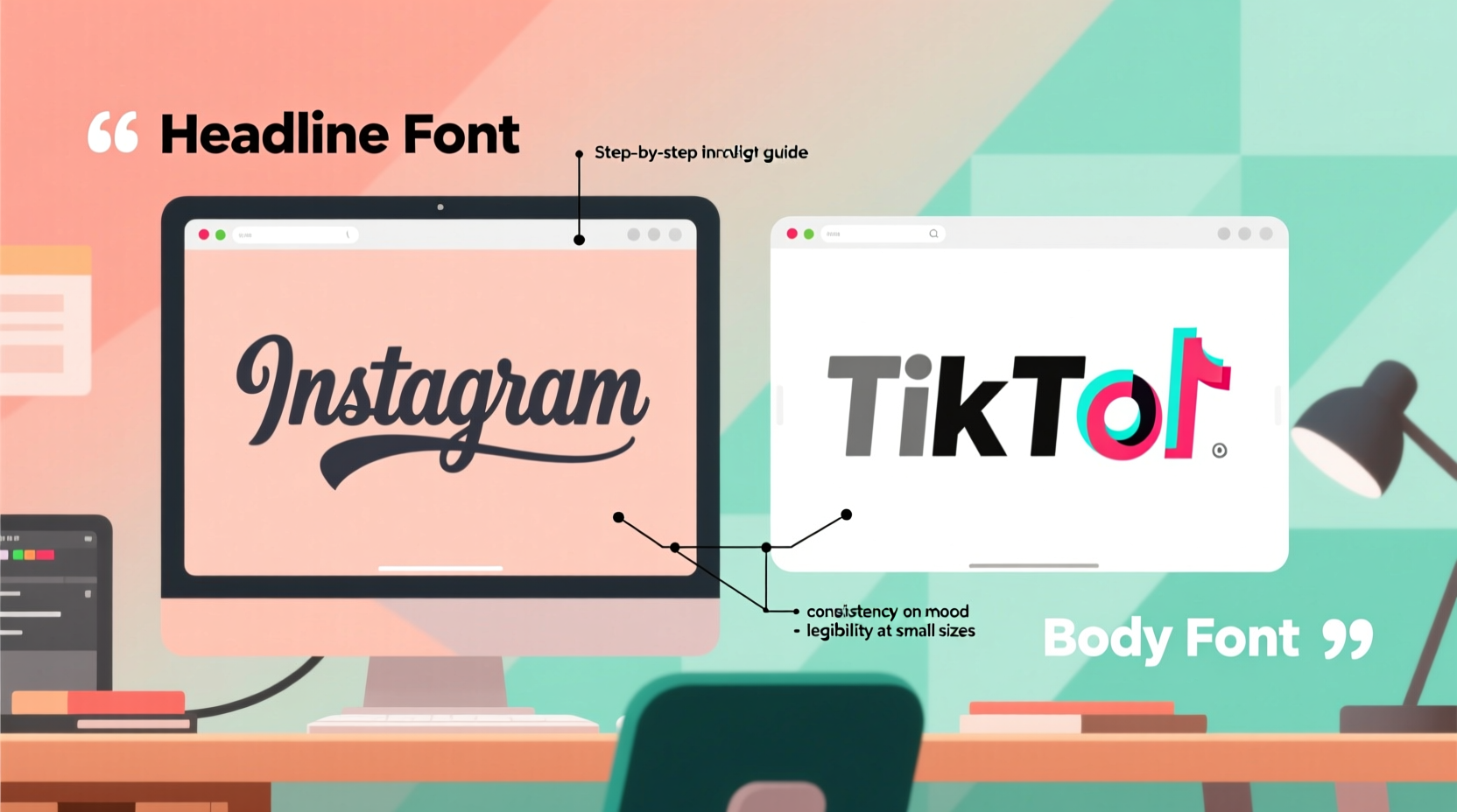
Understand the Role of Typography in Social Media
Social media graphics exist in a crowded digital space. Users scroll quickly, and attention spans are short. Typography must do more than look good—it must function efficiently. Fonts carry psychological weight: serif fonts often convey tradition and trust, sans-serif suggest modernity and clarity, script fonts evoke elegance or creativity, and display fonts grab attention with bold personality.
Each font has a voice. Pairing them effectively means assigning roles. Typically, one font serves as the headline (dominant, expressive), while the other handles body text or captions (clear, legible). The goal is harmony through contrast—not similarity. Two overly decorative fonts compete; two too-similar sans-serifs lack distinction.
“Typography is not just about letters. It’s about how those letters behave in context and what they make people feel.” — Erik Spiekermann, typographer and author of *Stop Stealing Sheep & Find Out How Type Works*
Establish Visual Hierarchy Through Contrast
Hierarchy ensures that viewers absorb information in the intended order. On social media, this usually means drawing attention to a headline first, then supporting details. Achieving this relies on deliberate contrast between your two fonts.
Contrast can be created through:
- Font style: Pair a serif with a sans-serif for classic balance.
- Weight: Use a bold headline font with a light or regular body font.
- Size: Clearly differentiate heading and subheading sizes.
- Case: All caps for impact, sentence case for readability.
- Width: Combine a condensed font with a wide or standard one.
The key is to avoid pairing fonts that are too different in multiple ways at once. For example, combining a wild display font with a curly script creates visual chaos. Instead, change only one or two attributes significantly—such as pairing a bold geometric sans-serif with a delicate serif—to maintain cohesion.
A Step-by-Step Guide to Font Pairing
Creating successful font combinations doesn't have to be guesswork. Follow this five-step process to make informed decisions every time:
- Define the message and mood. Is the post playful, urgent, elegant, or informative? Align your font choice with the emotional intent. A luxury brand launch calls for refined serifs, while a fitness challenge benefits from bold, energetic sans-serifs.
- Select a primary (headline) font. Choose a typeface with strong character that reflects your brand voice. Test it at large sizes to ensure legibility and impact.
- Pick a secondary (body) font. Opt for simplicity and high readability. This font will handle smaller text like dates, hashtags, or descriptions. Avoid decorative styles here unless used sparingly.
- Test for contrast and compatibility. Display both fonts together in a mockup. Ask: Does the headline stand out? Can I read the caption easily? Do they feel like they belong together?
- Review across devices and platforms. What looks crisp on desktop may blur on mobile. Preview your graphic on Instagram, Facebook, or LinkedIn to ensure clarity at small sizes.
This methodical approach reduces trial and error and builds confidence in your choices over time.
Common Font Pairing Combinations That Work
While creativity should be encouraged, proven pairings offer reliable starting points. Below are four widely effective combinations with real-world applications:
| Pairing Type | Example Fonts | Best Use Case |
|---|---|---|
| Serif + Sans-Serif | Playfair Display + Lato | Luxury brands, editorial-style quotes, professional services |
| Sans-Serif Duo | Montserrat (Bold) + Open Sans (Regular) | Digital products, tech startups, clean infographics |
| Script + Simple Sans | Great Vibes + Roboto | Invitations, fashion, lifestyle content |
| Display + Neutral Body | Bebas Neue + Inter | Event promotions, sales announcements, sports |
These combinations succeed because they balance personality with practicality. The dominant font grabs attention, while the supporting font ensures readability. When in doubt, lean on these templates—they’re popular for a reason.
Mini Case Study: Revamping a Fitness Brand’s Social Graphics
A boutique fitness studio noticed low engagement on their Instagram posts despite high-quality photos. Their graphics used a handwritten script paired with another flowing cursive for subtitles—both beautiful in isolation, but illegible when overlaid on busy backgrounds.
After a redesign, they switched to **Oswald (Bold)** for headlines and **Nunito Sans** for supporting text. The new pairing introduced strong contrast: Oswald’s tall, narrow caps commanded attention, while Nunito’s rounded friendliness softened the tone. Within three weeks, engagement rose by 42%, with followers commenting on the “cleaner” and “more professional” look.
The lesson: even attractive fonts fail if they don’t serve function. Prioritize clarity without sacrificing brand character.
Do’s and Don’ts of Font Pairing
To reinforce best practices, here’s a quick-reference table summarizing critical guidelines:
| Do’s | Don’ts |
|---|---|
| Limit yourself to two fonts per graphic | Use more than three typefaces in a single design |
| Prioritize readability, especially on mobile | Choose overly decorative fonts for body text |
| Ensure sufficient contrast between headline and body | Pick two fonts that look almost identical |
| Stick to brand-aligned fonts across all posts | Randomly switch fonts without strategy |
| Test typography against background colors | Ignore legibility in low-light viewing conditions |
Consistency builds recognition. Over time, audiences begin to associate your font choices with your brand—much like a logo or color palette. Randomness erodes trust; intentionality builds it.
Essential Checklist Before Finalizing Your Pair
Before exporting your next social media graphic, run through this checklist to ensure your font pairing is optimized:
- ✅ Have I limited the design to no more than two typefaces?
- ✅ Is the headline font bold enough to stand out at thumbnail size?
- ✅ Can the body text be read within two seconds on a mobile screen?
- ✅ Do the fonts complement my brand personality (e.g., modern, classic, playful)?
- ✅ Have I tested the graphic on both light and dark backgrounds?
- ✅ Are special characters (like @, #, &) clearly visible?
- ✅ Does the overall composition feel balanced, not lopsided due to font weight?
Skipping even one of these checks can result in a design that fails in real-world use. Taking 60 extra seconds to verify can save hours of underperforming content.
Frequently Asked Questions
Can I use Google Fonts for social media graphics?
Yes, absolutely. Google Fonts are free, web-safe, and widely used in social media design tools like Canva, Adobe Express, and Figma. Many popular pairings (e.g., Merriweather + Open Sans) are available there. Just ensure licensing allows commercial use—which Google Fonts do.
How do I pair fonts when my brand already has a logo typeface?
Start with your logo font as the anchor. If it’s decorative, pair it with a neutral sans-serif for text. If it’s simple (like Helvetica), you can afford a slightly more expressive secondary font. Always test how the logo integrates with the rest of the text layout.
Should I use different font pairings for each platform?
No. Maintain consistent typography across Instagram, Facebook, LinkedIn, and TikTok to strengthen brand recognition. Adapt sizing and spacing for each platform’s dimensions, but keep the core fonts the same.
Final Thoughts: Typography as Silent Branding
Your font pairing may seem like a minor detail, but it speaks volumes. It shapes first impressions, guides reading flow, and silently communicates your brand’s values. In social media, where visuals dominate communication, mastering typography isn’t optional—it’s essential.
The best pairings feel inevitable: as though no other combination could have worked. That sense of inevitability comes not from luck, but from applying clear principles—contrast, hierarchy, consistency, and purpose. Start with proven combinations, refine through testing, and gradually develop a distinctive yet functional style.


 浙公网安备
33010002000092号
浙公网安备
33010002000092号 浙B2-20120091-4
Comments
No comments yet. Why don't you start the discussion?