
Digital color matching is essential for designers, photographers, print professionals, and even casual creators who rely on visual consistency. Yet one of the most common—and frustrating—barriers to accurate color work is a screen that distorts true hues. Whether you're selecting brand colors, editing product photos, or preparing files for print, an uncalibrated monitor can mislead your decisions. What looks vibrant on your screen may appear dull or oversaturated elsewhere. The good news: with the right knowledge and tools, you can minimize these discrepancies and achieve reliable digital color matching—even on imperfect hardware.
Why Screen Distortion Matters in Digital Color Work
Every display interprets color differently. Factory settings often prioritize brightness and contrast to catch attention in retail environments, not accuracy. This means reds might lean orange, blues could appear too cold, and skin tones may look unnaturally warm. These shifts compromise your ability to make informed design choices.
The problem compounds when working across devices. A client viewing your design on a properly calibrated screen may see something drastically different than what you saw during creation. Inconsistent color leads to rework, miscommunication, and lost credibility.
Color distortion stems from multiple factors: panel type (TN vs. IPS), age of the display, ambient lighting, and lack of calibration. Without intervention, your screen becomes a filter—altering reality rather than reflecting it.
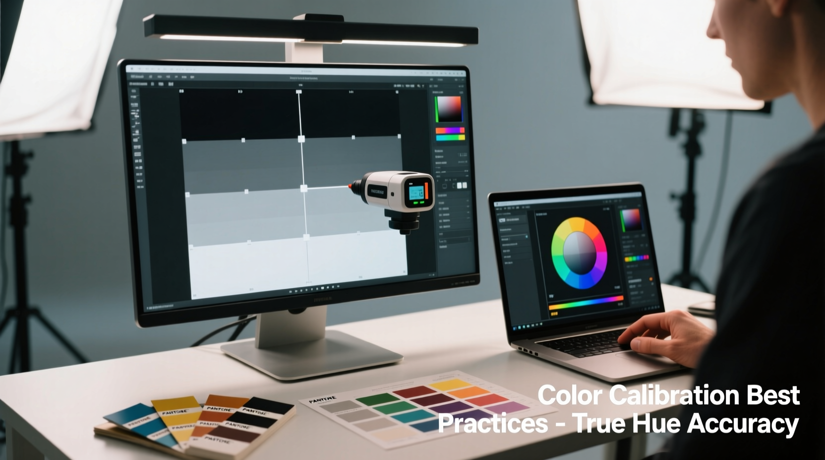
Step-by-Step Guide to Monitor Calibration
Calibrating your screen isn’t just for professionals—it’s a foundational step for anyone serious about digital color accuracy. Follow this structured process to bring your display closer to true color representation.
- Prepare Your Environment: Turn off bright overhead lights and eliminate glare. Use consistent, neutral lighting (preferably daylight-balanced). Allow your monitor to warm up for at least 30 minutes before calibration.
- Reset Display Settings: Navigate to your monitor’s on-screen menu and reset to factory defaults. Disable any dynamic contrast, eco modes, or “vivid” presets.
- Set Native Resolution & Refresh Rate: Ensure your system is using the monitor’s native resolution and recommended refresh rate. Non-native scaling alters pixel rendering and affects color clarity.
- Select Correct Color Temperature: Aim for 6500K, which aligns with D65—the standard daylight white point used in design and printing industries.
- Adjust Brightness and Contrast: Set brightness so that white areas are clear but not glaring. Use a grayscale test image (if available) to ensure smooth transitions between black and white without crushed shadows or blown-out highlights.
- Use Built-in OS Tools: On macOS, go to System Settings > Displays > Color Profile and use the Display Calibrator Assistant. On Windows, search for \"Calibrate display color\" in the Control Panel to access the Microsoft calibration utility.
- Save and Apply Profile: Once complete, assign the new profile as default. This tells your operating system how to correct output based on measured deviations.
This software-level calibration improves consistency but has limits. For true precision, move beyond built-in tools.
Using Hardware Calibration Devices for True Accuracy
While software calibration helps, only hardware solutions provide measurable, repeatable results. A colorimeter or spectrophotometer physically measures emitted light from your screen and creates a custom ICC profile tailored to its behavior.
Popular models include the X-Rite i1Display Pro, Datacolor SpyderX, and Calibrite ColorChecker Display. These devices attach to your screen and run through automated test sequences, analyzing hundreds of color patches across the spectrum.
After measurement, accompanying software generates a correction profile that maps inaccurate outputs to target values. This profile integrates directly with your OS and design applications like Adobe Photoshop, Illustrator, and InDesign.
“Hardware calibration reduces human error and environmental variables. It’s the only way to ensure your monitor reflects actual color data.” — Dr. Lena Torres, Imaging Scientist at Rochester Institute of Technology
Professionals working in photography, prepress, or brand identity should recalibrate monthly. Casual users benefit from quarterly checks. Over time, LCD backlights degrade and color performance drifts—regular calibration compensates for this decay.
Best Practices for Reliable Digital Color Matching
Even with a calibrated screen, achieving consistent color matching requires discipline and awareness. Implement these strategies to maintain integrity throughout your workflow.
- Work in a Controlled Lighting Environment: Ambient light influences perceived screen color. Avoid strong colored lights or direct sunlight hitting the display.
- Use Consistent Color Spaces: Stick to sRGB for web work and Adobe RGB or ProPhoto RGB for print and high-end photography. Embed profiles in files to preserve intent.
- Avoid Relying on Eyedroppers Alone: Digital eyedroppers sample pixels but don’t account for display inaccuracies. Pair sampled values with known references (e.g., Pantone codes converted to RGB/CMYK via trusted libraries).
- Cross-Check on Multiple Devices: View your work on tablets, phones, and other monitors. Note recurring discrepancies—these reveal systemic issues.
- Leverage Soft Proofing Features: In Adobe apps, use View > Proof Setup > Working CMYK (or Custom) to simulate how colors will appear under specific output conditions.
Do’s and Don’ts of Digital Color Matching
| Do | Don't |
|---|---|
| Calibrate your monitor regularly with a hardware device | Rely solely on factory settings or visual adjustment |
| Use standardized color spaces relevant to your medium | Assume RGB values are universal across all screens |
| Compare digital colors against physical samples under controlled light | Match screen colors to printed materials under fluorescent lighting |
| Embed ICC profiles in exported images | Share untagged files without specifying color space |
| Use monitor hoods to reduce ambient glare | Work near windows with shifting daylight exposure |
Real Example: Brand Identity Redesign Gone Wrong
A mid-sized fashion label hired a freelance designer to update their logo and packaging. The designer worked on a consumer-grade laptop with vivid mode enabled, believing the rich magenta looked perfect. Upon delivery, the client printed samples and found the color leaned toward purple—clashing with existing branding.
Further investigation revealed the designer’s screen had a blue bias, causing them to under-compensate reds. No hardware calibration was used, and the file lacked an embedded profile. The project required two weeks of revisions, delaying the product launch and straining the relationship.
The fix? The agency invested in a SpyderX calibrator and established a policy requiring all external creatives to submit files with embedded sRGB or CMYK profiles. They also began sharing physical Pantone guides with digital partners. Since then, color mismatches have dropped by over 90%.
Essential Checklist for Accurate Digital Color Matching
Follow this checklist before starting any color-critical project:
- ✅ Calibrate your monitor using a hardware colorimeter
- ✅ Confirm your OS is applying the latest ICC profile
- ✅ Set your creative software to use a defined working space (e.g., sRGB IEC61966-2.1)
- ✅ Disable GPU acceleration in design apps if color rendering issues persist
- ✅ Match colors using numeric values (HEX, RGB, CMYK) instead of visual approximation
- ✅ Cross-reference with official color standards (Pantone, brand guidelines)
- ✅ Preview output using soft proofing or device simulation tools
- ✅ Export files with embedded color profiles
Frequently Asked Questions
Can I calibrate my laptop screen accurately?
Yes, modern laptops—especially those marketed for creative work—can be effectively calibrated using hardware tools. However, limitations exist: smaller gamut coverage and lower brightness consistency compared to professional desktop monitors. For best results, choose a laptop with IPS panel and factory color calibration (like Apple MacBook Pro or Dell XPS series).
Why does my printed color still look different after calibration?
Calibration aligns your screen to a standard, but printing involves additional variables: paper type, ink formulation, printer model, and RIP software. To bridge the gap, use printer-specific ICC profiles and perform test prints. Also, ensure your design software is set to preview in the intended print color space (usually CMYK).
Is there a free way to get decent color accuracy?
While no free method matches hardware calibration, you can improve accuracy significantly using built-in OS tools and free test images. Websites like Lagom.nl offer LCD test patterns for adjusting contrast, gamma, and color balance. Combine this with viewing your work on multiple devices and referencing known color values (e.g., web-safe HEX codes) to reduce errors.
Maintaining Long-Term Color Consistency
Color accuracy isn’t a one-time fix. Displays change over time, environments shift, and projects demand different standards. Establish a routine: schedule monthly calibration sessions, document your setup (device model, profile name, date), and keep a log of adjustments made.
For teams, centralize color management. Share approved ICC profiles, define standard workflows, and require calibration verification before accepting deliverables. Cloud-based design platforms like Figma now support color space warnings, helping flag potential mismatches early.
Remember, the goal isn’t perfection—it’s predictability. You don’t need every shade to be flawless, but you do need to know how your screen behaves so you can compensate accordingly.
Conclusion: Take Control of Your Digital Color Workflow
Screen distortions don’t have to sabotage your creative efforts. By understanding the causes of color inaccuracy and implementing systematic calibration practices, you reclaim control over how colors are represented and matched digitally. From simple software adjustments to investing in hardware tools, each step brings you closer to trustworthy, reproducible results.


 浙公网安备
33010002000092号
浙公网安备
33010002000092号 浙B2-20120091-4
Comments
No comments yet. Why don't you start the discussion?