
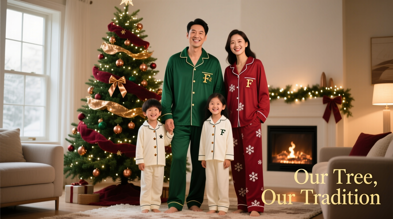
Matching family pajamas have become a beloved holiday tradition—symbolizing warmth, unity, and joyful intentionality. But when those cozy sets clash with your carefully curated tree, the visual harmony dissolves. A crimson-and-gold plaid set may look stunning on its own, yet overwhelm a minimalist silver-and-white spruce. Or a pastel lavender ensemble might vanish beside a deep emerald fir. Coordinating isn’t about exact color duplication; it’s about intentional resonance—creating a cohesive, layered holiday narrative where décor and people feel like parts of the same thoughtful composition.
This requires more than scrolling through “Christmas PJs” on a marketplace. It demands an understanding of color theory as applied to seasonal interiors, awareness of lighting conditions (candlelight vs. LED string lights), fabric texture’s impact on hue perception, and sensitivity to family members’ comfort and personal style—not to mention practical constraints like laundry durability and sizing inclusivity. Done well, coordinated pajamas elevate your holiday photos, deepen the sense of occasion, and make your home feel like a living editorial spread: warm, intentional, and quietly sophisticated.
Understand Your Tree’s True Color Personality
Your tree is not just green—it’s a complex chromatic anchor. Its dominant hue, undertones, and material all influence how surrounding colors read. Artificial trees range from cool-toned “arctic pine” (bluish-green) to warm “balsam” (yellow-tinged), while real firs, spruces, and pines each carry distinct pigment profiles. Even needle density and sheen affect light reflection—and thus perceived color temperature.
Begin by identifying your tree’s base color family using the standard seasonal color system:
- Winter trees (e.g., Nordmann Fir, Blue Spruce): Cool, crisp greens with blue or gray undertones. Often paired with metallic silver, icy blues, deep burgundy, or stark white.
- Fall trees (e.g., Fraser Fir, White Pine): Warm, rich greens with yellow or olive undertones. Complement best with terracotta, mustard, burnt sienna, cream, and charcoal.
- Spring trees (e.g., some pre-lit artificial varieties with soft mint or sage tones): Light, airy greens with subtle blue or yellow hints. Work beautifully with blush, seafoam, pale gold, and dove gray.
- Neutral or monochrome trees (e.g., white, black, or frosted silver trees): Act as blank canvases—but demand careful tonal alignment. A white tree isn’t “colorless”; it reflects ambient light and intensifies neighboring hues.
Build a Harmonious Palette Using the 60-30-10 Rule
Interior designers rely on the 60-30-10 rule to create balanced color schemes: 60% dominant (your tree + major décor), 30% secondary (ornaments, garlands, pillows), and 10% accent (ribbons, small decor, or—yes—pajamas). Your family’s sleepwear should occupy that strategic 10%: noticeable but never dominant, enhancing rather than competing.
Apply this to pajama selection with intention:
| Tree Base Color | Dominant (60%) | Secondary (30%) | Pajama Strategy (10%) |
|---|---|---|---|
| Cool Green (Blue-Spruce) | Tree + silver tinsel | Icy blue glass balls, white velvet bows | Choose soft heather gray, pale duck-egg blue, or muted silver-gray stripes—avoid pure white (washes out) or neon teal (clashes). |
| Warm Green (Balsam Fir) | Tree + natural wood elements | Amber glass, cinnamon sticks, cream burlap | Opt for oatmeal, rust, or olive green solids—or subtle herringbone in cream + terracotta. Steer clear of lime green or electric yellow. |
| Pastel Green (Mint Artificial) | Tree + matte white ornaments | Blush satin ribbons, pale gold accents | Select muted rose, dusty sage, or antique gold—never bright pink or fluorescent green. Texture (e.g., brushed cotton) adds depth without saturation. |
| White or Frosted Tree | Tree + mirrored or crystal décor | Charcoal velvet bows, slate-gray garlands | Deep navy, charcoal heather, or plum—adds richness without visual noise. Avoid black (too harsh) or pure white (creates glare). |
Note: This isn’t about matching. Matching implies repetition; coordinating implies relationship. A charcoal PJ set beside a white tree doesn’t echo the tree—it provides grounded contrast, making both elements more expressive. Likewise, rust PJs against a warm green tree don’t mimic the needles—they echo the earthy tones of pinecones and cinnamon, tying the scene together organically.
A Step-by-Step Coordination Process
Follow this actionable 5-step sequence to select pajamas that truly harmonize—not just coexist—with your tree:
- Analyze lighting & context: Photograph your tree in evening lighting, indoors, with existing décor visible. Note how ornaments reflect light and whether shadows lean cool or warm.
- Identify your tree’s dominant + undertone: Use a color picker tool (free online) on your photo to extract the three most frequent hex codes from the foliage. Average them or identify the strongest undertone (e.g., #2A5C4D = green with blue bias).
- Define your secondary palette: List your top 3 ornament colors and 2 non-green décor elements (e.g., “amber glass, matte white, brushed brass, cream burlap, charcoal velvet”). These are your coordination anchors.
- Select PJ fabrics first, then colors: Prioritize breathable, camera-flattering fabrics—brushed cotton, modal blend, or lightweight flannel. Their texture diffuses color intensity, making even bold hues feel softer. Then choose a hue from your secondary palette—or a neutral that bridges two (e.g., “oatmeal” sits between cream and rust).
- Test digitally before ordering: Upload your tree photo into free tools like Adobe Express or Canva. Overlay semi-transparent color swatches (set opacity to 70%) in potential PJ colors. If the swatch visually “settles” into the scene—neither jumping forward nor disappearing—it’s a keeper.
Real Example: The Anderson Family’s Silver-White Tree Transformation
The Andersons invested in a premium frosted-white artificial tree with built-in warm-white LEDs. Initially, they ordered classic red-and-green plaid PJs—only to find the red vibrated aggressively against the cool, reflective branches, and the green looked muddy and desaturated in photos. Their holiday video calls felt visually jarring.
They paused, re-analyzed: their tree wasn’t “white”—it was a luminous, slightly cool-toned ivory. Their ornaments were mercury glass, matte white ceramic, and brushed nickel. Their garland was eucalyptus-dusted with silver glitter. The missing link? Depth.
They chose deep heather charcoal PJs in a soft, brushed-cotton blend—same cut for all five family members, including a petite teen and a tall dad. In practice, the charcoal provided elegant contrast, echoed the shadowed undersides of the tree branches, and made the warm-white lights glow richer. The texture absorbed glare, and the neutral tone let their ornaments shine. Their Christmas morning photos now have quiet cohesion: the tree feels luminous, the family feels grounded, and the overall impression is serene—not saccharine.
“Color coordination in holiday styling isn’t about sameness—it’s about visual rhythm. When pajamas act as a tonal bridge between people and environment, they humanize the décor and dignify the tradition.” — Lena Torres, Interior Stylist & Holiday Visual Consultant, featured in Architectural Digest Holiday Edition
Key Considerations Beyond Color
Even perfect color alignment falls flat if overlooked practicalities undermine comfort or longevity:
- Fabric weight and drape: Heavy flannel in deep forest green can appear overly saturated next to delicate white lights; lighter jersey or Tencel blends diffuse color more gracefully and photograph better.
- Pattern scale matters: Large-scale plaids or bold graphics compete with tree texture. Opt for micro-checks, tonal stripes, or subtle embroidered motifs (e.g., tiny snowflakes in matching thread) that read as texture, not pattern.
- Lighting interaction: Metallic threads (gold, silver) catch LED light unpredictably—sometimes creating dazzling highlights, sometimes distracting hotspots. Matte finishes offer consistent, elegant cohesion.
- Inclusive fit & sizing: Matching doesn’t mean identical cuts. Look for brands offering relaxed-fit options for adults, tapered legs for taller teens, and stretch waistbands for comfort—all in the same color family. A coordinated palette loses meaning if someone feels self-conscious.
- Laundry realism: Deep jewel tones (navy, plum, emerald) hold up better over multiple washes than pastels or bright primaries. Choose colors with proven colorfastness—check reviews for “no fading after 5+ washes.”
FAQ
What if my tree has multiple colors—like red, gold, and green ornaments?
Anchor your pajamas to the tree’s *base green*, not the ornaments. Ornaments are accents; the tree is the foundation. If your tree is a warm green, lean into its undertone (e.g., rust, cream, olive). The ornaments will naturally harmonize because they already relate to the tree. Introducing a fourth strong color via PJs fractures the hierarchy.
Can I use white or cream PJs with any tree?
Cream works universally—it’s a warm neutral that complements both cool and warm greens, and reads as organic next to natural elements. Pure white is riskier: it can look clinical beside warm trees and cause glare under bright LEDs. If choosing white, opt for “ivory,” “oat,” or “ecru”—slightly off-white shades with subtle warmth that soften the contrast.
My family hates matching. Any alternatives that still coordinate?
Absolutely. Try “tonal layering”: everyone wears the same neutral base (e.g., charcoal, oatmeal, or deep navy) but in different silhouettes (shorts, long pants, camisoles, robes) and subtle variations (solid, micro-houndstooth, tonal embroidery). Or adopt a shared accent color used minimally—a navy PJ set with cream piping, paired with cream PJs with navy piping. Unity emerges from restraint, not replication.
Conclusion
Coordinating family pajamas with your tree isn’t about perfection—it’s about presence. It’s the quiet confidence of knowing your holiday morning photos won’t require heavy editing, the ease of moving through your decorated space feeling like part of the scene, not apart from it. It’s choosing rust over red not because it’s trendier, but because it honors the warmth in your balsam fir and the cinnamon in your coffee. It’s selecting charcoal not to disappear, but to deepen the glow of your white tree’s lights.
You don’t need a designer’s eye or a stylist’s budget. You need observation, intention, and willingness to see your tree not as background—but as the first voice in your holiday story. Your family is the second. The pajamas? That’s the sentence where they meet.


 浙公网安备
33010002000092号
浙公网安备
33010002000092号 浙B2-20120091-4
Comments
No comments yet. Why don't you start the discussion?