
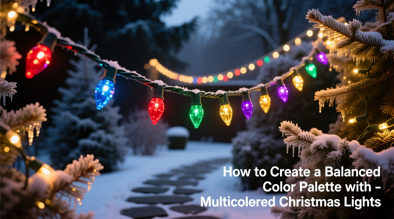
Stringing up Christmas lights is one of the most joyful parts of holiday decorating. But when it comes to multicolored lights, enthusiasm can sometimes lead to visual chaos. A haphazard mix of red, green, blue, and yellow might seem festive at first glance, but without thoughtful coordination, the result can feel overwhelming or unbalanced. Creating a harmonious color palette with multicolored Christmas lights transforms your display from chaotic to captivating—drawing in guests and elevating your home’s seasonal charm.
The key lies not in avoiding variety, but in curating it. Just as interior designers use color theory to craft inviting spaces, you can apply similar principles to outdoor and indoor lighting displays. With intentional planning, multicolored lights can produce a dynamic yet cohesive glow that feels both celebratory and refined.
Understand Color Theory Basics for Holiday Lighting
Before selecting bulbs, it helps to understand how colors interact. The color wheel—a tool used by artists and designers—divides hues into categories: primary (red, blue, yellow), secondary (green, orange, purple), and tertiary (combinations like red-orange or blue-green). These relationships guide how colors complement or contrast with one another.
In the context of Christmas lights, the goal isn’t to replicate a fine art painting, but to avoid clashing tones and ensure visual flow. For example, placing bright magenta next to lime green without transition can strain the eye. Instead, grouping analogous colors (those adjacent on the color wheel) or using complementary pairs (opposites, like red and green) creates balance.
Warm tones—such as red, gold, and orange—emit a cozy, traditional feel, ideal for front porches or living rooms. Cool tones—like blue, violet, and icy white—add a modern or wintry ambiance, perfect for rooftop outlines or tree canopies. Blending warm and cool shades is possible, but works best when anchored by neutral whites or soft ambers to bridge the temperature gap.
Plan Your Palette with Intention
Start by assessing your home’s exterior and existing decor. Does your roofline have a particular trim color? Are your window shutters navy, black, or white? Even small details influence which light colors will enhance rather than clash with your architecture.
Consider these guiding questions:
- What mood do I want to convey—traditional warmth, modern elegance, or playful festivity?
- Are there recurring colors in my yard or entryway (e.g., wreaths, ribbons, planters)?
- Will the lights be viewed mostly at night, or during twilight hours when natural light affects perception?
A well-planned palette often includes:
- A dominant color (e.g., deep red or royal blue) appearing most frequently.
- A secondary accent (e.g., emerald green or gold) used in moderation.
- A pop color (e.g., violet or turquoise) for surprise and depth.
- Neutral connectors like warm white or soft amber to unify the scheme.
“Lighting is emotional design. A balanced palette doesn’t just look better—it makes people feel welcome.” — Lena Torres, Residential Lighting Designer
Step-by-Step Guide to Installing a Cohesive Light Display
Once your palette is chosen, follow this structured approach to installation:
- Map your layout: Sketch a rough outline of your house or tree area. Label zones where lights will go—roofline, windows, railings, trees.
- Group cords by color: Separate strands into labeled bins or bags. This prevents confusion during setup.
- Begin with neutrals: Install warm white or clear lights along architectural edges (eaves, columns) to frame the space.
- Add dominant colors: Place your main hue (e.g., red) in high-visibility areas like the front door or peak of the roof.
- Layer in accents: Use secondary and pop colors sparingly—on stair railings, tree trunks, or within garlands—to create rhythm.
- Test before finalizing: Turn on the display at dusk. Walk around and observe from multiple angles. Adjust clusters that appear too dense or isolated.
- Balance density: Avoid long stretches of one color. Alternate or intersperse hues every 2–3 feet for even distribution.
Do’s and Don’ts of Multicolored Light Coordination
| Do | Don't |
|---|---|
| Use warm white lights as a base to soften bright colors | Mix cool white and warm white LEDs in the same section |
| Limit your palette to three main colors plus one accent | Use all available colors from a “multicolor” pack indiscriminately |
| Space out vibrant hues with neutral intervals | Cluster all red or blue bulbs together in large blocks |
| Choose LED lights with consistent color temperature (e.g., 2700K for warm) | Combine daylight-blue LEDs with vintage-style incandescents |
| Test your display at different times of evening | Install everything in daylight and assume it looks the same at night |
Real Example: Transforming a Cluttered Porch into a Festive Retreat
The Henderson family had always loved Christmas lights—but their display had grown haphazard over the years. Each season brought a new string: red and green icicle lights here, a net of rainbow bulbs there, and a tangled mix of colored mini-lights wrapped around porch columns. By year five, neighbors joked that their house looked like a “candy explosion.”
Determined to improve, they applied a simple redesign. First, they removed all lights and inventoried what they had. They kept only LED strings with warm-toned bases and sorted them into red, green, gold, and warm white. They decided on a palette: 40% warm white (for framing), 30% red, 20% green, and 10% gold as an accent.
They began by outlining the roof and doorway in warm white. Then, they alternated red and green strands vertically along the porch columns, spacing each color evenly. Gold lights were woven into the wreath on the front door and added to the top of the tree in a spiral pattern. The final effect was vibrant but orderly—inviting rather than jarring. Passersby slowed down to admire it, and the Hendersons received more compliments than ever before.
Enhance Indoor Displays with Themed Palettes
Indoor trees and mantels benefit just as much from curated color schemes. While outdoor lighting prioritizes visibility and durability, indoor setups allow for subtlety and theme-based storytelling.
Popular indoor palettes include:
- Traditional Triad: Red, green, and gold—timeless and rich, especially when paired with pine-scented candles and wooden ornaments.
- Winter Wonderland: Blue, silver, and white—ideal for homes with minimalist or Scandinavian decor.
- Retro Glamour: Pink, turquoise, and chrome yellow—inspired by mid-century holiday cards, best with vintage glass bulbs.
- Cozy Neutrals: Amber, cream, and copper—perfect for creating a warm, intimate atmosphere without bold colors.
For indoor trees, consider layering: place warmer or brighter colors toward the trunk for depth, and cooler or softer tones on the tips of branches for dimension. Rotate your bulb types—some faceted, some smooth—to add texture without overwhelming the palette.
Checklist: Building Your Balanced Light Display
Follow this checklist to ensure a polished, professional-quality result:
- ☐ Define your desired mood (festive, elegant, nostalgic, etc.)
- ☐ Audit existing lights—keep only those matching your intended palette
- ☐ Choose 3–5 colors maximum, including at least one neutral
- ☐ Purchase additional strands if needed to balance quantities
- ☐ Sketch a layout showing where each color will go
- ☐ Install neutral/base lights first to define the structure
- ☐ Add dominant colors in focal areas
- ☐ Layer in accent colors sparingly for visual interest
- ☐ Test the display at night from street level and nearby sidewalks
- ☐ Make adjustments to spacing, density, or color ratio as needed
Frequently Asked Questions
Can I mix LED and incandescent multicolored lights?
It’s not recommended. LEDs typically emit a brighter, more saturated light, while incandescents have a softer, warmer glow. Mixing them can create uneven illumination and noticeable color shifts. If you must combine them, stick to the same color temperature (e.g., both warm white base) and test thoroughly.
How do I store my lights to keep colors organized for next year?
Wind each color on a separate cardboard reel or use labeled plastic bags. Wrap gently to avoid kinking, and store in a cool, dry place. Consider using color-coded tags or colored tape on the plug ends for quick identification.
Are there apps to help visualize light color combinations?
Yes. Design tools like Adobe Color or Canva’s color wheel can help you preview palettes. Some smart lighting brands (e.g., Philips Hue, LIFX) also offer holiday scene simulators in their apps, letting you preview multicolor effects virtually.
Final Thoughts: Let Your Lights Tell a Story
A truly memorable Christmas light display isn’t about quantity—it’s about harmony. When multicolored lights are arranged with intention, they don’t just illuminate a space; they evoke emotion, tradition, and joy. Whether you’re draping a towering spruce or outlining a city apartment balcony, a balanced color palette ensures your efforts shine with clarity and charm.
This holiday season, step back from the impulse to “add one more string” and instead focus on curation. Choose colors that speak to your style, support your setting, and flow naturally from one element to the next. The result will be more than decorative—it will be meaningful.


 浙公网安备
33010002000092号
浙公网安备
33010002000092号 浙B2-20120091-4
Comments
No comments yet. Why don't you start the discussion?