
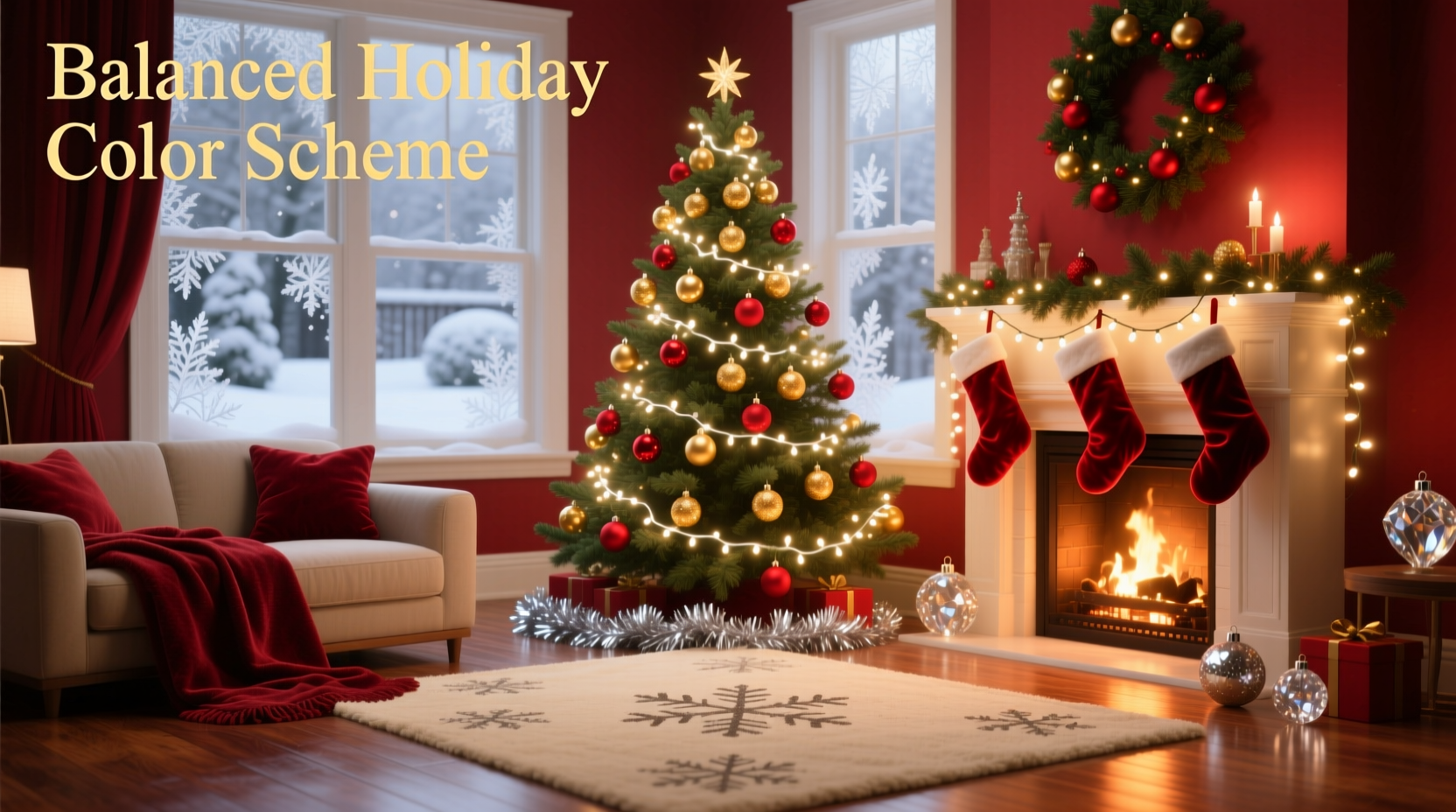
Color is the silent conductor of holiday atmosphere. A thoughtfully balanced Christmas palette doesn’t just look beautiful—it evokes warmth, intention, and calm amid seasonal busyness. Yet many homes fall into common traps: overwhelming red-and-green saturation, clashing metallics, or unintentional visual noise from mismatched light temperatures and decor textures. Balance isn’t about restraint—it’s about resonance. It’s the difference between a space that feels curated and one that feels crowded; between festive energy and visual fatigue. This guide distills decades of professional interior styling, lighting design principles, and real-world client experience into actionable strategies—not trends—to help you build a color scheme that feels personal, polished, and enduring.
Understand the Three Pillars of Holiday Color Balance
True balance rests on three interdependent elements: hue harmony, light temperature consistency, and material tonality. Neglect any one, and the whole scheme falters—even if the colors “match” on paper.
Hue harmony goes beyond choosing “red, green, and gold.” It involves understanding saturation (intensity), value (lightness/darkness), and undertones (e.g., whether your green leans blue or yellow). A forest green with cool undertones pairs elegantly with icy white LEDs—but clashes with warm amber string lights or brass ornaments with reddish patina.
Light temperature—measured in Kelvin (K)—is often overlooked. Standard incandescent bulbs emit ~2700K (warm, yellow-tinged light); modern “warm white” LEDs range from 2200K–3000K; “cool white” LEDs sit at 4000K–5000K (bluish, clinical). Mixing 2200K candle-style lights with 4500K icicle strands creates visual dissonance no amount of matching ornament color can fix.
Material tonality refers to how surfaces reflect or absorb light—and how they interact chromatically. Matte velvet ribbons mute brightness; mirrored glass ornaments amplify it. Unfinished wood introduces organic neutrals that ground saturated hues; brushed nickel hardware adds cool contrast to warm palettes. These aren’t decorative afterthoughts—they’re structural components of your color architecture.
Step-by-Step: Build Your Scheme in Five Deliberate Phases
- Anchor with a Dominant Hue (Not Necessarily Red): Choose one primary color that reflects your home’s existing palette or emotional intent—e.g., deep navy for sophistication, charcoal gray for modern minimalism, or sage green for earthy serenity. This becomes your base for 60% of visible color mass (wreaths, tree skirt, large ornaments).
- Select a Complementary Accent (Not Its “Opposite”): Avoid rigid color wheel opposites (e.g., red + green) unless intentionally high-contrast. Instead, choose a hue that shares an undertone or value—like terracotta with olive green, or dusty rose with antique gold. Reserve this for 25% of elements (garlands, smaller ornaments, table runners).
- Introduce a Neutral “Breathing Space”: Allocate 15% to true neutrals—not beige, but materials with inherent depth: blackened steel, raw linen, bleached birch, or charcoal wool. These prevent saturation overload and give the eye places to rest.
- Standardize Light Temperature Across All Sources: Audit every light source—string lights, lanterns, candle sleeves, even plug-in nightlights near the tree. Replace any bulb or LED strand outside your chosen Kelvin range. For cohesive warmth, stick to 2200K–2700K. For crisp, airy elegance, use 3000K uniformly.
- Layer Textures, Not Just Colors: Introduce variation through material contrast—not additional hues. Pair smooth mercury glass with nubby burlap, glossy ceramic with rough-hewn wood, or frosted glass with hammered copper. Texture creates visual rhythm without adding chromatic complexity.
Do’s and Don’ts: Lighting & Decor Integration
| Action | Do | Don’t |
|---|---|---|
| String Lights | Use uniform filament type (e.g., all warm-white micro LED or all vintage-style Edison bulbs) and consistent spacing (e.g., 6” or 12” intervals) | Mix C7 and C9 bulbs on the same strand; combine battery-operated and hardwired lights with different dimming behaviors |
| Ornaments | Group by material family first (glass, wood, metal), then vary size and finish within that group | Assume “gold” means one thing—mix unlacquered brass, antique gold leaf, and chrome-plated “gold” without testing them side-by-side |
| Wreaths & Garlands | Build around a botanical anchor (e.g., eucalyptus for silvery-green, magnolia for deep gloss) and add accents that echo its natural tones | Start with pre-made faux garlands and force-fit ornaments that clash with their base color temperature |
| Tree Lighting | Calculate density: 100 lights per vertical foot for standard trees; use warm-white micro LEDs for subtle glow, not spotlighting | Wrap lights haphazardly—creating dark patches or hotspots—or use blinking modes that disrupt color perception |
| Outdoor Decor | Match exterior light temperature to interior (e.g., 2700K porch lights sync with living room ambiance) | Let motion-sensor floodlights (often 5000K+) blast your carefully balanced front-yard display with harsh blue light |
Real Example: The Maple Street Rebalance Project
When interior stylist Lena Rossi consulted for a 1920s Craftsman home on Maple Street, the clients loved tradition but felt exhausted by their “classic red-and-green” scheme. Their tree glowed with 2700K warm-white lights, yet their outdoor wreath used cool-white LEDs, and their mantel held mercury glass ornaments beside plastic red berries that reflected light with unnatural intensity. The result was visual whiplash—not celebration.
Rossi began by replacing all outdoor lighting with 2700K integrated LED fixtures. She swapped the plastic berries for hand-dyed wool felt balls in a muted cranberry hue (lower saturation, warm undertone), and introduced matte black iron hooks and reclaimed oak slice ornaments. The tree kept its warm lights but gained layers: dried orange slices (natural warm accent), unbleached cotton garlands (neutral breathing space), and matte-finish ceramic ornaments in charcoal and rust. Within two days, the homeowners reported guests commenting not on “how Christmassy it looked,” but on how “calm and welcoming” the space felt—even with the same number of decorative elements.
This wasn’t about removing color. It was about aligning intention, material, and light physics.
Expert Insight: The Physics of Perception
“People don’t see ‘red ornaments’—they see how red reflects off nearby surfaces, how it interacts with ambient light temperature, and how its saturation compares to adjacent textures. A single high-saturation element can dominate an entire room if surrounded by low-contrast neutrals. Balance is contextual, not absolute.” — Dr. Aris Thorne, Lighting Psychologist & Author of *Chromatic Environment Theory*
Dr. Thorne’s research confirms what seasoned decorators observe: human visual processing prioritizes contrast and movement. A flickering candle sleeve draws attention not because it’s bright, but because its light fluctuates against static surfaces. Similarly, a glossy ornament catches the eye more than a matte one of identical hue—not due to color, but to luminance variance. This explains why “balanced” schemes often include one intentional point of higher contrast or subtle movement (e.g., a kinetic mobile of spun copper, or a slow-dimming LED candle ring). It satisfies the brain’s need for visual hierarchy without disrupting chromatic harmony.
FAQ: Practical Questions Answered
Can I use both warm-white and cool-white lights if I love the contrast?
Yes—but only with deliberate zoning and purpose. Use warm-white (2200K–2700K) for intimate, lived-in areas (living room, dining nook) where people gather. Reserve cool-white (4000K) strictly for functional, transitional spaces (entryway, hallway, garage door frame) where clarity matters more than coziness. Never mix them within the same visual field—e.g., on one tree or across a single mantel. The eye cannot reconcile the competing thermal signals.
My tree lights are cool-white, but I want a warm scheme. Do I need new lights?
Not necessarily. First, test inexpensive warm-white LED retrofit sleeves over existing cool-white bulbs. Many modern sleeves filter blue wavelengths effectively while preserving brightness. If sleeves don’t suffice, prioritize replacing lights on the *front-facing* third of your tree—the portion most visible from main vantage points. The back and interior branches contribute less to perceived color temperature and can retain existing lights if covered by dense foliage or matte ornaments.
How do I know if my “gold” and “silver” are actually compatible?
Hold them together under your primary lighting source (not daylight). If one appears yellowish and the other bluish, they’re incompatible in context—even if both are labeled “antique gold” or “brushed silver.” True compatibility means both metals read as similarly warm or similarly cool *in your space*. When in doubt, unify with a single metal family (e.g., all unlacquered brass) and introduce variation through texture (hammered, spun, matte) rather than hue.
Conclusion: Your Palette Is a Living System
A balanced Christmas color scheme isn’t a static checklist—it’s a responsive system where light, material, and hue continuously negotiate meaning. It respects your home’s architecture, honors your emotional needs for the season, and acknowledges how human eyes truly perceive color in three-dimensional space. You don’t need more ornaments, brighter lights, or trendier palettes. You need alignment: between the Kelvin rating of your string lights and the undertone of your velvet ribbon; between the grain of your wooden ornaments and the reflection quality of your glass baubles; between the warmth you wish to evoke and the physics of how light behaves in your rooms.
Start small. This year, choose one area—a mantel, a single wreath, your tabletop centerpiece—and apply just one principle from this guide: standardize light temperature, unify metal finishes, or replace one saturated element with a textured neutral. Observe how that single change alters the feeling of the space. Then expand. Because balance isn’t achieved through perfection—it’s cultivated through attentive, repeated choices that honor both beauty and belonging.


 浙公网安备
33010002000092号
浙公网安备
33010002000092号 浙B2-20120091-4
Comments
No comments yet. Why don't you start the discussion?