
A bedroom should be more than just a place to sleep—it should be a sanctuary of peace, restoration, and emotional balance. One of the most powerful yet underutilized tools in achieving this is color. Far beyond mere decoration, color influences mood, heart rate, and even hormone levels. When chosen intentionally, colors can transform your bedroom into a haven that supports relaxation, reduces anxiety, and improves sleep quality. This guide explores how to harness the science of color psychology to cultivate a truly calming bedroom environment.
The Science Behind Color and Emotion
Color psychology is the study of how hues affect human behavior, emotions, and physiological responses. Research shows that different wavelengths of light—perceived as color—stimulate various parts of the brain, particularly the hypothalamus, which regulates stress hormones like cortisol and melatonin, the hormone responsible for sleep.
Cool tones such as blue, green, and soft violet have been consistently linked to reduced blood pressure, slower breathing, and lower heart rates. A 2018 study published in *Nature Human Behaviour* found that people who slept in rooms painted blue reported higher sleep satisfaction compared to those in neutral or warm-colored rooms. Warm colors like red, orange, and bright yellow, while energizing, can increase alertness and are generally less suitable for bedrooms unless used sparingly.
The key is not just selecting a \"calming\" color but understanding how its tone, saturation, and context influence perception. For example, a deep navy evokes stability and depth, while a pale sky blue suggests openness and serenity. Similarly, a muted sage green feels grounded and restorative, whereas a neon lime would feel jarring and disruptive.
“Color is one of the fastest ways to influence mood. In bedrooms, we’re aiming for hues that signal safety and stillness to the nervous system.” — Dr. Lena Torres, Environmental Psychologist
Best Calming Colors for Bedrooms
Not all calming colors work the same way. Each hue brings a unique psychological effect. Choosing the right one depends on your personal sensitivity, room lighting, and existing décor. Below is a breakdown of top calming colors and their psychological impact:
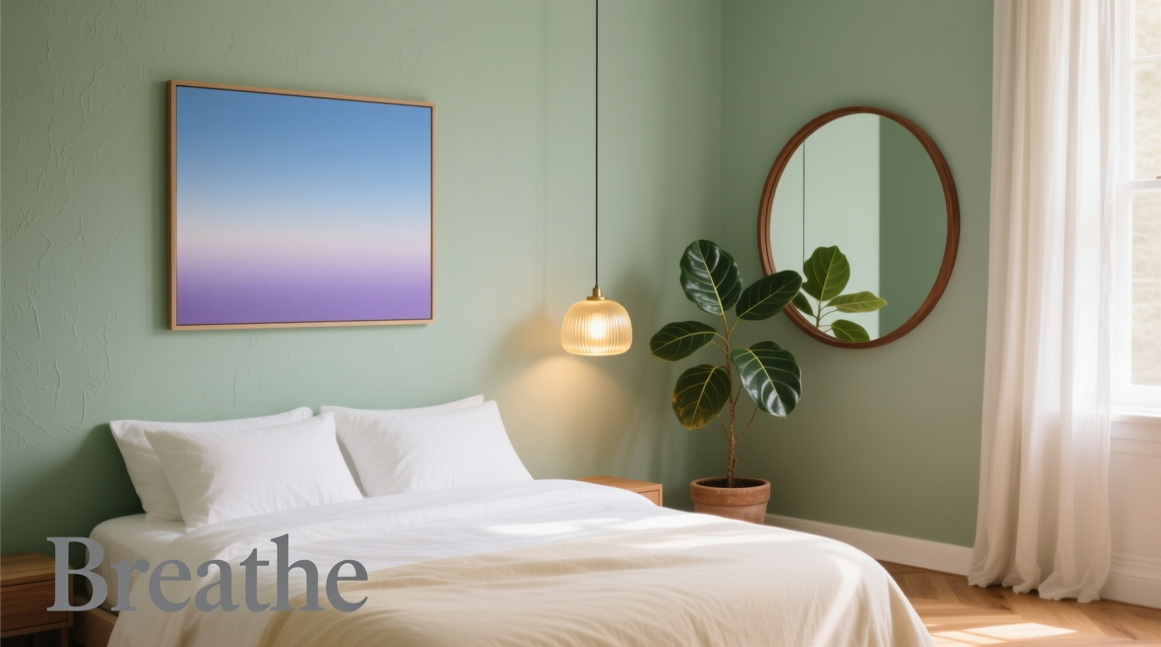
- Soft Blue: Associated with the sky and water, soft blue promotes tranquility and mental clarity. Ideal for overthinkers or those with insomnia.
- Sage Green: Evokes nature and renewal. Green balances the nervous system and fosters a sense of harmony, making it excellent for high-stress lifestyles.
- Lavender & Muted Violet: These shades have long been linked to relaxation. Lavender’s scent is known to reduce anxiety, and its color has a similar soothing effect on the mind.
- Warm Neutrals (Beige, Greige, Oatmeal): Neutral tones provide a blank emotional canvas, reducing visual clutter and promoting focus on comfort rather than stimulation.
- Soft Gray with Warm Undertones: Avoid cool grays, which can feel sterile. Opt for greige (gray + beige) to maintain calm without coldness.
How Lighting Affects Color Perception
Natural daylight reveals the truest version of a color, but evenings rely on artificial lighting, which can shift a calming blue toward a harsh steel tone if paired with cool LED bulbs. To preserve the intended mood:
- Use warm white bulbs (2700K–3000K) to soften cool colors.
- Avoid overhead fluorescent lights; opt for layered lighting with table lamps, sconces, or dimmable fixtures.
- Consider smart bulbs that allow you to adjust color temperature throughout the day—cooler in morning, warmer at night.
Creating Balance with Accent Colors
A monochromatic palette can feel serene but risk appearing flat. Strategic use of accent colors adds depth without disrupting calm. The goal is contrast that soothes, not stimulates.
Earth tones like terracotta, warm taupe, or soft rust can complement a sage green wall, grounding the space with organic warmth. Similarly, a navy headboard can add sophistication to a pale blue room without overwhelming it.
| Base Wall Color | Recommended Accents | Colors to Avoid |
|---|---|---|
| Soft Blue | White, cream, light wood, navy | Bright red, electric yellow, hot pink |
| Sage Green | Terracotta, oatmeal, walnut brown | Neon green, orange, metallic silver |
| Lavender | Dove gray, blush pink, linen white | Black, fire engine red, gold |
| Greige | Charcoal, sage, dusty rose | Primary colors, glossy black |
When introducing accent colors, follow the 60-30-10 rule: 60% dominant color (walls), 30% secondary (furniture, curtains), and 10% accent (pillows, art, rugs). This creates rhythm and prevents sensory overload.
Step-by-Step Guide to Applying Color Psychology in Your Bedroom
Transforming your bedroom into a calming retreat doesn’t require a full renovation. Follow this practical sequence to make intentional, lasting changes:
- Assess Your Current Environment: Spend a few evenings in your bedroom. Do you feel restless? Overwhelmed? Notice which elements feel jarring—the wall color, bedding, or lighting?
- Identify Your Emotional Goal: Are you seeking deeper sleep, reduced anxiety, or a sense of renewal? Match your goal to a color: blue for sleep, green for balance, lavender for emotional release.
- Test Paint Samples: Buy small cans of 2–3 candidate colors. Paint 2x2 ft swatches on different walls. Observe them in morning, afternoon, and evening light.
- Update Soft Furnishings: If repainting isn’t feasible, start with bedding, curtains, and rugs. Swap bright patterns for solid, muted tones in your chosen calming hue.
- Incorporate Natural Elements: Add wooden furniture, plants, or stone textures to enhance the grounding effect of your color scheme.
- Adjust Lighting: Replace cool bulbs with warm ones. Install dimmers or use salt lamps for soft, ambient glow.
- Evaluate and Refine: After two weeks, reassess. Does the room feel calmer? Adjust accents or layer in additional textures as needed.
Real-Life Example: Transforming a Stressful Bedroom
Sophia, a 34-year-old project manager in Chicago, struggled with insomnia and nighttime anxiety. Her bedroom had stark white walls, a black metal bed frame, and bright overhead lighting. Despite trying meditation and sleep supplements, she felt “wired” at bedtime.
After consulting an interior therapist, she repainted her walls in a soft greige (Benjamin Moore’s “Revere Pewter”) and added a sage green duvet cover. She replaced her ceiling light with a pair of warm-toned sconces and introduced a small snake plant for natural texture. Within three weeks, she reported falling asleep 25 minutes faster and waking up less frequently.
“It wasn’t just the color,” Sophia said. “It was how the whole room stopped feeling like an office extension. It finally felt like a place to exhale.”
Common Mistakes to Avoid
Even with good intentions, certain choices can undermine a calming atmosphere. Be mindful of these pitfalls:
- Overusing Cool Tones Without Warmth: A bedroom painted entirely in icy blue can feel emotionally distant. Balance with warm wood tones or creamy textiles.
- Ignoring Ceiling and Floor Colors: Dark ceilings can feel oppressive; overly bright floors can reflect too much light. Opt for ceilings in off-white and flooring in neutral or warm wood.
- Choosing High-Gloss Finishes: Shiny paints or lacquered furniture create glare, increasing visual stimulation. Matte or eggshell finishes absorb light and feel softer.
- Mixing Too Many Calming Hues: Combining lavender, seafoam, and lilac can create a chaotic pastel clash. Stick to one primary calming color with tonal variations.
Checklist: Building a Calming Bedroom with Color Psychology
Use this checklist to ensure every element supports tranquility:
- ☐ Choose a base wall color from the calming spectrum (blue, green, lavender, warm neutral)
- ☐ Test paint samples under natural and artificial light
- ☐ Use warm white lighting (2700K–3000K)
- ☐ Apply the 60-30-10 color ratio for balance
- ☐ Select matte or eggshell paint finishes
- ☐ Introduce natural materials (wood, cotton, wool, stone)
- ☐ Limit accent colors to 10% of the visual field
- ☐ Remove or cover electronics with bright LEDs
- ☐ Add plants for biophilic connection
- ☐ Evaluate the space weekly for two months and adjust as needed
Frequently Asked Questions
Can I use dark colors in a calming bedroom?
Yes, but with caution. Deep navy or charcoal can feel cozy if balanced with ample warm lighting and natural textures. Avoid using dark colors on all walls; instead, apply them to a single accent wall behind the bed. Ensure the room receives sufficient natural light during the day to prevent it from feeling cave-like.
Is white a calming color for bedrooms?
Pure white can feel sterile and clinical, increasing alertness rather than relaxation. However, warm whites (with yellow or pink undertones) or off-whites like ivory or almond can serve as excellent neutral bases when paired with soft accent colors. Always pair white walls with rich textures—knit throws, wooden furniture, woven baskets—to add warmth.
What if I love bold colors but want a calm room?
You don’t have to eliminate bold colors—just contain them. Use vibrant hues in small doses: a single piece of art, a decorative bowl, or patterned throw pillow. Keep the dominant palette neutral or cool, and let the bold color act as a focal point rather than an immersion. This satisfies aesthetic preferences without overstimulating the mind.
Final Thoughts: Design for Well-Being
Your bedroom is more than a functional space—it’s a daily ritual of unwinding, healing, and preparing for tomorrow. By applying color psychology thoughtfully, you align your environment with your inner needs. The right color doesn’t just look good; it feels like a deep breath after a long day.
Start small. Change a pillowcase. Repaint a single wall. Adjust your lamp. Each choice moves you closer to a space that doesn’t just house your body, but nurtures your mind. Calm isn’t a luxury—it’s a design decision.


 浙公网安备
33010002000092号
浙公网安备
33010002000092号 浙B2-20120091-4
Comments
No comments yet. Why don't you start the discussion?