
Christmas decor often leans into exuberance: bold reds, high-gloss finishes, flashing lights, and maximalist arrangements. But for many—especially those managing sensory load, chronic fatigue, or simply craving stillness during the holidays—a quieter, more grounded approach feels essential. A calming Christmas aesthetic isn’t about minimalism as absence; it’s about presence—presence of warmth, tactility, rhythm, and rest. It prioritizes how a space *feels* over how it *photographs*. This approach relies on two foundational elements: soft lighting that mimics candlelight and twilight, and layered textures that invite touch and slow the eye. When thoughtfully combined, they transform seasonal decor from festive spectacle into sanctuary.
The Psychology of Soft Light in Holiday Spaces
Harsh, cool-white LED strings and overhead spotlights trigger physiological arousal: elevated cortisol, pupil constriction, and subconscious alertness—counterproductive when the season is meant to evoke comfort and pause. In contrast, soft lighting operates at wavelengths and intensities that align with our circadian rhythm’s evening phase. Warm-toned light (2200K–2700K) signals safety and rest; diffused light reduces glare and visual “edge fatigue,” allowing the nervous system to settle. Research in environmental psychology confirms that ambient, low-contrast illumination supports emotional regulation—particularly important during a time of heightened social demands and disrupted routines.
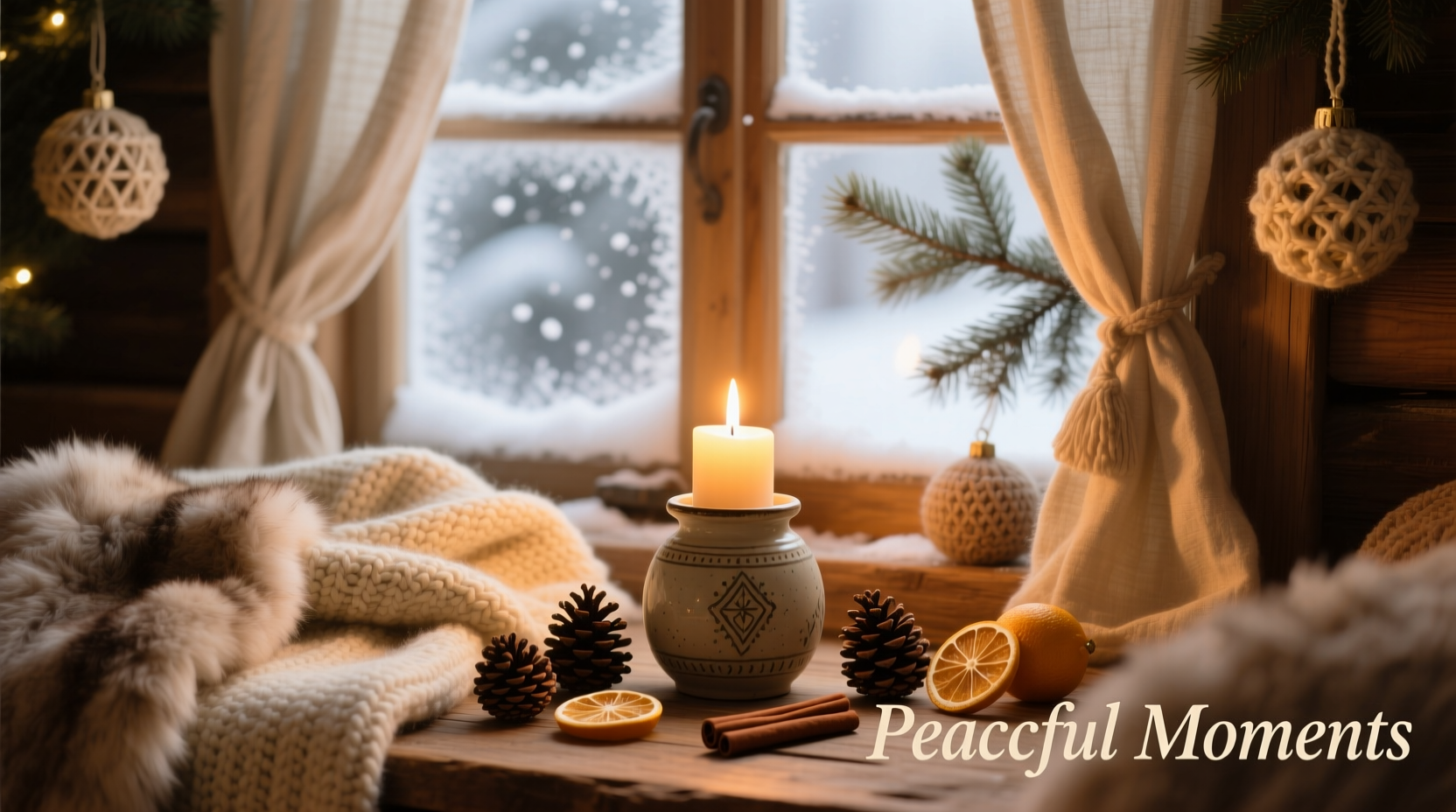
Soft lighting doesn’t mean dimness—it means intentionality. It’s the difference between light that *illuminates an object* and light that *holds a mood*. Think of how firelight dances across a wool blanket, or how a single beeswax candle casts shifting amber halos on pine boughs. These are not functional light sources alone; they’re atmospheric anchors.
Textural Layering: The Unseen Architecture of Calm
If soft lighting sets the emotional tone, texture provides the physical grammar. A calming Christmas aesthetic avoids visual flatness by stacking materials with contrasting hand-feel and surface behavior: nubby linen against smooth ceramic, raw-edged wood beside brushed brass, unspun wool next to matte-finish paper. These contrasts don’t compete—they converse. Each material absorbs or reflects light differently, creating subtle micro-shadows and depth that the eye can explore slowly, rather than scanning rapidly for focal points.
Texture also invites embodied connection. Running fingers over a hand-thrown mug, brushing a dried eucalyptus sprig, or sinking into a chunky knit throw activates the parasympathetic nervous system through gentle somatosensory input. This is why tactile richness matters more than visual density: three well-chosen textural elements will calm more effectively than ten identical ornaments.
“Calming spaces aren’t silent spaces—they’re *resonant* ones. Texture gives light something to land on, and light gives texture something to reveal. Together, they create a perceptual rhythm that mirrors breath.” — Dr. Lena Torres, Environmental Neuroscientist & Author of Sensory Space
A Step-by-Step Guide to Building Your Calming Scheme
Follow this sequence—not as rigid rules, but as a scaffold for thoughtful curation. Begin with light, then build outward in layers of texture and form.
- Start with ambient foundation light. Install warm-white, dimmable LED floor or table lamps (2700K max) in key zones: near seating, beside reading nooks, flanking mantels. Use fabric or paper shades—not glass—to diffuse output.
- Add localized warmth. Place 3–5 battery-operated pillar candles (unscented, flicker-free) on shelves, mantels, and side tables. Vary heights (e.g., 4\", 6\", 8\") to avoid uniformity.
- Introduce organic linear elements. Drape dried eucalyptus, olive branches, or preserved magnolia along mantels, stair rails, or tabletop edges. Avoid tight, symmetrical arrangements—let stems fall asymmetrically.
- Anchor with grounded textiles. Layer a natural-fiber rug (jute, seagrass, or undyed wool) under seating. Top with a generously sized, oversized knit throw in oatmeal, charcoal, or heather grey. Add one or two linen pillow covers with visible stitching or raw hems.
- Integrate quiet objects. Select 3–5 meaningful items: a hand-thrown ceramic tree ornament, a small brass bell, a smooth river stone wrapped in twine, a vintage book bound in cloth. Place them singly—not in clusters—on surfaces where hands naturally rest.
Do’s and Don’ts: Textures & Lighting in Practice
Successful execution hinges on nuance. Below is a distilled comparison of choices that support—or disrupt—the calming intent.
| Category | Do | Don’t |
|---|---|---|
| Light Sources | Use warm-white (2200K–2700K), non-dimmable bulbs in shaded fixtures; opt for candlelight simulation over sparkle | Install cool-white LEDs, blinking lights, or uncovered bare bulbs—even if “vintage-style” |
| Natural Elements | Choose dried botanicals with matte, porous surfaces (pampas, wheat, lavender); include raw wood slices or unglazed ceramics | Use glossy faux berries, plastic pine cones, or anything with synthetic sheen or uniform color saturation |
| Fabrics & Weaves | Select unbleached linens, nubby wools, bouclé, or hand-loomed cotton; embrace visible slubs, irregular weaves, and frayed edges | Pick polyester blends, high-sheen satin, or tightly woven fabrics with zero texture variation |
| Color Palette | Build around tonal neutrals: oyster, ash, parchment, charcoal, moss—and one muted accent (dusty rose, sage, or tarnished brass) | Rely on saturated primaries (kelly green, candy cane red) or stark black-and-white contrast |
| Arrangement Logic | Group by weight and scale—not symmetry. Let one large textured item dominate a shelf; balance with negative space | Align objects in grids, match heights rigidly, or fill every surface to the edge |
Mini Case Study: The Urban Apartment Living Room Transformation
Mira, a graphic designer in Portland, found her pre-holiday energy collapsing each December. Her previous decor—red velvet pillows, mirrored ornaments, and bright string lights—felt increasingly jarring against her otherwise muted, Scandinavian-inspired apartment. She began experimenting with restraint: she removed all overhead lighting except a single adjustable floor lamp with a linen shade (2700K). She replaced her tinsel garland with a 12-foot strand of dried eucalyptus, loosely coiled over her sofa’s backrest. On her coffee table, she placed a heavy, unglazed stoneware bowl holding three beeswax candles, a small bundle of cinnamon sticks, and a single smooth basalt stone collected from the Columbia River. She added a wide-weave oatmeal wool throw draped asymmetrically over the sofa arm and swapped her glossy red pillows for two linen-covered cushions in dove grey with visible topstitching.
“The change wasn’t dramatic visually,” Mira shared, “but the shift in *feel* was immediate. My partner noticed I stopped rubbing my temples when we sat down in the evenings. Guests commented on how ‘settled’ the room felt—not ‘Christmassy’ in the traditional sense, but deeply hospitable. I realized I’d been decorating for expectation, not experience.” Within two weeks, Mira extended the same principles to her kitchen counter (linen tea towels, wooden spoon rest, matte ceramic mugs) and entryway (a jute rug, raw-edge wooden coat hook, and a single brass bell hung on twine).
Essential Tools & Sourcing Principles
Creating this aesthetic doesn’t require specialty stores or high budgets—it requires discernment. Prioritize materials that age gracefully, show patina, and feel honest in their making.
- Lighting: Look for UL-listed, flicker-free battery-operated candles with realistic wax texture and weighted bases. For lamps, seek out brands that specify CCT (Correlated Color Temperature) and CRI (Color Rendering Index >90). Avoid “warm white” labels without Kelvin ratings—many mislabeled bulbs emit 3000K+ light.
- Botanicals: Source dried eucalyptus, lavender, or wheat from local flower farms or sustainable online growers (e.g., The Dried Flower Co., Botanica Collective). Avoid imported, chemically treated varieties that shed dust or emit strong odors.
- Textiles: Choose OEKO-TEX certified linens or GOTS-certified organic cotton/wool. Support small textile studios—many offer undyed, minimally processed yardage or finished throws with visible craftsmanship.
- Objects: Visit antique shops for unglazed ceramics, brass, or wood. Search Etsy using filters like “hand-thrown,” “raw edge,” or “natural finish.” Avoid mass-produced “rustic” items with artificial distressing.
FAQ
Can I achieve this aesthetic on a tight budget?
Absolutely. Start with what you already own: swap out harsh bulbs for warm-white replacements ($3–$5 per bulb), gather fallen branches or pinecones from local parks (check regulations first), repurpose old linen napkins as table runners, and fold a favorite sweater over a chair as instant texture. Calm aesthetics thrive on authenticity—not acquisition.
How do I keep the look from feeling “too sparse” or “unfestive”?
It’s not about adding more—it’s about deepening meaning. Instead of five ornaments, choose one heirloom piece and display it thoughtfully: on a bed of moss in a shallow dish, lit by a single candle. Festivity emerges from resonance, not volume. Ask: “Does this object spark quiet joy or nostalgic warmth?” If yes, it belongs—even if it’s not “Christmassy” in a conventional sense.
Is this approach suitable for families with young children?
Yes—with thoughtful adaptations. Use shatterproof resin “candles” instead of real flame. Opt for sturdy, kiln-fired ceramics over delicate porcelain. Choose machine-washable linen or cotton throws instead of dry-clean-only wool. Keep fragile or small-textured items on higher shelves, but ensure accessible tactile elements remain: a basket of smooth river stones, a bin of unfinished wooden blocks, or a soft, nubby rug where children can sit and play. Safety and sensory accessibility reinforce calm—not contradict it.
Conclusion
A calming Christmas aesthetic is an act of quiet resistance—not against joy, but against exhaustion disguised as festivity. It rejects the pressure to perform cheer and instead cultivates conditions where genuine warmth can emerge: in the hush after candlelight settles, in the weight of a wool throw pulled close, in the quiet reverence of touching something handmade and earth-rooted. Soft lighting and intentional texture are not decorative flourishes; they are tools of care—care for your nervous system, your attention, and the people who share your space. You don’t need to overhaul your home in one weekend. Begin with one lamp, one branch, one folded textile. Notice how light falls across it. Feel its surface. Breathe. That moment—attentive, unhurried, grounded—is where the season truly begins.


 浙公网安备
33010002000092号
浙公网安备
33010002000092号 浙B2-20120091-4
Comments
No comments yet. Why don't you start the discussion?