
Christmas need not be synonymous with sensory overload. In a season often defined by bold reds, glittering golds, and high-intensity LEDs, a growing number of designers, therapists, and mindful homeowners are choosing a different path: one rooted in stillness, warmth, and gentle visual harmony. A calming Christmas palette isn’t about minimalism for its own sake—it’s a deliberate, psychologically grounded strategy to reduce seasonal stress while deepening connection, presence, and rest. This approach centers on two interdependent elements: color selection guided by chromatic softness and luminance control through intentional lighting design. When these forces align, they transform spaces into sanctuaries—not stages.
The Psychology Behind Calm: Why Softness Matters
Human visual processing responds strongly to contrast, saturation, and brightness. High-saturation reds (like traditional candy-cane or poinsettia tones) trigger alertness and elevated heart rate—evolutionarily useful for spotting danger, but counterproductive when seeking holiday repose. Likewise, cool-white LEDs above 4000K mimic midday sun, suppressing melatonin and disrupting circadian rhythm just when rest is most needed.
Conversely, low-chroma, high-value colors—those with muted intensity and ample light reflectance—activate the parasympathetic nervous system. They signal safety, slowing respiration and lowering cortisol. Neuroaesthetics research confirms that environments using desaturated palettes with subtle tonal variation support sustained attention and emotional regulation. As Dr. Lena Torres, environmental psychologist at the University of Edinburgh, explains:
“Color doesn’t just decorate space—it modulates physiology. A palette built on whisper-soft tones and layered, diffused light creates what we call ‘visual quiet’: an environment where the eyes don’t have to work to resolve harsh edges or competing signals. That quiet directly translates into neural calm.” — Dr. Lena Torres, Environmental Psychologist & Author of *Chromatic Wellbeing*
This isn’t aesthetic preference—it’s neurobiological responsiveness. Calming palettes prioritize harmony over hierarchy, subtlety over spectacle, and warmth over wattage.
Building Your Core Palette: Five Foundational Hues
A truly calming Christmas palette avoids monochrome blandness by embracing nuanced tonal families—not single “safe” colors, but cohesive, interrelated hues that breathe together. Below are five foundational tones, each selected for chromatic softness, natural resonance, and lighting compatibility:
| Hue Name | Hex Code | Natural Reference | Lighting Behavior |
|---|---|---|---|
| Cloud Wool | #E6E3DD | Freshly spun alpaca fleece | Reflects warm light evenly; never glares, even under 2700K bulbs |
| Ember Ash | #B5A99C | Cool ash from a dying hearth fire | Deepens subtly under low light; gains warmth without shifting hue |
| Frosted Moss | #8D9A8D | Winter-damp evergreen needles under mist | Maintains green integrity in dim settings; avoids sickly yellow-green cast |
| Vanilla Smoke | #D8CDBB | Steamed milk swirling into dark roast coffee | Reads as warm neutral in daylight, creamy beige at night |
| Twilight Plum | #6A5B6B | Dusk sky over snow-covered hills | Provides quiet depth; stays rich, not muddy, below 15 lux |
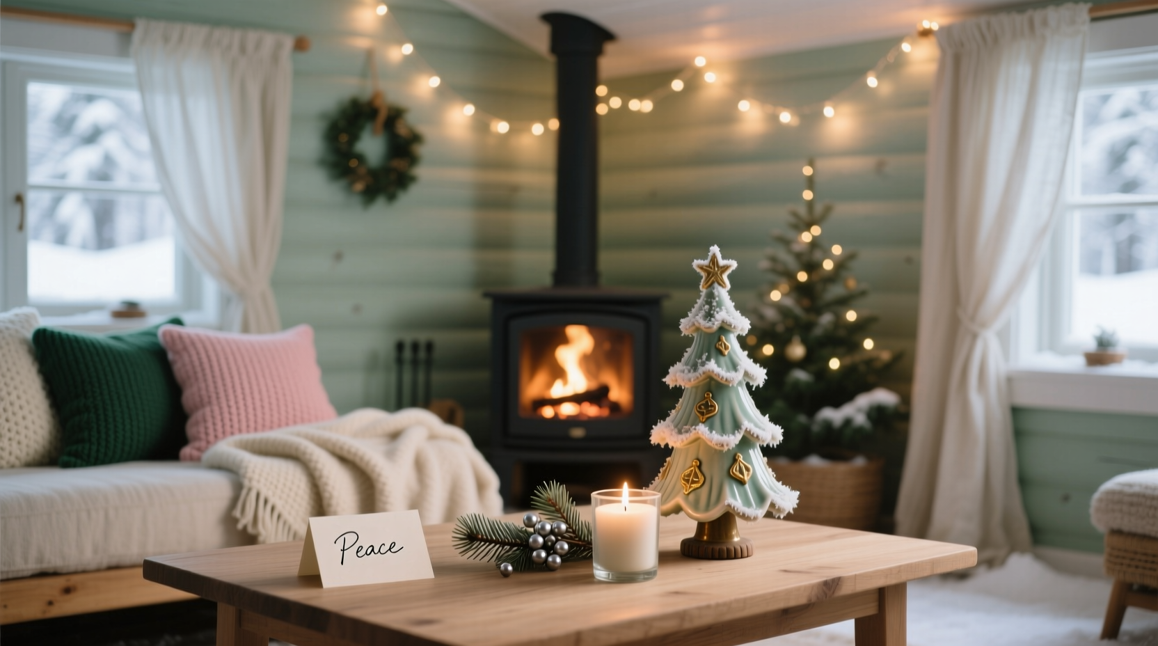
Notice the absence of pure white, black, or saturated primaries. These five tones share three critical properties: low saturation (no hue exceeds 25% chroma), high light reflectance (all values sit between 70–85 on the L* scale), and harmonious undertones (all lean subtly warm or neutral—no clashing cool/warm juxtapositions). Together, they form a flexible, breathable system: use Cloud Wool as your dominant wall or textile base; Ember Ash for wood tones or ceramic accents; Frosted Moss for botanical elements; Vanilla Smoke for upholstery or table linens; Twilight Plum for grounding textiles like throws or velvet cushions.
Soft Lighting: The Invisible Architect of Calm
Color cannot express calm without supportive illumination. Soft lighting here means more than low wattage—it refers to three technical qualities: low correlated color temperature (CCT), high color rendering index (CRI ≥ 95), and diffused distribution. A 2700K LED bulb with CRI 80 will flatten Frosted Moss into grayish olive; the same bulb at CRI 97 renders its subtle blue-green complexity and winter-fresh vitality.
Layer lighting intentionally:
- Ambient Base (30–50 lux): Use recessed, fully dimmed 2700K fixtures with frosted glass lenses or fabric shades. Avoid exposed bulbs—every light source must be obscured from direct line of sight.
- Task Accent (70–100 lux): For reading nooks or mantel displays, use adjustable brass or matte-black sconces fitted with Edison-style filament bulbs (2200–2400K). Their gentle, directional glow highlights texture without glare.
- Atmospheric Glow (5–15 lux): This is where Christmas magic lives softly: battery-operated fairy lights inside linen pouches, LED candles nestled in frosted glass jars, or fiber-optic strands woven into garlands. These emit no heat, cast zero shadows, and produce ambient luminescence—not illumination.
Crucially, eliminate all sources above 2700K—including smart bulbs set to “cool white,” unshaded string lights, and standard overheads. Even one cool-toned light disrupts the entire thermal harmony of the palette, triggering subtle physiological resistance.
A Real-World Transformation: The Harper Family Living Room
In December 2023, the Harper family in Portland, Oregon, redesigned their main living space after years of post-holiday exhaustion. Their previous setup featured crimson velvet pillows, metallic gold ornaments, and bright white LED garlands strung across every surface. While festive, family members reported headaches by noon, restless nights, and children becoming overstimulated and irritable during gatherings.
Working with interior designer Maya Chen (specializing in neuro-inclusive spaces), they implemented a calibrated calming palette over three weeks:
- Walls repainted in Cloud Wool (#E6E3DD), replacing stark white.
- Existing oak shelving stained with a custom Ember Ash wash to unify grain and tone.
- Frosted Moss wool felt ornaments handmade with local artisans—textural, silent, non-reflective.
- Vanilla Smoke linen curtains installed with blackout lining, layered over sheer ivory voile.
- Twilight Plum velvet floor cushions added for grounding weight and tactile comfort.
- All lighting replaced: recessed 2700K/97CRI LEDs (dimmed to 40%), brass sconces with 2400K filament bulbs, and 120 feet of warm-white micro-LEDs concealed within eaves and behind bookshelves.
Results were immediate and measurable. Within days, adults reported deeper sleep onset and reduced evening anxiety. Children engaged in longer, quieter play. Guests consistently commented on the “hush” of the room—not silence, but a palpable sense of ease. As Sarah Harper shared in her journal: “It didn’t feel less festive. It felt more *true*. Like the joy wasn’t shouting—it was breathing.”
Your Step-by-Step Implementation Plan
Creating this effect requires intention—not perfection. Follow this realistic, phased sequence:
- Week 1: Audit & Remove
Walk through your space at dusk. Note every light source (bulbs, strings, candles) and every dominant color object (ornaments, textiles, decor). Remove anything above 2700K or with saturation above 30% (test with a grayscale filter app). Discard or store—don’t compromise. - Week 2: Anchor & Layer
Paint one key surface (walls, ceiling, or large furniture) in Cloud Wool. Install your new ambient lighting. Add one major textile in Vanilla Smoke (a throw, runner, or pillow set). This establishes your tonal foundation. - Week 3: Introduce Depth
Add Ember Ash accents (wood stain, ceramic vase, framed art matting) and Frosted Moss elements (dried eucalyptus, wool garland, hand-dyed paper ornaments). Ensure all have matte or suede finishes—no gloss, no foil, no plastic sheen. - Week 4: Refine Light Quality
Install atmospheric glow sources. Place them so light falls *on surfaces*, not into eyes. Test with a light meter app: ambient zones should read 30–50 lux; accent zones 70–100 lux; glow zones 5–15 lux. Adjust dimmers accordingly. - Week 5: Live & Observe
Resist adding more. Spend time in the space at different times of day. Note where calm holds—and where tension lingers. Adjust only one element at a time: swap a bulb, reposition a cushion, trim a garland. Calm is iterative, not instantaneous.
Do’s and Don’ts: Color & Light Alignment Checklist
- ✓ All bulbs are 2700K or lower, with CRI ≥ 95
- ✓ No ornament or textile has a glossy, metallic, or mirrored finish
- ✓ Every color used appears in at least two materials (e.g., Frosted Moss in both wool garland and ceramic bowl)
- ✓ There is at least one “quiet zone”—an area with zero decorative objects, lit only by ambient light
- ✗ No pure white, black, or neon accents appear anywhere in the visible field
- ✗ No light source is visible from seated eye level
FAQ: Practical Questions Answered
Can I incorporate traditional red or green without breaking the calm?
Yes—if radically softened. Replace “Christmas red” with Ember Ash (#B5A99C) or Twilight Plum (#6A5B6B); replace “holly green” with Frosted Moss (#8D9A8D) or Cloud Wool with a green-gray undertone. Never use saturated versions. The tradition lies in symbolism—not pigment intensity.
What if I can’t change my overhead lighting right now?
Use full-spectrum, dimmable 2700K LED bulbs with CRI 95+ and install high-quality fabric lampshades or pendant diffusers. Layer heavily with atmospheric glow sources to draw visual focus downward and away from ceilings. Prioritize controlling light quality over replacing fixtures immediately.
Does this palette work in small or dark rooms?
Especially well. Low-saturation, high-reflectance tones expand perceived space. Cloud Wool walls bounce soft light efficiently, while Twilight Plum adds depth without heaviness. Avoid dark accents—opt for Ember Ash instead of charcoal, Vanilla Smoke instead of brown.
Conclusion: Calm Is a Choice You Make With Color and Light
A calming Christmas isn’t achieved by removing festivity—it’s cultivated by refining it. It asks us to shift from spectacle to substance, from volume to vibration, from accumulation to attunement. When you choose Cloud Wool over stark white, Frosted Moss over neon green, and 2700K/97CRI light over blinding LEDs, you’re not compromising on beauty—you’re elevating it. You’re designing for human biology, honoring the nervous system’s need for rest even amid celebration. This palette doesn’t mute joy; it lets joy resonate more deeply, linger longer, and settle more quietly into the bones.
Start small: replace one bulb tonight. Repaint one shelf next weekend. Weave a length of warm micro-LEDs into your existing garland. Let calm accumulate—not as an absence, but as a presence you grow more familiar with each evening. Your home doesn’t need to shout “Merry Christmas” to feel joyful. Sometimes, the most profound holiday feeling arrives not with a fanfare—but with a sigh of relief, a slow blink, and the quiet certainty that you are exactly where you need to be.


 浙公网安备
33010002000092号
浙公网安备
33010002000092号 浙B2-20120091-4
Comments
No comments yet. Why don't you start the discussion?