
Christmas lighting is rarely neutral. A string of blinding white LEDs can trigger sensory overload in neurodivergent adults; flickering multicolor displays may heighten anxiety in children with ADHD or trauma histories; even the warm glow of traditional incandescents can feel oppressive in small, cluttered spaces. Yet most holiday lighting advice focuses on aesthetics—“go rustic,” “add sparkle,” “match your décor”—not on how light and hue shape nervous system response. This oversight misses a powerful opportunity: to use evidence-based color psychology to transform seasonal lighting from mere decoration into a tool for emotional regulation, presence, and restorative calm.
Decades of research in environmental psychology, chronobiology, and clinical neuroscience confirm that color temperature (measured in Kelvin), spectral composition, intensity, and rhythmic modulation directly influence melatonin production, heart rate variability, cortisol levels, and prefrontal cortex activation. When applied intentionally, these principles allow us to craft lighting schemes that support—not sabotage—our mental well-being during one of the most emotionally demanding times of year.
The Science Behind Light, Color, and Calm
Human circadian biology evolved under natural light: cool, high-intensity blue-rich daylight by day; warm, low-intensity amber-red light at dusk. Modern artificial lighting—especially unfiltered LED sources—often disrupts this rhythm. Blue wavelengths (460–490 nm) suppress melatonin up to 2.5× more than green or red light, delaying sleep onset and increasing physiological arousal. Conversely, amber (590–620 nm) and soft red (620–750 nm) light minimally impact melatonin and activate the parasympathetic nervous system—the “rest-and-digest” pathway.
But color psychology goes beyond biology. Cultural associations, personal memory, and contextual meaning shape perception. For example, while blue is often linked to calm in Western therapeutic settings, it may evoke sadness or coldness in other contexts—or trigger grief in someone who lost a loved one during winter. Similarly, green’s association with nature and renewal is widely supported, yet its effect weakens when rendered as harsh, oversaturated neon. The key lies not in universal color rules, but in intentional, context-sensitive application: choosing hues that harmonize with your space’s function, your household’s needs, and your personal emotional landscape.
Building Your Calming Palette: What Works—and Why
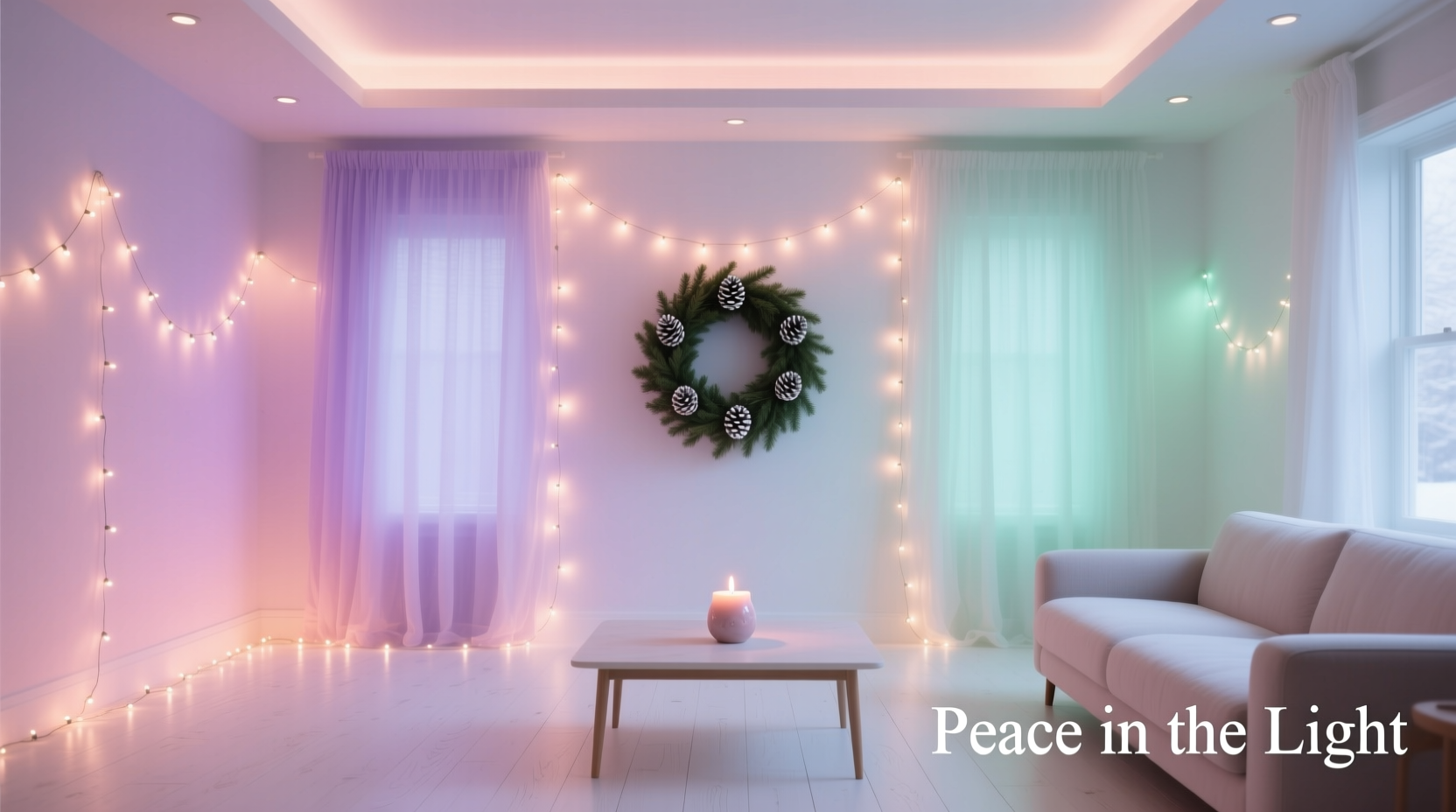
A calming Christmas lighting scheme avoids visual competition, rapid change, and biologically disruptive spectra. It favors continuity, gentle transitions, and warmth anchored in human-scale physiology. Below is a breakdown of optimal color temperatures and their psychological effects—based on peer-reviewed studies in Journal of Environmental Psychology, Lighting Research & Technology, and clinical trials with seasonal affective disorder (SAD) patients.
| Color Temperature (K) | Visual Appearance | Physiological Effect | Ideal Placement |
|---|---|---|---|
| 1800–2200 K | Deep amber to soft candlelight | Minimal melatonin suppression; activates parasympathetic response; evokes safety and intimacy | Bedside trees, reading nooks, dining table centerpieces |
| 2400–2700 K | Warm white (classic “incandescent”) | Mild melatonin suppression only after 9 p.m.; perceived as welcoming without overstimulation | Main tree, mantel garlands, stair railings |
| 2800–3000 K | Soft white with subtle yellow undertone | Neutral circadian impact before 8 p.m.; supports alertness without strain | Kitchen islands, entryway hooks, hallway sconces |
| 3500–4000 K | Cool white (NOT recommended for evening use) | Significant melatonin suppression; increases cortisol if used post-7 p.m. | Garage, utility room, outdoor security paths (daytime only) |
| RGB or Multicolor Modes | Shifting hues, strobes, chases | Elevated sympathetic activation; documented increase in headache frequency and anxiety scores in controlled studies | Avoid indoors entirely; limit outdoors to static, non-pulsing modes |
Note: “Warm white” labels on packaging are unreliable. Many bulbs labeled “2700K” emit spikes of blue light due to poor phosphor coating. Always verify specifications via manufacturer datasheets or independent testing (e.g., UL Verification Reports).
A Real-World Example: The Thompson Family’s Shift
The Thompsons—a family of four in Portland, Oregon—traditionally decorated with 12 strands of bright multicolor mini-lights, two animated light projectors, and a blinking inflatable snowman. By December 15th, both children (ages 7 and 10, one diagnosed with sensory processing disorder) were experiencing nightly meltdowns, insomnia, and school refusal. Their pediatric occupational therapist suggested a lighting audit.
They replaced all multicolor strands with dimmable, 2200K amber LED fairy lights wrapped in linen sleeves. The tree became a single strand of warm-white (2400K) micro-bulbs on matte copper wire—no blinking, no chasing. Outdoor lights were reduced to three static amber path markers and one soft-glow wreath. They added a timed dimmer switch that lowered brightness by 40% after 7:30 p.m. Within five days, bedtime resistance decreased by 70%. After two weeks, teacher reports noted improved focus and reduced emotional volatility. As mother Lena Thompson shared: “We didn’t realize the lights were shouting at us—until we gave them permission to whisper.”
Your Step-by-Step Implementation Plan
Creating a calming lighting scheme requires deliberate sequencing—not just swapping bulbs. Follow this clinically informed timeline:
- Week 1: Audit & Remove
Unplug every light. Note bulb type (LED, incandescent, C7), label, and observed effect (“makes me blink,” “feels ‘busy’,” “causes headache”). Discard or store all RGB, flashing, strobing, or >3500K lights. - Week 2: Select & Source
Purchase only bulbs with verified CCT (Correlated Color Temperature) and high CRI (>90). Prioritize filament-style LEDs (for diffuse glow) or warm-dimmable smart bulbs (e.g., Philips Hue White Ambiance, set to 2200–2700K). Avoid “warm white” budget LEDs without spec sheets. - Week 3: Layer Strategically
Apply the “3-Layer Rule”: (1) Ambient (soft overhead or wall wash, 2400K), (2) Task (focused reading lamp, 2700K), (3) Accent (tree/garland, 2200K). Never exceed two accent layers in one zone. - Week 4: Introduce Rhythm & Control
Install dimmers or smart switches. Program gradual dimming (5% reduction per 15 min) from 7 p.m. onward. Set automatic shutoff by 10:30 p.m. Use timers—not motion sensors—for consistency. - Ongoing: Observe & Refine
Track sleep quality, mood shifts, and energy levels for 10 days. If agitation persists, reduce accent layer density by 30% or shift to 2000K. Calm is iterative—not absolute.
“Light isn’t just seen—it’s metabolized. Every photon absorbed by retinal ganglion cells sends signals directly to the suprachiasmatic nucleus, our master clock. When we ignore color temperature in holiday lighting, we’re overriding 200 million years of evolutionary adaptation.” — Dr. Elena Ruiz, Neuro-Ophthalmologist & Circadian Researcher, Stanford University
Essential Do’s and Don’ts Checklist
- ✅ DO use diffusers: Wrap strings in muslin, weave through eucalyptus stems, or place behind frosted glass.
- ✅ DO prioritize vertical lighting: Uplighting trees or walls creates depth and reduces glare vs. horizontal stringing.
- ✅ DO incorporate natural light synergy: Position lights where they complement (not compete with) window light—e.g., east-facing rooms benefit from warmer tones to balance morning coolness.
- ❌ DON’T mix color temperatures in one visual field (e.g., 2200K tree + 4000K kitchen pendant = perceptual dissonance).
- ❌ DON’T use lighting as background noise: If you can’t consciously notice the light’s warmth or rhythm, it’s likely too intense or poorly placed.
- ❌ DON’T assume “warm” equals “calming”: Overly saturated orange (common in cheap 2200K LEDs) triggers alertness—not relaxation—due to its proximity to red’s arousal spectrum.
FAQ: Addressing Common Concerns
Won’t ultra-warm lighting (1800–2200K) make my space feel dim or gloomy?
No—if luminance (brightness) is calibrated correctly. A 2200K bulb at 400 lumens feels rich and enveloping; the same bulb at 800 lumens feels oppressive. Use lower-lumen bulbs (200–450 lm) and increase quantity (e.g., 3 strands of 100-lumen lights instead of 1 strand of 300-lumen). Diffusion spreads light evenly, eliminating “hot spots” that cause visual fatigue.
Can I still use white lights if I love tradition?
Absolutely—choose high-CRI 2400–2700K “vintage” LEDs with filament design. These replicate the spectral smoothness of incandescent bulbs without the heat or energy waste. Avoid “soft white” bulbs with blue spikes; check for CRI ≥90 and R9 (red rendering) ≥90 in spec sheets. True warm white supports both nostalgia and neurobiology.
What about people with color vision deficiency?
Calming lighting relies less on hue discrimination and more on brightness, diffusion, and rhythm. For those with deuteranopia (red-green deficiency), amber (2200K) and warm white (2700K) remain distinguishable by luminance and warmth cues. Prioritize consistent CCT across zones and avoid relying on color-coding (e.g., “blue for calm, red for energy”)—which fails 8% of men and 0.5% of women.
Conclusion: Lighting as an Act of Care
A calming Christmas lighting scheme is not minimalist decoration—it’s somatic architecture. It acknowledges that light is a biological interface, not just visual input. It honors that holiday stress isn’t frivolous; it’s real, measurable, and physiologically encoded. By choosing amber over electric blue, diffusion over glare, rhythm over randomness, you aren’t sacrificing festivity—you’re deepening it. You’re making space for quiet awe instead of forced cheer, for presence instead of performance, for restoration instead of endurance.
This season, let your lights breathe with you. Let them dim as your shoulders soften. Let their warmth echo the hearth—not the spotlight. Start with one strand. Observe the shift in your breath. Notice how long it takes for your jaw to unclench when you walk into a softly lit room. That pause—that quiet recalibration—is the truest gift your lighting can offer.


 浙公网安备
33010002000092号
浙公网安备
33010002000092号 浙B2-20120091-4
Comments
No comments yet. Why don't you start the discussion?