
A beautifully decorated home during the holidays does more than impress guests—it enhances the festive spirit for everyone inside. Yet too often, homes fall into the trap of mismatched decor: a red-and-green living room, a silver-and-blue dining area, and a gold-and-white bedroom that feels like it belongs in a different season altogether. Creating a cohesive Christmas color scheme across rooms transforms your house into a unified celebration of the season, where every space feels intentional and connected. The key isn’t uniformity, but harmony—using a consistent palette with thoughtful variations that reflect each room’s function and mood.
Start with a Unified Color Foundation
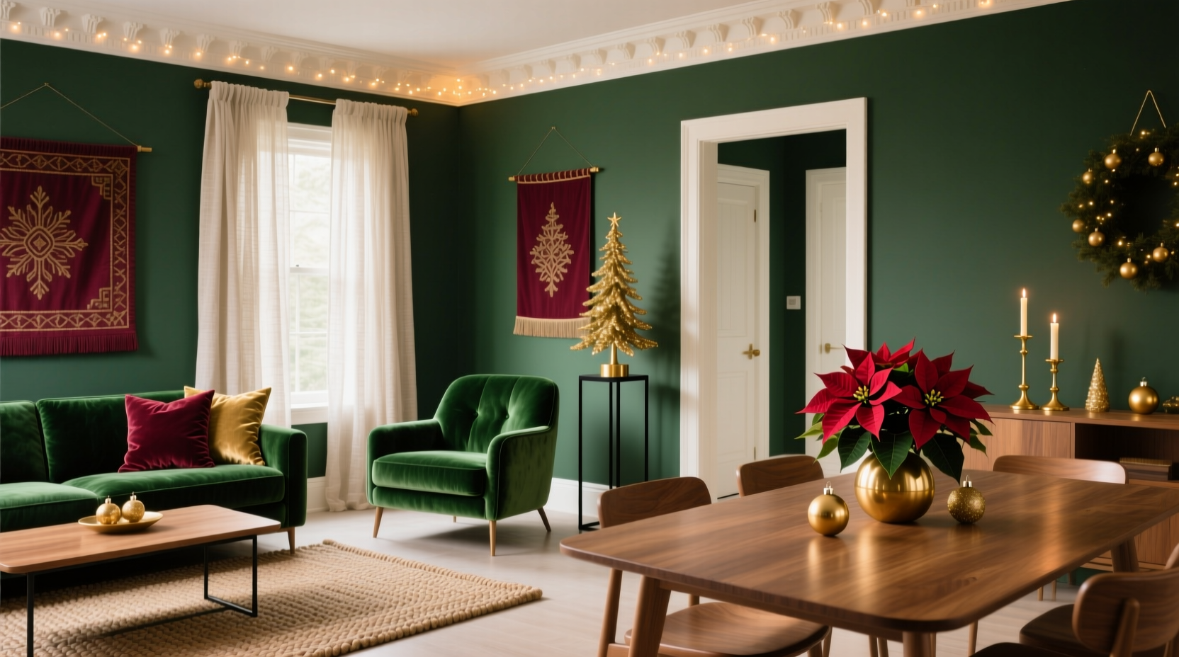
The first step in achieving cohesion is choosing a master color palette. While traditional red, green, and gold remain popular, modern interpretations embrace everything from icy pastels to deep jewel tones. What matters most is selecting three to four core colors that will anchor your entire home’s decor.
Begin by identifying a dominant color—this will be the most visible shade throughout your spaces. Then choose one or two secondary colors that complement it, followed by an accent hue for visual interest. For example:
- Dominant: Forest green
- Secondary: Cream or ivory
- Accent: Burnt copper or matte gold
This foundation allows flexibility. In the living room, you might emphasize green with plush throws and garlands, while in the kitchen, cream takes center stage on table linens, accented by copper ornaments. The repetition of these hues—even in varying proportions—creates continuity.
Use a Base Palette with Room-Specific Variations
Cohesion doesn’t mean monotony. Each room serves a different purpose and can express the theme in its own way. The living room may lean into bold statement pieces, while the bedroom embraces soft textures and subdued lighting. The trick is maintaining the same color language while adjusting intensity and application.
Consider this approach:
- Living Room: Use the full palette boldly—green tree, gold-trimmed stockings, cream pillows. Add depth with layered textures like velvet and faux fur.
- Dining Room: Focus on elegance. A cream table runner with green napkin rings and copper cutlery ties into the scheme without overwhelming the space.
- Bedroom: Soften the look. Swap bright green for sage-toned bedding, use cream string lights, and place a single gold-trimmed wreath above the bed.
- Bathroom: Subtle touches—a green hand towel, a small sprig of pine in a vase, gold soap dispenser—keep the theme present without clutter.
This method ensures every room contributes to the overall aesthetic while respecting its unique role in the household.
Step-by-Step Guide: Building Your Scheme Room by Room
Follow this five-step process to implement a cohesive look throughout your home:
- Define Your Core Colors (Day 1)
Select 3–4 primary colors using inspiration from nature, heirloom ornaments, or existing decor. Write them down and assign each a role: dominant, secondary, accent. - Map Out Each Room (Day 2)
Walk through your home and note how much space each room has for decor. Prioritize high-traffic areas like the entryway, living room, and dining space. - Assign Color Roles Per Room (Day 3)
Determine which color will take center stage in each room. For instance, let gold shine in the dining room, while cream dominates the hallway. - Shop Strategically (Days 4–7)
Purchase only items that fit your palette. Avoid impulse buys in clashing colors. Repurpose existing decor that aligns with the scheme. - Install & Adjust (Final Weekend)
Decorate room by room, stepping back frequently to assess balance. Move standout pieces between rooms if one area feels overloaded.
Expert Insight: The Psychology of Holiday Color Harmony
Color isn’t just decorative—it shapes emotion. Interior designer Mara Sinclair, who specializes in seasonal transformations, emphasizes intentionality:
“People underestimate how much color continuity affects mood during the holidays. A disjointed palette creates subconscious stress. When colors flow from room to room, it signals safety and order—exactly what we seek during a busy season.” — Mara Sinclair, Interior Designer & Seasonal Stylist
Sinclair recommends grounding festive schemes in earthy tones like forest green, walnut brown, or deep burgundy. These shades provide stability, allowing metallics and whites to add sparkle without chaos. She also advises against over-relying on artificial reds and greens, which can feel jarring under indoor lighting. Instead, she suggests incorporating real greenery—pine, eucalyptus, cedar—which naturally varies in shade and brings organic warmth.
Do’s and Don’ts: Maintaining Cohesion Without Sacrificing Style
Even with a strong plan, common mistakes can disrupt harmony. This table outlines essential do’s and don’ts to keep your scheme intact:
| Do | Don’t |
|---|---|
| Repeat at least one element in every room (e.g., gold accents, pine boughs). | Use a new color combination in each room “to keep things interesting.” |
| Vary textures (velvet, wood, metal) within the same color family for depth. | Stick to one material (e.g., all plastic ornaments), which looks flat and cheap. |
| Use neutral connectors like cream, beige, or gray to bridge bold colors. | Introduce black unless it’s part of your original plan—black absorbs light and can make spaces feel cold. |
| Repurpose decorations across rooms after events (e.g., move centerpiece florals to the entry). | Leave every decoration up for six weeks—rotate small elements to keep the look fresh. |
Real Example: The Thompson Family’s Transitional Townhouse
The Thompsons live in a narrow three-story townhouse where each floor serves a distinct function: entertaining on the main level, dining on the second, and sleeping on the third. Last year, their decor felt fragmented—red tinsel in the living room, blue snowflakes in the kids’ bedrooms, and mismatched ornaments on the tree.
This year, they committed to a forest green, cream, and antique gold scheme. They began by painting a large wreath in cream on the front door—a subtle signal of the theme to come. Inside, the ground floor featured a green-trimmed tree with gold-dipped pinecones and cream ribbon. The dining table used cream linens with green napkin cuffs and gold-rimmed glasses.
Upstairs, the children’s rooms incorporated smaller versions of the same elements: green stockings with gold names, cream night-lights shaped like stars, and miniature wreaths made of preserved eucalyptus. Even the bathrooms had matching green hand towels and gold-sprayed bottle labels.
The result? Guests commented on the “calm, elegant” atmosphere. More importantly, the family felt a greater sense of peace during a typically hectic season. By sticking to the same palette, they reduced decision fatigue and created a home that felt truly festive—not frantic.
Checklist: Achieving a Cohesive Christmas Color Scheme
Use this checklist to ensure every room aligns with your vision:
- ☐ Selected 3–4 core colors (one dominant, one or two secondary, one accent)
- ☐ Tested colors in natural and artificial light across rooms
- ☐ Identified high-visibility areas (entry, living room, staircase)
- ☐ Assigned primary color focus per room (e.g., gold in dining, cream in hallway)
- ☐ Reused at least one decorative element (wreaths, ribbon, ornaments) in multiple rooms
- ☐ Incorporated natural materials (wood, pine, dried citrus) for texture and authenticity
- ☐ Limited off-palette purchases to functional items (e.g., wrapping paper)
- ☐ Scheduled a final walkthrough to assess visual flow between spaces
Frequently Asked Questions
Can I include family heirlooms that don’t match my color scheme?
Yes—but integrate them thoughtfully. If you have a red glass ornament passed down through generations, pair it with other red elements in one curated display rather than scattering it randomly. Alternatively, surround it with green and gold accents so it becomes a focal point within the scheme, not a disruption.
What if I want different themes in each room (e.g., rustic cabin, winter wonderland)?
Themes can vary, but the color foundation must stay consistent. A rustic cabin room can use wooden signs and plaid in green and cream, while a winter wonderland space uses frosted branches and glittery gold—both rooted in the same palette. The emotional tone changes, but the visual language remains unified.
How do I handle kids’ preferences without breaking the scheme?
Give children creative freedom within boundaries. Let them choose ornaments—as long as they’re in one of your approved colors. Offer craft kits using green, cream, and gold supplies. This fosters inclusion while preserving design integrity.
Conclusion: Design a Home That Feels Truly Festive
A cohesive Christmas color scheme is more than an aesthetic choice—it’s an act of care. It reduces visual noise, supports emotional well-being, and turns your home into a sanctuary during a demanding time of year. By anchoring your decor in a consistent palette, varying expression by room, and repeating key elements, you create a narrative that unfolds as people move through your space.
You don’t need a professional budget or designer skills. You need intention, a few well-chosen colors, and the willingness to edit out what doesn’t belong. Start small, test your choices, and refine as you go. The goal isn’t perfection—it’s harmony.


 浙公网安备
33010002000092号
浙公网安备
33010002000092号 浙B2-20120091-4
Comments
No comments yet. Why don't you start the discussion?