
Creating a cohesive Christmas color scheme transforms your home into a harmonious winter retreat where every room, ornament, and light feels intentionally connected. More than just matching red and green, a well-designed holiday palette ties together your tree, mantel, dining table, and entryway into a unified experience. The magic lies not in abundance but in consistency—choosing a few core colors and applying them thoughtfully across spaces. This guide walks you through the process of selecting, testing, and implementing a color story that elevates your entire holiday aesthetic without feeling cluttered or chaotic.
Start with Your Existing Decor and Space
Your home’s permanent interior style should anchor your holiday palette. A modern minimalist space may feel overwhelmed by traditional crimson velvet and gold tassels, while a rustic farmhouse might lack cohesion if styled with icy silver and white metallics alone. Begin by assessing the dominant colors in your living room rug, kitchen backsplash, or bedroom bedding. These are natural starting points for building a Christmas scheme that feels integrated, not imposed.
For example, if your sofa is deep navy and your accent pillows are mustard yellow, consider a non-traditional Christmas palette of navy, gold, and cream. This approach ensures the holiday decor enhances rather than clashes with your everyday environment. Similarly, homes with warm wood tones benefit from earthy reds and forest greens, while cooler gray-based interiors often pair better with sage, silver, and frosted white.
Choose a Core Palette of 3–5 Colors
A cohesive color scheme relies on restraint. Limiting your palette to three to five colors—including neutrals—creates visual rhythm. Most successful Christmas themes follow a simple structure: one dominant color, one or two supporting hues, and one or two accent shades. Neutrals like white, cream, black, gray, or natural wood count toward your total but offer flexibility.
Popular combinations include:
- Classic Red & Green: Deep emerald with cherry red and antique gold accents.
- Winter White & Silver: Icy white, brushed silver, and pale blue-gray for a frost-kissed effect.
- Rustic Farmhouse: Cream, burlap tan, evergreen, and matte black for a grounded, organic feel.
- Luxury Velvet: Navy, ruby, and brass—rich and elegant without being flashy.
- Nordic Forest: Moss green, birch white, and touches of burnt orange or cinnamon.
“Cohesion comes from repetition, not variety. Use the same few colors in different textures and finishes to add depth without breaking harmony.” — Lena Pruitt, Interior Stylist & Holiday Design Consultant
Apply the Scheme Room by Room
Once your palette is set, distribute it consistently throughout your home. The goal isn’t uniformity—every room should reflect its function—but continuity. Use the same color ratios and material language so transitions feel intentional.
Entryway
The first impression sets the tone. Hang a wreath in your primary green with red berries or dried citrus slices. Line the console with candles in your accent color (e.g., navy taper candles) and scatter pinecones dipped in gold paint. Even your doormat can echo the theme—choose one with embroidered lettering in a supporting hue.
Living Room
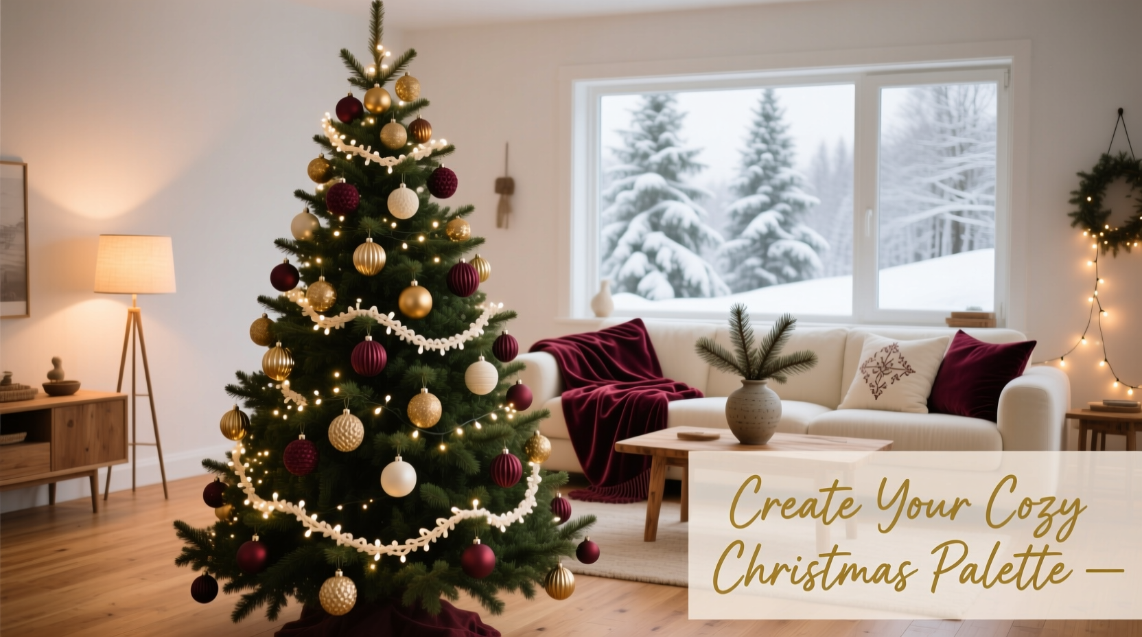
This is the centerpiece of your holiday display. Drape your tree with lights in a warm white or soft gold to complement your palette. Ornaments should reflect all your chosen colors—don’t overload on one shade. For example, if using sage, cream, and copper, aim for 50% sage bulbs, 30% cream textured balls, and 20% copper stars or geometrics.
Extend the scheme to throw pillows, blankets, and coffee table vignettes. A tray with mini pine trees, cream candles, and copper-dipped pinecones ties back to the tree. If you have built-in shelves, style them with books wrapped in kraft paper and tied with twine in your accent color.
Dining Room
Here, function meets festivity. Use table linens in your dominant or neutral color. A cream runner with a garland of eucalyptus, red berries, and small ornaments repeats the tree’s materials. Chair sashes in your secondary color (like forest green) unify seating. Even flatware ribbons or place card holders can echo your palette.
Tree as Focal Point
Your Christmas tree should be the most concentrated expression of your scheme. Start with lights as the base layer—warm white blends best with warm palettes; cool white suits icy themes. Then layer in ribbon or garland in one supporting color. Finally, hang ornaments in varying sizes and textures but consistent hues.
Step-by-Step Guide to Building Your Scheme
- Assess your home’s year-round palette. Note wall colors, furniture, and textiles.
- Select a mood or theme. Are you aiming for cozy, glamorous, traditional, or modern?
- Pick 3–5 colors that align with both your theme and existing decor.
- Create a physical or digital mood board with paint swatches, fabric scraps, and product images.
- Shop with a list. Only buy decor items in your designated colors.
- Test in one room first. Style your tree or mantle and live with it for 24 hours.
- Adjust as needed. Swap out clashing pieces before expanding to other areas.
- Deploy consistently. Carry the same colors and textures into every decorated space.
Do’s and Don’ts: Maintaining Cohesion
| Do | Don't |
|---|---|
| Use multiple textures in the same color (e.g., velvet, glass, wood) | Mix too many competing patterns or finishes |
| Repeat key elements (like a signature ornament or ribbon) in different rooms | Introduce new colors after finalizing the palette |
| Incorporate natural elements (pine, holly, cinnamon sticks) that fit your scheme | Let packaging or storage items break the mood (use neutral bins) |
| Balance shiny and matte finishes for depth | Over-light one area while leaving another dim |
| Store decor by color group for next year | Reinvent the palette annually without reason |
Real Example: The Urban Apartment Transformation
Sophie, a graphic designer in Chicago, lives in a loft with exposed brick, stainless steel appliances, and gray hardwood floors. Each year, her decorations felt disjointed—red here, silver there, no real flow. In November, she decided to build a cohesive scheme around her space.
She started by identifying her home’s base: warm grays, black metal, and brick red accents. She chose a palette of charcoal, cranberry, and champagne gold—colors that echoed her environment. Her tree was dressed in matte black ornaments, cranberry glass bulbs, and gold-dipped twig stars. Lights were warm white with a slight gold tint.
The living room mantle got a garland of seeded eucalyptus with cranberry sprigs and gold wire-wrapped pinecones. Pillows in charcoal velvet and cranberry linen repeated the tree’s colors. Even her dining table featured black chargers, cranberry napkins, and gold-rimmed glasses.
Visitors commented on the “intentional” feel of her decor. Sophie realized that cohesion wasn’t about buying more—it was about editing and repeating. By staying within her three-color framework, every piece supported the whole.
Checklist: Creating Your Cohesive Christmas Scheme
- ☐ Audit your home’s permanent color scheme
- ☐ Choose a holiday mood (cozy, elegant, playful, etc.)
- ☐ Select 3–5 colors (include at least one neutral)
- ☐ Create a mood board with swatches and inspiration
- ☐ Shop only for items in your approved palette
- ☐ Style the tree first as a reference point
- ☐ Repeat key colors and textures in every decorated room
- ☐ Edit ruthlessly—remove anything that doesn’t belong
- ☐ Photograph your setup for future reference
- ☐ Store decor by color group for easy retrieval next year
Frequently Asked Questions
Can I mix metallics in my color scheme?
Yes, but limit yourself to one primary metallic. Mixing gold and silver can work if balanced correctly—use one as dominant and the other as an accent. For example, gold tree picks with silver candle holders can harmonize if both appear in moderation and share a common neutral base like white or gray.
What if my family prefers traditional red and green, but my home is modern?
Adapt tradition to fit your space. Use sophisticated versions of red and green: deep burgundy instead of bright red, matte hunter green instead of glossy lime. Pair with black, concrete gray, or bleached wood. This honors the spirit of the season while respecting your aesthetic.
How do I make kids’ handmade ornaments fit a cohesive scheme?
Display them thoughtfully. Cluster them on one branch or section of the tree, then surround them with solid-colored ornaments in your palette. Use ribbons or tags in your accent color to tie them in. Their charm becomes a feature, not a disruption.
Final Thoughts: Design with Intention
A cohesive Christmas color scheme isn’t about perfection—it’s about intention. When your tree, mantel, and table settings speak the same visual language, your home feels calmer, more inviting, and truly festive. The effort pays off not just in aesthetics, but in atmosphere. Guests sense the care behind the details, and you enjoy a holiday environment that feels authentic and personal.
Start early, edit bravely, and repeat what works. Over time, you may even develop a signature holiday palette—one that becomes part of your family’s tradition. And when January arrives, pack it away with care, knowing you’ve created something worth revisiting.


 浙公网安备
33010002000092号
浙公网安备
33010002000092号 浙B2-20120091-4
Comments
No comments yet. Why don't you start the discussion?