
Christmas lighting has evolved far beyond strings of red-and-green bulbs. Today’s smart lighting ecosystems—Philips Hue, Nanoleaf, LIFX, Govee, and others—offer unprecedented control over hue, saturation, brightness, timing, and synchronization. Yet many homeowners still default to preset “festive” modes or haphazardly mix warm whites with saturated reds and icy blues, resulting in visual dissonance rather than harmony. A truly cohesive Christmas color scheme isn’t about matching ornaments or avoiding clashing shades—it’s about intentionality: building a unified chromatic language across interior and exterior spaces that supports mood, architecture, and personal storytelling. This requires more than aesthetic instinct; it demands understanding color theory as applied to dynamic, programmable light—and leveraging app-based tools to execute it precisely.
Why “Cohesive” Matters More Than “Traditional”
Historically, Christmas palettes were constrained by physical limitations: the pigments available in glass bulbs, the chemistry of early LED phosphors, and cultural shorthand (red = Santa, green = pine, gold = royalty). Modern smart lighting removes those constraints—but introduces new challenges. Without guardrails, users often layer animations, schedules, and zones independently, leading to jarring transitions: a cool-blue porch light blinking while the living room glows amber, or a strobing magenta tree competing with static ivory wall sconces. Cohesion solves this. It creates rhythm and rest for the eye. It signals thoughtfulness—not just decoration. And psychologically, studies in environmental psychology show that consistent chromatic environments reduce cognitive load and increase perceived warmth and safety, especially during high-stimulus holiday periods.
“Color coherence in lighting isn’t decorative—it’s architectural. It defines spatial boundaries, guides movement through rooms, and subtly cues emotional tone. A well-orchestrated scheme makes guests feel welcomed before they even step inside.” — Dr. Lena Torres, Environmental Lighting Designer & Adjunct Professor, RISD School of Architecture
Step-by-Step: Building Your Scheme from Concept to App
Creating cohesion begins long before opening your lighting app. Follow this five-stage process:
- Define your narrative anchor: Is your holiday vibe “rustic woodland,” “Scandinavian minimal,” “vintage Hollywood glamour,” or “modern monochrome”? Write it down. This isn’t about aesthetics alone—it determines which hues carry emotional weight. For example, “Scandinavian minimal” favors muted sage, oat, and soft charcoal over candy-cane red.
- Select a base palette of 3–4 colors: Use the 60-30-10 rule adapted for light: 60% dominant (e.g., warm white at 2700K), 30% secondary (e.g., deep forest green), 10% accent (e.g., antique brass gold). Avoid choosing RGB values blindly—start with real-world references: a wool sweater, ceramic mug, or dried eucalyptus stem.
- Map zones and functions: List every controllable light zone (front porch, tree, mantel, dining pendant, staircase railing, backyard patio) and assign its role: ambient, focal, transitional, or accent. A mantel light might serve as both ambient and focal—so its color must support both roles.
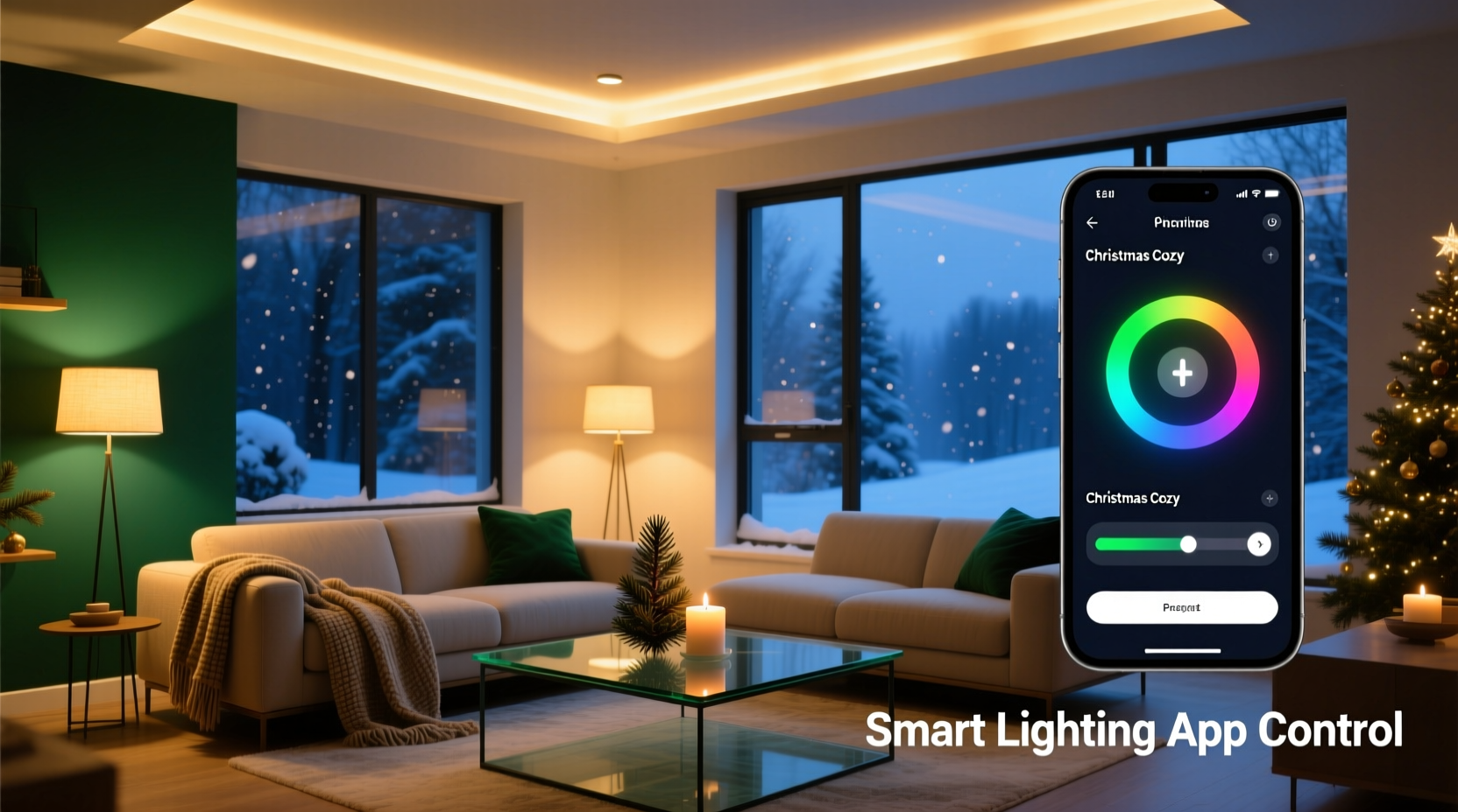
- Translate to app parameters: In your lighting app, convert each color to precise HSB (Hue-Saturation-Brightness) or Kelvin values. Note: Kelvin only controls white light temperature; for colored light, use HSV sliders or hex codes. Save each as a named scene (e.g., “Mantel – Warm Hearth,” “Porch – Twilight Pine”).
- Test transitions and timing: Program gradual crossfades between scenes—not instant jumps. Set duration to 8–12 seconds for ambient shifts; use shorter 3–5 second fades for accent highlights. Schedule scenes to align with natural light decay (e.g., “Twilight Pine” activates at civil twilight, not 5:00 p.m. sharp).
Smart App Features That Enable Real Cohesion
Not all lighting apps are built for nuanced color orchestration. Here’s how top platforms support (or hinder) cohesion—and what to activate:
| Feature | Why It Enables Cohesion | How to Use It Effectively |
|---|---|---|
| Scene Syncing (Hue Sync, Nanoleaf Light Panels + App) | Ensures all zones shift color simultaneously, preventing visual “stutter” | Disable individual zone timers when using synced scenes. Use “Group Scenes” instead of per-bulb schedules. |
| Color Temperature Presets (LIFX, Govee) | Allows seamless blending of white and colored light without hue clash | Set all white lights to the *exact* same Kelvin value (e.g., 2200K) across zones—even if bulbs are different brands. Avoid mixing 2200K and 2700K in adjacent spaces. |
| Custom Animation Curves (Nanoleaf, Philips Hue Labs) | Replaces robotic “pulse” or “glow” effects with organic, wave-like transitions | Create custom fade curves: start slow, accelerate mid-transition, ease out. Mimics candle flicker or firelight rhythm. |
| Geofencing + Sunset/Sunrise Triggers (Govee, Hue) | Aligns lighting with natural circadian cues, reinforcing tonal consistency | Use “Sunset Start” for your primary scene—not a fixed clock time. Adjust offset manually (+/- 15 min) weekly as daylight shifts. |
| RGBW Separation (Govee, LIFX Z) | Prevents desaturation when mixing white + color channels | For accent zones, disable white channel entirely. For ambient zones, use white channel *only*—no RGB bleed. |
Mini Case Study: The Anderson Family’s “Midnight Fir” Transformation
The Andersons live in a 1920s Craftsman bungalow with exposed beams, stained-glass transoms, and a front porch wrapped in cedar shingles. Last year, their lights felt chaotic: cool-white porch floods, hot-pink tree lights, and amber string lights on the mantel competed rather than complemented. They wanted “cozy but sophisticated”—nothing twee or commercial.
Working with a local lighting consultant, they defined “Midnight Fir” as their narrative anchor: deep evergreen, charred black, frosted silver, and ember-orange. They mapped zones and discovered their biggest issue was the transom window—it acted as a bright, uncontrolled light source at night, washing out the porch’s intended depth.
In the Govee app, they created four core scenes: “Porch – Charred Cedar” (2000K white, 10% brightness), “Tree – Fir Depth” (hue 145°, saturation 72%, brightness 35%), “Transom – Frosted Glass” (hue 200°, saturation 18%, brightness 22%), and “Mantel – Ember Glow” (hue 25°, saturation 88%, brightness 40%). Crucially, they used Govee’s “Group Fade” feature to ensure all four scenes activated within a 4-second window at sunset—and programmed a 12-second crossfade to “Ember Glow” when entering the living room at night.
Result? Neighbors commented on the “calm elegance” of their display. The transom no longer fought the porch—it became a subtle, luminous frame. And because all scenes shared the same low-brightness baseline (22–40%), the house felt enveloping, not glaring.
Do’s and Don’ts of Color Harmony in Smart Lighting
- Do calibrate your app’s color picker using a physical swatch book (e.g., Pantone SkinTone Guide or Benjamin Moore Color Portfolio) placed under your main light source—then match the app’s output to the swatch in situ.
- Do limit animated zones to one per room. If your tree pulses, keep the mantel static. Motion draws attention; too much motion fractures focus.
- Do test your scheme on overcast days. Cloud cover diffuses light and reveals saturation imbalances invisible in direct sun.
- Don’t use RGB values from Pinterest or Instagram. Those are screen-rendered approximations—not photometric outputs. A hex #8B4513 (saddle brown) on your phone bears little relation to how 8B4513 renders as light on your ceiling.
- Don’t assume “white” is neutral. Warm white (2200K–2700K) reads as creamy or honeyed; cool white (4000K+) reads as clinical or wintry. Choose based on your scheme’s emotional intent—not convenience.
- Don’t ignore light direction. Uplighting a green wall with amber light creates muddy olive; downlighting the same wall with amber creates rich, dimensional warmth. Map light vectors before finalizing hues.
FAQ: Common Cohesion Challenges Solved
My smart bulbs don’t all support the same color range—how do I maintain consistency?
Focus on saturation and brightness alignment, not identical hues. If your porch flood only reaches 240° (blue) but your tree lights hit 145° (green), lower the saturation of the blue to 30% and raise its brightness to 65%—it will recede visually, letting the richer green dominate. Prioritize tonal harmony over chromatic duplication.
Can I use the same color scheme indoors and outdoors—or should they differ?
They should relate, not repeat. Think of outdoor lighting as the “overture”: simpler, broader strokes (e.g., porch = dominant color at 40% saturation). Indoor lighting is the “movement”: layered, nuanced, with intentional accents (e.g., mantel = same hue at 85% saturation + 10% brightness boost). This creates narrative continuity without monotony.
How often should I recalibrate my scenes as daylight hours change?
Recalibrate sunset/sunrise triggers every 10–14 days from late November through early January. Most apps auto-adjust, but manual verification prevents scenes activating too early (while it’s still light) or too late (leaving you in darkness). Keep a log: note date, actual sunset time, and scene activation time—adjust offset if variance exceeds 3 minutes.
Conclusion: Light With Intention, Not Just Illumination
A cohesive Christmas color scheme isn’t a luxury—it’s a form of quiet hospitality. It tells guests, “This space was considered. You are anticipated. Your comfort matters.” Smart lighting apps give us the tools, but cohesion emerges only when we move beyond tapping presets and begin designing with the same rigor we’d apply to paint selection or furniture layout. It asks us to slow down: to observe how light falls on wood grain at 4:47 p.m., to notice how amber reflects in a glass ornament versus a matte ceramic, to understand that a 5% difference in saturation can shift a room from serene to saccharine. The technology is powerful—but its true magic lies in how deliberately we wield it. This season, resist the urge to “set and forget.” Instead, open your app not as a remote control, but as a conductor’s baton. Tune each zone. Refine each transition. Let your home speak in a single, resonant chromatic voice.


 浙公网安备
33010002000092号
浙公网安备
33010002000092号 浙B2-20120091-4
Comments
No comments yet. Why don't you start the discussion?