
Creating a harmonious holiday atmosphere in a multi-story home doesn’t require matching every room in red and green. In fact, one of the most sophisticated approaches to festive decorating is building a narrative through color, texture, and theme—without ever duplicating a single hue. Whether your home spans two levels or four, achieving visual continuity while maintaining individuality on each floor is not only possible—it can elevate your entire Christmas aesthetic.
The key lies in thoughtful planning, a unifying design thread, and an understanding of how colors relate to one another. By using complementary palettes, consistent materials, and recurring motifs, you can guide guests from floor to floor as if turning pages in a beautifully illustrated storybook—each chapter distinct, yet clearly part of the same tale.
Establish a Unifying Design Language
Cohesion in multi-floor decorating isn’t about repetition—it’s about resonance. Instead of copying a color scheme from the living room to the attic guest suite, think in terms of rhythm and relationship. A warm copper tone on the first floor might echo in the form of antique brass candlesticks upstairs. Velvet ribbons on tree ornaments downstairs could find their counterpart in plush throw pillows with similar sheen, even if the hues differ.
Start by selecting a central theme that transcends color: “woodland elegance,” “vintage nostalgia,” or “coastal calm” are all strong anchors. These themes allow for variation in palette while maintaining emotional consistency. For instance, a woodland theme might use mossy greens and bark browns on the ground floor, transition to icy blues and silvers on the second, and finish with dusky purples and charcoal grays in the loft—evoking dawn, day, and dusk in a forest clearing.
Choose a Color Progression Strategy
Rather than assigning random colors to each floor, treat your home like a gradient. Select a base color family—such as jewel tones, pastels, or earthy neutrals—and allow it to evolve as you ascend or descend.
For example:
- Basement or Entry Level: Deep burgundy (symbolizing warmth and welcome)
- Ground Floor: Forest green (representing tradition and abundance)
- Second Floor: Navy blue (introducing calm and reflection)
- Third Floor or Attic: Soft lavender (suggesting serenity and magic)
This progression creates movement and intentionality. Each floor feels unique, yet the gradual shift in saturation and temperature ensures harmony.
“Cohesion in holiday decor comes not from sameness, but from storytelling. Let each space contribute a different verse to the same seasonal song.” — Clara Mendez, Interior Stylist & Seasonal Design Consultant
Use Repeating Elements—But Not Colors
To tie diverse spaces together without relying on identical shades, focus on repeating non-color elements. These become the invisible threads that bind your design:
- Natural materials: Wood slices, pinecones, dried citrus, and cinnamon sticks used throughout
- Lighting style: Edison bulbs, fairy lights in glass jars, or flameless candles in uniform holders
- Ornament shapes: Teardrop baubles, paper snowflakes, or hand-knit stars repeated across trees
- Typography: Vintage-style chalkboard signs with holiday phrases in the same font
Even if one tree glows with amber and ochre and another shines in emerald and sapphire, these shared details whisper, “You’re still in the same world.”
Create a Signature Scent Journey
Scent is a powerful, often overlooked tool in creating continuity. While colors change from floor to floor, a consistent fragrance profile can unify the experience. Choose a base note—such as cedar, vanilla, or clove—and vary its expression per level:
| Floor | Color Scheme | Scent Variation |
|---|---|---|
| Basement | Burgundy + Gold | Cedar + Black Pepper (warm, grounding) |
| Living Room | Forest Green + Cream | Pine + Vanilla (classic, comforting) |
| Bedrooms | Navy + Silver | Snow Musk + Amber (cool, serene) |
| Attic | Lavender + Pearl | Lavender + Tonka Bean (soft, dreamy) |
The scent evolves, just like the colors, but remains recognizable—like a melody played in different keys.
Step-by-Step Guide: Building Your Multi-Floor Palette
Follow this timeline to plan and execute your non-repeating, cohesive Christmas decor:
- Week 1: Define Your Theme and Flow
Select an overarching theme and decide the emotional journey you want guests to experience—from vibrant and lively at entry level to peaceful and reflective upstairs. - Week 2: Map Out Your Floors
Sketch a simple floor plan. Assign a mood and purpose to each level (e.g., entertaining, relaxation, family gathering). This informs color choice more than aesthetics alone. - Week 3: Build a Color Ladder
Pick five related but distinct colors—one for each floor or major area. Use a color wheel to ensure they’re harmonious (analogous or triadic schemes work well). Avoid adjacent shades that are too close; aim for contrast with cohesion. - Week 4: Source Connective Materials
Order or gather items that will appear on every floor: specific candleholders, wooden ornaments, ribbon style, or lanterns. These will be your glue. - Week 5: Decorate with Intention
Begin on the lowest level. Install your first color scheme with signature materials. As you move up, introduce new colors but repeat textures, lighting, and shapes. Step back frequently to assess flow. - Final Touch (Day Before Gathering): Walk through the house at night with only decorative lighting on. Adjust brightness, scent placement, and focal points to ensure smooth transitions.
Real Example: The Thompson Family Townhouse
The Thompsons live in a four-level London townhouse. They wanted a festive home that felt curated, not chaotic, for their annual open-house Christmas party. Their solution?
They chose a “Northern Lights” theme, inspired by auroras shifting across winter skies. Each floor represented a phase of twilight:
- Basement Playroom: Crimson and black velvet drapes with flickering copper string lights—simulating dusk.
- Ground Floor Living: Deep evergreen walls with silver-dipped pinecones and frosted branches—early nightfall.
- First Floor Dining: Midnight blue table runner with iridescent sequin placemats—peak darkness with shimmer.
- Top Floor Lounge: Icy lavender and pearl-white textiles with glow-in-the-dark star stickers on the ceiling—dawn approaching.
What tied it together? Every room featured handmade paper lanterns in the shape of snowflakes, lit from within. Though colors never repeated, the repeated silhouette created unity. Guests commented on the “magical journey” through the house, describing it as “moving through a winter dream.”
Avoiding Common Pitfalls
Even experienced decorators can misstep when trying to balance variety and harmony. Here’s what to avoid:
| Do | Don't |
|---|---|
| Use a consistent bulb type (warm white LED) in all string lights | Mix cool and warm lighting—it disrupts mood continuity |
| Repeat one natural element (e.g., real pine garlands) on each floor | Use artificial greenery downstairs and none upstairs—breaks immersion |
| Label your color plan with floor names and assigned hues | Decorate room by room without reference—leads to accidental repeats or clashes |
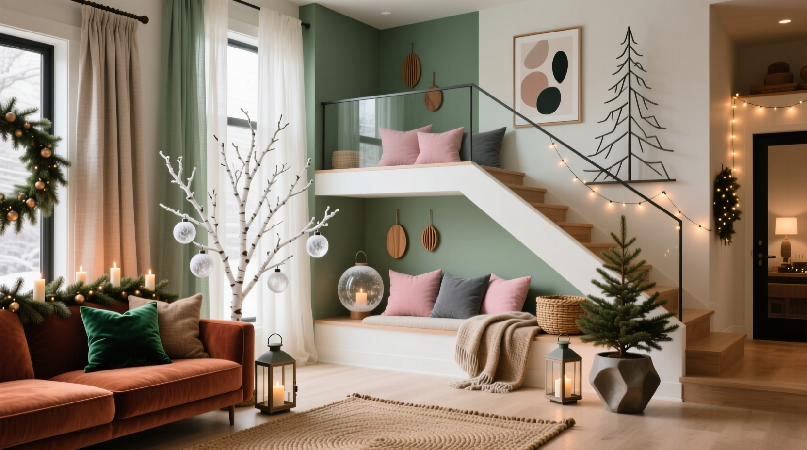
| Let staircases serve as transition zones with neutral-toned accents | Over-decorate landings with clashing colors—creates visual noise |
Checklist: Cohesive Multi-Floor Christmas Decor
Before hanging the first ornament, run through this checklist:
- ☐ Chosen a central theme (e.g., rustic charm, modern glam, Scandinavian minimal)
- ☐ Assigned one unique color to each floor or main area
- ☐ Selected 2–3 non-color elements to repeat (material, shape, texture)
- ☐ Planned scent strategy with evolving but related fragrances
- ☐ Purchased or prepared connector items (candles, lanterns, ribbon)
- ☐ Tested color swatches together for harmony
- ☐ Designed staircase decor to bridge color transitions
- ☐ Scheduled decorating in order from bottom to top
- ☐ Planned a final walkthrough under evening lighting
FAQ
Can I use patterns instead of solid colors to maintain uniqueness?
Absolutely. In fact, using patterned fabrics—like plaids, damasks, or folk prints—with a dominant unique color per floor can enhance distinction while allowing for subtle secondary tones that echo other levels. Just ensure the primary color in each pattern is clearly different.
What if I have an open-plan layout on one floor?
In open-concept spaces, use furniture groupings or lighting zones to define areas within the floor. You can then assign a sub-color or accent hue to each zone, but keep the main floor’s designated color dominant. This prevents visual fragmentation while supporting your overall progression.
How do I handle hallways and bathrooms?
Treat smaller spaces as supporting roles. Use them to reinforce the floor’s primary color with small touches—mini wreaths, scented soaps, or towel embroidery. Avoid introducing a new color here; save surprises for main rooms.
Conclusion: Your Home, Your Holiday Story
A truly memorable Christmas home isn’t one where every room looks the same—it’s one where each space feels intentional, connected, and full of character. By avoiding repeated colors and instead crafting a thoughtful progression, you invite exploration and wonder. Guests won’t just see decorations; they’ll experience a journey.
The beauty of this approach is that it rewards creativity. You’re not limited by tradition or forced into seasonal clichés. Instead, you’re free to express the evolving spirit of the holidays—from the hearty welcome of the entrance to the quiet reverence of a top-floor reading nook.


 浙公网安备
33010002000092号
浙公网安备
33010002000092号 浙B2-20120091-4
Comments
No comments yet. Why don't you start the discussion?