
True holiday cohesion isn’t about uniformity—it’s about resonance. When every ornament, garland, table runner, and candleholder shares the same exact shade of red, the result often feels sterile, like a catalog photo rather than a lived-in home. Cohesion emerges not from repetition, but from intention: shared undertones, complementary contrasts, layered textures, and a clear visual hierarchy. This approach allows personality to shine while preserving harmony—so your tree doesn’t compete with your mantel, and your dining table feels like part of the same story as your front door wreath. It’s the difference between “everything matches” and “everything belongs.”
The Myth of Matching—and Why It Weakens Your Design
For decades, holiday decorating advice emphasized strict color coordination: red, green, gold, and white—all in precise, branded tones. While this delivers instant recognizability, it sacrifices warmth, depth, and authenticity. Real homes contain heirlooms with faded velvet ribbons, modern ceramic ornaments in muted clay tones, vintage glass baubles with subtle iridescence, and handmade felt stars in earthy ochres. Insisting they all “match” forces compromise: sanding down patina, discarding beloved pieces, or buying new items that lack history or soul.
Design psychologist Dr. Lena Torres notes:
“Visual coherence is processed by the brain through relational cues—not sameness. A range of reds reads as unified when they share warmth, value contrast, or textural rhythm—even if their chroma differs significantly.”In other words, your grandmother’s cranberry glass bell and your matte terracotta candle holder can coexist beautifully—not because they’re the same red, but because they both carry warmth, weight, and quiet confidence.
Build Your Palette Using the 60-30-10 Rule (with Holiday Flexibility)
Instead of selecting three identical colors, choose three *families*—each with its own character, scale, and role. The classic 60-30-10 proportion ensures balance without rigidity:
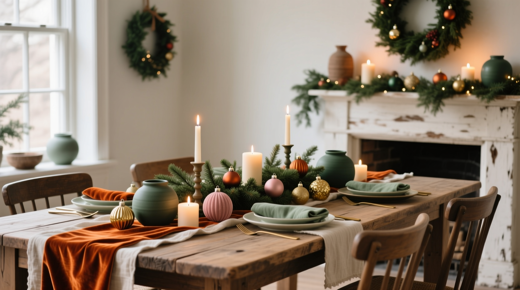
- 60% Anchor (Base Tone): Your dominant, grounding hue—not necessarily “green” or “red,” but the color that appears most consistently across large surfaces: walls, wrapping paper, tree skirt, or main garlands. Think forest floor green, charcoal pine, deep burgundy, or even warm oatmeal.
- 30% Counterpoint (Supporting Hue): A color that provides gentle contrast and energy—used on medium-scale elements like ornaments, stockings, or tabletop accents. This should harmonize with your anchor, not clash: e.g., burnt sienna with forest green; dusty rose with charcoal; antique brass with burgundy.
- 10% Accent (Spark & Surprise): A smaller, higher-contrast element used sparingly for focal points: mercury glass reflections, hand-stitched embroidery details, or a single branch of dried orange slices. This isn’t “pops of color”—it’s purposeful punctuation.
A Practical Step-by-Step Guide to Curating Your Palette
- Gather what you already own. Lay out every decoration: lights, ornaments, textiles, candles, greenery. Don’t edit yet—just observe.
- Identify your natural anchor. Which color appears most frequently? Which feels most substantial or calming? That’s likely your 60% base—even if it’s not “traditional.”
- Group similar hues—not identical ones. Sort ornaments by warmth (cool vs. warm reds), value (light vs. dark), and saturation (muted vs. vivid). Notice which groups feel related: e.g., a faded cranberry ball, a rust-colored pinecone, and a brick-red ceramic star may belong together despite different names.
- Introduce one deliberate counterpoint. Choose a single new item—a set of napkins, a garland, or a table runner—in your 30% supporting hue. Ensure it shares at least one quality with your anchor: same undertone (both warm or both cool), similar lightness, or comparable texture (e.g., both matte or both softly reflective).
- Add accent with material, not just color. Instead of buying a bright yellow ornament, try a brass bell, a linen-wrapped gift tag, or a sprig of silver-dollar eucalyptus. Texture and finish often unify more powerfully than hue alone.
Do’s and Don’ts: Color Harmony in Practice
| Do | Don’t |
|---|---|
| Use natural materials (wood, wool, dried citrus, unglazed ceramics) to soften transitions between hues | Force a “theme” color onto every surface—e.g., painting pinecones gold to “match” your tree lights |
| Repeat a single neutral across categories: creamy linen napkins, off-white pillar candles, raw-edge burlap ribbon | Assume white = neutral—cool bright white clashes with warm ivory or cream; test them side-by-side |
| Let lighting shape perception: warm LED string lights (2700K–3000K) unify diverse reds and greens far better than cool white lights | Ignore undertones—e.g., pairing a blue-based emerald green with a yellow-based kelly green creates unintended tension |
| Embrace tonal variation: use 3–4 shades of green in your garland (deep fir, sage, olive, moss) for organic depth | Buy “coordinated sets” unless you’ve physically tested each piece against your existing decor |
| Anchor with scent and sound: pine, cinnamon, and crackling firelogs reinforce visual cohesion through multisensory alignment | Treat metallics as afterthoughts—brass, copper, pewter, and matte black each carry distinct temperature and weight; choose one primary metal family |
Real Example: The “Hearth & Hemlock” Palette in Action
When interior stylist Maya Chen renovated her 1920s bungalow, she inherited mismatched holiday pieces: her mother’s tarnished brass bells, her partner’s collection of matte-black ceramic trees, her own thrifted amber glass ornaments, and a vintage kilim rug with faded indigo and rust stripes. Rather than replace anything, she built a palette around what was already present.
She identified charcoal pine (from her real Fraser fir) as her 60% anchor—not a paint swatch, but the deep, complex green-black of mature evergreen needles. Her 30% counterpoint became burnt umber, pulled from the kilim’s rust stripe and echoed in dried walnut shells, cinnamon sticks bundled with twine, and matte-black ornaments with subtle umber glaze drips. Her 10% accent was antique brass, appearing only on her mother’s bells and the hardware of her custom-made wooden gift boxes—never duplicated elsewhere.
The result? A living room where the kilim rug didn’t “fight” the tree, the brass bells felt like heirlooms rather than interruptions, and the black ceramics read as grounded—not cold—because their matte finish absorbed the warm glow of nearby candles. “People always ask, ‘Where did you buy the matching set?’” Maya says. “I tell them: ‘I didn’t. I listened to what was already here—and gave it permission to be itself.’”
Expert Insight: Why Texture Trumps Tone
Color theorist and textile designer Aris Thorne spent five years documenting holiday palettes in over 200 homes across North America and Scandinavia. His finding is unequivocal:
“The strongest predictor of perceived cohesion isn’t hue accuracy—it’s tactile consistency. Homes where wool, wood, and matte ceramics dominate feel unified even with wide color variance. Those relying heavily on glossy plastic, mirrored glass, and synthetic fabrics fracture visually—even with perfect Pantone matches.”He recommends anchoring your palette with at least two natural, matte-finish materials: e.g., raw wood + undyed linen, or dried botanicals + stoneware. These mute chromatic differences and invite the eye to rest.
FAQ
Can I use more than three colors and still feel cohesive?
Absolutely—if you maintain a clear hierarchy and shared quality. For example: 50% deep navy (anchor), 25% heather gray (counterpoint), 15% oyster shell (soft accent), 10% brushed brass (spark). The key is ensuring no secondary color competes for dominance, and all share the same low-saturation, matte character.
What if my favorite ornament is neon pink?
Recontextualize it—not reject it. Pair it with deep charcoal and raw wood to ground its intensity. Use it as your sole 10% accent, placed deliberately where it draws the eye naturally (e.g., centered on the top branch of your tree, or tied to your front door handle). Its singularity becomes intentional, not jarring.
How do I know if my palette feels “off”?
Step back and close your eyes for three seconds—then open them. Does one area “jump” unexpectedly? Does your gaze skitter instead of settling? That’s usually a sign of imbalance: either too many competing accents, mismatched undertones, or a missing neutral buffer (like cream, oat, or soft gray) to bridge contrasting hues.
Conclusion: Belonging Over Blending
Cohesion in holiday design isn’t achieved by erasing difference—it’s cultivated by honoring it with intention. A cohesive palette doesn’t demand conformity; it invites conversation between tones, textures, and traditions. It allows your grandmother’s hand-blown glass to sit comfortably beside your child’s salt-dough star, not because they match, but because they both carry time, care, and quiet significance. Start small: choose one shelf, one mantel, or one tree. Apply the 60-30-10 framework. Trust your eye over a color wheel. Let warmth guide you more than labels. And remember—the most memorable holiday spaces aren’t those where everything matches, but where everything feels like it has earned its place.


 浙公网安备
33010002000092号
浙公网安备
33010002000092号 浙B2-20120091-4
Comments
No comments yet. Why don't you start the discussion?